• Blog
  • about
  • printing museums in be
  • printmaking in be
  • workshops
Menu

Type & Press

  • Blog
  • about
  • printing museums in be
  • printmaking in be
  • workshops
image source

image source

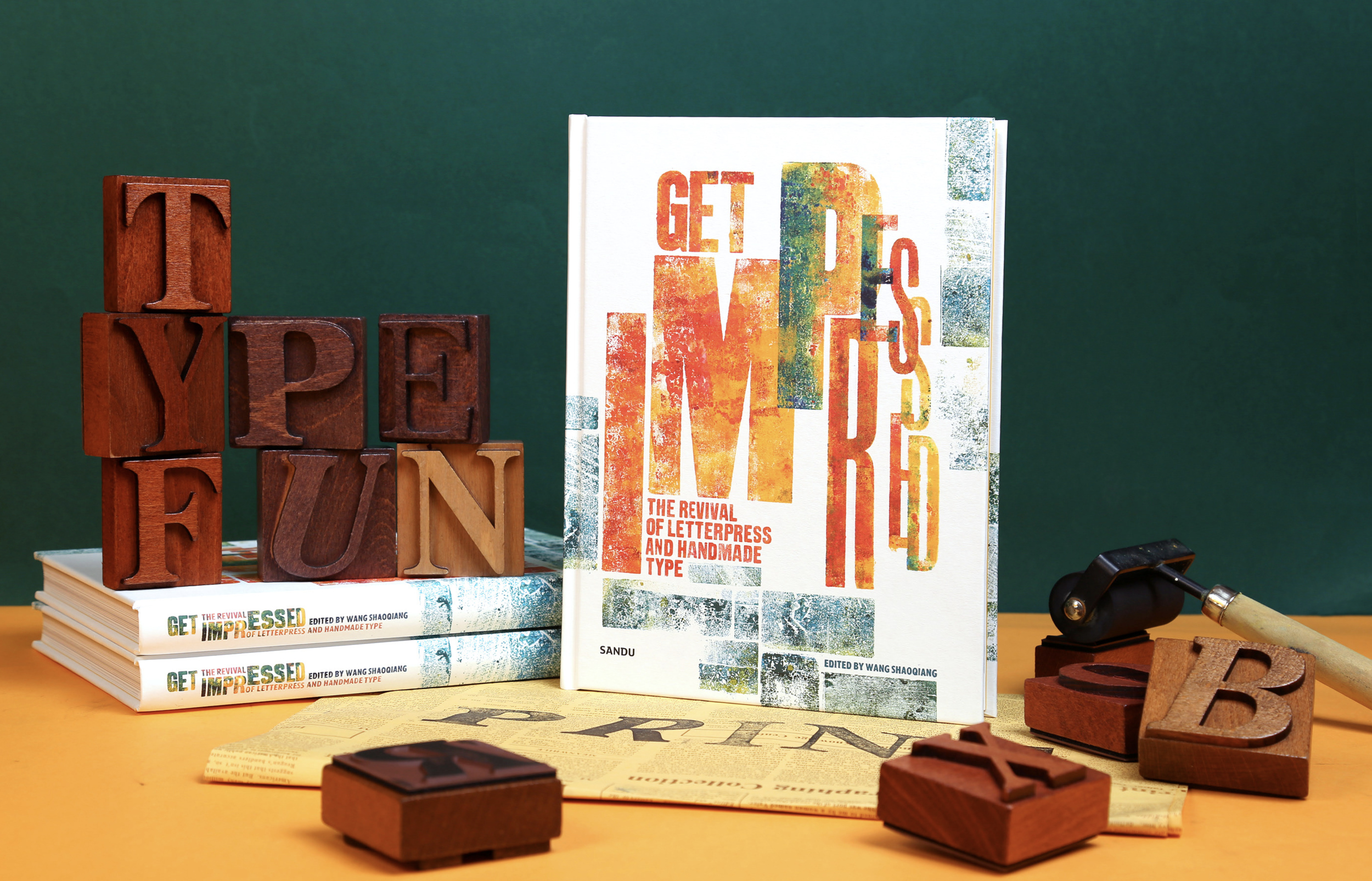
Get Impressed. The Revival of Letterpress and Handmade Type.

September 15, 2021

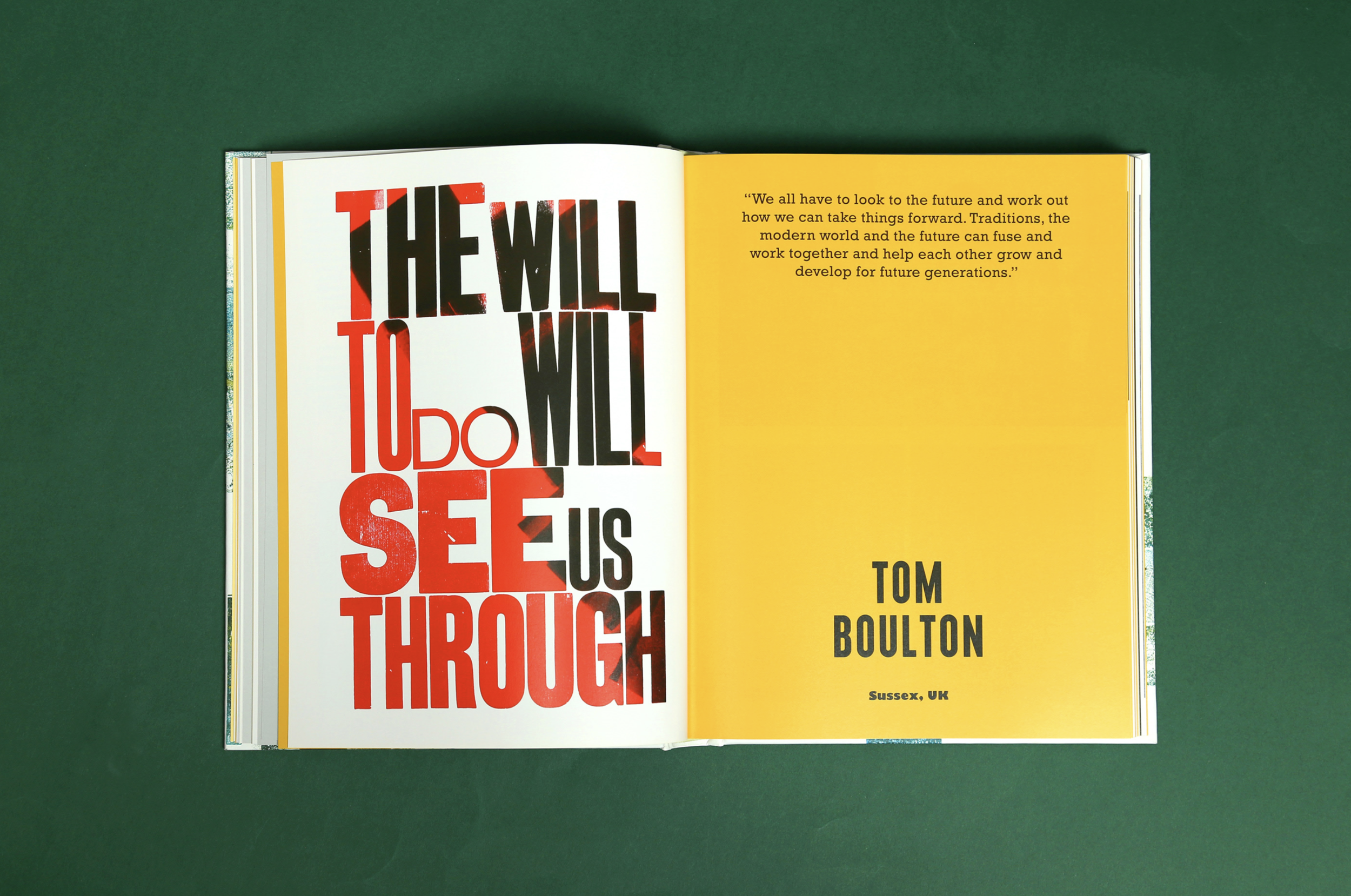
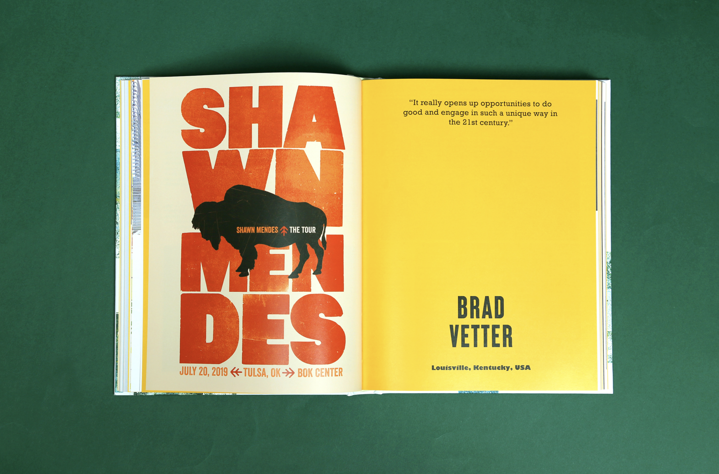
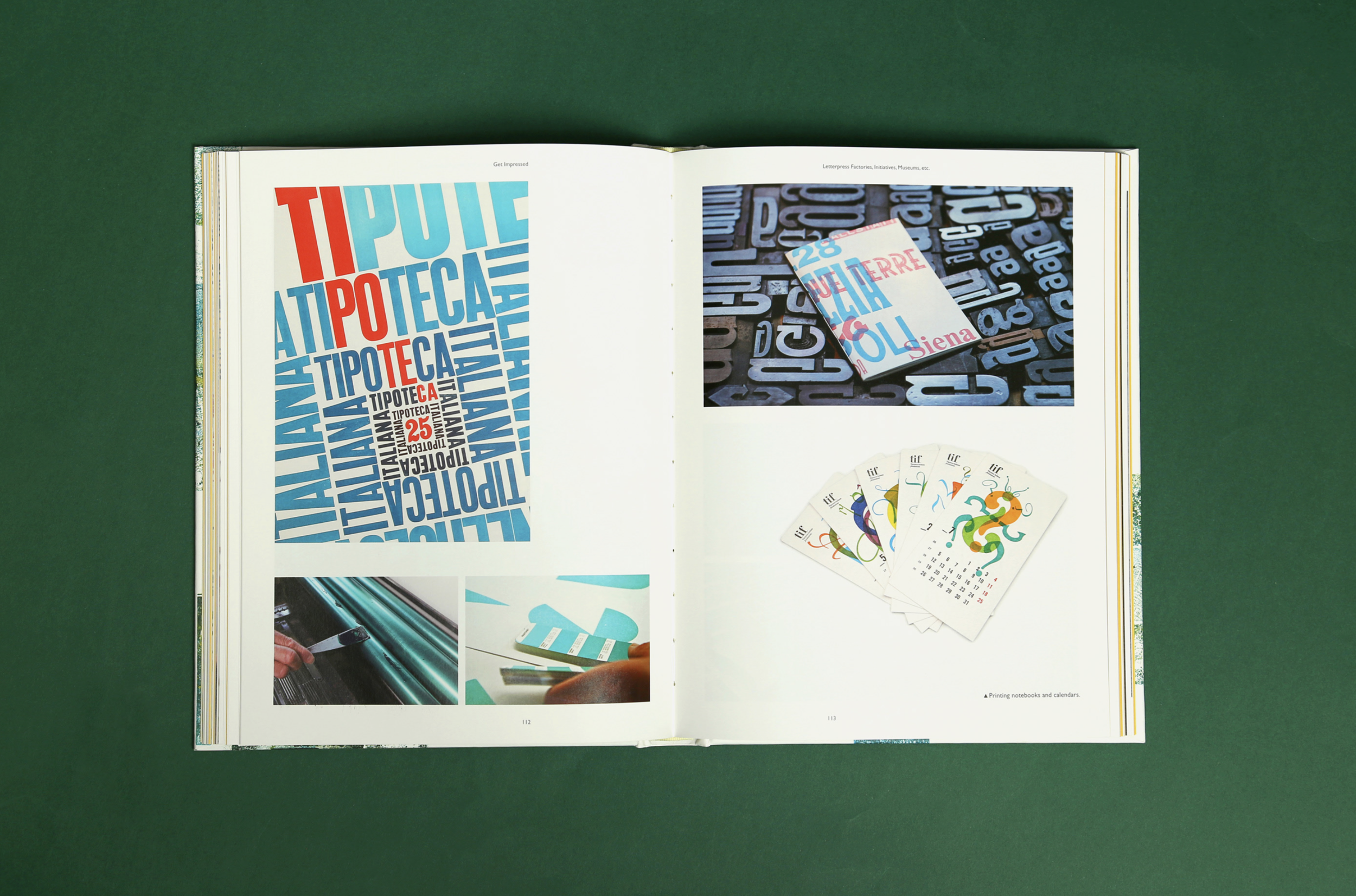
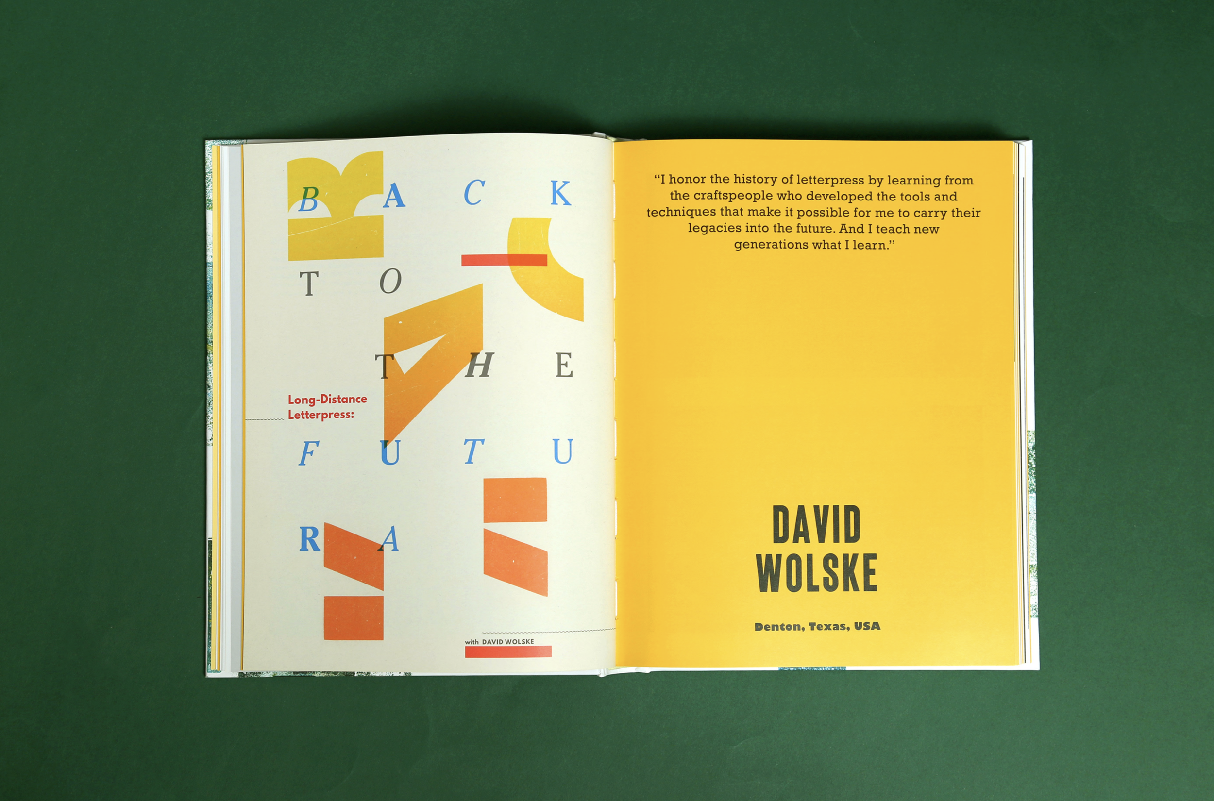
Happy to have my work featured in this publication by Sandu Publishing Co., Ltd. from China. I’m looking forward to receiving the book and meeting old and new ‘faces’ on the pages filled with ink and wood type.

Here is a short info about the publication:

Get Impressed. The Revival of Letterpress and Handmade Type

Letterpress, an old-world invention, forever changed the face of communication and the speed in which information could pass from person to person. It gave birth to the “press”. Today letterpress is in a full-blown revival and widely used in printing books, posters, bespoke stationery like invitations, name cards, letterheads and so on. Letterpress designers carve out their names in the computer-generated design world with beautifully composed types.

190 mm × 250 mm, 240pp
Hardcover, English
ISBN: 978-84-17656-37-9 (Oversea market)
ISBN: 978-988-74493-5-5 (Chinese market)
Contact sales@sandupublishing.com to purchase

And a few impressions:
View fullsize Screenshot 2021-09-15 at 17.43.30.png
View fullsize Screenshot 2021-09-15 at 17.44.32.png
View fullsize Screenshot 2021-09-15 at 17.43.49.png
View fullsize Screenshot 2021-09-15 at 17.44.00.png
View fullsize Screenshot 2021-09-15 at 17.44.22.png
View fullsize Screenshot 2021-09-15 at 17.45.00.png

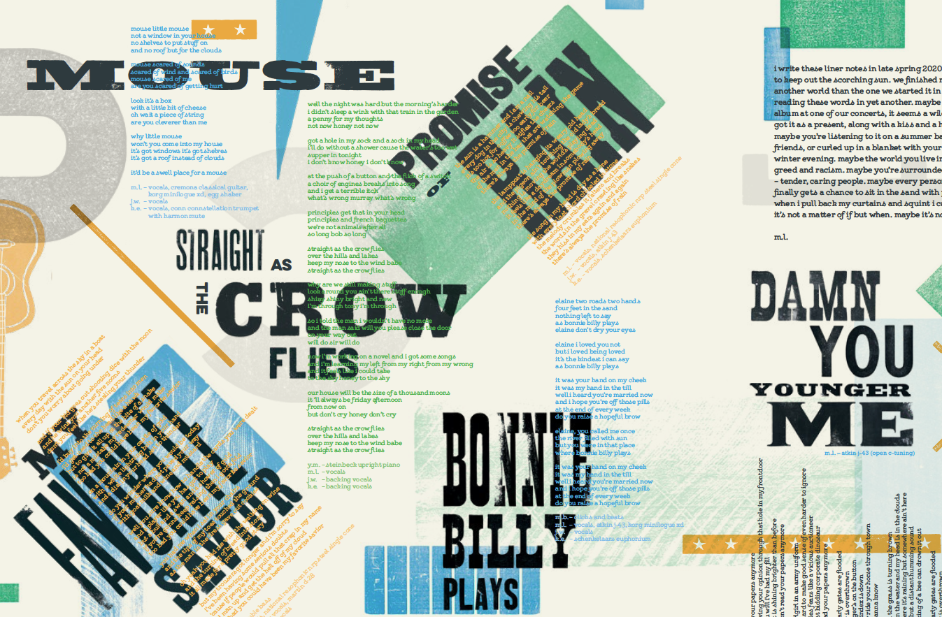
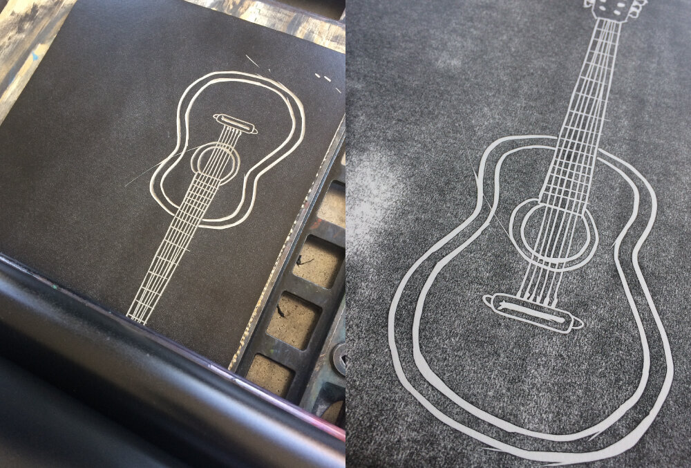
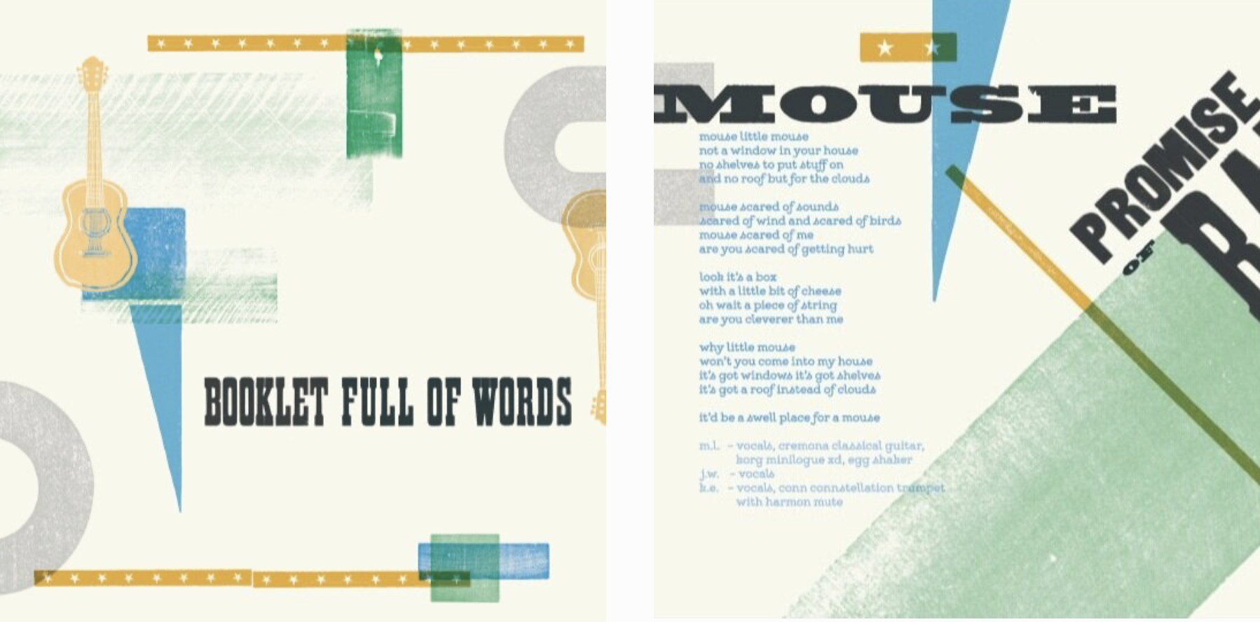
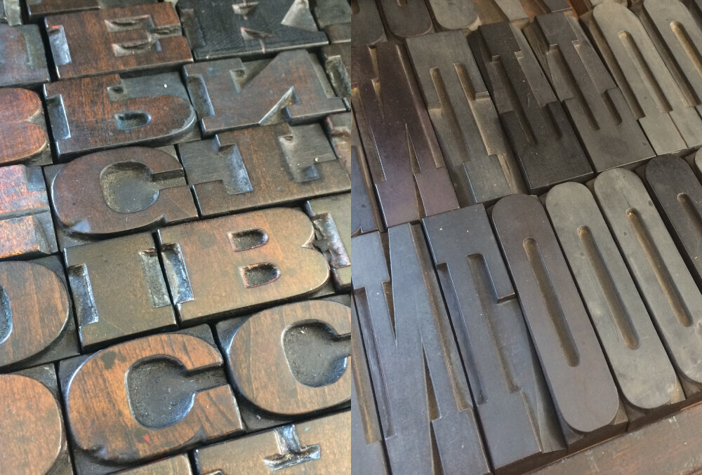
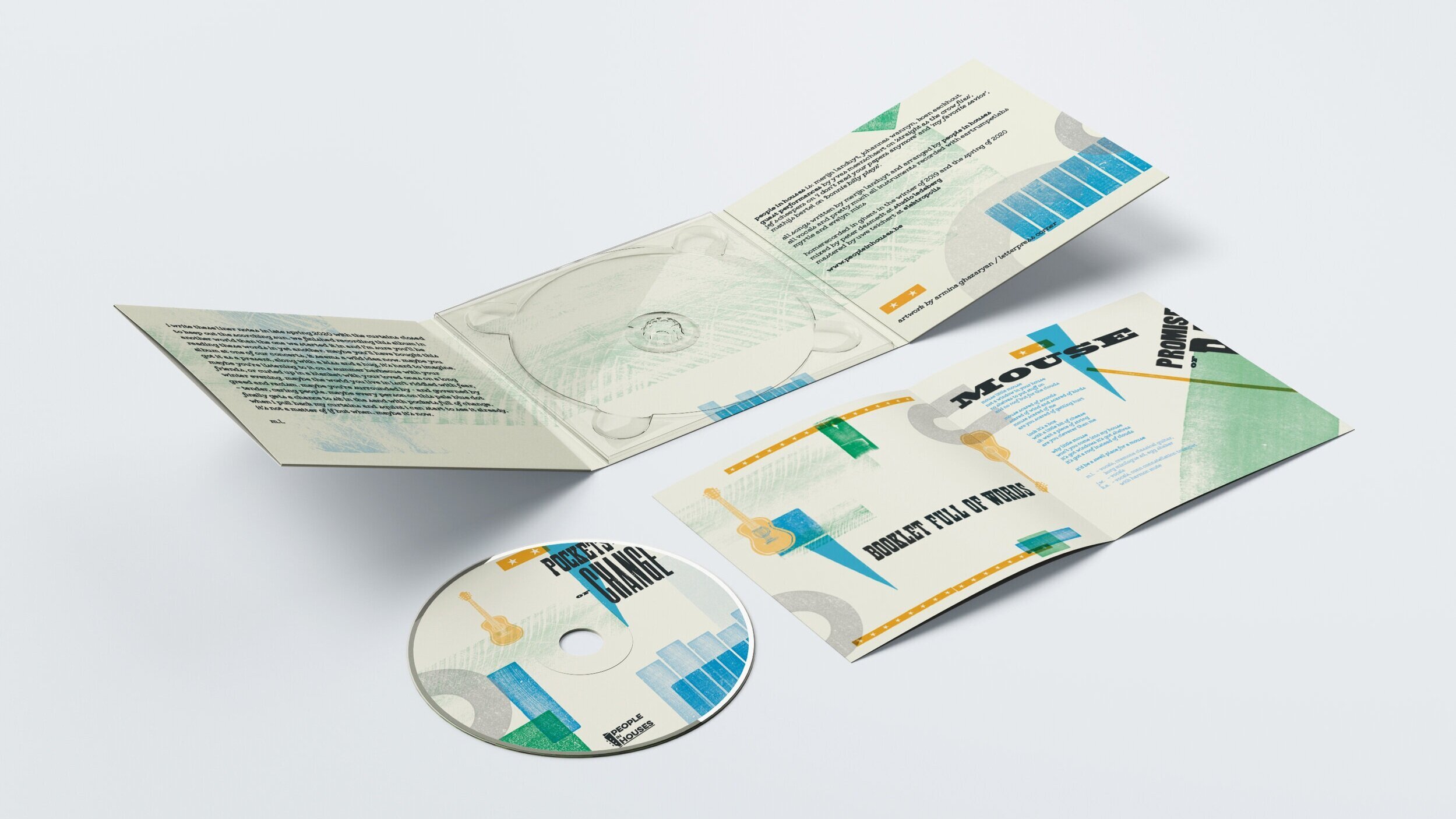
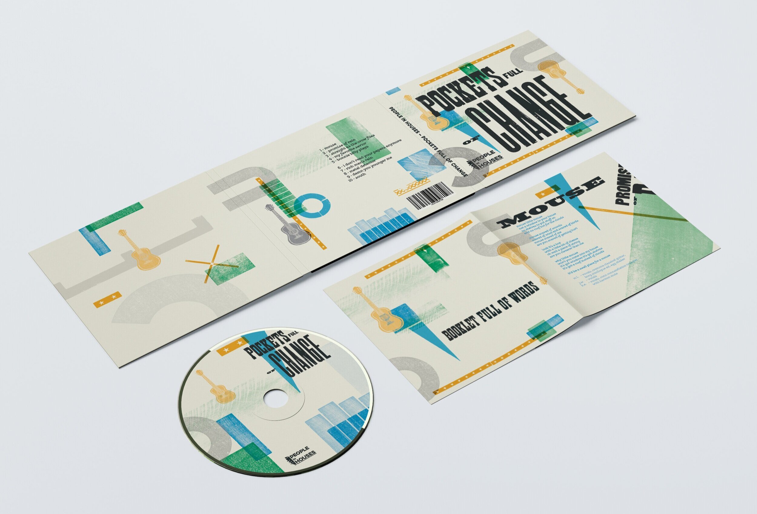
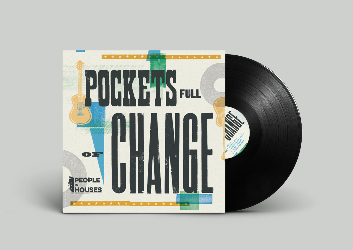
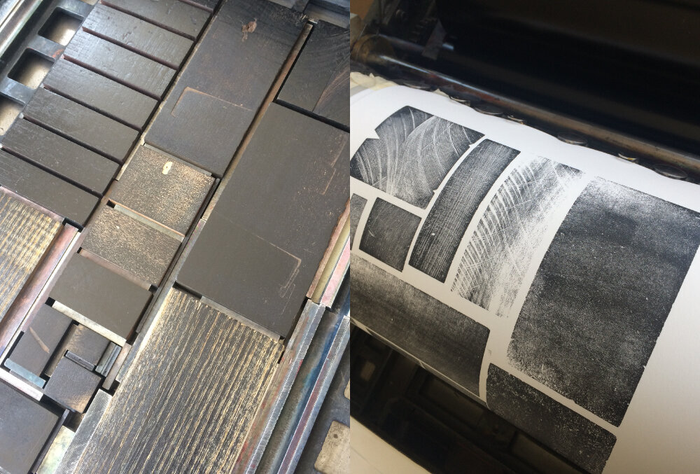
My submission for this publication was the design for an LP sleeve (gatefold) and CD cover+booklet for the ‘Pockets Full of Change’ album by ‘People in Houses’ music band from Ghent. Together with the band we decided to use crafty approach: the illustrations were made from linocut, I printed and scanned the wood type to be used for the titles and the back side of the wood type for the textures. The letterpress printing took place at my studio Letterpress Corner and offset printing at Deepgrooves (NL).
Screen+Shot+2020-08-31+at+15.13.15.png
PiH_linocut.jpg
Screen+Shot+2020-08-31+at+15.15.35.png
PiH_linocut_02.jpg
Screenshot 2021-09-15 at 18.02.47.png
PiH_linocut_03.jpg
Free_6_panel_digipack_mockup_201.jpg
Free_6_panel_digipack_mockup_601.jpg
Screen+Shot+2020-08-31+at+15.13.15.png PiH_linocut.jpg Screen+Shot+2020-08-31+at+15.15.35.png PiH_linocut_02.jpg Screenshot 2021-09-15 at 18.02.47.png PiH_linocut_03.jpg Free_6_panel_digipack_mockup_201.jpg Free_6_panel_digipack_mockup_601.jpg

Get Impressed
The Revival of Letterpress and Handmade Type
190 mm × 250 mm, 240pp
Hardcover, English
ISBN: 978-84-17656-37-9 (Oversea market)
ISBN: 978-988-74493-5-5 (Chinese market)
Contact sales@sandupublishing.com to purchase

you might also like
Reverting to Type 2020: Protest Posters.
From Futura to the Future. Leipzig.
25x25. Tipoteca 25.
The Museum of Industry. Textile Posters.
Visiting Chalcography department in Brussels. 11.07.19.
Visiting Bodoni Museum in Parma. 28.06.19.
Visiting Familia Plómez in Madrid
Trip to Amsterdam. Makers Match & GWA.
Museum 't Aloam
Zomertyposium 2017 / 2018
Letterpress Amsterdam
Print Me Baby One More Type or LpW 2017
Visiting the London College of Communication
St Bride Foundation Wayzgoose 2017
Trip to Barcelona. Part I. Lauren Press
Trip to Barcelona. Part II. BunkerType
Bookbinders' Fair. Sint- Niklaas, Belgium
event
In printmaking, typography, event, book Tags letterpress, book
Comment
post_pub-1.png
post_pub-2.png
post_pub-9.png
3.png

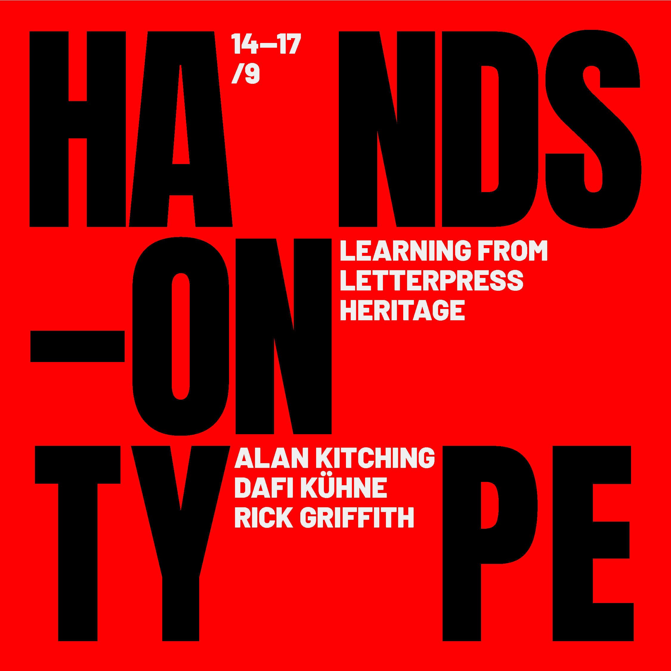
HANDS-ON TYPE | typography event in Porto/Portugal | 14—17 September 2021

July 24, 2021

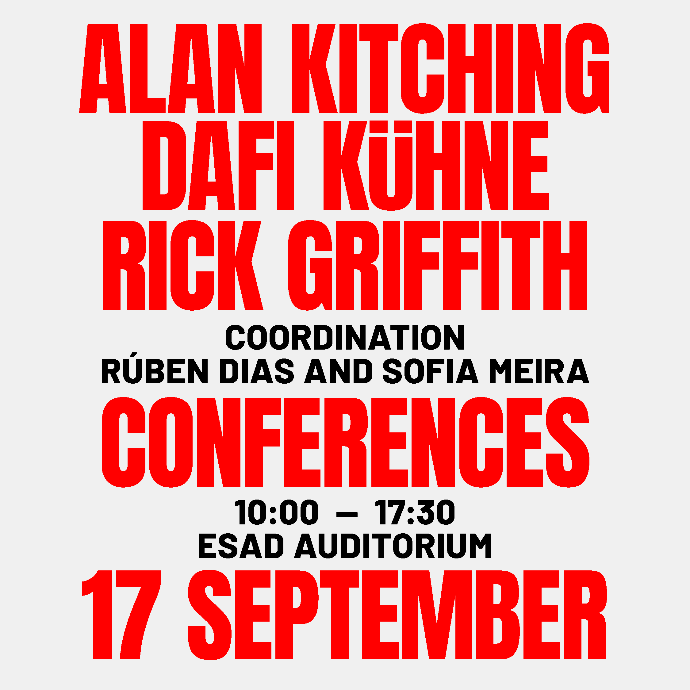
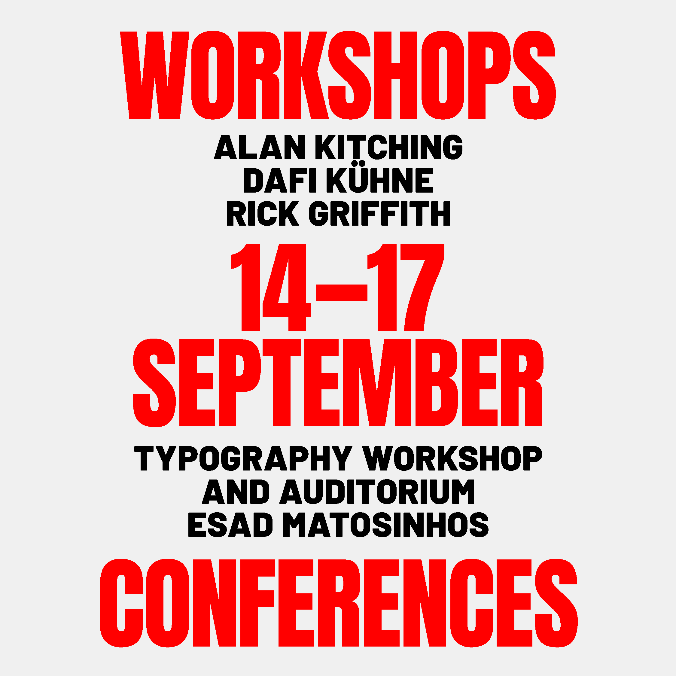
A series of workshops and conferences on the letterpress heritage, with three super-guests: Alan Kitching (UK) | The New Typography Workshop; Dafi Kühne (CH) | Babyinktwice; Rick Griffith (US) | Matter.

Alan Kitching (UK) | The New Typography Workshop — One of the world's leading typography and handprint designers (The New Typography Workshop), recognized for his expressive use of wood and metal types in the creation of his graphic works. He is an honorary member of The Royal College of Art, visiting professor at the University of the Arts London, and a member of the Alliance Graphique International.

Dafi Kühne (CH) | Babyinktwice — Designer, printer and professor, known for the wild mix of analogue and digital tools to produce posters for music, art and architecture, theatre, films and also products. He is the author of the publication True Pint (2016), the video series The Dafi Kühne Printing Show (2020) and the typographic project Wood Type Now! (2009).

Rick Griffith (US) | Matter — Designer, visual artist, printer, teacher, writer and activist. His creative practice results in a collage of form, color and grammar, with an autoethnographic focus. His works can be found all over the world, integrating museums and collections in the United States.

WORKSHOPS | 15—16 SEP [9:30 am–5:30 pm]

14 SEP | Alan Kitching (UK)
15 SEP | Dafi Kühne (CH)
16 SEP | Rick Griffith (US)

CONFERENCES | 17 SEP [10 am–06 pm]

11:00 am | Alan Kitching (UK)
02:30 pm | Dafi Kühne (CH)
04:00 pm | Rick Griffith (US)

REGISTRATIONS
handsontype.esad.pt

FEES
· workshops: 140€ (w/ lunch + goodie bag)
· conferences: 40€ (w/ lunch + goodie bag)
· pack 3 workshops + conferences: 400€ (w/ lunch + goodie bag)
· ESAD community: 30% discount

WHERE
ESAD/ Typography Workshop
ESAD/ Auditorium
Organisation: esadidea, Research in Design and Art + ESAD, College of Art and Design
Support: Direção-Geral das Artes
Partners: I2ADS, ID+, Imprensa Nacional–Casa da Moeda, uniMAD + Fedrigoni, Grafopel, Maiadouro, Tecnimprensa, Viarco

In printmaking, typography, event Tags letterpress, conference, workshop
Comment
BW_01.jpg

Camiel Van Breedam in The Bibliotheca Wittockiana.

April 12, 2021

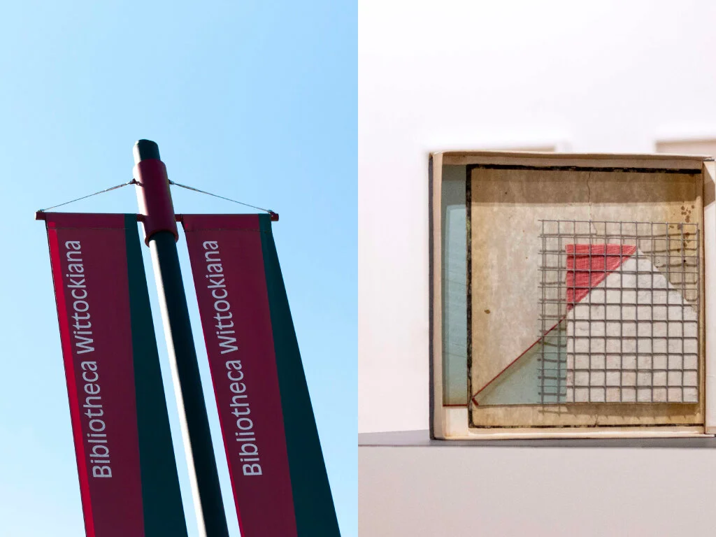
As travelling abroad remain restricted at the moment, we (me and my art-loving friend) are travelling every month within Belgium to visit museums we've never been to yet. Well, you can be a tourist in your own country, aren't you?

On Saturday morning, following our passion for books and discovering that we haven't been to The Bibliotheca Wittockiana yet, we took a train and started our journey. Upon arrival in Brussels, we decided to take a walk and enjoy the beauty of the city, soaking in the warm morning sun. So unusual for this time of the year.

Read More
In typography, printmaking, event Tags exhibition, BibliothecaWittockiana, books
Comment
Poster_IM_web.jpg

The Museum of Industry. Textile Posters.

March 13, 2021

After being absent from printshop for more than 2 months due to 'we all know what’ I'm happy to be back! As many of you might know my printshop 'Letterpress Corner' is currently closed for the public and I'm back at work at the printing department of the Museum of industry. Actively involved in the life of the printing department, as well as designing and typesetting posters from wood and metal type using a rich collection of the museum.

Read More
In printmaking, typography, event Tags letterpress, poster, industriemuseum, woodtype, textile
Comment
https---cdn.evbuc.com-images-122295565-193854586259-1-original.20210105-183619.jpeg

Typographic Surprises! 26.02.2021

February 7, 2021

First of the Typographic Surprises! webinar series organised by Printing Historical Society. An online event not to be missed.

Dr Alexandra Franklin

A surprising journey to the third dimension

Librarians make every effort to keep things flat. When is it OK to go 3D? We will take a behind-the-scenes and inside-the-lines look at often-neglected collections of printing surfaces in one library, the Bodleian in Oxford. These testify to the three-dimensional history and nature of the printed page.

Alexandra is Co-ordinator of the Bodleian Libraries Centre for the Study of the Book and the Bodleian Bibliographical Press. She is the author of 'Woodcuts,' in Book Parts (2019) and of 'Casting Off: a journey in five starts,' in the journal Inscription 1, 2020.

Patrick Goossens

What came after punch cutting

At the outset of printing in the west, it is (almost) generally accepted that type was made via a steel punch driven in a copper matrix. The advent of the nineteenth, with its hankering for speed, efficiency and de-skilling, brought new technologies to the old trade. Pantographic punch and matrix cutting were one of them. Patrick will take us inside his Antwerp engraving room for a look at some of the different punch and matrix engraving equipment he has gathered over the last decades with a brief explanation and demonstration of the processes.

Born in Antwerp, the home-town of the Plantin-Moretus Museum, Patrick studied history at the University Antwerp and Louvain. Mesmerised by the Museum’s press room he started to collect and research historical printing and typecasting equipment. This collection has allowed him to research the tangible and intangible sides of printing history for his ongoing doctoral thesis on the dissemination of innovative printing technology in the nineteenth century, focusing on Belgium. Patrick has presented some of his preliminary findings, worldwide.

Martin Killeen

What is the use of a book without pictures?

This presentation will provide some perspectives on the illustration of early printed books including a brief comparison of the relatively few illustrated books of native literature published in England before 1700 compared to Continental Europe, especially Italy.

Martin Killeen, recently retired Rare Books Librarian at the Cadbury Research Library, spent more than thirty years exploiting the rich resources of the repository (printed books, archives and manuscripts) to support teaching, learning and research across all the disciplines within the University and beyond. This included delivering talks and presentations and using original materials to lead seminars and classes (which often cover themes relating to print and publishing history and physical bibliography). Martin also publishes papers based on the Cadbury Research Library's holdings.

Date And Time
Fri, 26 February 2021
19:00 – 21:00 CET
Register (free) - link

In printmaking, typography, event Tags stbribe, talk, punch, 3D, typography
Comment
NNP_Home_RTT2020_--1024x585.jpg

Reverting to Type 2020: Protest Posters

November 27, 2020

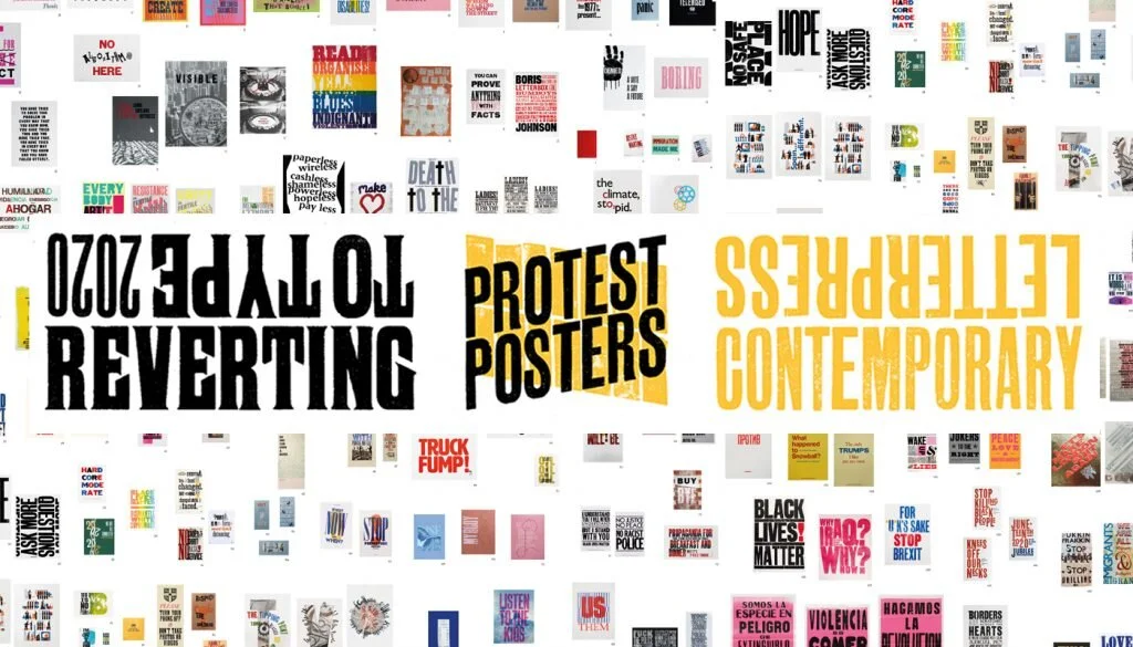
This winter, New North Press is holding an exhibition of letterpress artworks with something to say. Marking 10 years since the last Reverting to Type exhibition, 2020’s show will be of letterpress protest posters. As before, this will be an international exhibition showcasing progressive letterpress artwork from presses around the world, alongside the work of students and specially-invited collaborators. I’m proud to have two of my works selected for this exhibition and I wish I could attend the opening.

Exhibition launch
3 December 2020
Live-streamed broadcast on YouTube, Instagram and Facebook

Exhibition dates
4 December 2020 – 29 January 2021 (restrictions allowing)

Location
Standpoint Gallery
45 Coronet Street
London N1 6HD
UK

PP_ArminaGhazaryan_01.jpg
IMG_4172.JPG
IMG_4187.JPG
IMG_4194.JPG
PP_ArminaGhazaryan_01.jpg IMG_4172.JPG IMG_4187.JPG IMG_4194.JPG
PP_ArminaGhazaryan_02.jpg
IMG_4500.JPG
IMG_4511.JPG
IMG_4510.JPG
PP_ArminaGhazaryan_02.jpg IMG_4500.JPG IMG_4511.JPG IMG_4510.JPG
In event, printmaking, typography Tags letterpress, protestposters, exhibition, poster
Comment
from-futura_v2.jpg

From Futura to the Future. Leipzig.

July 31, 2020

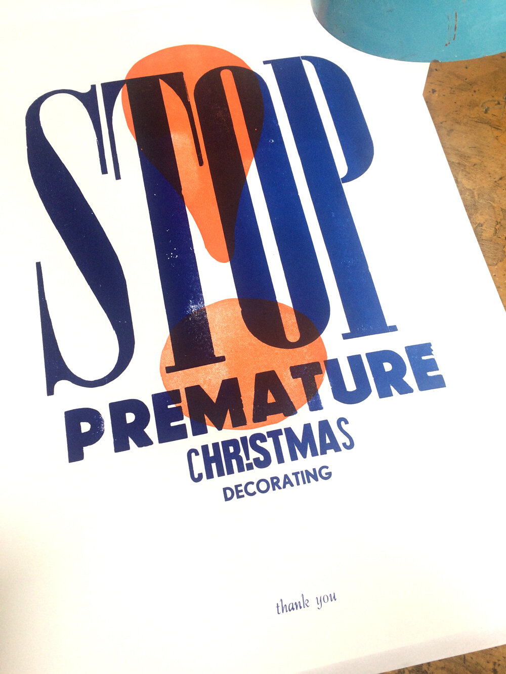
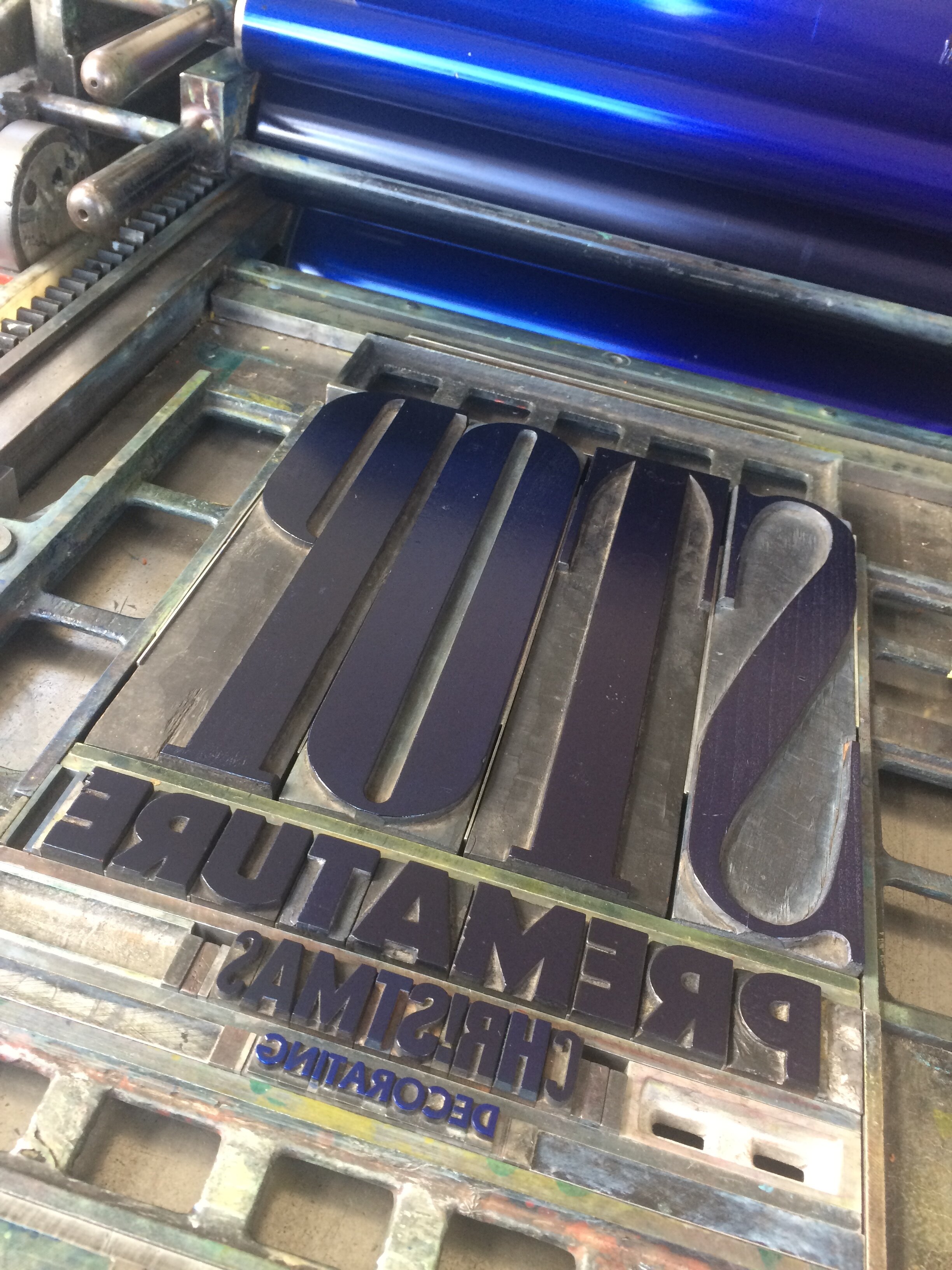
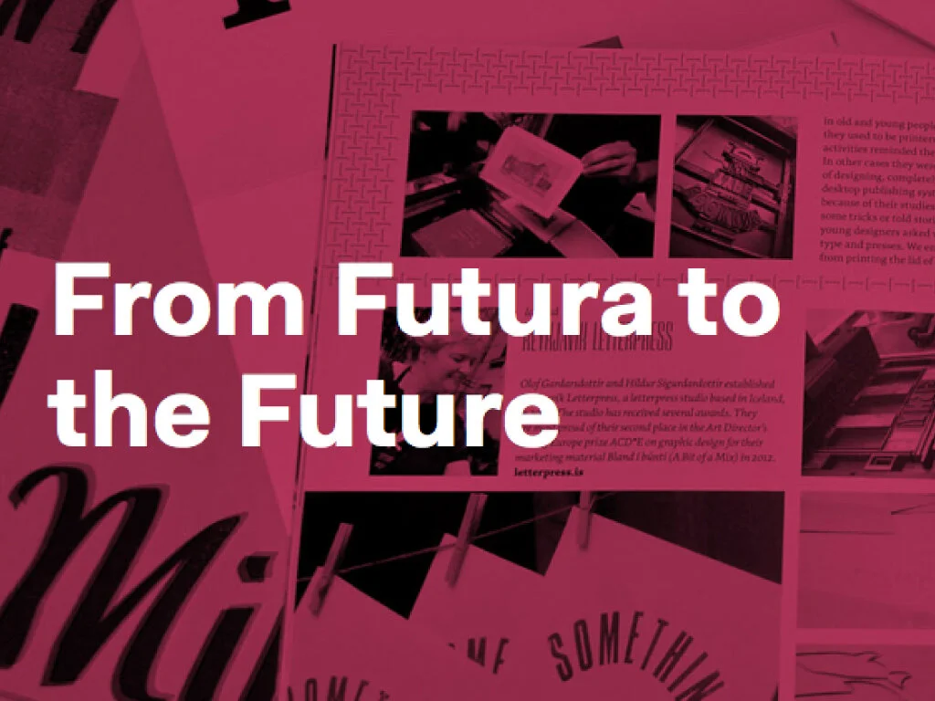
In the first week of October Letterpress Workers will be holding an event at the Museum of Printing in Leipzig called “From futura to the future: International Letterpress Workers”. There will be a live printing session as well as a curated exhibition of prints produced by Letterpress Workers over the years. Delighted to be part of it! These two posters are going to Leipzig (and hopefully I would be going there too ;) ) The exhibition will be open for public from 4.10.20 til 15.11.20.

Read More
In event, printmaking, typography Tags leipzig, lpw, exhibition, poster, typography
Comment
← Newer Posts Older Posts →
lijn_001.png
No results found
lijn_001.png
subscribe to Ink, type, and pressing news
lijn_001.png

Latest & Greatest

Featured
Type walk in Ghent. Before & after. Oudburg.
October 2, 2026
Type walk in Ghent. Before & after. Oudburg.
October 2, 2026

When walking through Oudburg in Ghent, which I do quite often, I have noticed a number of small changes over the years. Signs disappear. Façades are repainted. Businesses move on. New lettering takes their place.

None of these changes is particularly dramatic. But together they tell us something about how the visual identity of a street evolves.

Read more →
October 2, 2026
Type Walk in Ghent. Before & After. Looking up: the fading letters of Cockney's Distillery.
July 5, 2026
Type Walk in Ghent. Before & After. Looking up: the fading letters of Cockney's Distillery.
July 5, 2026

A couple of weeks ago, during the annual flea market on Lange Violettestraat, I found myself doing what I probably do too often: looking up.

While most people were browsing records, ceramics and old books, my attention drifted towards the façades. That's when I noticed it. Barely visible beneath layers of age and weather, a painted sign slowly emerged from the brickwork.

Read more →
July 5, 2026
quick links typography_V201.jpg
June 25, 2026
Type Walks in Paris and beyond
June 25, 2026
Read more →
June 25, 2026
quick links typography.jpg
June 6, 2026
Type Walks in Ghent and beyond.
June 6, 2026
Read more →
June 6, 2026
Type walk in Ghent. Before & after. 90 years of Dossche Sport.
May 24, 2026
Type walk in Ghent. Before & after. 90 years of Dossche Sport.
May 24, 2026

Dossche Sport is one of the symbols of Ghent’s rich cycling heritage — a business rooted in professional racing history, family tradition, and nearly a century of dedication to the bicycle culture of the city.

Read more →
May 24, 2026
Type walk in Ghent. Before & after. Marchandises & stories.
March 28, 2026
Type walk in Ghent. Before & after. Marchandises & stories.
March 28, 2026

Tucked away near Sint-Jacobsplein in Ghent once stood a place that many locals still remember with a certain nostalgia: Marchand’10. The name Marchand’10 (Marchandise) — French for “merchant” — suited the place perfectly. This was never just a shop, but a world of its own. It felt more like wandering into a densely packed cabinet of curiosities.

Read more →
March 28, 2026
Type walk in Ghent. Before & after. Only “Beerhouse” remains.
January 18, 2026
Type walk in Ghent. Before & after. Only “Beerhouse” remains.
January 18, 2026

Het Waterhuis aan de Bierkant is one of Ghent’s most recognizable cafés. With its large beer selection and sunny terrace along the water, it attracts locals and visitors from all over the world. But this is more than just a place to have a drink—it’s a building with a long and surprising history.

Read more →
January 18, 2026
Type walk in Ghent. Before & after or from lace to lunch: the changing story of Kraanlei 33.
January 6, 2026
Type walk in Ghent. Before & after or from lace to lunch: the changing story of Kraanlei 33.
January 6, 2026

It’s been quite a while since I started my Sunday type walks. What began as a simple stroll through the city—my only free day as a self-employed graphic designer—quickly became a way to move, clear my head, and indulge my long-standing fascination with typography in all its forms. Whenever I arrive in a new city, I instinctively take a type walk; the streets are full of hidden typographic gems, waiting to be discovered.

Read more →
January 6, 2026

Categories

  • lpw (3)
  • book (15)
  • video (33)
  • event (129)
  • typography (266)
  • quick links (272)
  • printmaking (451)

Achive

  • 2010 1
  • 2011 17
  • 2012 74
  • 2013 11
  • 2014 9
  • 2015 34
  • 2016 43
  • 2017 62
  • 2018 39
  • 2019 17
  • 2020 35
  • 2021 31
  • 2022 34
  • 2023 24
  • 2024 28
  • 2025 39
  • 2026 27
lijn_001.png
Letterpress Blogs
Blog RSS