Just got back from Letterpress Workers Summit in Milan, 4 days filled with the joy of meeting like-minded people, learning from printmakers from all over the world, visiting museums and being genuinely inspired by what I saw. Even though this year I arrived one day later, missed the first day of the event and the 'Type and Ink' PechaKucha night, I've enjoyed every bit of it. The theme of this LpW edition was 'Resist', so each day the printmakers (approx. 40) divided into groups of 3 or 4 were producing some irresistible pieces of printwork using wood type and proof presses provided by Novepunti.
On Friday morning while one part of printmakers was starting the printing session at Leoncavallo, the another part went to 'I'm not an early type' talk given by Claudio Madella (Novepunti, IT) & Myrna Keliher (Expedition Press, USA), hosted at the Frog Design Milan headquarters who provided the venue, tasty breakfast and coffee. As the first talk was starting at 9 o'clock, I got up early, squeezed myself into the tube and after changing about 3 tube lines arrived at Frog Design just on time. The first talk was given by Claudio Madella in Italian and told the story of Novepunti and the beginning and evolution of the Letterpress Workers - a unique event gathering various designers/artists/printmakers at one place once a year, creating an unforgettable atmosphere of camaraderie.
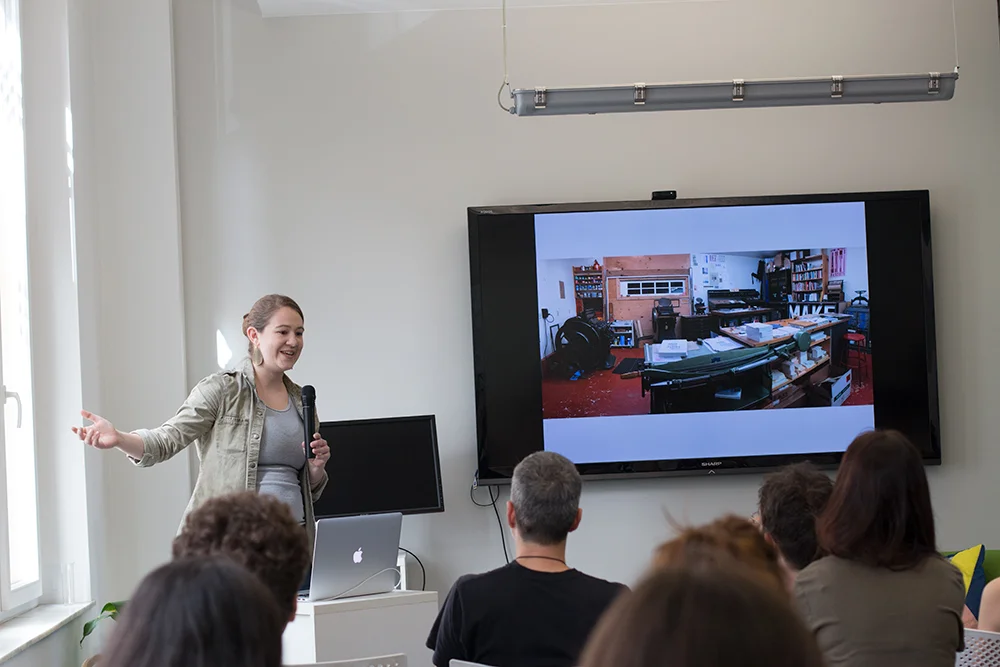
The second talk was in English and given by Myrna Keliher (Expedition Press, USA), a typographer, printer and publisher. Using handset type and antique presses Myrna publishes poetry books, broadsides, and visual art with a typographic focus. Her mission is to deepen regard for language and to increase access to poetry. Where in my opinion she succeeded very well.


After the talk, we all went back to Leoncavallo, some to join the printing sessions, some (as me:), to meet the old and new faces. In the afternoon John Christopher (Flowers and Fleurons, UK) gave a workshop called 'Little bit of Hope', where participants could print their own cards and assemble it into the elegant black boxes made by John especially for the occasion.
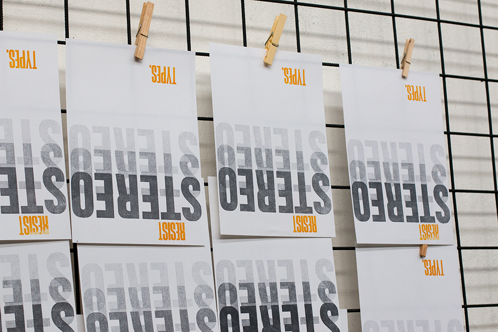
Meanwhile, the letterpress workers, inspired by the theme of this year - 'Resist' produced some incredible pieces of work using just wood/metal type, linocuts and tons of creativity.


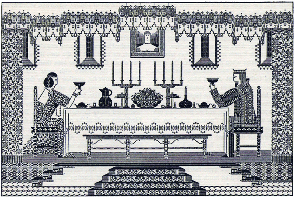
In the evening, after having a meal, Naomi Midgley (Inksquasher, UK) gave a presentation about the life and work of Albert Schiller (1898-1970), a talented and well-respected advertising typographer who worked as an art director for the Advertising Agencies Service Company, Inc. in New York City from the 1920s through the early 1960s and served as the secretary of the American Institute of Graphic Arts.
He was born in Russia, was brought to the United States at the age of 6 and left school at 17 to work in a neighbourhood print shop in Harlem. Schiller is best known for his type pictures which were made primarily from metal type and ornaments. Schiller also created several type pictures as tributes to people he admired such as Frederic W. Goudy and Bruce Rogers and a few impressive holiday (Christmas) type pictures. Currently, the Cary Graphic Arts Collection is lucky to be the caretaker of Schiller's personal archive.


The presentation aboutAlbert Schiller suddenly made me think of Solomon Telingater (1903-1969). Telingater? Well, that's the biggest name in Russian typography and lettering you (probably) never heard before. The works of prominent Soviet typographer and book artist (+600 books) are not (yet) widely known in the English-speaking world. Recently, the guys from Typejournal.ru produced an exquisite book dedicated to Solomon Telingater's typographic heritage - "Искусство шрифта. Соломон Телингатер", 2015/ "The art of typography. Solomon Telingater", 2015. Book covers and promotional materials created by Telingater in the '20s are a considerable part of the golden age of Russian avant-garde along with the works of El Lissitzky, Rodchenko, Varvara Stepanova, Gustav Klucis.
Book covers typeset by Solomon Telingater from typographic material, 1927.
Daniele Milani (IT)
On Saturday, before heading to Leoncavallo, I briefly visited the Italian Toys exhibition at Triennale di Milano and one of their latest exhibitions where I stumbled upon a few letterpress posters created by Daniele Milani (IT).
Around 15 o'clock I was back to Leoncavallo, where alongside to the printing sessions 2 other activities were taking place - a children's workshop by Maria Zaramella (IT), who is running printing and typography courses for children - ABiCiDi, and a beer coasters printing workshop given by Jens Jørgen Hansen (DK) titled 'Cheers! Nothing better than some beers, 2° edition'.


Then the Letterpress Workers book with all the works of participants (120 letterpress printed posters, based on the theme ‘hope’) was launched and in the evening, following the tradition, the type auction was held, giving a chance to printmakers and visitors to buy some treasures donated by the letterpress workers: books, quoins, metal type and so much more. This time, in absence of Thomas Gravemaker, John Christopher was assisted by Jens Jørgen Hansen, who did his work just great and it was a great fun!
On Saturday evening, the slightly tired but fulfilled workers finished their prints and gathered to have a final drink before heading back home. The Letterpress Workers is an amazing experience and I'm thankful to be part of it! Thank you Novepunti for putting it together! Ciao!
More pictures of the event.
You might also like
Letterpress Workers. Milan. 2016
LpW 2015
LpW 2014
LpW 2013
