

After attending Zomertyposium last year I was curious about this years' edition and as soon as the date had been announced quickly bought a ticket (as this event is usually sold out quite fast).
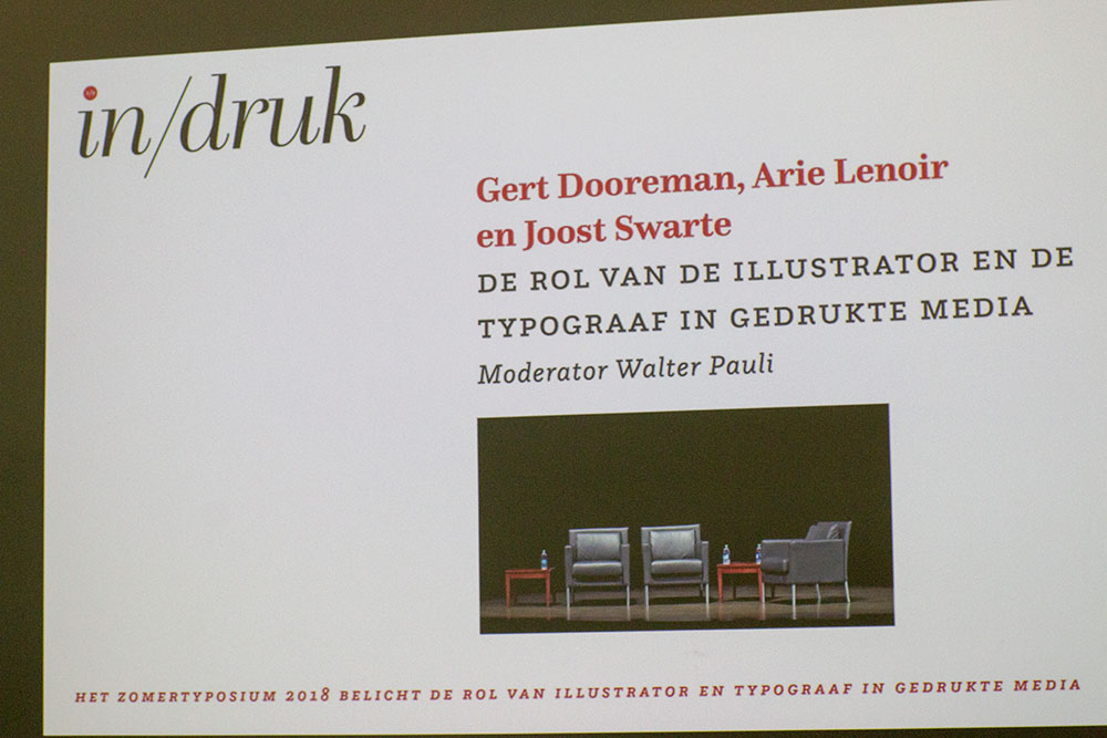
This year it focuses on the collaboration between the illustrator, the typographer and the printer and with printer Arie Lenoir, cartoonist Joost Swarte, typographer Gert Dooreman, journalist Walter Pauli and printmaker Vladimir Ivaneanu the line-up looked quite promising.


So, after a short train ride to Antwerp and a stroll through the sunny city centre I took St Anna's pedestrian tunnel which connects the city’s left and right banks. While opened in 1933 it remains pretty much intact, from the entrance buildings and the warning signs through the fences to the authentic wooden escalators which were unique at the opening.

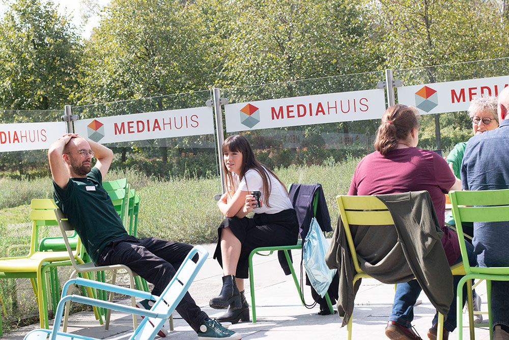
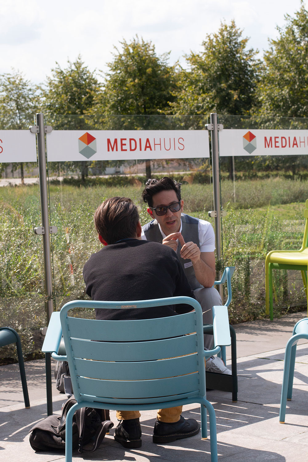
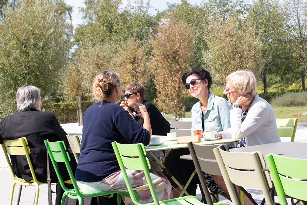
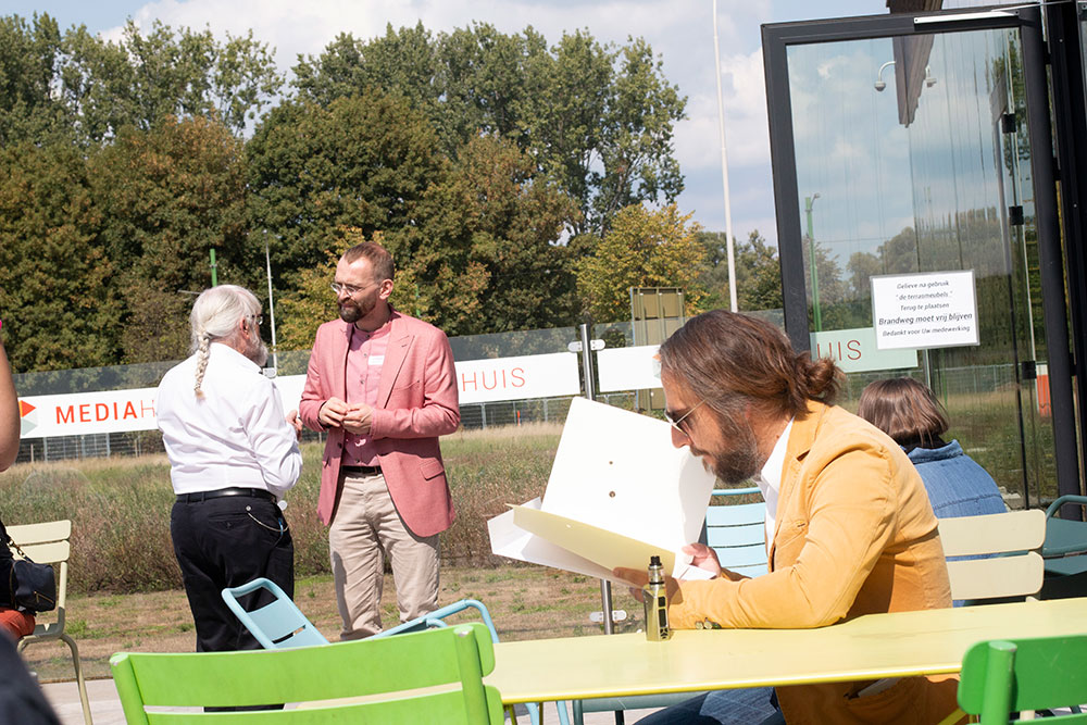
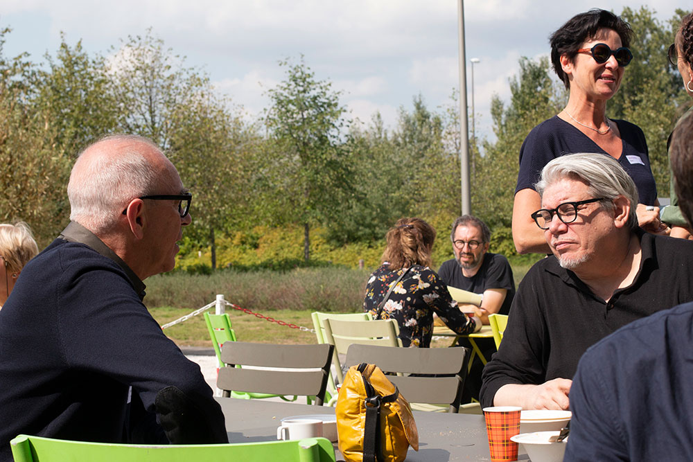
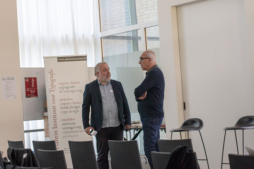
Upon arrival in Mediahuis and after being greeted by the friendly crew and chatting with friends I took my place in the already packed conference room.
The first speaker, publisher/printer Arie Lenoir told the story of the 'Lenoischuring, studio and printing office for designers' based in Amsterdam (NL). Lenoirschuring is a renowned studio and printing office for quality print work and therefore a favourite printer of many designers in the Netherlands. With ten people the print shop is specialised in print work that needs attention and dedication.
Initially being educated as economist/finance advisor Arie is fascinated by the paper and tries to stimulate the passion for the graphic design industry and show the unexpected beauty conjured by the interaction between text, image, material and colour. 'Paper is a feast for your senses. We live in a world where our drive to explore and develop the virtual, digital and abstract coexist with a craving for the authentic, real, handmade and genuine. And paper is authentic. Paper is genuine. It’s a physical product that you can experience with all senses.' At Lenoirschuring designers are always closely involved in the production process.
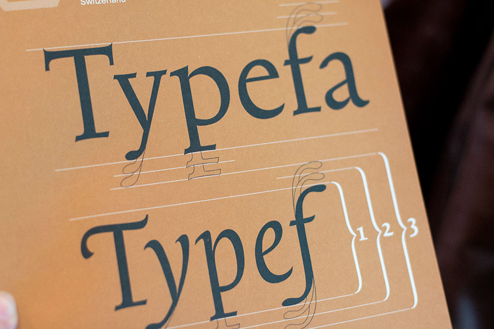
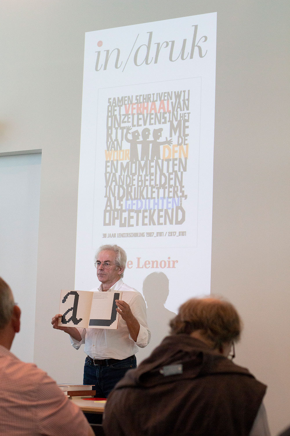
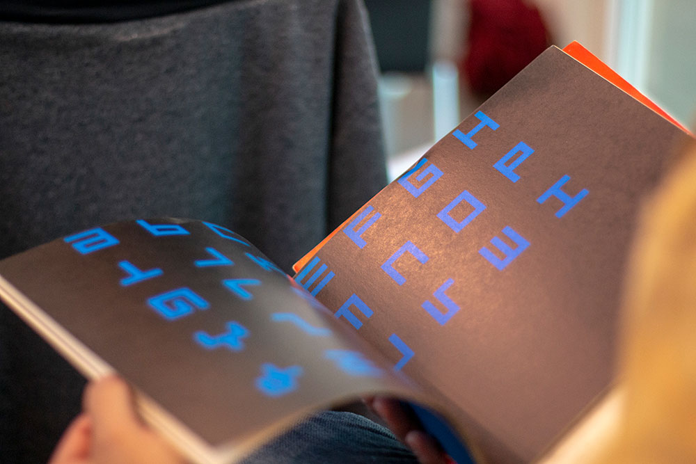
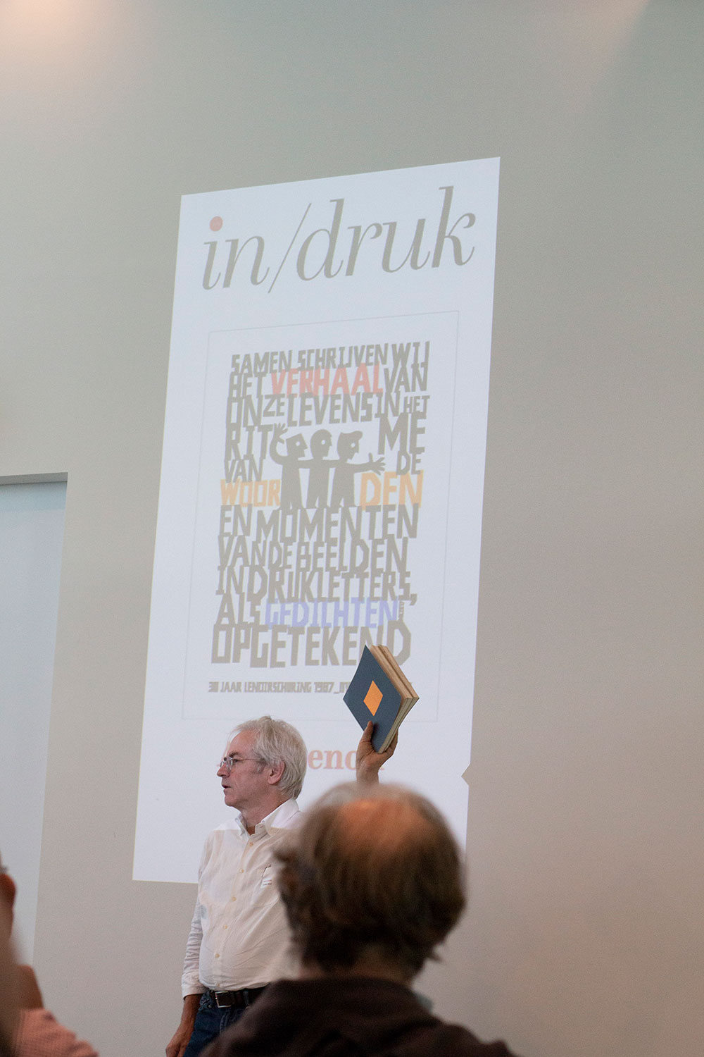
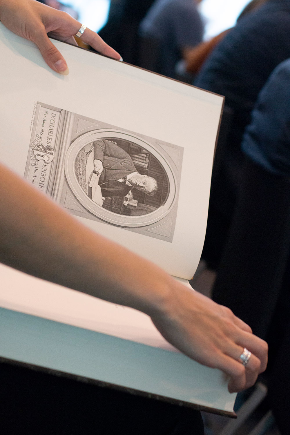
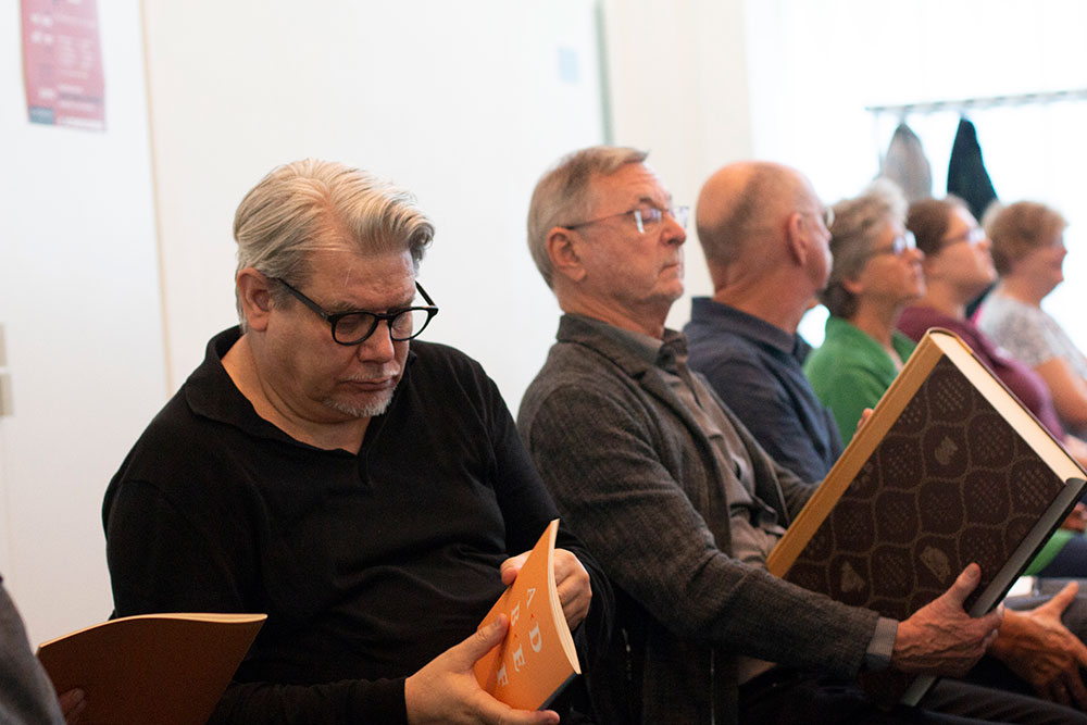
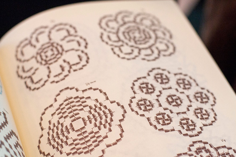
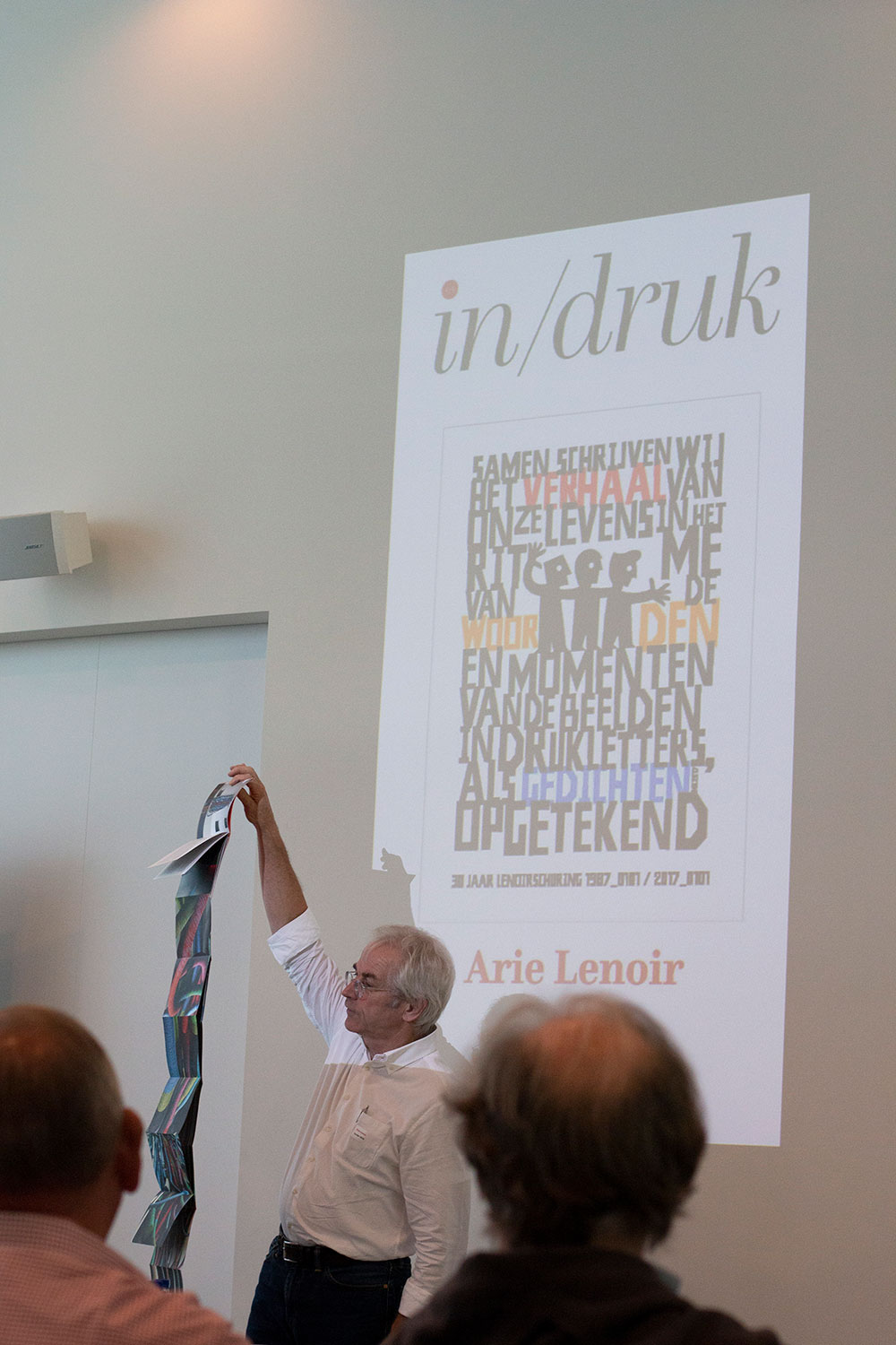
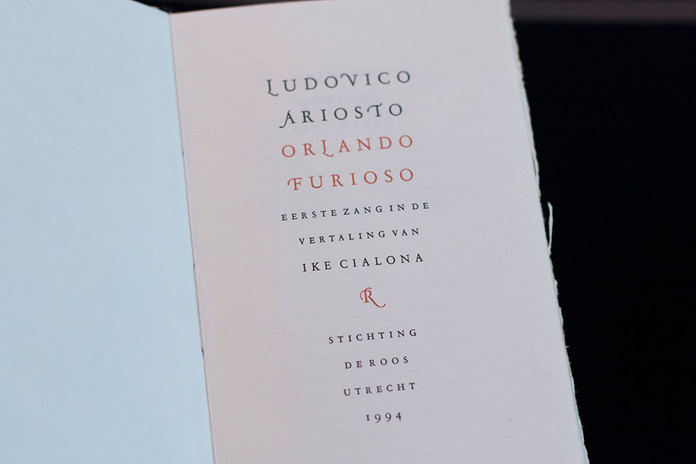
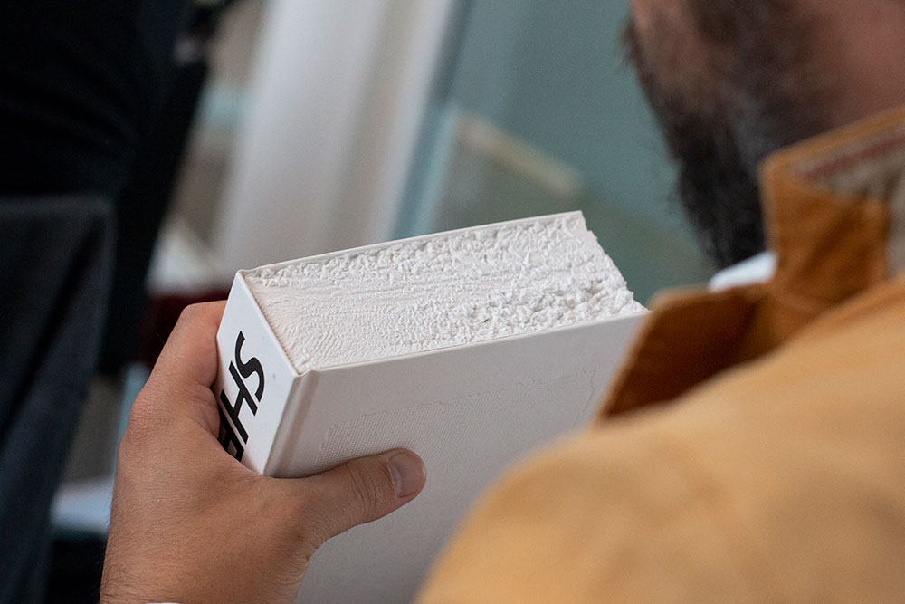
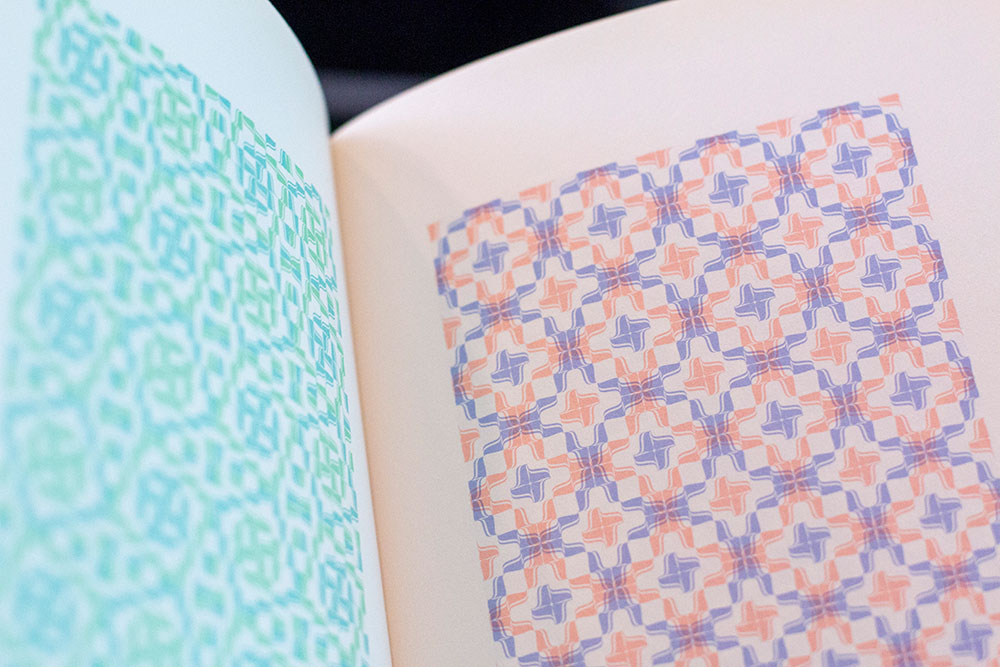
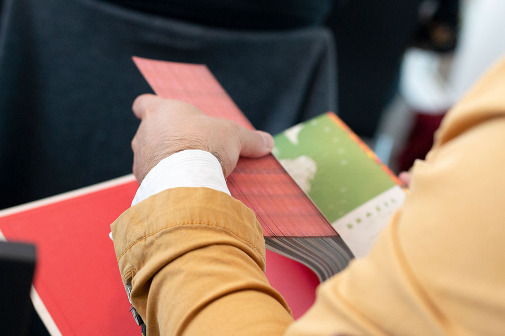
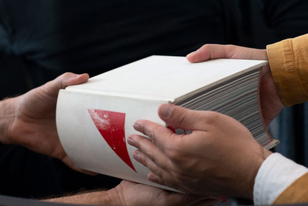
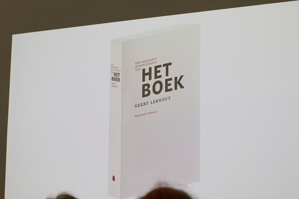
During his presentation Arie didn't show any slides. Actually, he did something much better…he brought a selection books with him and handed out to the audience so we could actually see, touch and smell these beautiful books. Books by Irma Boom, Wim Crouwel, Bram De Does etc.
'For me, a book is more than the sum of its content (text and image) and its form (concept, paper, printing, binding)’, said Lenoir. ‘A good book is the result of the fascinations of the authors, who have often spent years of hard work gathering their knowledge to put it in the content of the publication. These long years of work will then be combined with the know-how of specialists, all passionate: designers, writers, photographers, printers, bookbinders.'
'Mooie dingen maak je samen' (beautiful things you make together), said Arie. I couldn’t agree more!
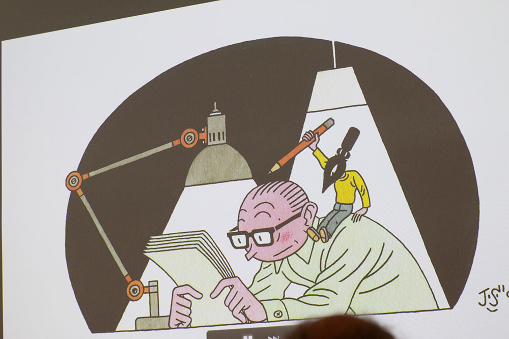
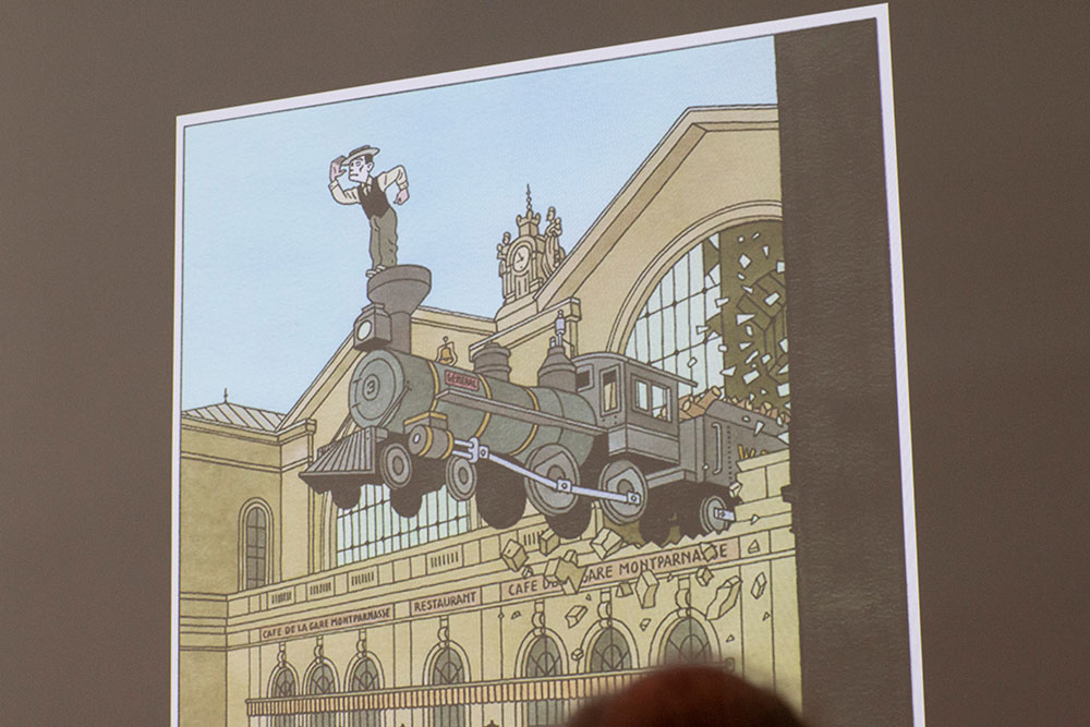
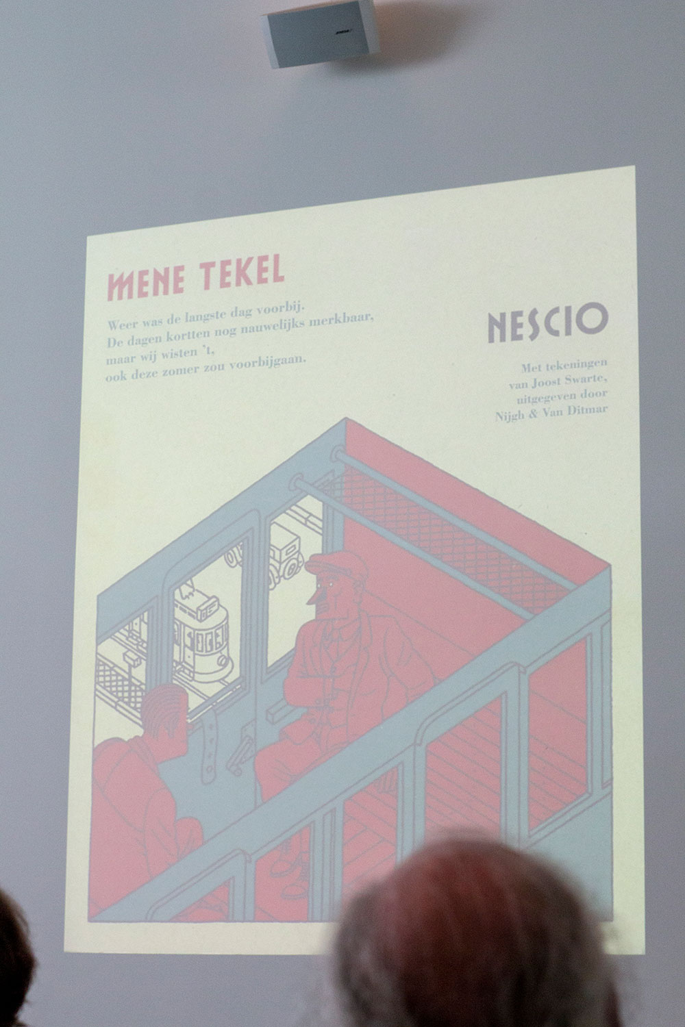
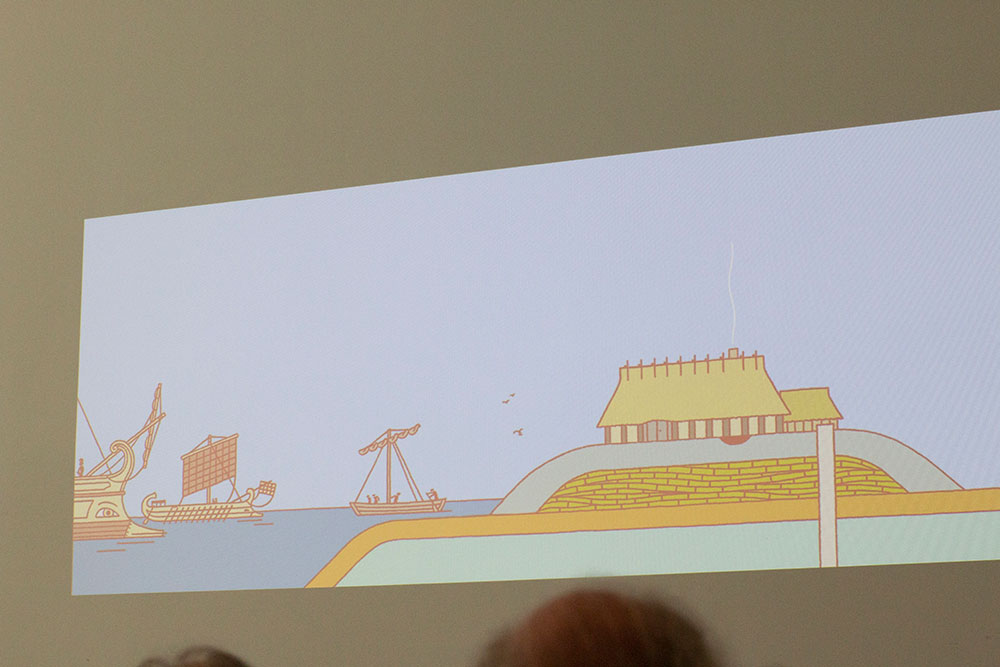
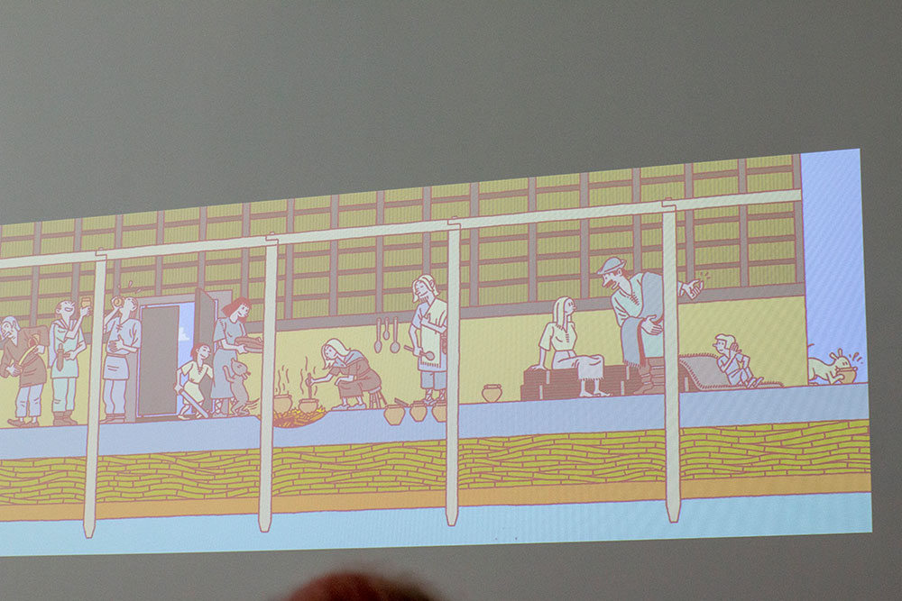
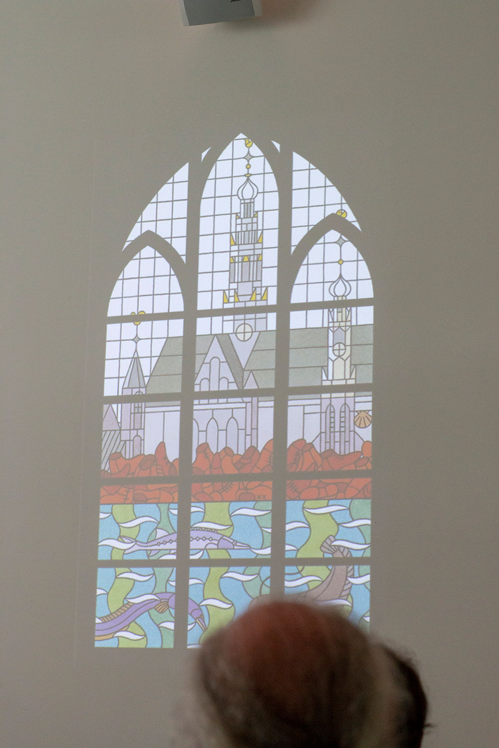
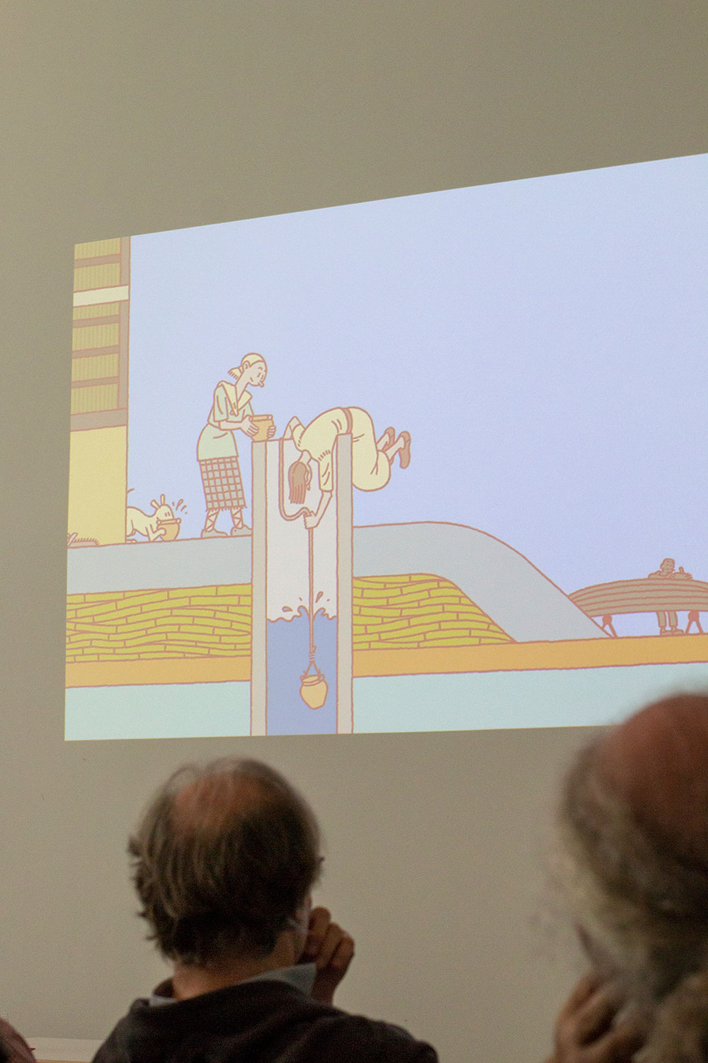
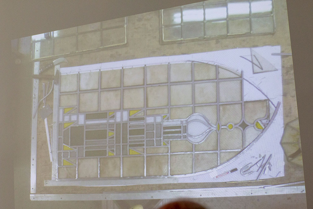
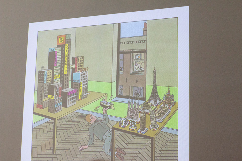
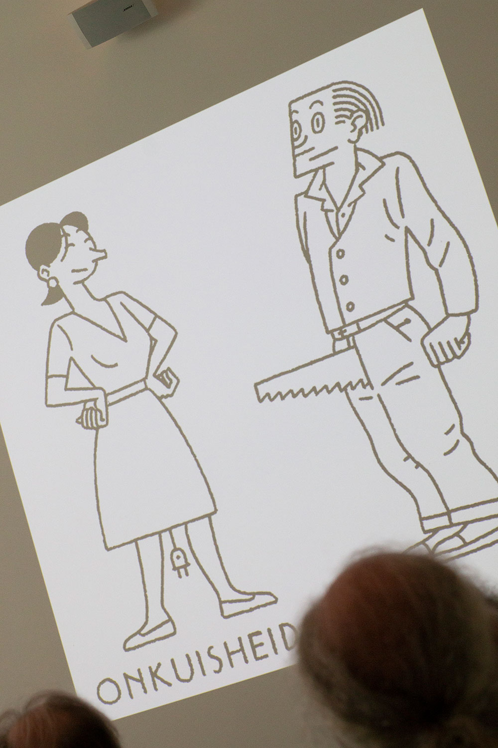
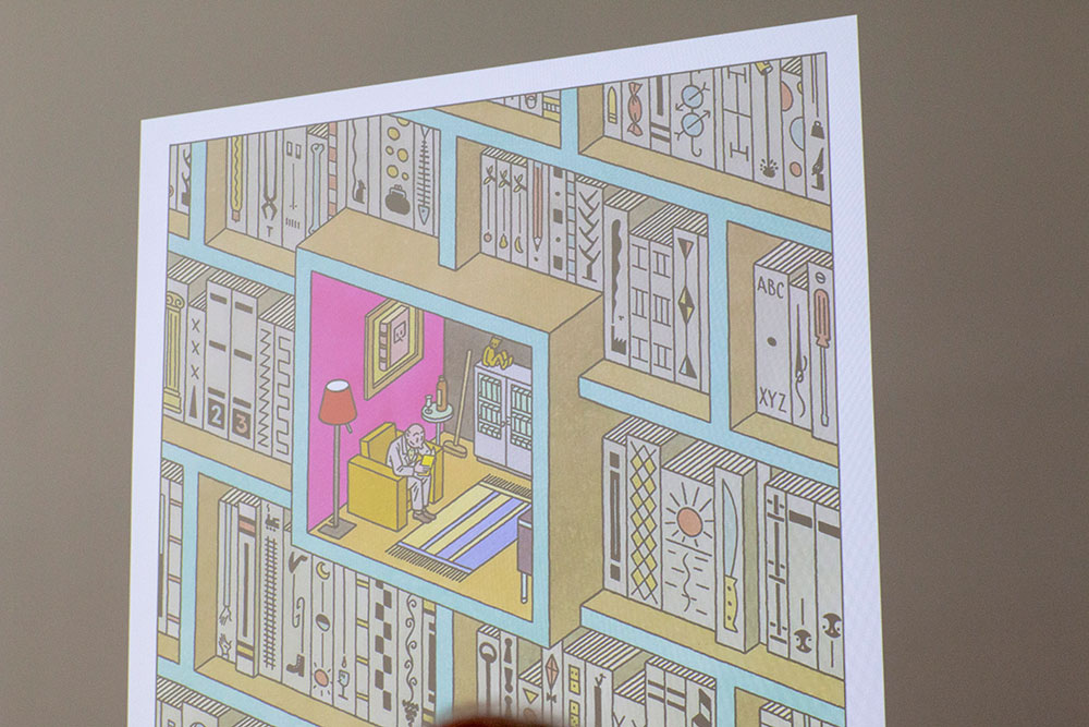
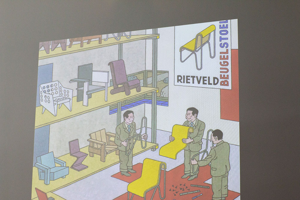
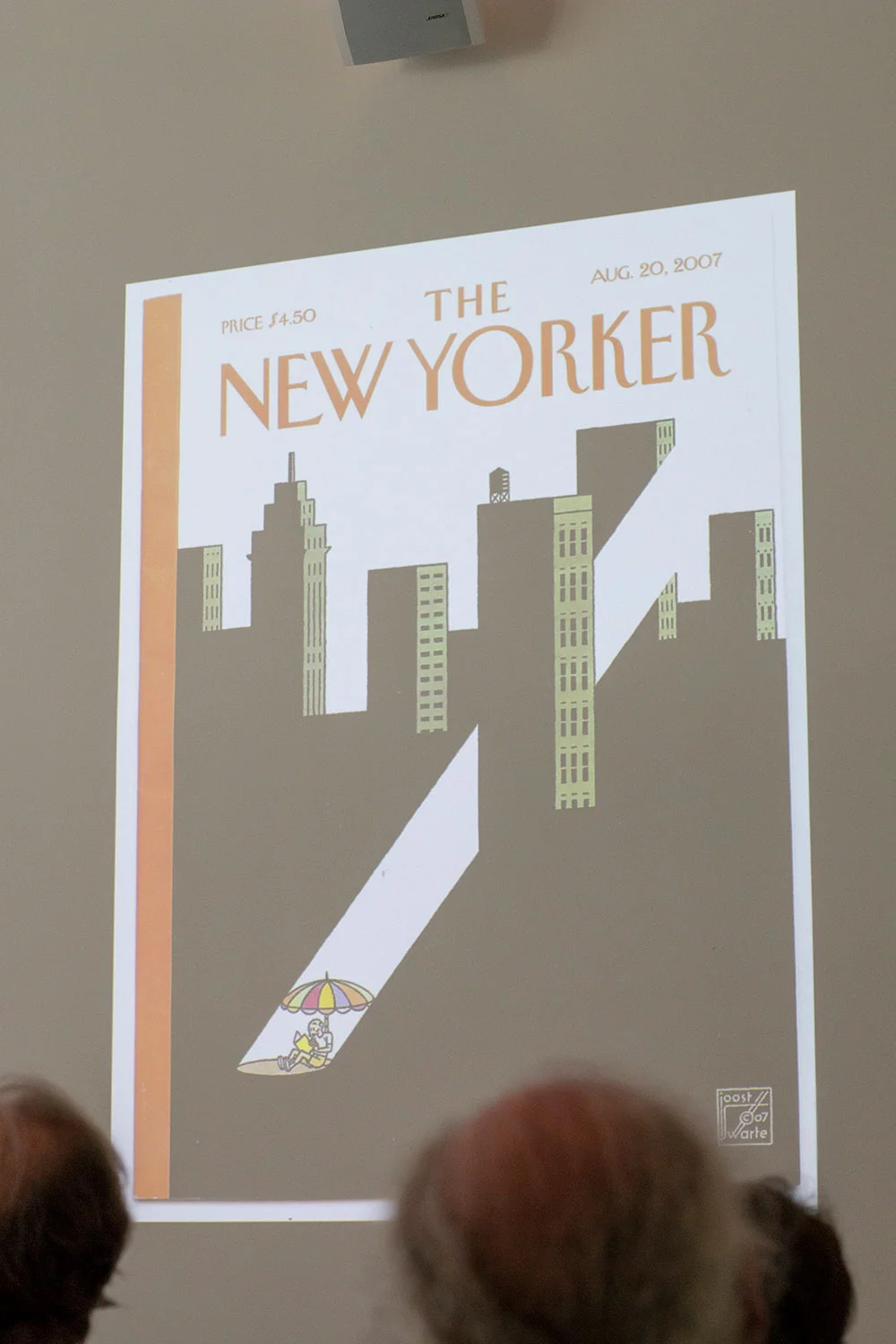
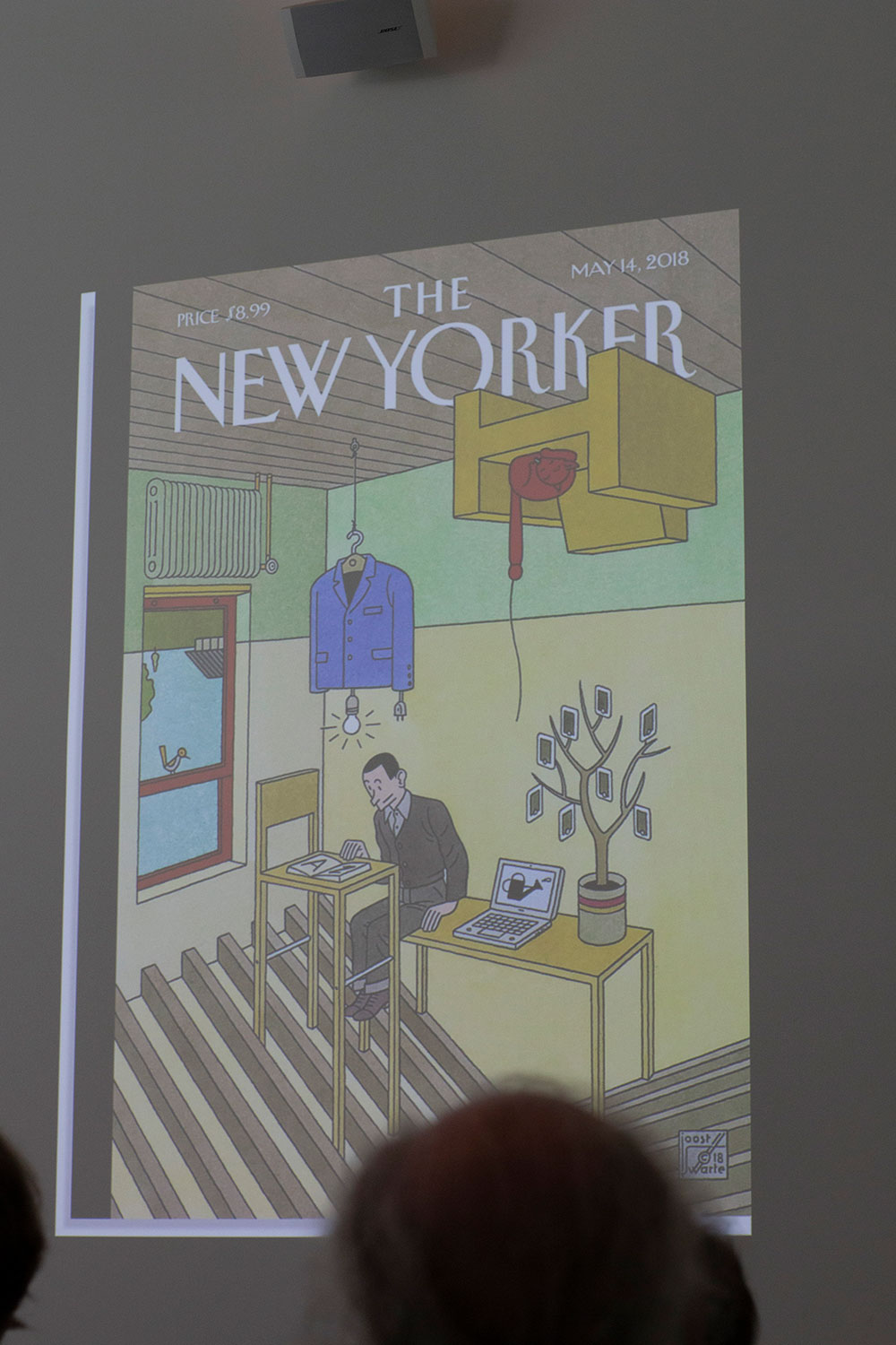
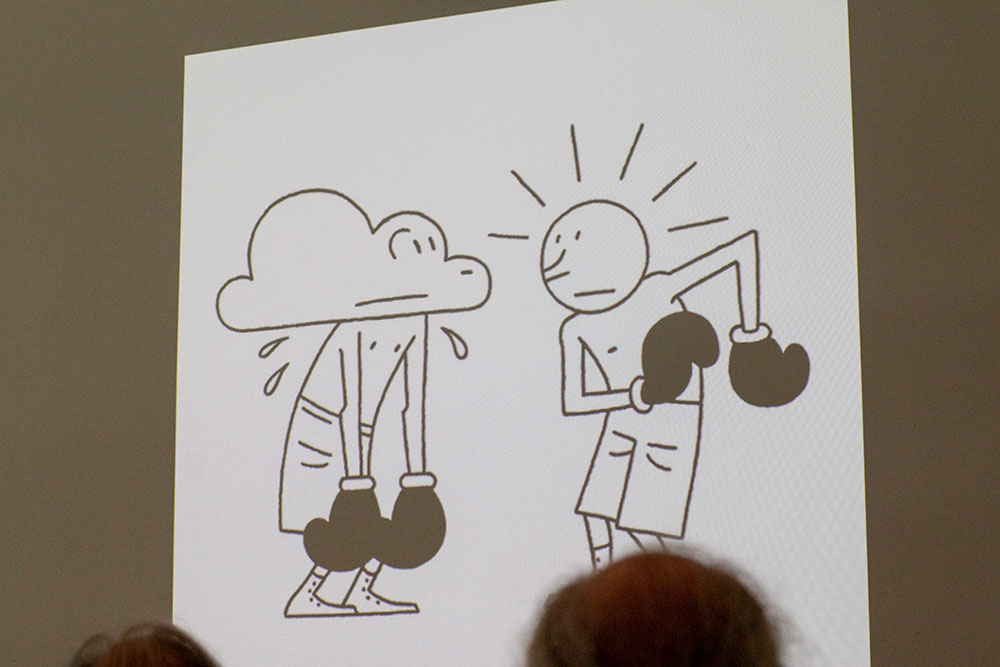
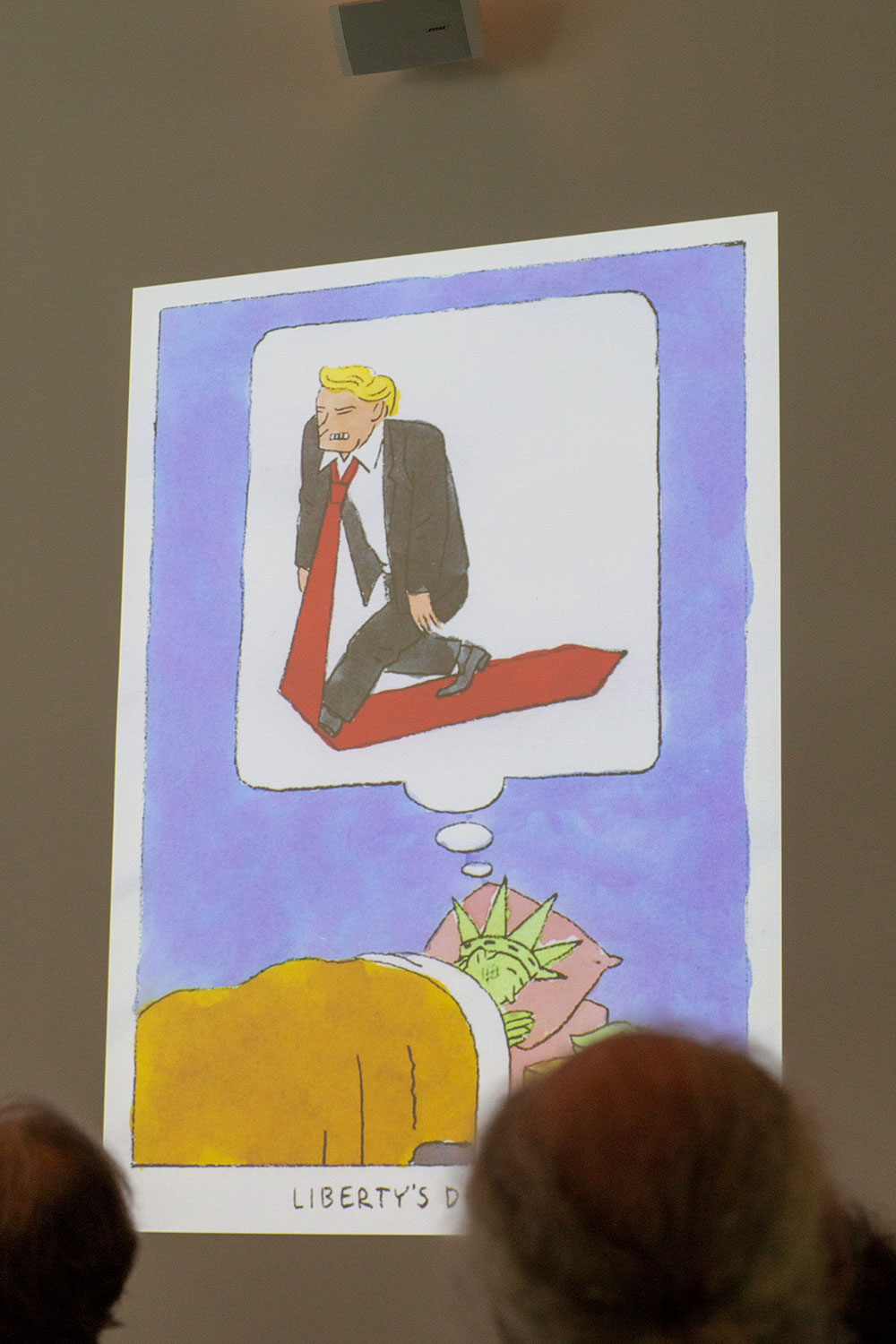
The second speaker was the Dutch cartoonist, industrial designer and architect Joost Swarte best known for 'clear line' style and his work for Dutch magazine 'Vrij Nederland', the Belgian 'HUMO' and the American 'The New Yorker'. While initially studied industrial design he started to draw comics in the late sixties. His work is very balanced, often satirical, elegant, beautifully drawn short stories. "Every element must be able to stand on its own", explained Joost. He sees himself as a narrator, he can tell the story just on one page, which is quite important when designing a cover. He still prefers to work with pen and paper, making the drawings from various angles, letting the client choose the best option and reads through the whole article to pint point the key words before starting the job.
Besides being active as an cartoonist Joost is also designes furniture, stained glass windows, murals and for his hometown Haarlem he designed a theatre building (De Toneelschuur) that was built in cooperation with Mecanoo (NL).
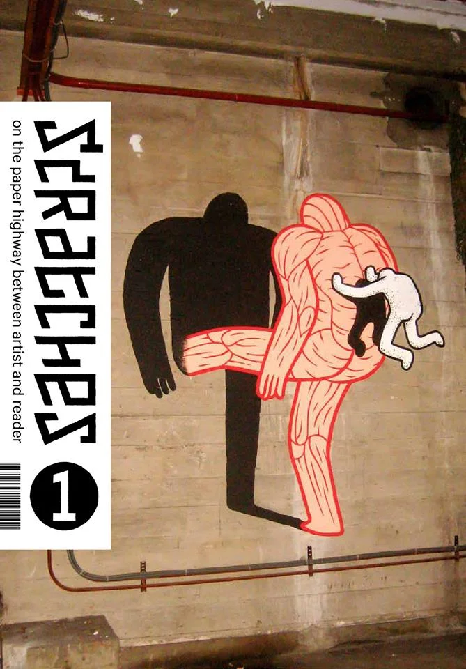
In the end, he showed his recent side project - Scratches, a magazine for and about cartoonists.

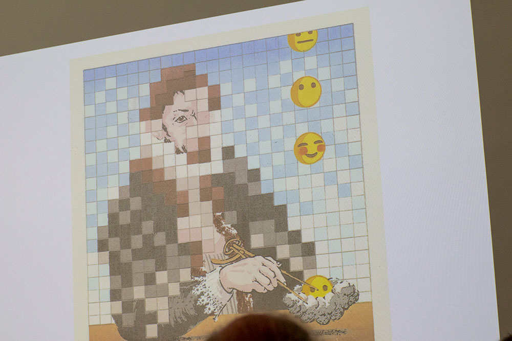
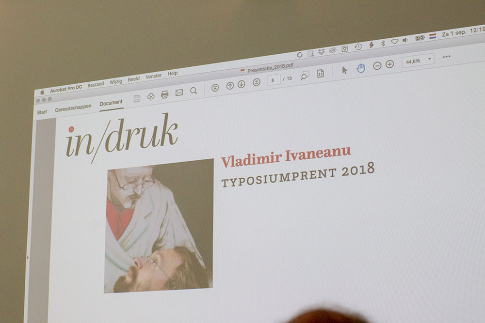
Each year, according to well-established tradition, an artist is asked to produced a limited edition print to be sold at the event. This year it was Vladimir Ivaneanu, a printmaker and teacher based in Ghent. Specialised in Western, Japanese woodcut he produced an exceptional print with no more then 16(!) print runs.
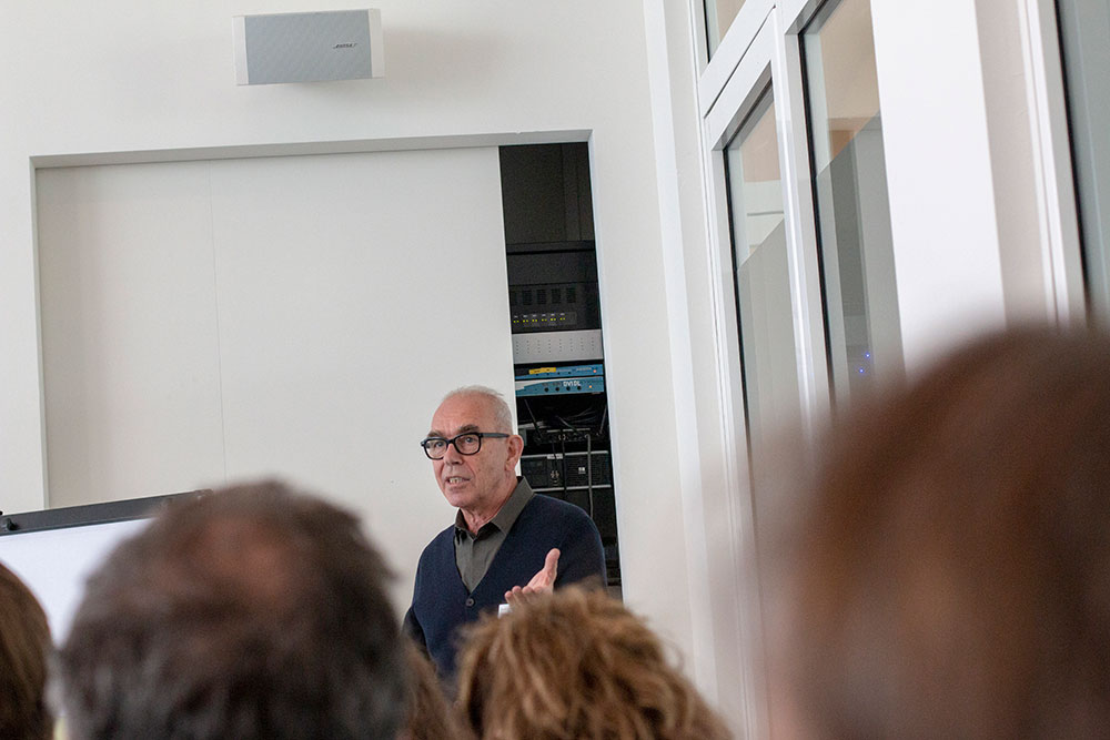
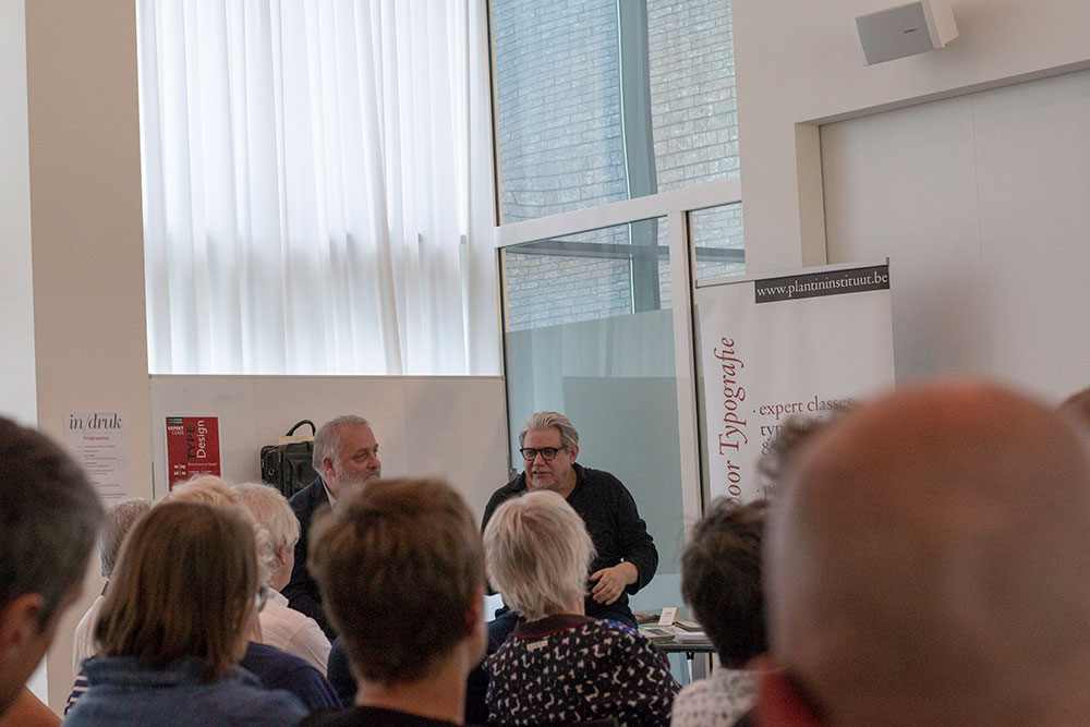
The last but not least in line was Gert Dooreman, one of is one of the most significant graphic designers in Belgium famous for his typographic book covers. For his presentation he teamed up with Walter Pauli, a journalist of De Morgen & Knack) and it took the form of an interview.
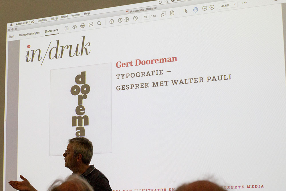
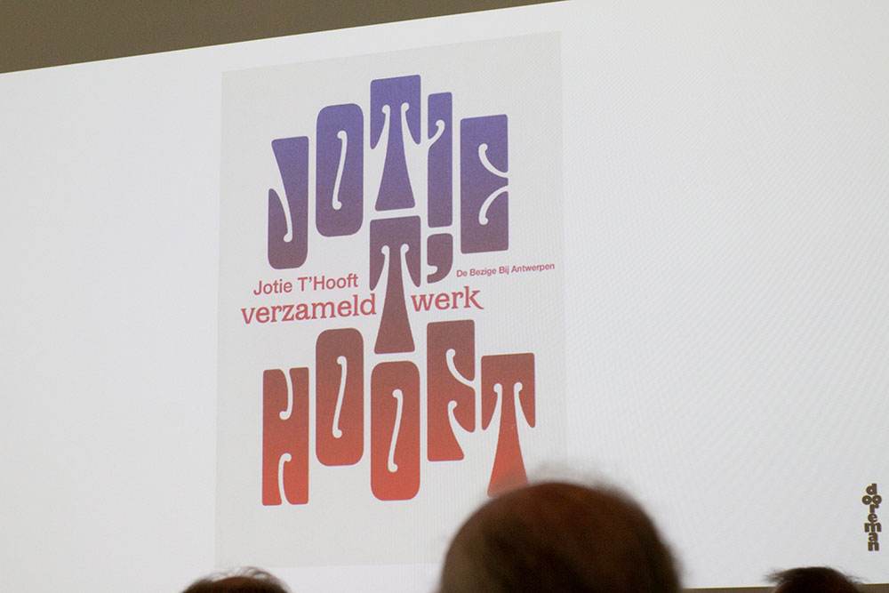
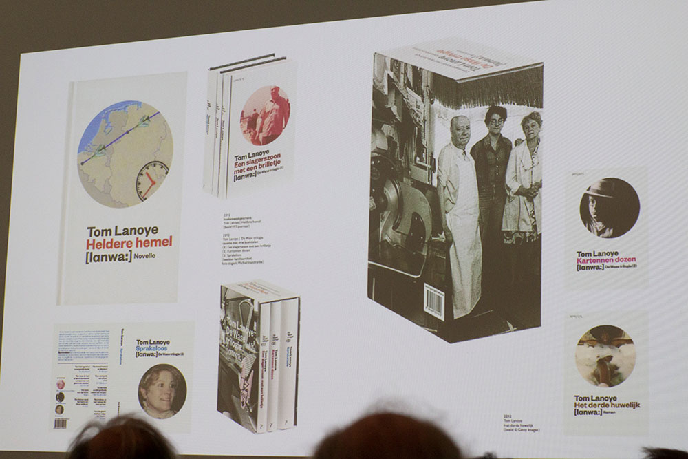
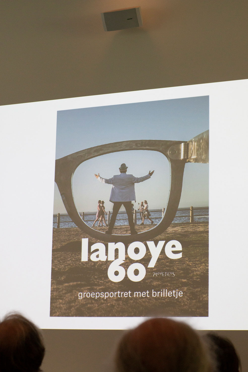
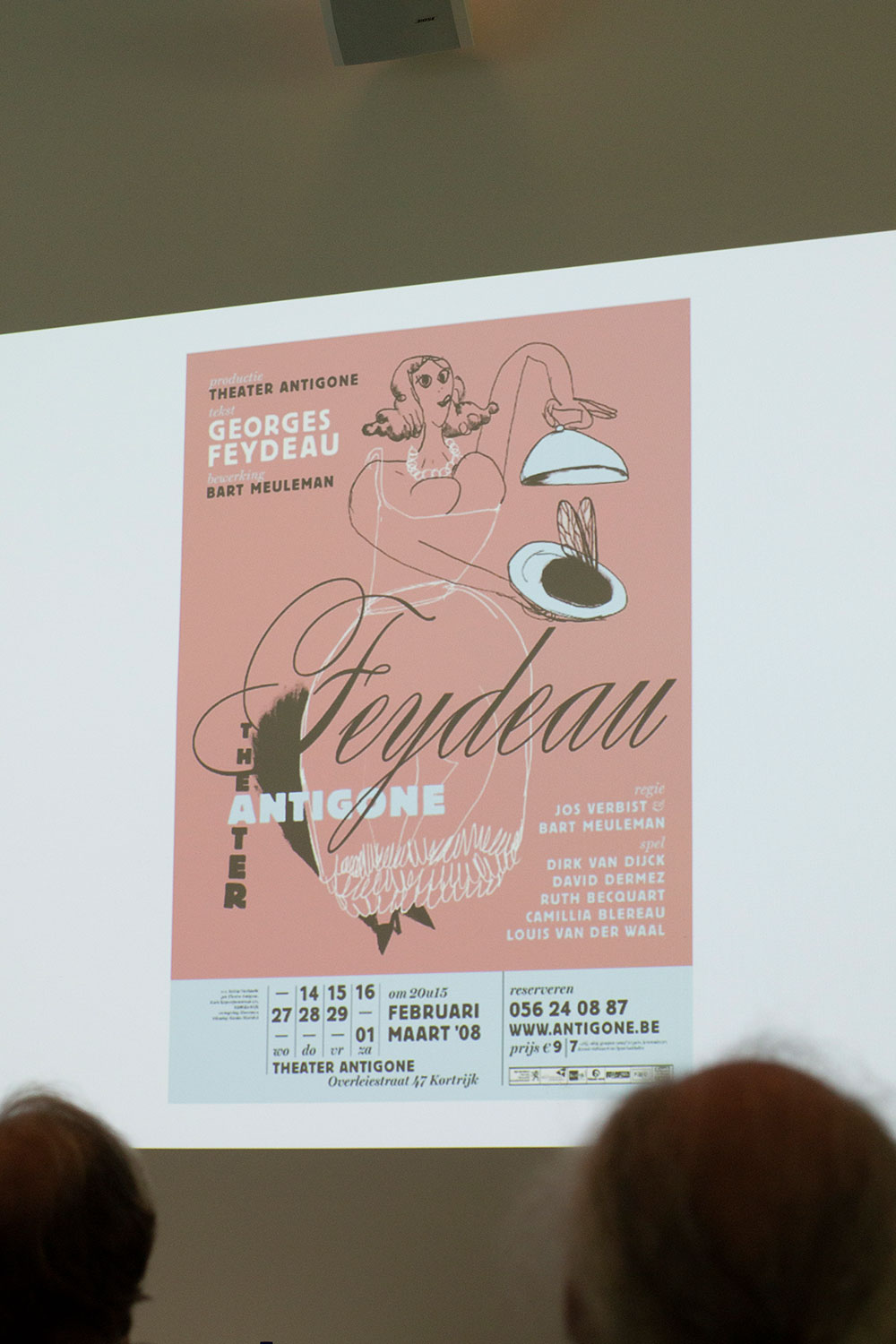
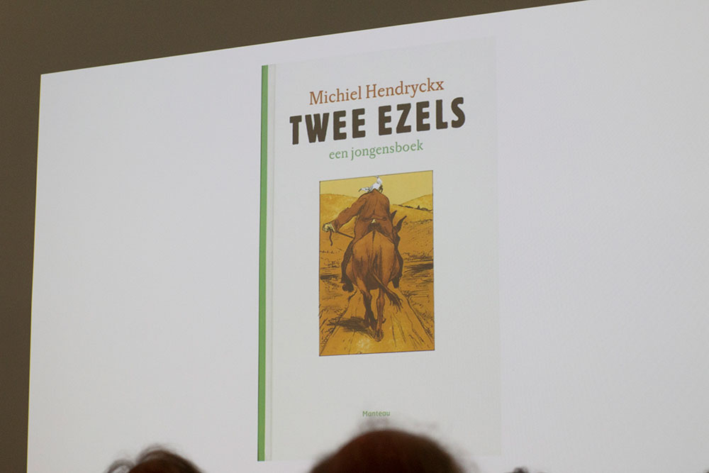
The design of Dooreman is recognizable. Simplicity and strength are just a few of the characteristics of his designs. Gert, initially trained as an illustrator and while working for HUMO, De Standaard as an illustrator for a number of years, was always fascinated by the letterforms. While calling himself an autodidact, Dooreman can, like no other, choose the right font for the publication. "It depends on the subject, image and the target audience," he says, "So this is my starting point. The design, the construction will develop from there. I am colour-blind', revealed Gert, 'that's why I have to rely on the construction. It has to work in black and white, the colour is only added later.' Dooreman is responsible for the book cover design for Belgian writer Tom Lanoye whom he is working with closely for the past decade. He had also stressed out the importance of working closely with photographers and publishing houses in order to deliver quality.
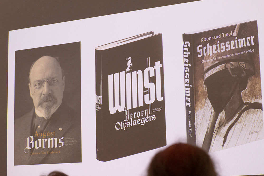
However he had told a few funny story about choosing the right font for the book cover and being actually able to sell the book. As it happend with ‘Scheisseimer. Getekende herinneringen aan een oorlog’ book, where the cover had to be redesigned and the typography had to be adjusted in order to make it look less dramatic.
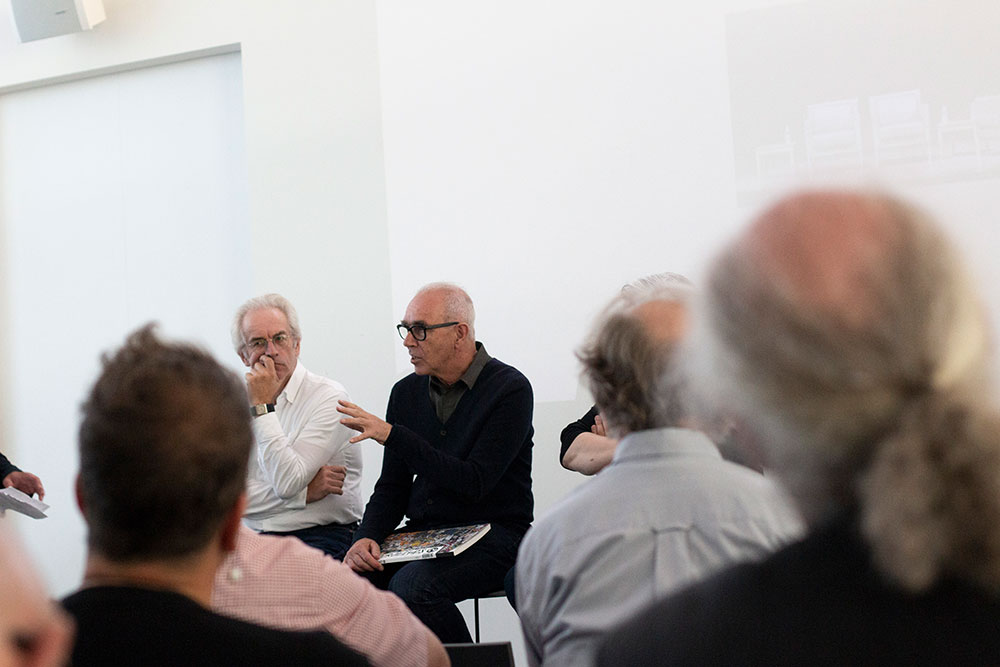
In conclusion, there was a panel discussion with Arie Lenoir, Joost Swarte and Gert Dooreman, moderated by Walter Pauli, about the role of each specialist in the printed media. About working together, but also looking ahead. Having respect towards each other and trusting the professionals. 'At The New Yorker they have respect for cartoonists', shared his experience Joost, 'They are treated as authors who help determine the content.' That's the way it should be.’ 'Mooie dingen maak je samen' (beautiful things you make together), rounded up Arie.
more pictures of Zomertyposium
you might also like
Zomertyposium 2017