While visiting the annual AEPM conference in Madrid I had made some time free to visit Familia Plómez which I knew a lot about but never got a chance to visit.
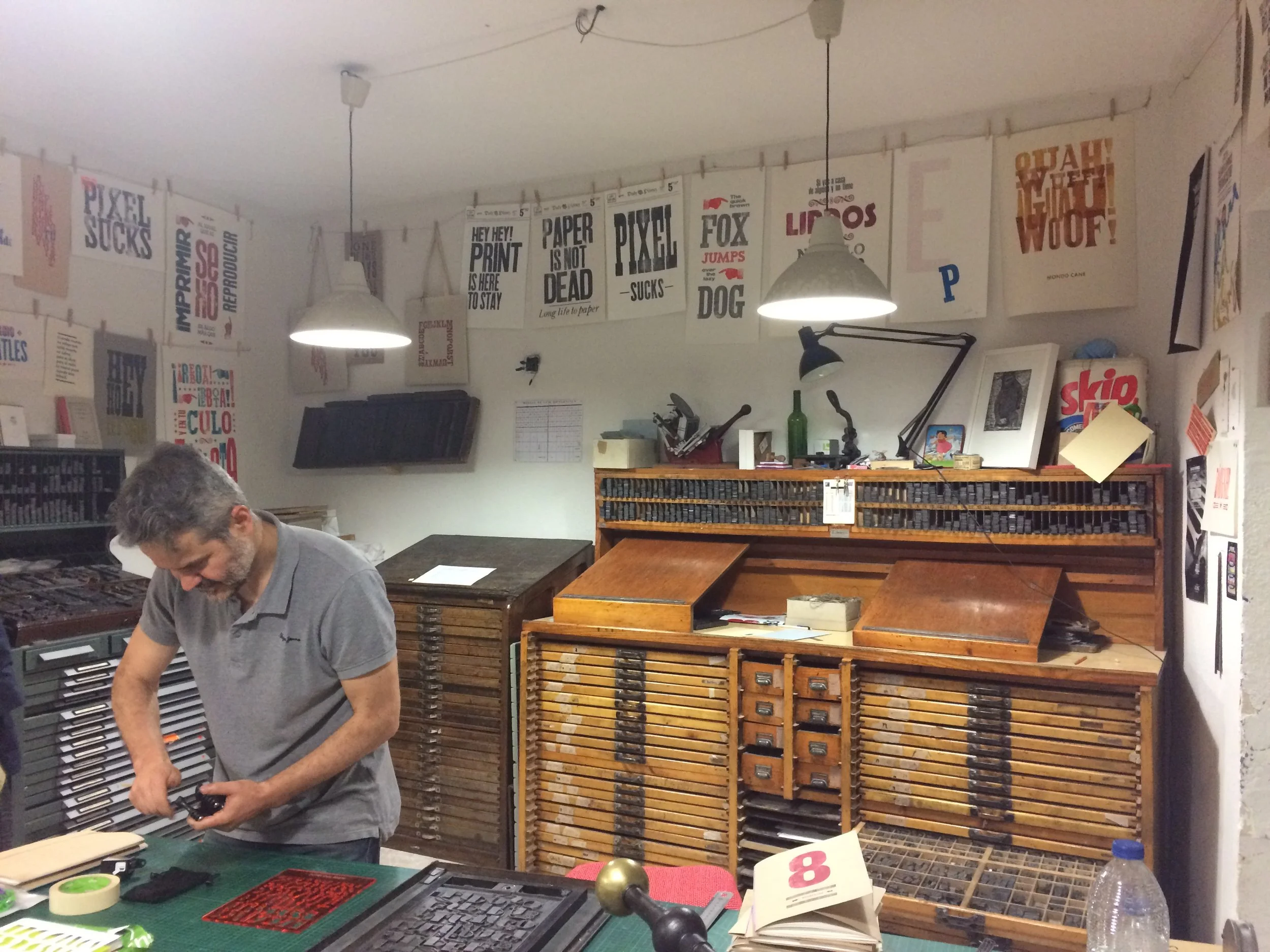
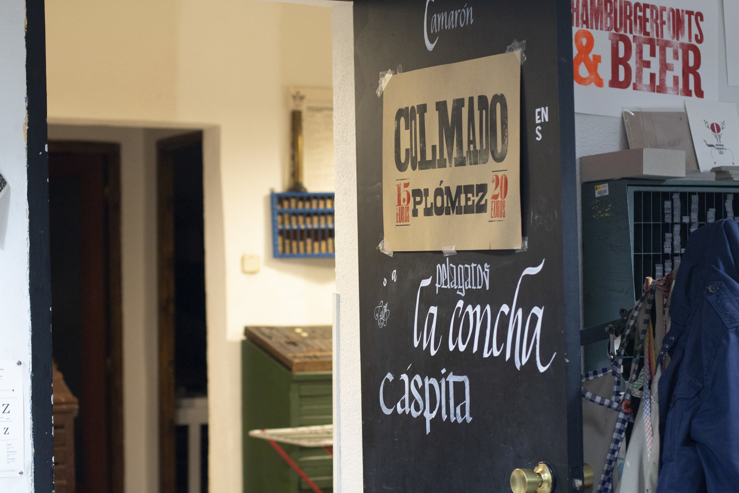
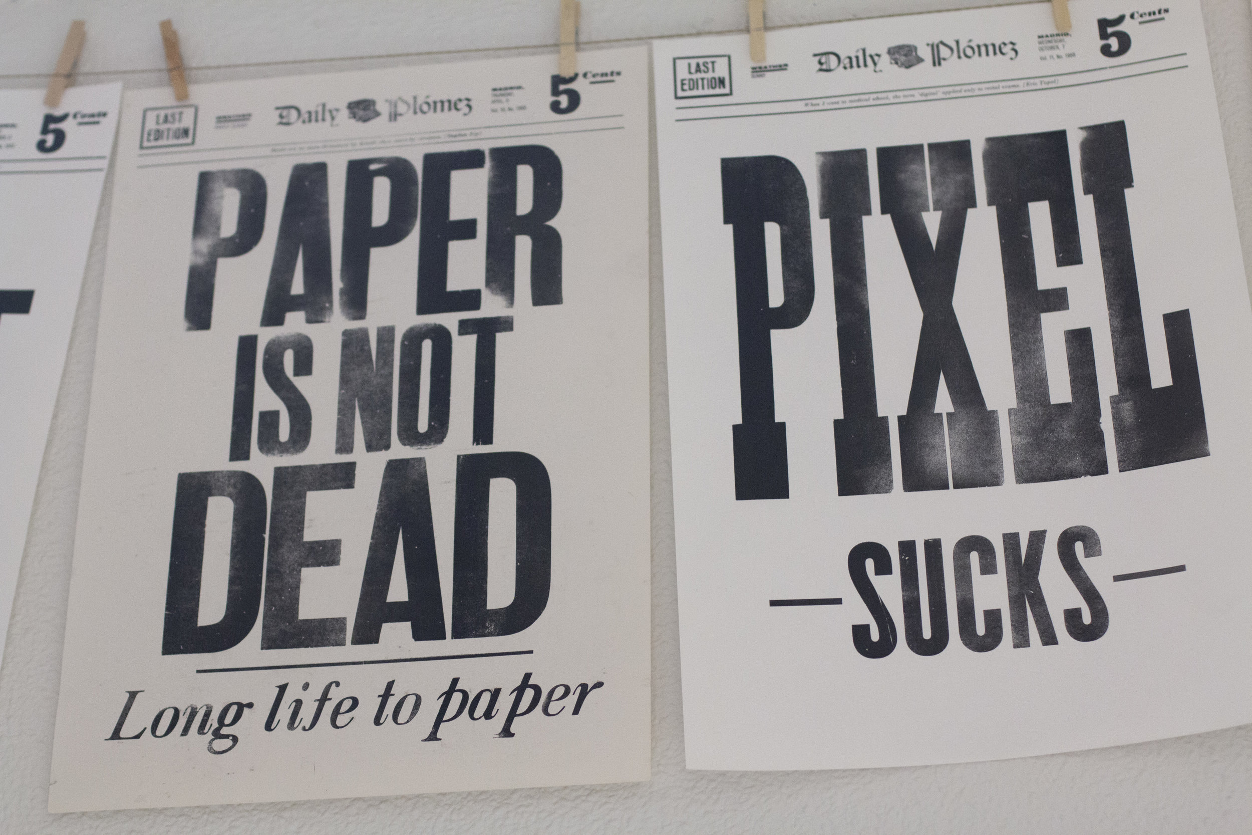
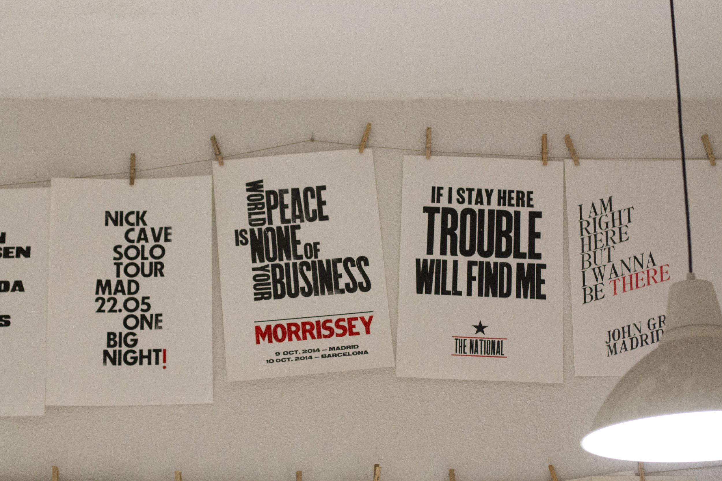
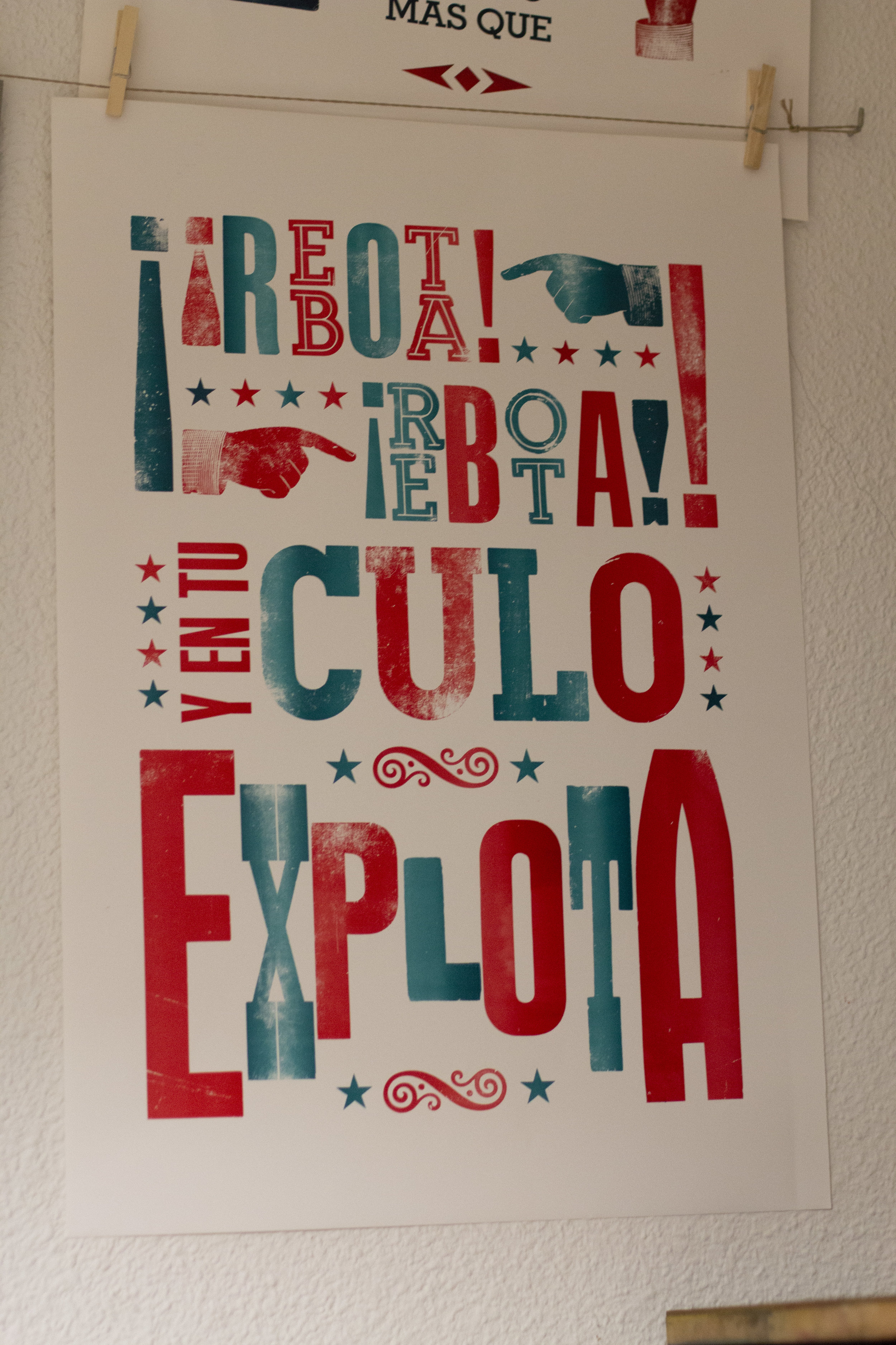
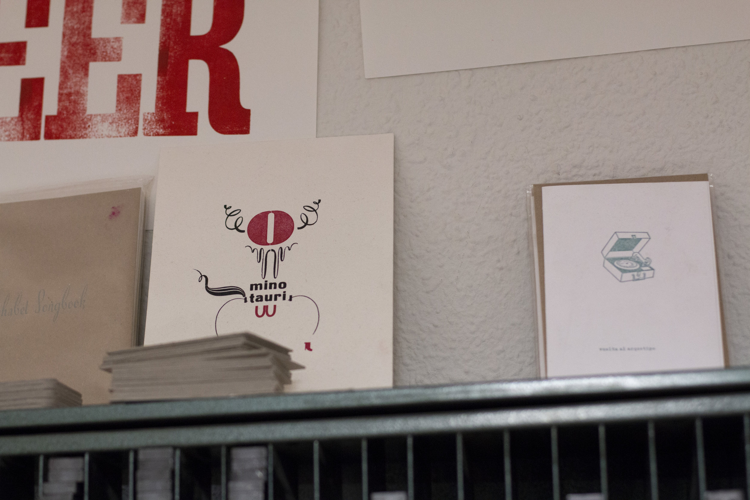
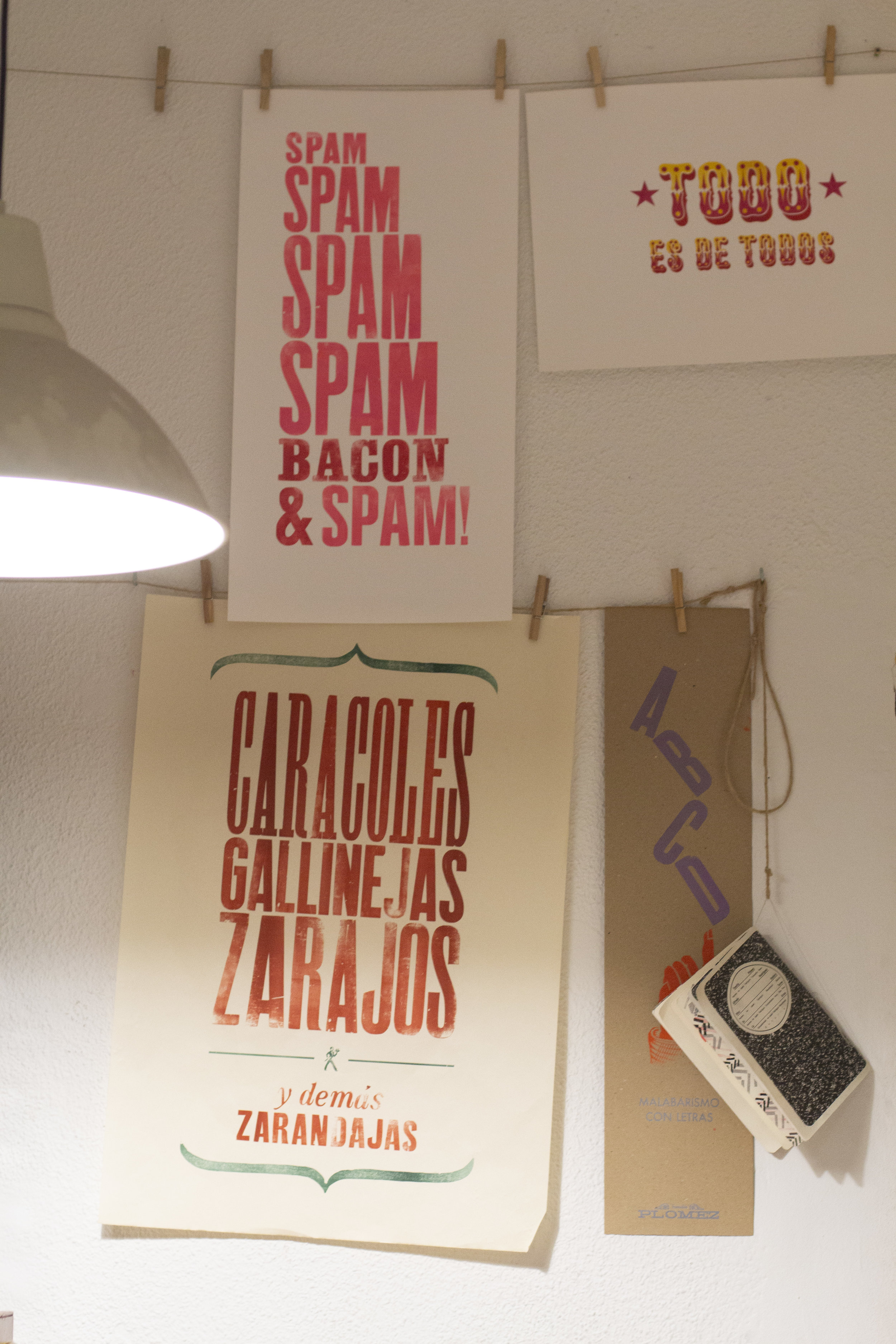
So I gladly accepted the invitation of Roberto Gamonal Arroyo to visit Familia Plómez, a cultural association whose objective is to preserve the printing presses and letterpress printing techniques. Familia Plómez is not a one-man show, it is a collective of more than 10 designers/printmakers who’s goal is to teach and foster the knowledge of typesetting, typography and whatever is related with the letter, printed, written or drawn. The collective of Familia Plómez primarily produces posters because it’s the most expressive form to show the visual power of typography.
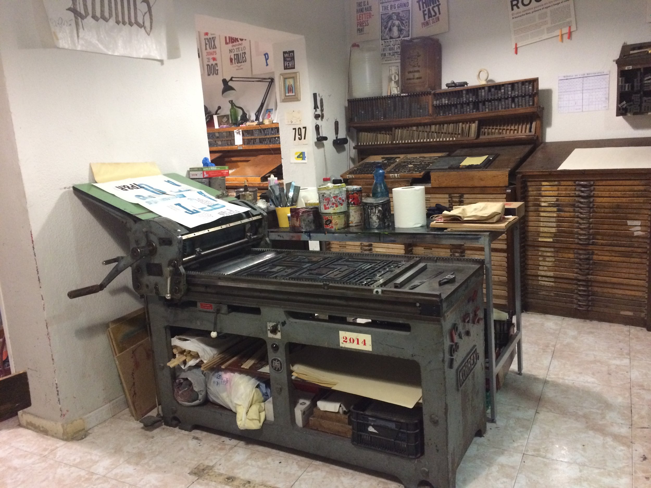
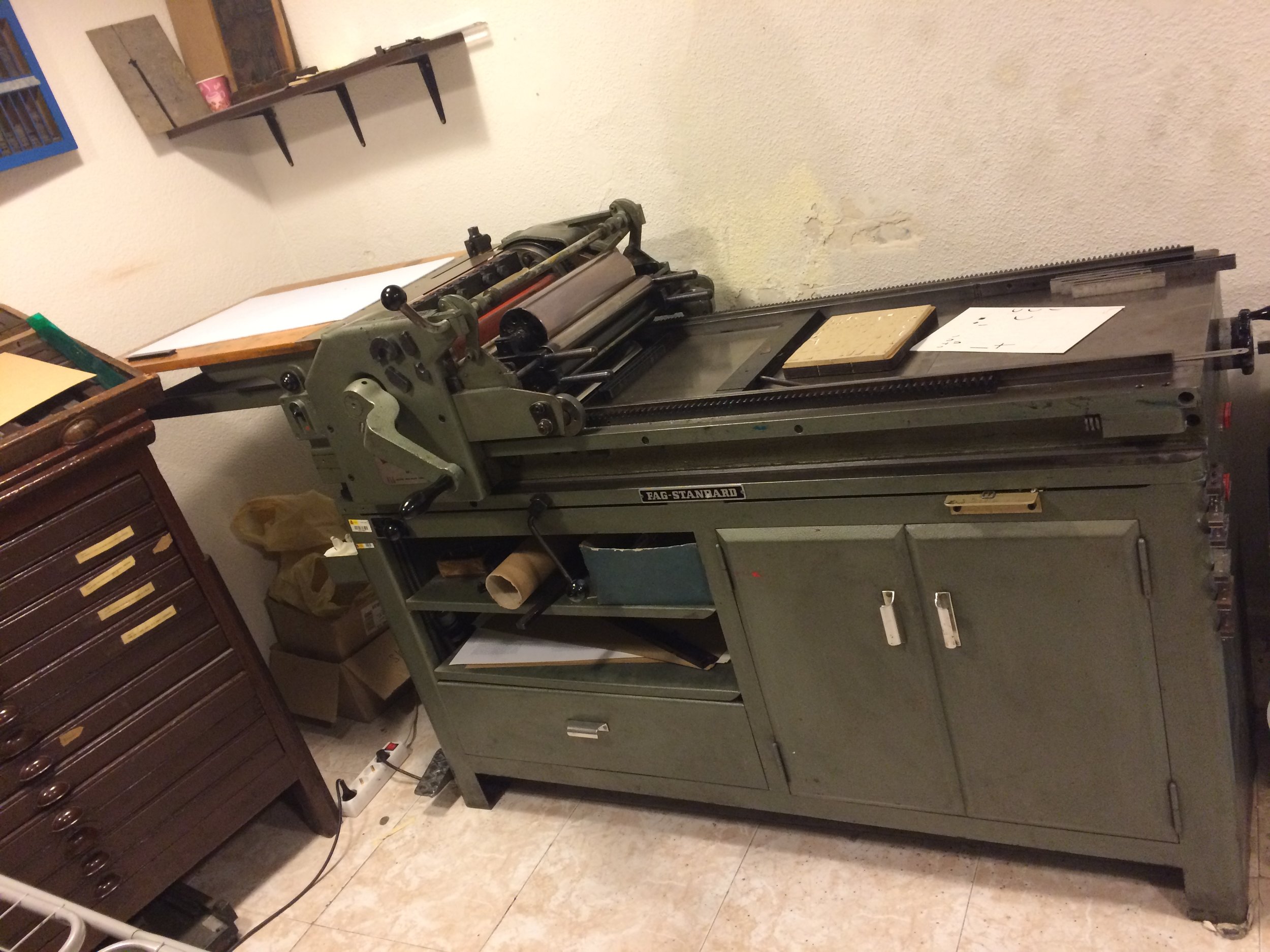
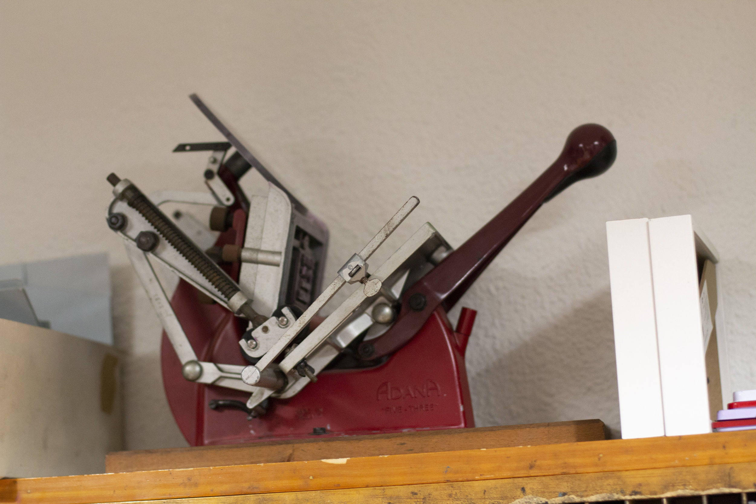
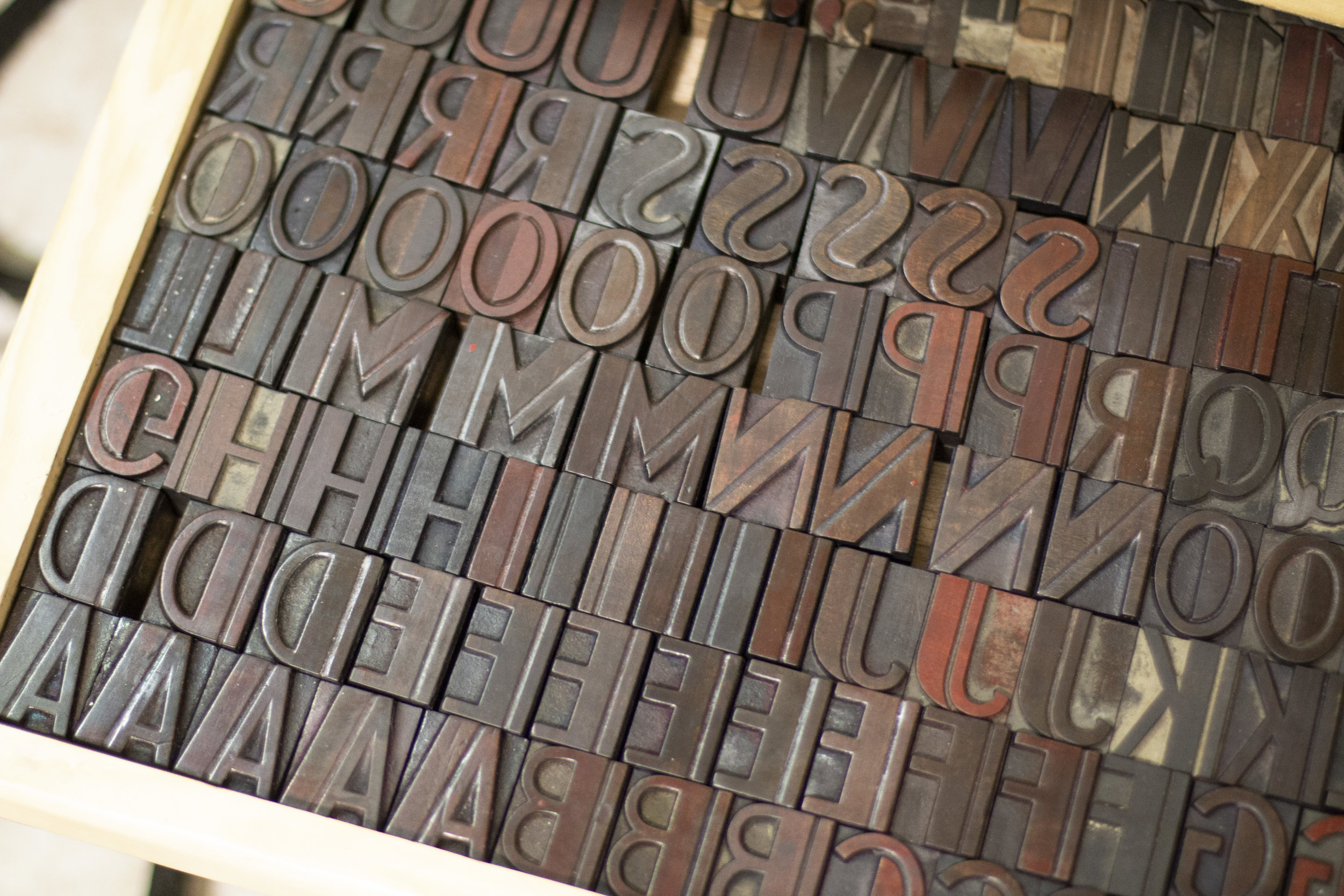
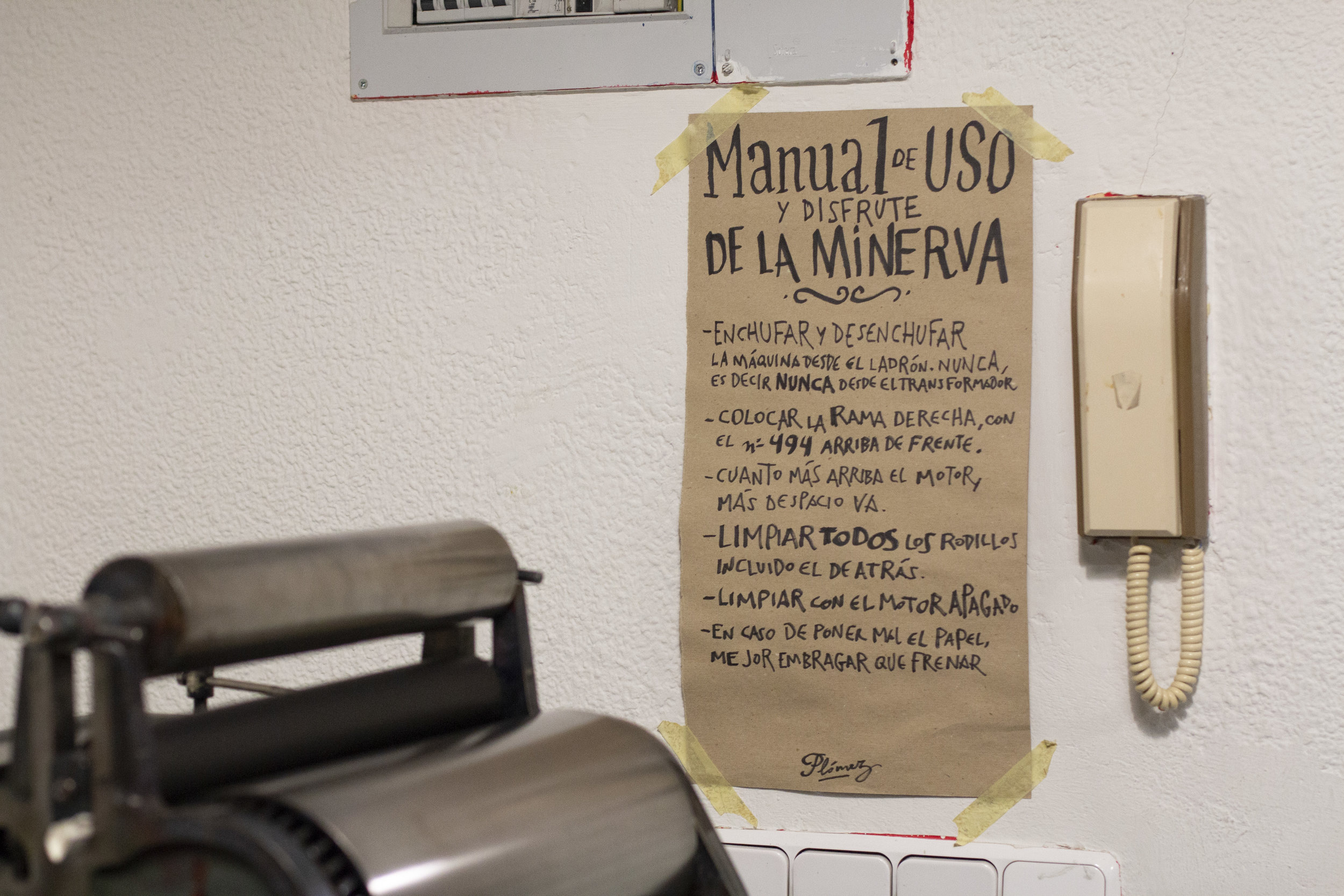
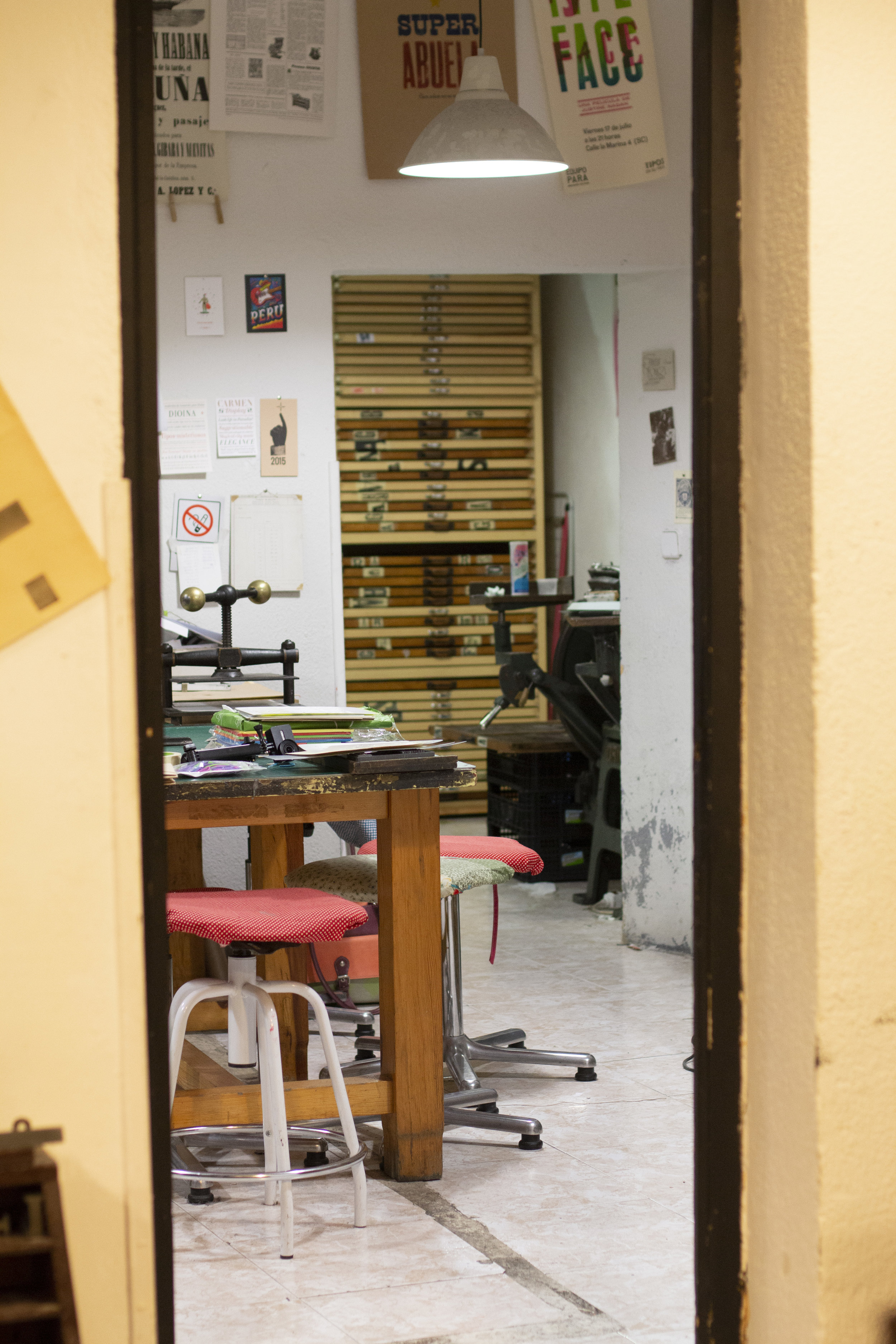
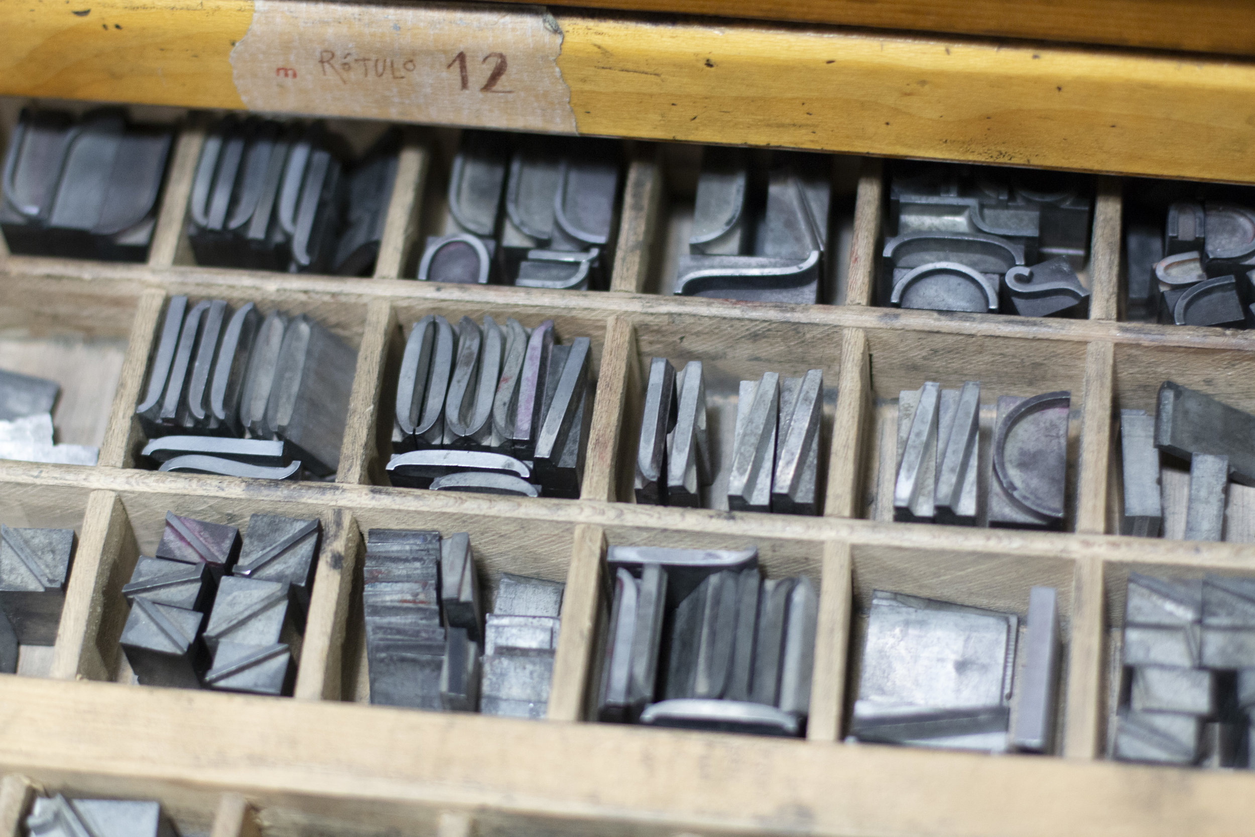
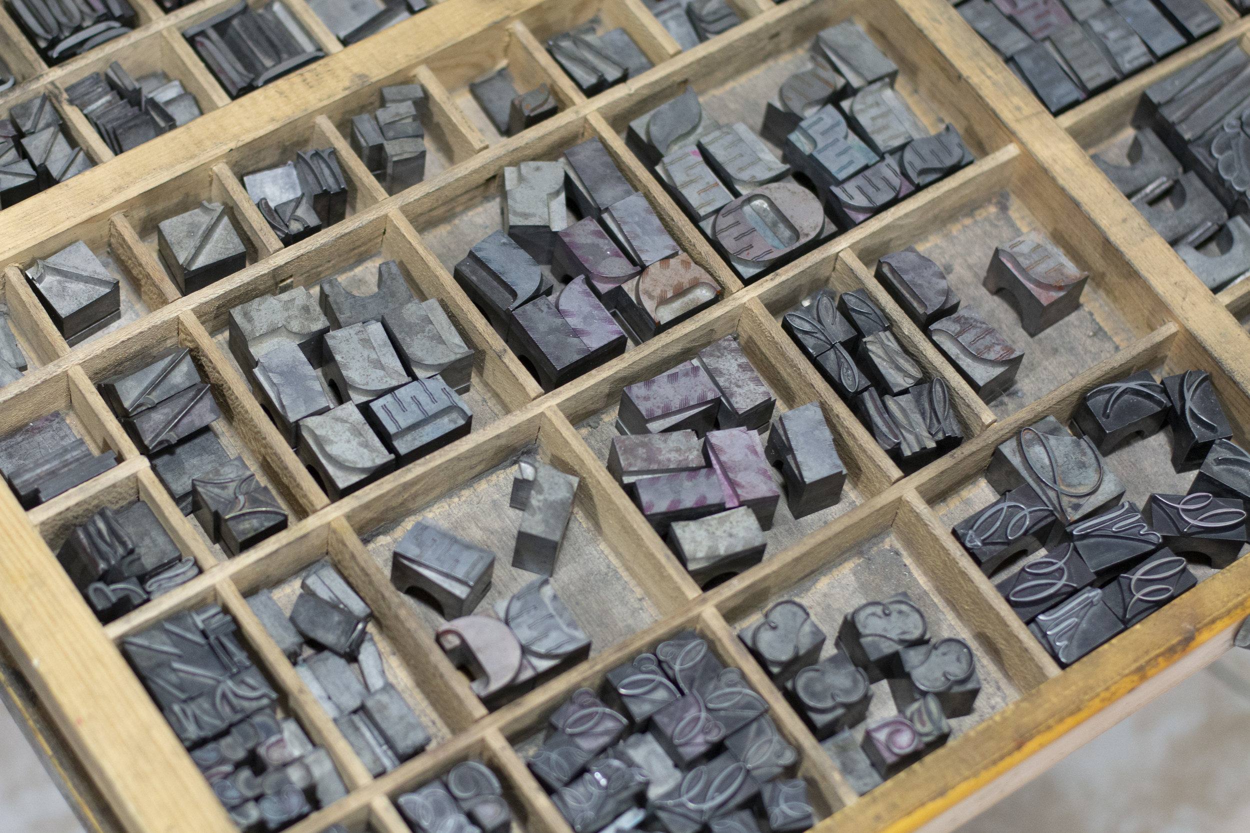
The venue of Familia Plómez, situated in the centre of Madrid and hidden behind the glass window with fancy lettering, is packed with printing presses and cabinets full of wood/metal type rescued from old printing houses around Madrid over the years. After entering the main room of the workshop and being warmly greeted by Roberto, I’ve noticed a Korrex Berlin (50x70cm) that has been travelling to Madrid from Germany, a Minerva platen press found in an old shop in Madrid, 2 Adana’s, plenty of proof presses and a beautiful FAG Standaard 550 with adjustable bed, stored in the corner of the second room of the workshop. Familia Plómez possesses a large collection of wood type and even larger collection of a metal type with a special mention of the treasure in their collection: Joan Trochut’s Super Tipo Veloz.
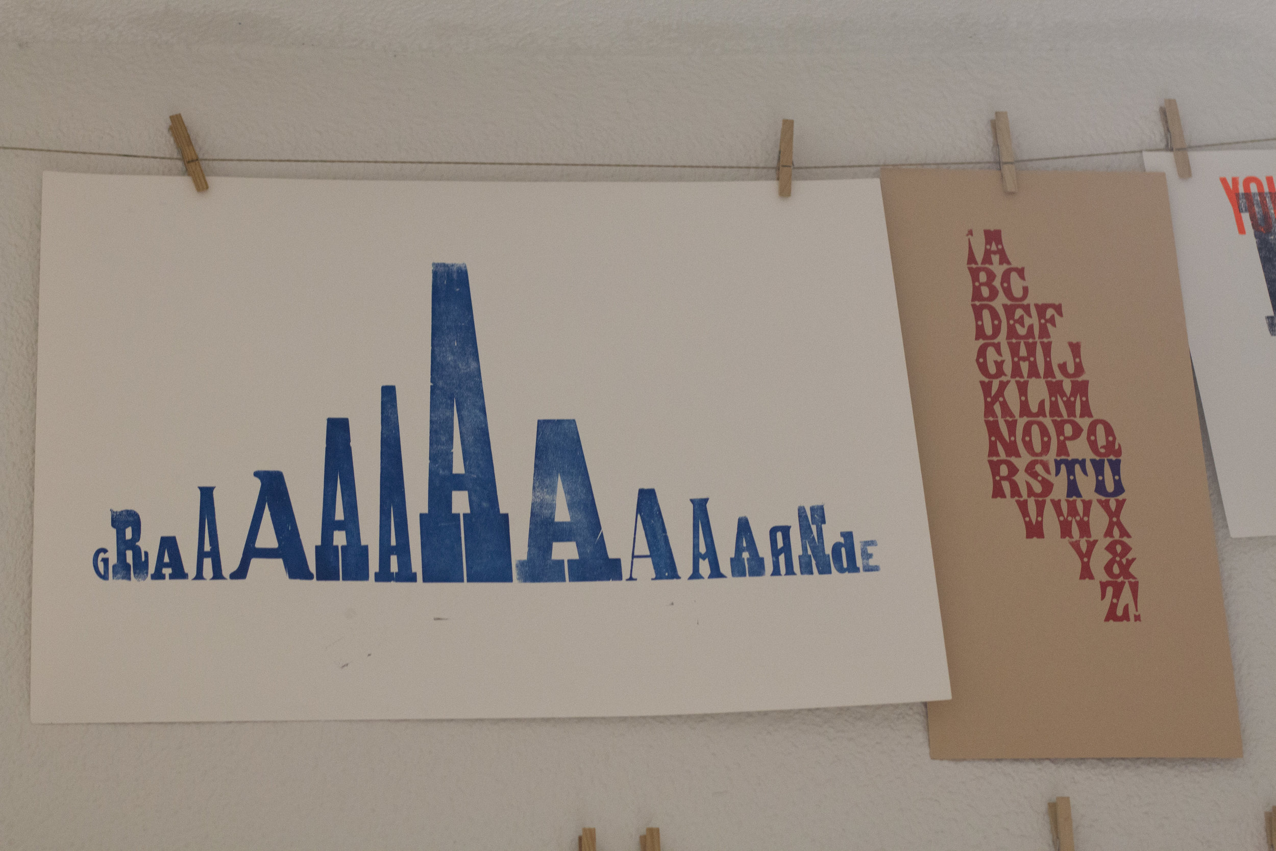
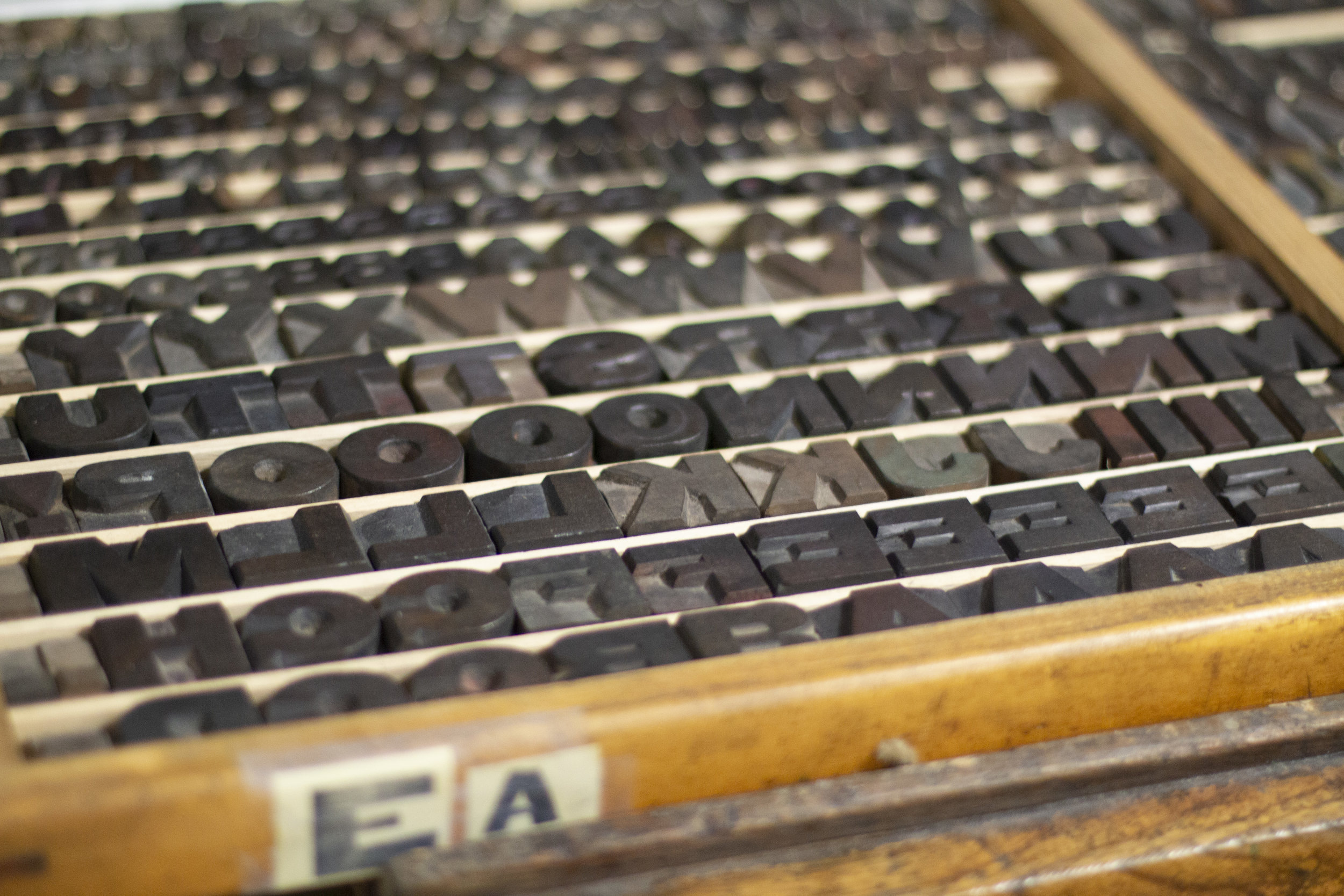
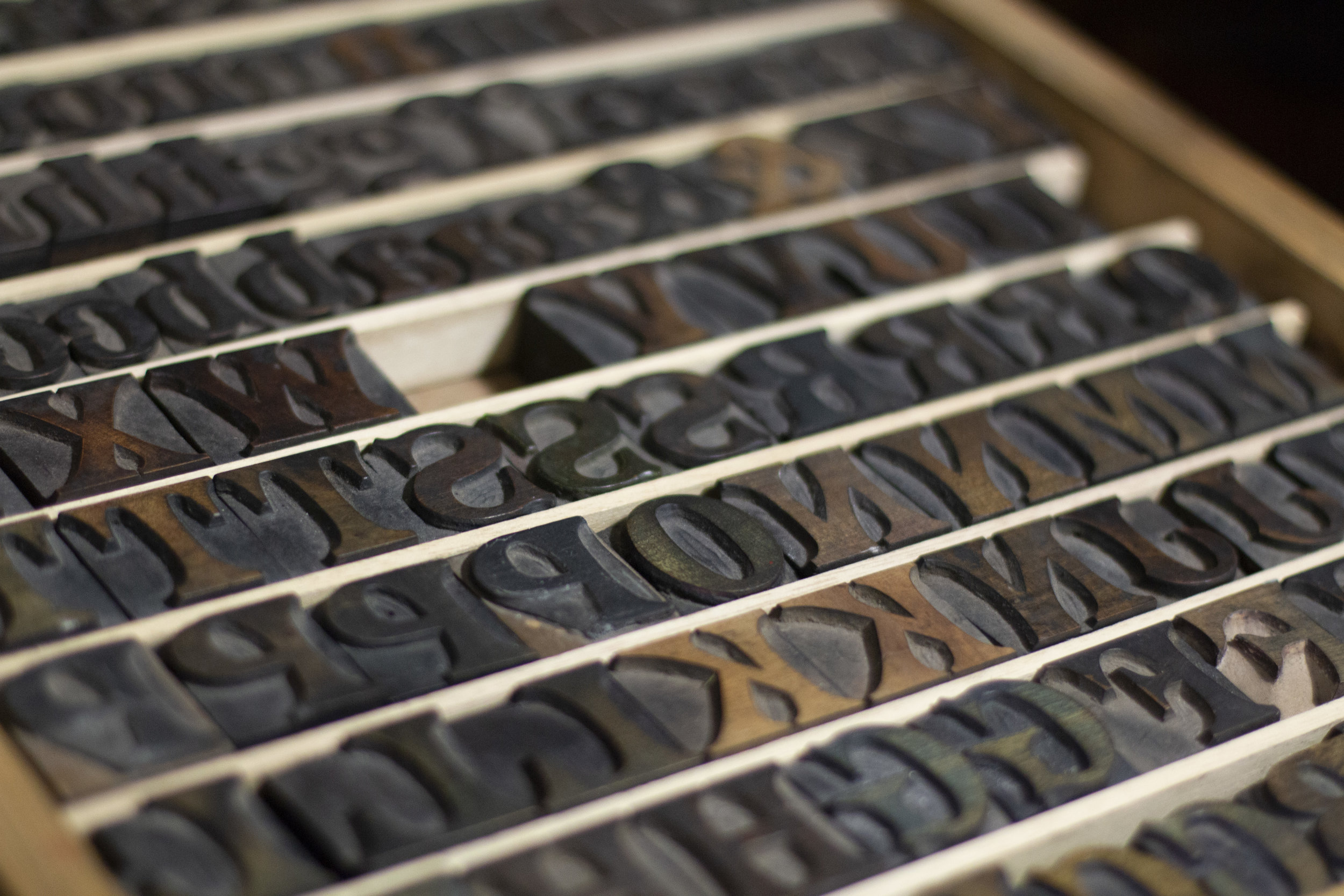
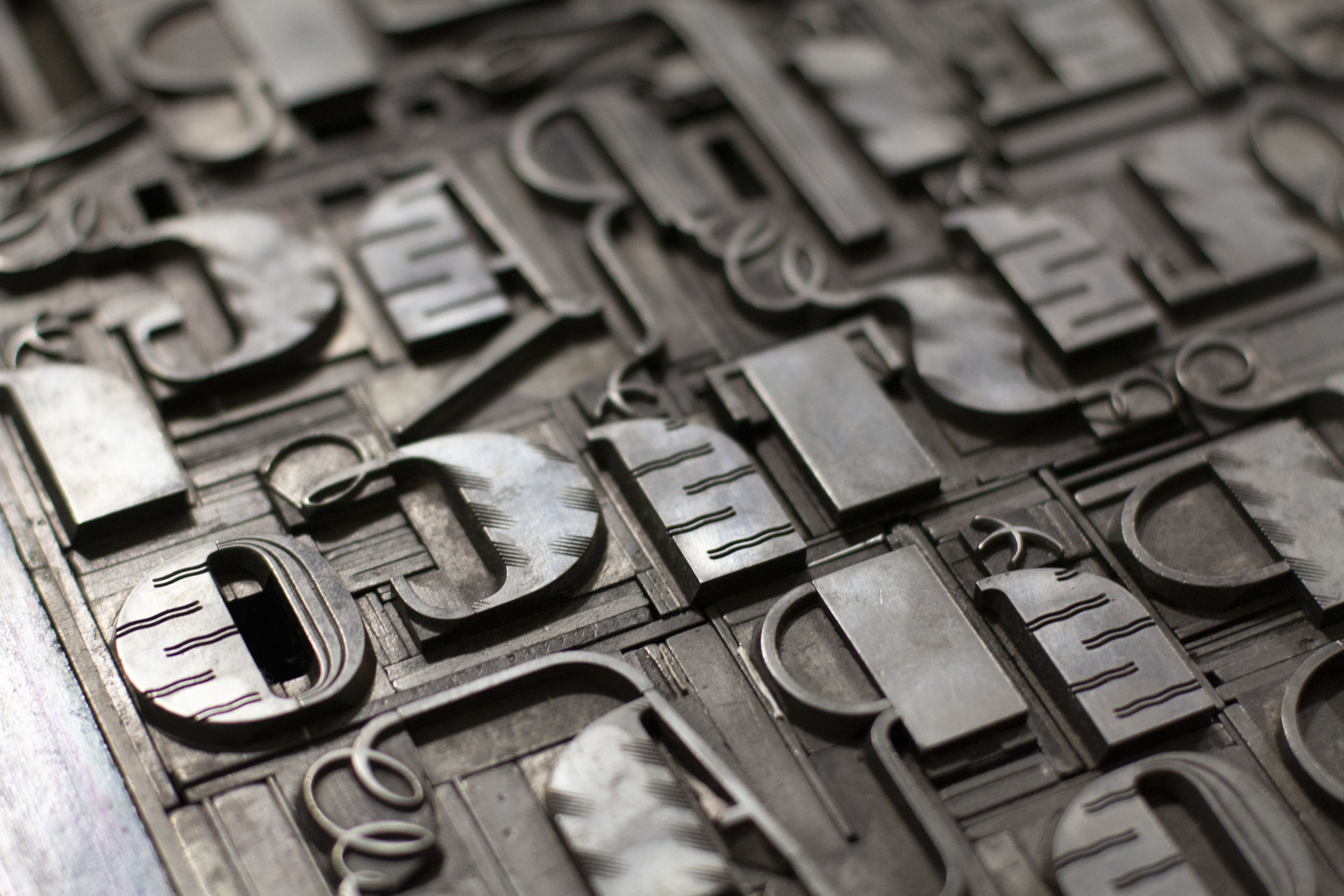
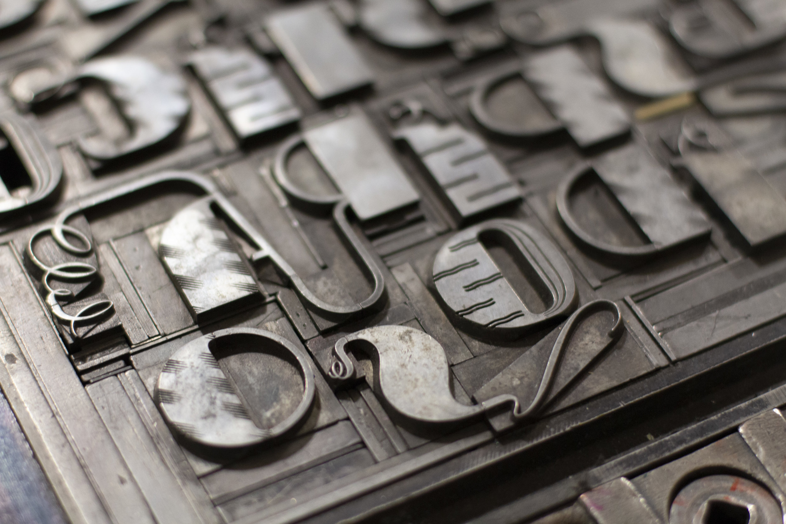
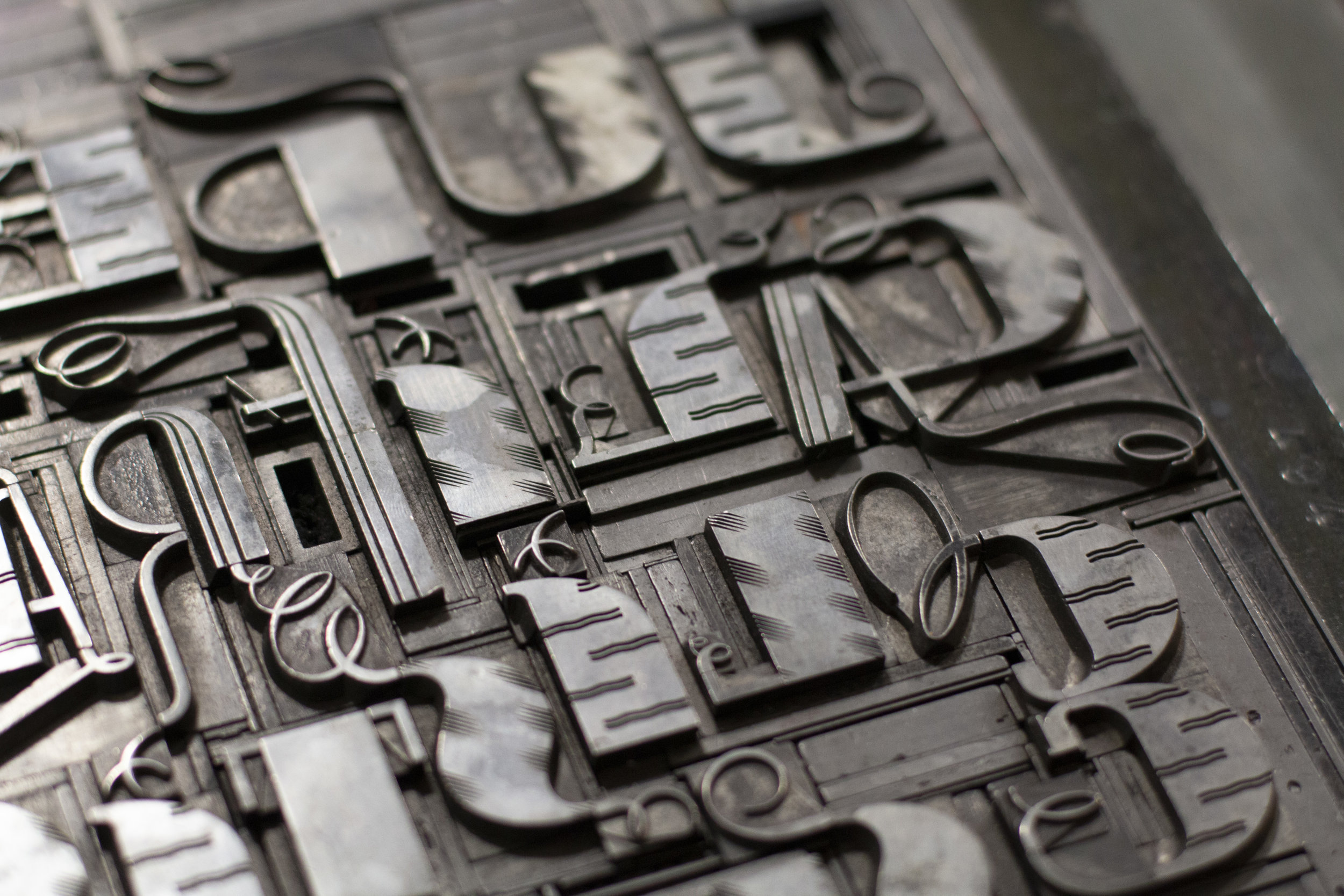
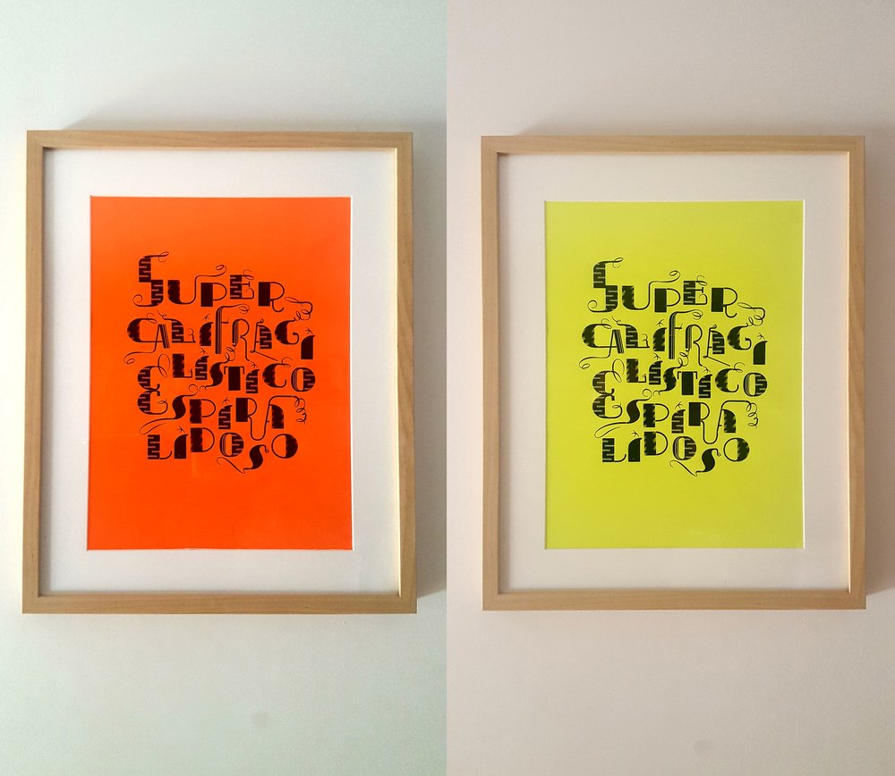
Created in an era of scarcity of typographic material in Spain after the Civil War by Catalan printer Joan Trochut and produced by Fundición Tipografica Iranzo (Barcelona) in 1942, Super Tipo Veloz is a brilliant invention, a typographic system combining geometric figures and calligraphic elements. It was made as a set of three modules accompanied with another three 72- and 36-point supplements. It is intelligent, and moreover, beautiful. Although it is a construction system based on the movable type and follows a modular logic, the results achieved using Super Veloz do not have a geometric appearance, due to the calligraphic elements used. It mixes logical, module construction with expressive calligraphy and provides an almost infinite number of possible combinations, allowing the printers to create not only letters but also typographic illustrations without having to make an engraving or drawing. But it’s name is deceiving. It’s not super fast (Super Veloz) to work with. It is very, very slow. Its composition is complicated due to the large number of spaces it needs to be adjusted with.
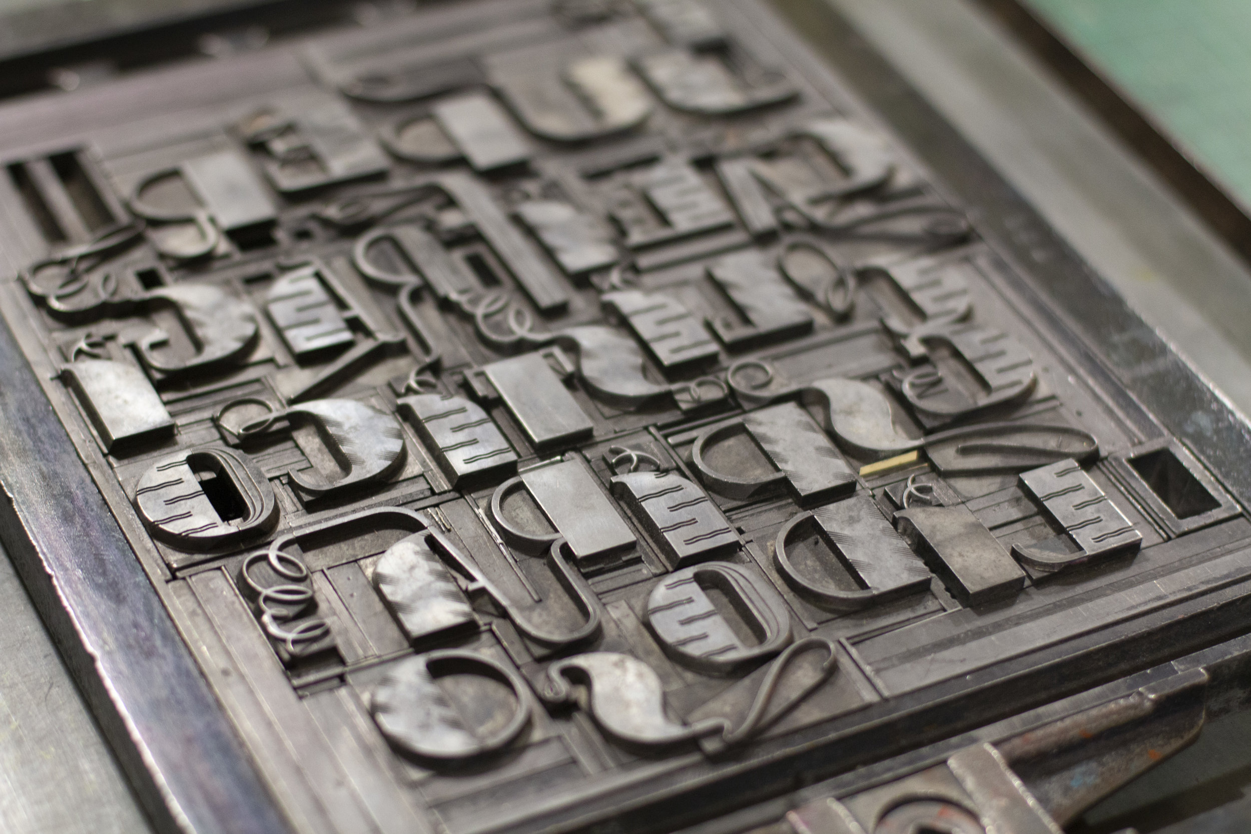
After having seen the Super Tipo Veloz and witnessing the intricate composition/ lock-up created by Roberto I was wondering how actually this metal type ended up at the Familia Plómez. What’s the story? ‘Well’, said Roberto, smiling mischievously, ‘we were very fortunate! We just had created Familia Plómez and were looking for material in old printing shops. We saw an advertisement in which a printing company in Cuenca (a city almost two hours driving from Madrid) were selling cases of wood type and a type cabinet full of metal type. Upon arrival, while inspecting the cabinet with metal type we’ve discovered that one drawer was missing. So we asked for it. The printer told us that there was a drawer with ornaments and borders that he had somewhere in the basement. We asked if we could see it and to our surprise, it was the Super Tipo Veloz! We put a "poker face" to hide our excitement and took this treasure with the rest of the material. That's how we found the Super Tipo Veloz!’
For those who can't lay their hands on the Super Tipo Veloz metal type, there is, fortunately, a digital version, designed in 2004 by Andreu Balius and Alex Trochut, the grandson of Joan and now a renowned designer specialising in lettering. The two met at Elisava design school as teacher and student, respectively.
But that’s not the end of the of Super Tipo Veloz story yet :) While wondering around the print shop, opening drawers of wood type and looking on a beautiful print work covering every inch of this space I’ve noticed an orange plastic stencil plate with shapes resembling the Super Tipo Veloz. Roberto Gamonal Arroyo had recently developed the stencil version of Super Tipo Veloz for an introductory course on the construction of the letter. ‘Working with the module’, said Roberto, ‘I thought that the most useful tools would be to use stencils as a limited and predefined form. It allowed the creation of an alphabetic system with a very few elements, but these elements can be combined almost infinitely and you can create multiple forms.’ Made from acrylate and measuring 18x23 cm and 2 mm thick, it contains 68 shape that allows the students to create an infinite combinations.

Familia Plómez is not only provide the letterpress workshops or occasionally give one on location, but also offering lettering workshops where you can use the stencil version of Super Tipo Veloz.
Familia Plómez
Asociación Cultural Familia Plómez
calle de Las Aguas, 3
28005 Madrid (ES)
you might also like
superveloz.net
Trip to Amsterdam. Makers Match & GWA.
Museum 't Aloam
Zomertyposium 2017
Letterpress Amsterdam
Print Me Baby One More Type or LpW 2017
Visiting the London College of Communication
St Bride Foundation Wayzgoose 2017
Trip to Barcelona. Part I. Lauren Press
Trip to Barcelona. Part II. BunkerType
Bookbinders' Fair. Sint- Niklaas, Belgium
more pictures from Madrid