(visited in January) read the first part - Trip to Barcelona. Part I. Lauren Press.
After a short coffee break me and Arcangela Regis (Lauren Press) jumped into the BCN tube heading to our next stop - BunkerType, a letterpress studio run by Jesús Morentin. Just in case you are wondering why is it called BunkerType, here is the answer: well, actually it is situated in a cellar (bunker), that is where the name comes from.
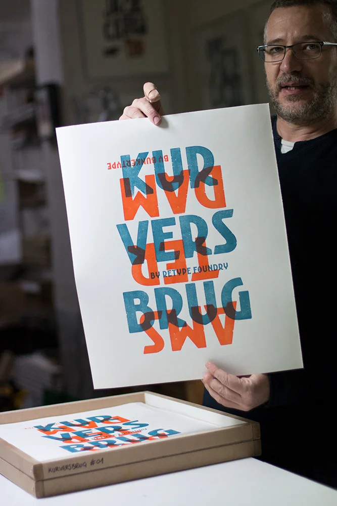
In 2009 , Jesús Morentin, a graphic designer with over 15 years of experience, started a project that involved the restoration of ancient printing presses and research on printing techniques. Jesús is interested in concepts and experiments, is involved in various collective exhibitions and doesn't accept any commercial printing jobs.
"I am not a printer, I just enjoy printing", explains Jesús. Currently, he is teaching in several schools in Barcelona such as the School of Design ESDi, Elisava, BAU etc.
I've discovered Jesús Morentin's works a few years ago when I accidently stumbled upon his project 'The Next Call' inspired by H.N. Werkman whose work we both admire. I was pleased to meet Jesús in person during Letterpress Workers in Milan a few years ago.


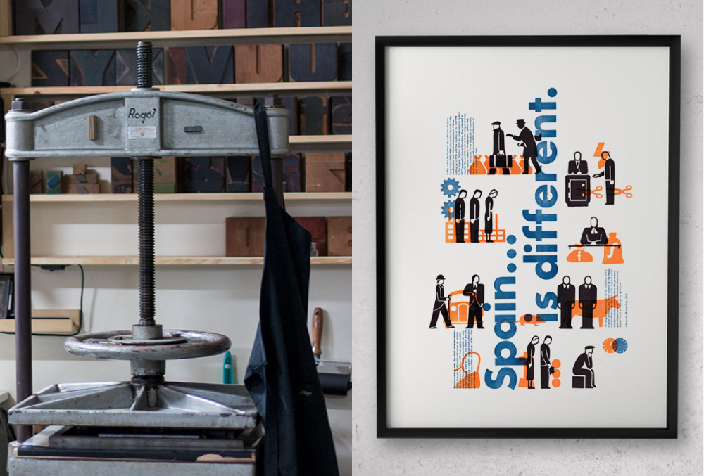
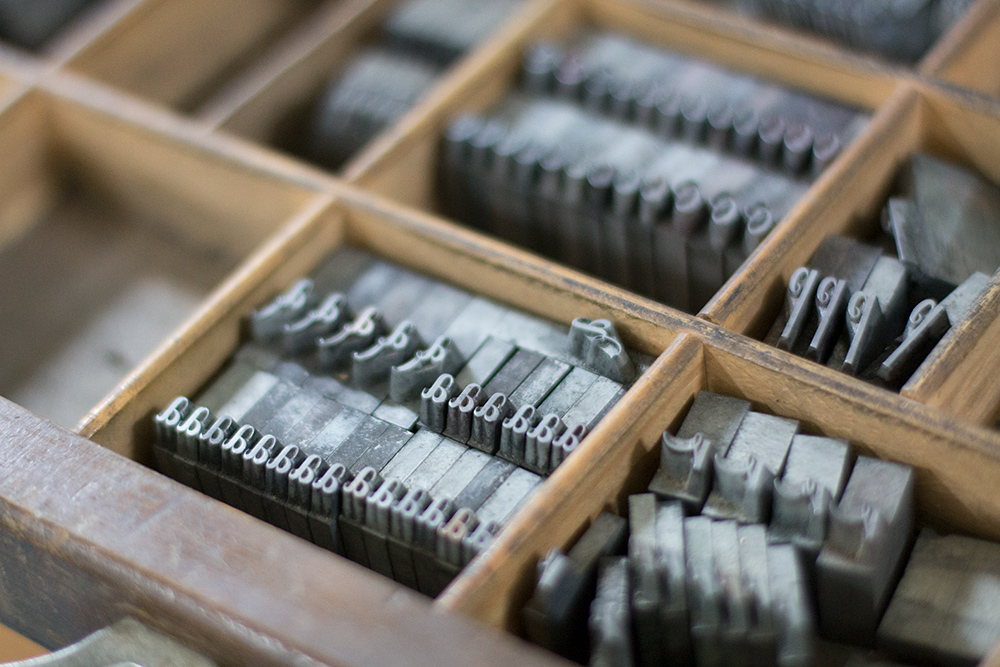
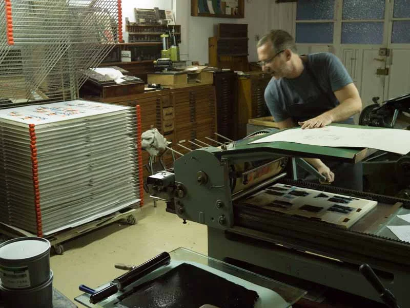
After being warmly greeted by Jesús who was waiting for us in front of the building, we entered the little door and took a tiny stairs to the cellar - Jesús' working space. Even though it had no windows it was very light and cozy. What struck me was how organised and neat was it inside: self-made wooden shelves filled with labeled cases of wood type, accompanied with green cabinets full of metal type, proofing and book press, tools and large pieces of wood type carefully arranged alongside the wall, big shelf full of books and even an LP record player producing some exquisite jazz tunes creating a lovely atmosphere.


Being curious about how people actually decide to set up a workshop I was surprised to hear that BunkerType was born accidently. Coming from a family of printers and graphic designers it’s not surprising Jesús has always been passionate about typography and printing. But it is only many years after he rediscovered the beauty of traditional printing after accidently following a letterpress workshop with a friend. "The smell of printing ink, paper, solvent, suddenly transported me into my father's print shop I used to visit as a child, or when visiting my uncles' house - who ran a small print shop in a small village in Tarragona", said Jesús. Being thrown back into childhood memories and following the 'smell of printing' Jesús came back to his roots and decided to established his own venture, 30 years after he stepped into his father's print shop for the first time. It all started from the rescuing and restoring the printing equipment with wood and metal type followed soon after.


ISOTYPE by Gerd Arntz - source
The project he has recently launched called 'Spain…is different'. It is a research and reinterpretation of visual language created by Gerd Arntz (1900-1988). In the end of the 1930s, Arntz joined the team of Otto Neurath (1882 -1945), director of the Museum of Society and Economy of Vienna, where they created Isotype - The International System Of Typographic Picture Education. Gerd Arntz designed over 4000 icons, which symbolized key data from industry, demographics, politics, economy etc. The Isotype symbols were not meant to completely replace words, but to summarize and support the verbal content of the statistics.
Almost a century later, following the aesthetics and the ideology behind Isotype, Jesús Morentin has launched 'Spain…is different', depicting three different aspects related to politics and society in Spain. Limited edition of 50 prints of each poster has been handset and letterpress printed in three colours on Korrex Hannover 1964.

The slogan 'Spain…is different' (¡España es diferente!) was created between 1962 and 1969 by Manuel Fraga Iribarne who served as Minister of Information and Tourism under Franco's dictatorial regime and played a major role in the revitalization of Spanish tourist industry. This slogan was used by tourist sector so that Spain’s image abroad would be appealing to potential tourists and foreign investors. However, the many Europeans who visited Spain that marketed sun and sea seemed unaware of the true political conditions under which the local population was living. Not much has changed, I'm afraid.
So, in this case, Jesús Morentin, has taken this slogan 'Spain…is different' with a touch of sarcasm. Trying to illustrate the modern Spanish society using artistic methods, he is not only criticizing social inequality and exploitation, but also criticizing ourselves for being too passive and noncritical as a society.
Jesús Morentin produces beautiful and experimental letterpress printed pieces in small editions. Although some of his works are rigorous and methodical, while others are more intuitive, they always come with solid historical reference to the figures of the past such as H.N. Werkman or Gerd Arntz without diminishing his own voice.
you might also like
Trip to Barcelona. Part I. Lauren Press
Letterpress Workers. Milan. 2016
LpW 2015
LpW 2014
LpW 2013
Letterpress Amsterdam
Visiting Sander Pinkse boekproductie
Typography Museum by Henry Thomas (82!)
Historische Drukkerij Turnhout