Last Saturday I got up early to take the train to Antwerp to visit Zomertyposium where this year it was all about the creation of letters; then, but surely now. The impressive list of speakers promising an interesting day ahead includes Martin Majoor (NL), Thomas Gravemaker (NL), Patrick Goossens (BE) and René Knip (NL), covering various topics of type design, from punch cutting and producing new wood type to digital type design and 2 & 3 dimensional type on an industrial scale.
This annual event is organized by Initial, a student and alumni organization of the Plantin Institute for Typography that emphasizes the great importance of sharing knowledge between the creators and lovers of good typography. Being hosted in the historical building of the Plantin-Moretus museum gives an extra dimension to it.
After checking in on the ground floor of the museum and meeting a few familiar faces, I joined the group of participants (around 50 people) and we moved on to the tiny hall under the roof. Greeted by Connie Wera we were kindly offered coffee and cookies and took our place on comfy chairs with goodie bags hidden underneath.
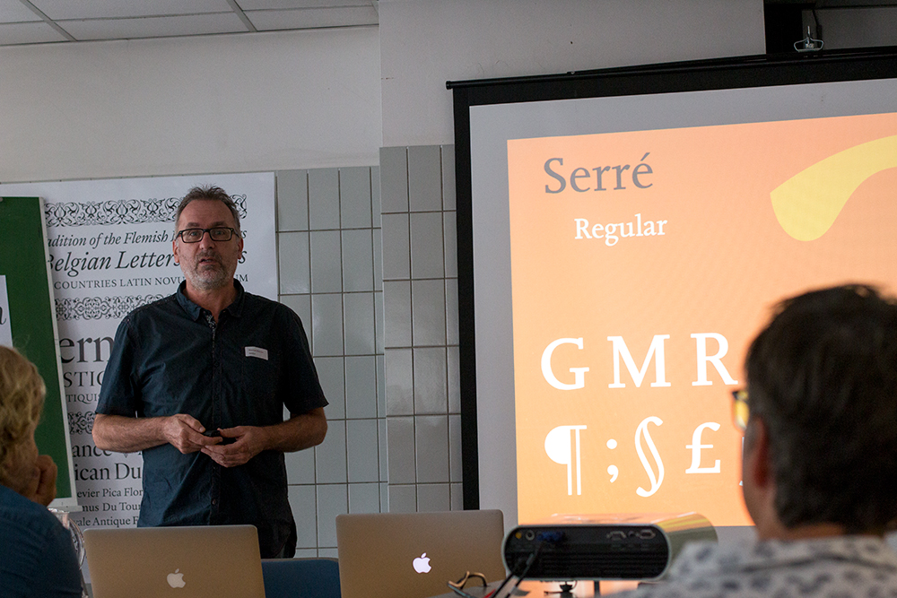
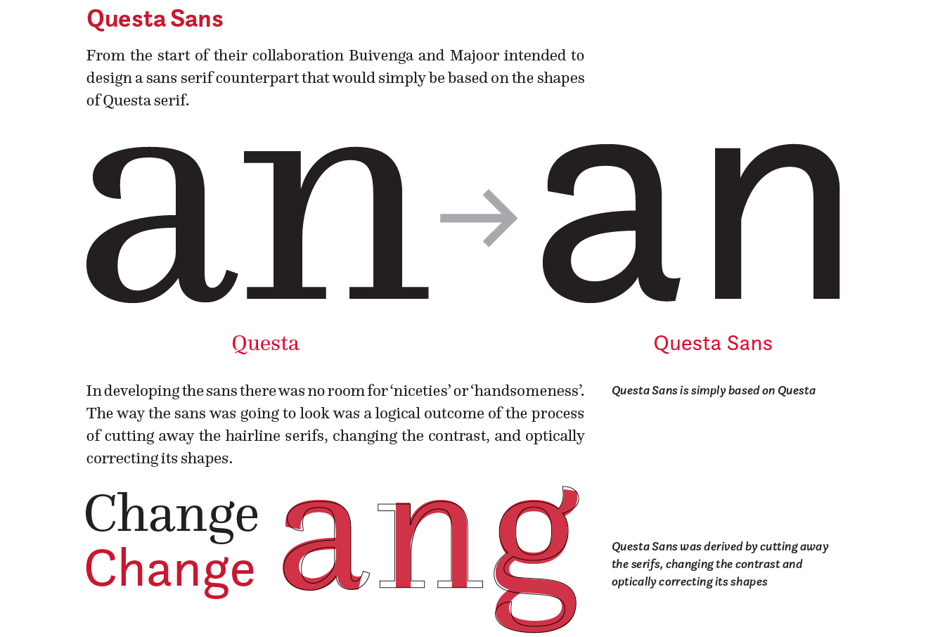
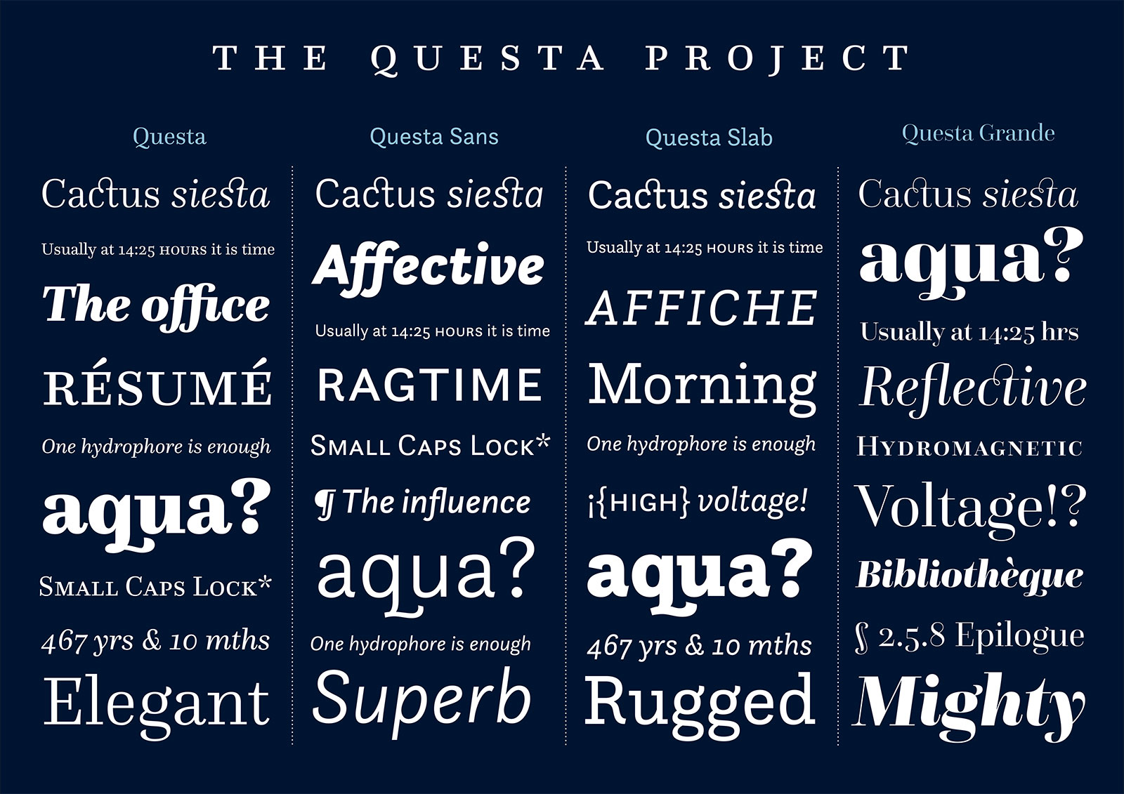
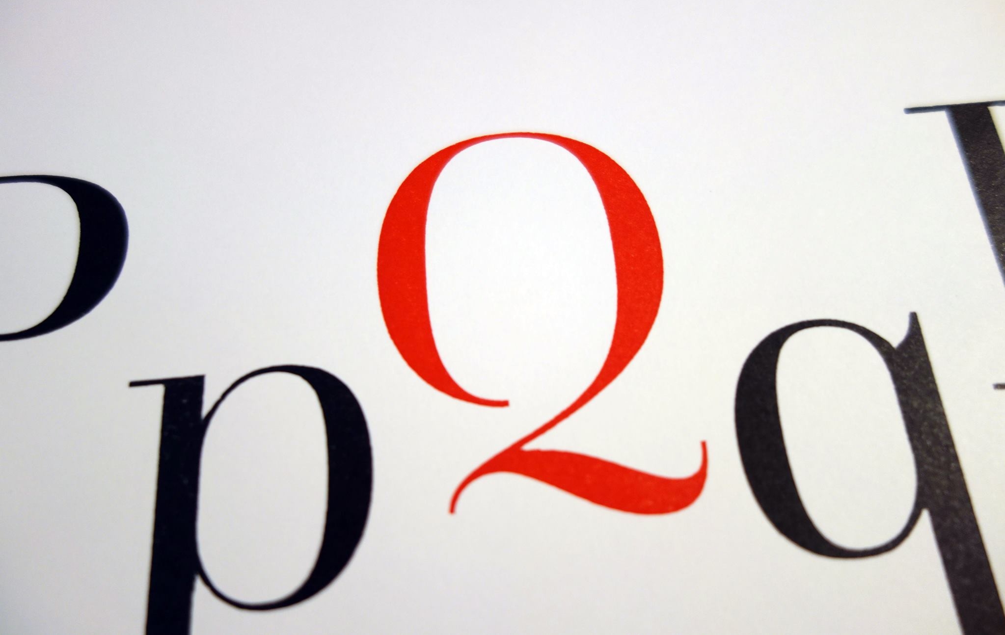
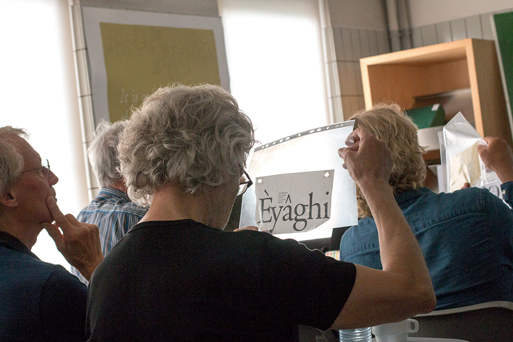
The first speaker, Martin Majoor (NL) told the story about his latest project - the Questa, a colossal piece of work he was working on for several years with Jos Buivenga (NL). The Questa Project, started as a classic text letter in Didot style, is a typeface superfamily containing a serif, a matching sans and a matching display version, small caps, four sets of figures, ligatures and extended language support. Martin revealed look behind the scenes of this quirky and grand letter design, which is still being developed. Martin believes that you can only be a good type designer once you've typeset the book with it. As a type designer, you must know how the letter behaves in running text, on different papers, and what influence of different printing techniques it might have on your letter. Martin is convinced that serif and sans serifs have to have a common basis.

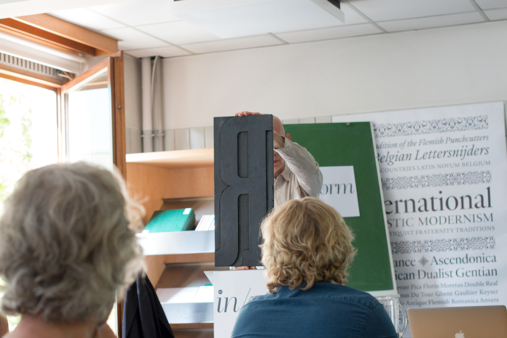
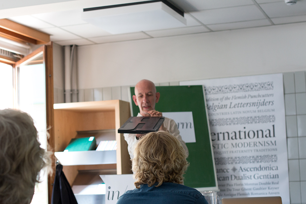
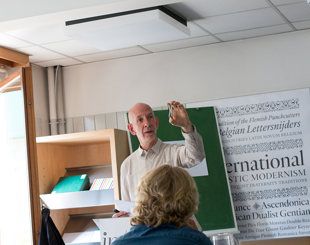
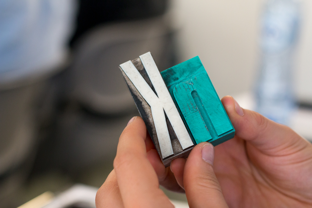
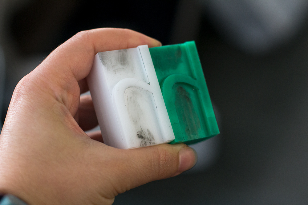
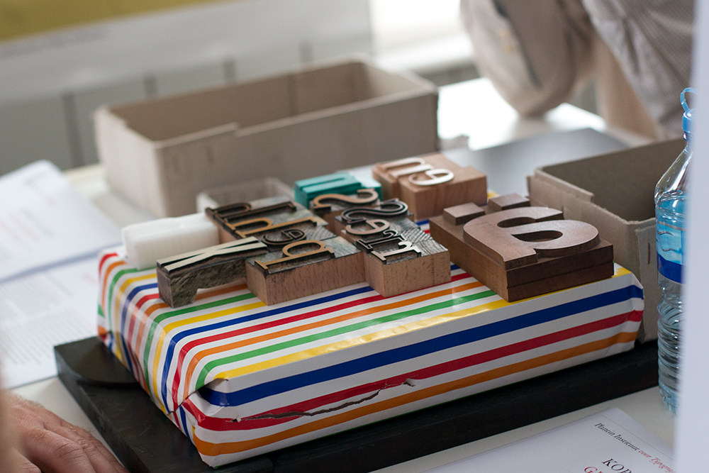
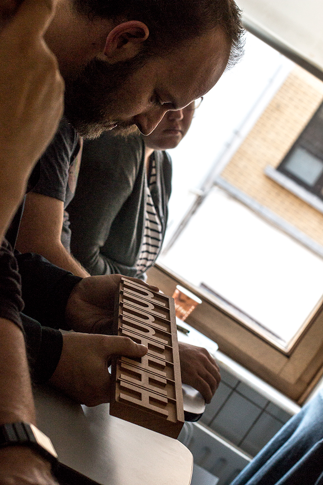
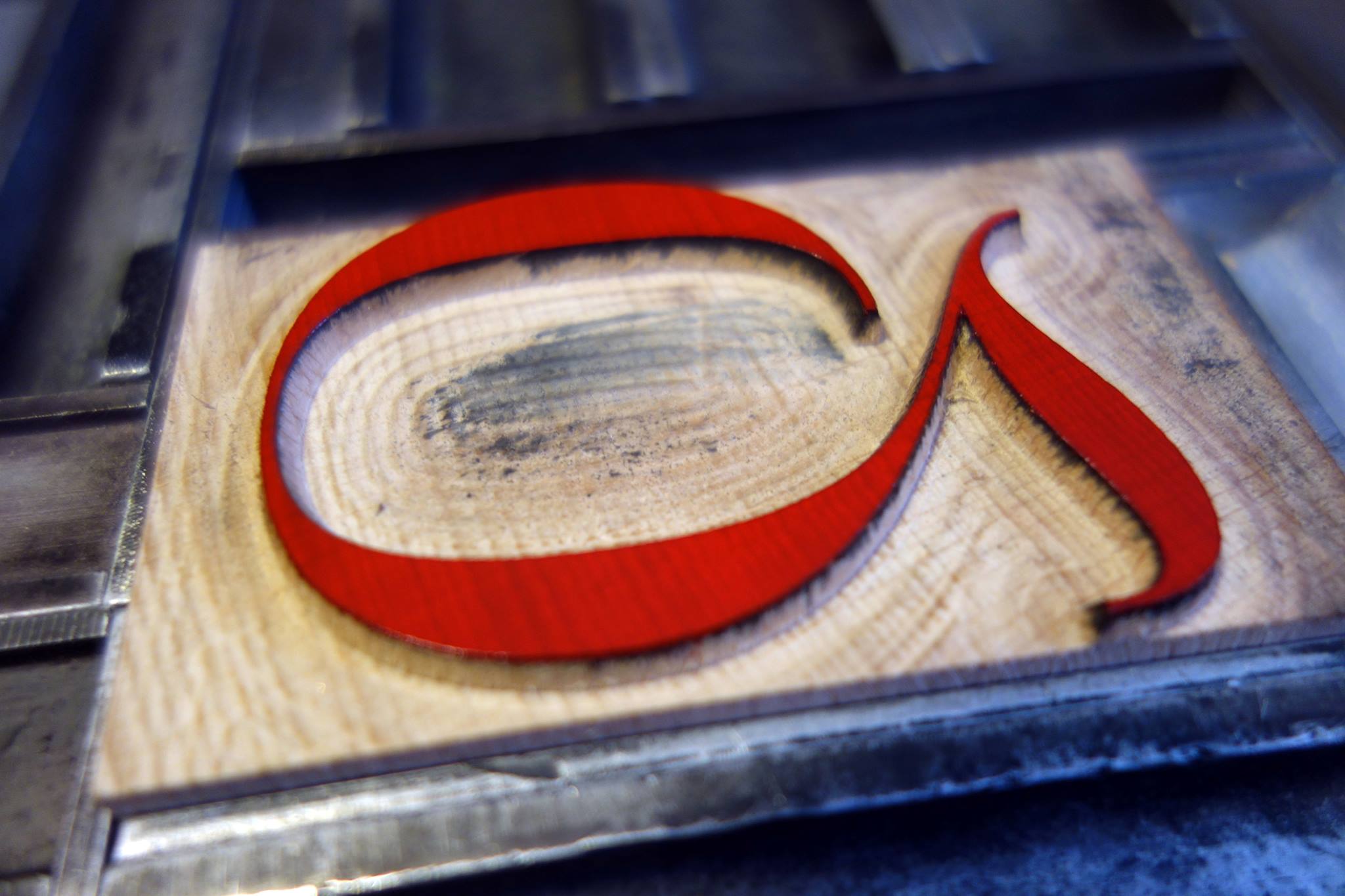
Following the latest development of Questa, the next speaker, Thomas Gravemaker from Letterpress Amsterdam took us on a journey about the design process and the production of the wooden version of the Questa Grande. Can very contrasting letters also be cut from wood? Which type of wood, which technique should be applied, what are the challenges?
Thomas showed various experimental letters executed with different techniques and various materials, from nylon/Delrin to wood. After running numerous tests using laser cutter, 3D printer and pantograph the Questa Grande has been cut from dry, treated beech wood on a CNC milling machine by Delia & Tudor Petrescu in Romania. The results were more than satisfying. At the end of his speech he revealed a fresh letterpress printed posters using the Questa Grande and each of the participants got one.
Thomas combines new methods with the old ones to create inspiring products that are always executed to a high standard, both technically and aesthetically.


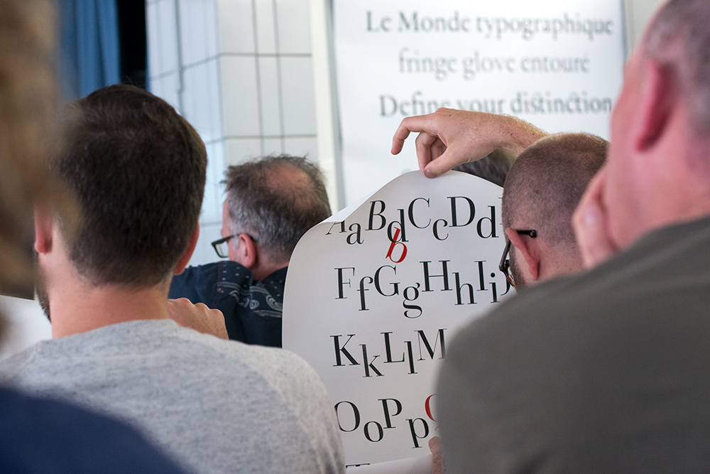
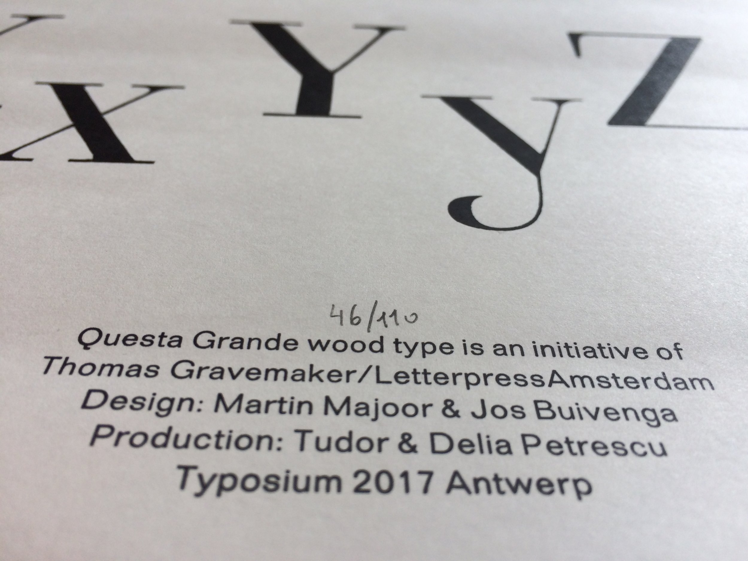
According to well-established tradition each year an artist is invited to make a special print for the symposium which is available for sale during the event and this year it was Tim Hinterding (NL).
He produced an exceptional piece of work with no less than three print runs in five colors. The composition that may seem as if the medium or technique has determined its direction is by no means spontaneous. In Tim's work, everything is very well thought out to create balance of colour, shape and
technique.
After delicious lunch break in the garden of the Plantin-Moretus museum, we were ready for the second part of the symposium, starting with Patrick Goossens (BE).
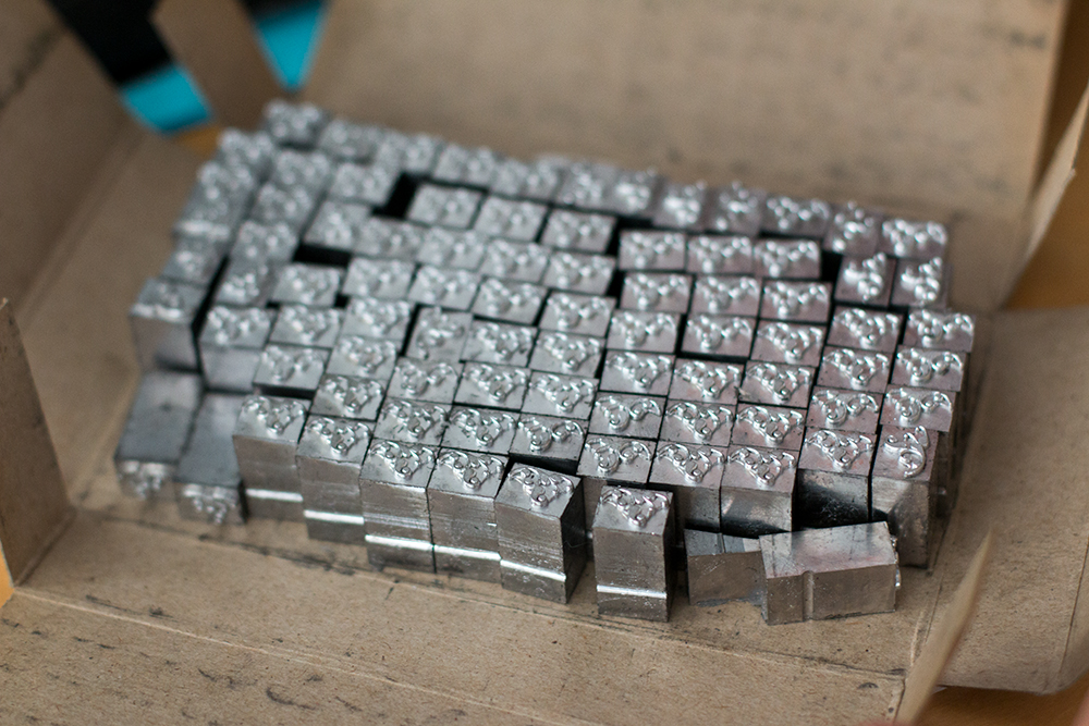
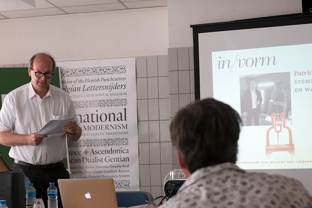
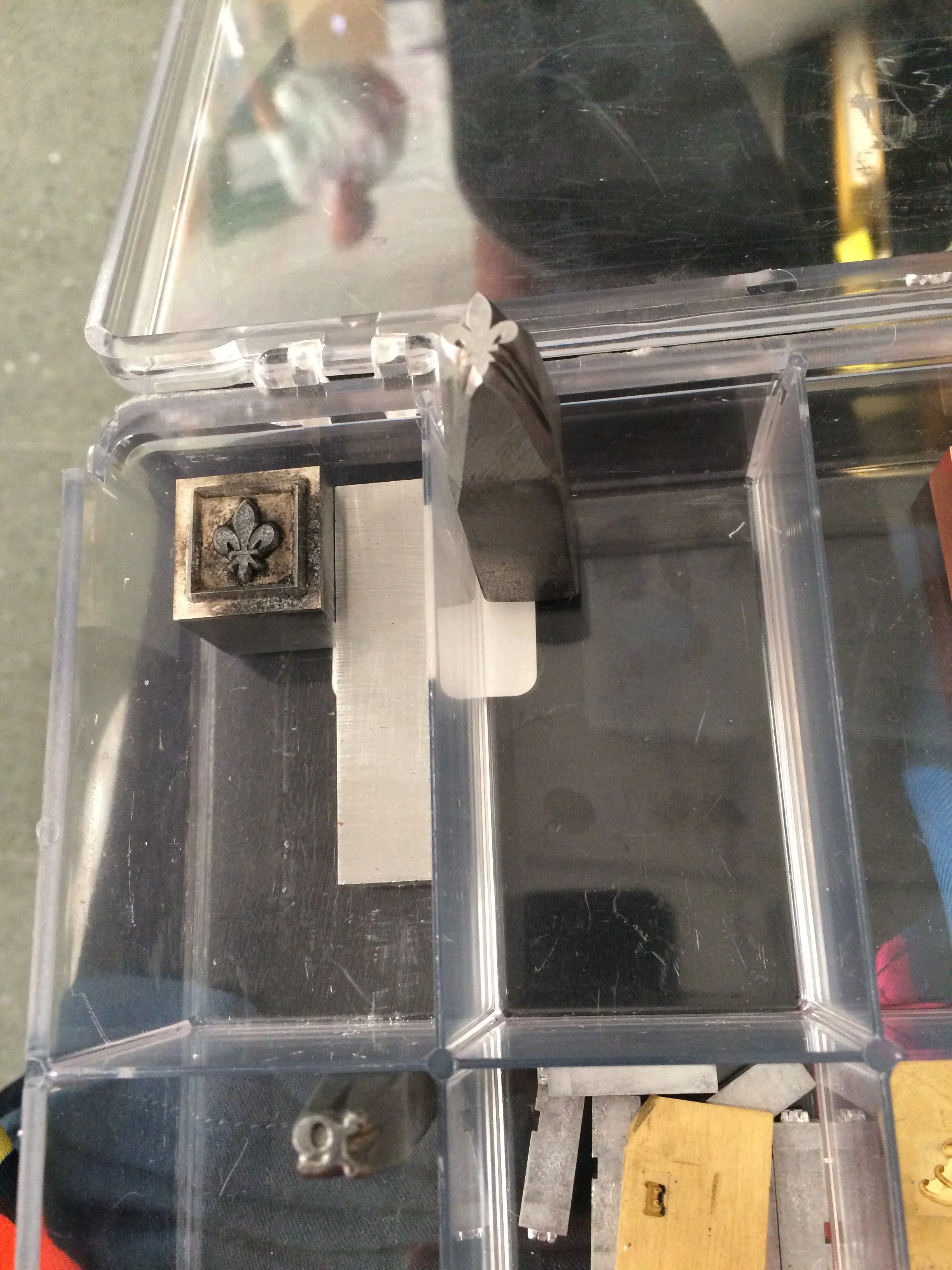
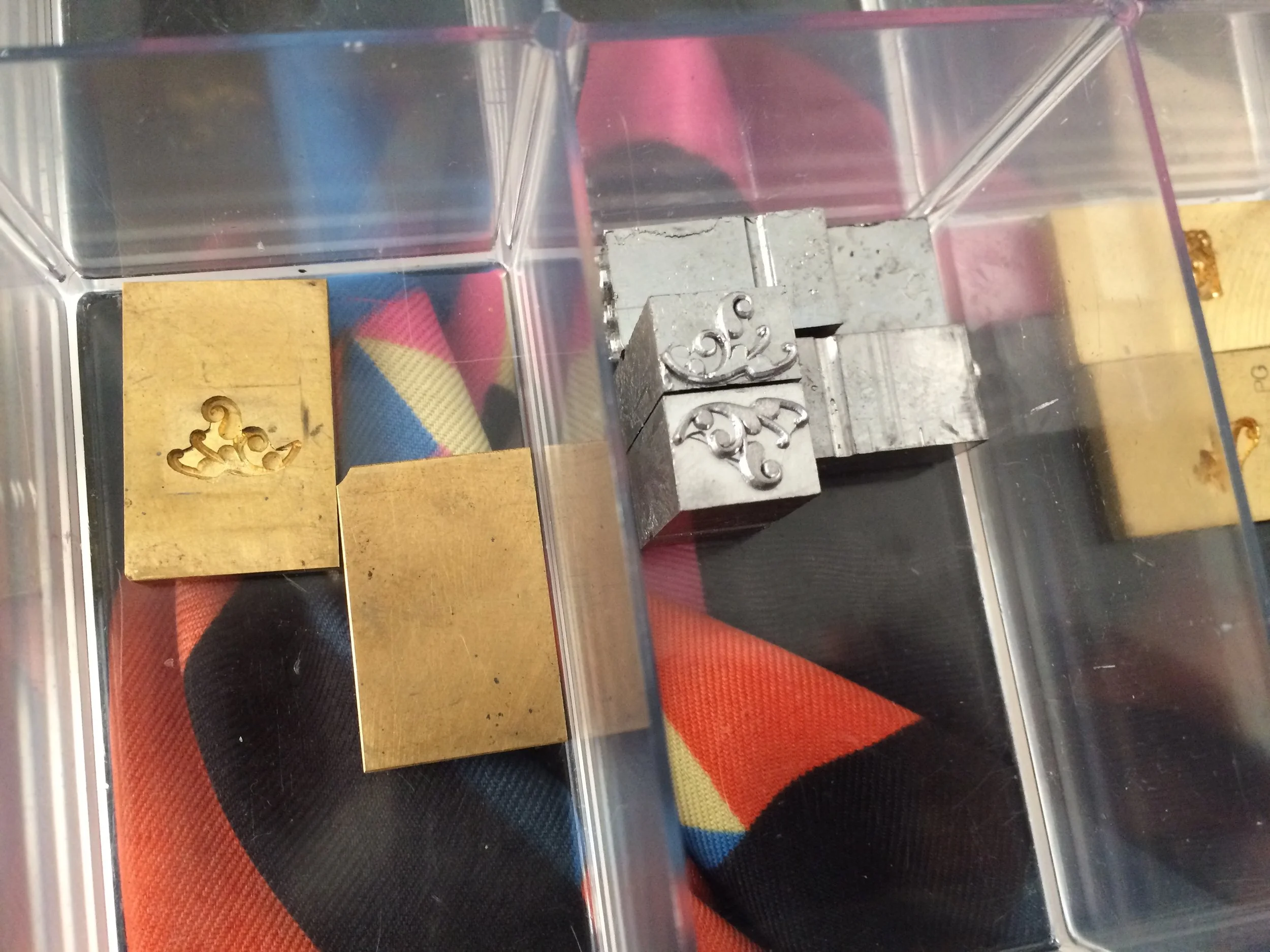
'Type is something that you can pick up and hold in your hand', wrote Harry Carter in his book "A view of early typography" in 1969. As a historian, Patrick Goossens is very interested in the actual making of the letter. This spring, Patrick was a guest at the Imprimerie Nationale (FR) where he learned everything about punch cutting from Nelly Gable (FR). There are not many people left in the world who have hand punch cutting in their fingers. It is a highly skilled craft requiring much patience and practice. There are also a lot of different methods. Through hands-on research, Patrick also learned about other techniques, which came from 1870: mechanical punch cutting, engraving of the matrices in hot metal and cutting the punches in soft metal.
Patrick showed a few examples of punches and matrices recently executed with a pantographic punch-cutting machine, industrializing typeface production and simplifying the process of matrix production. As an independent researcher and collector, Patrick Goossens is the ideal guide through the world of latest development of punch cutting and typecasting.
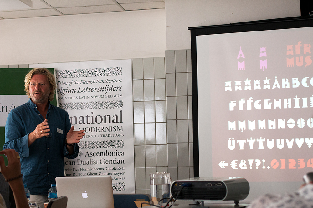


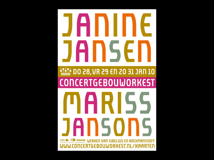
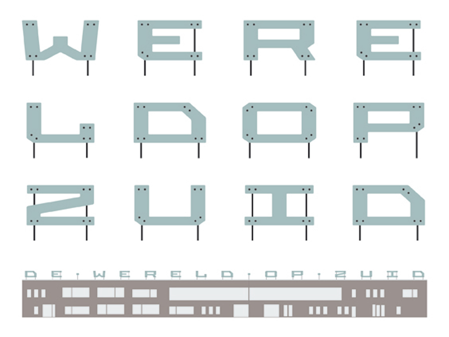
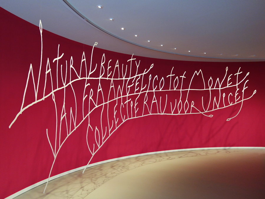


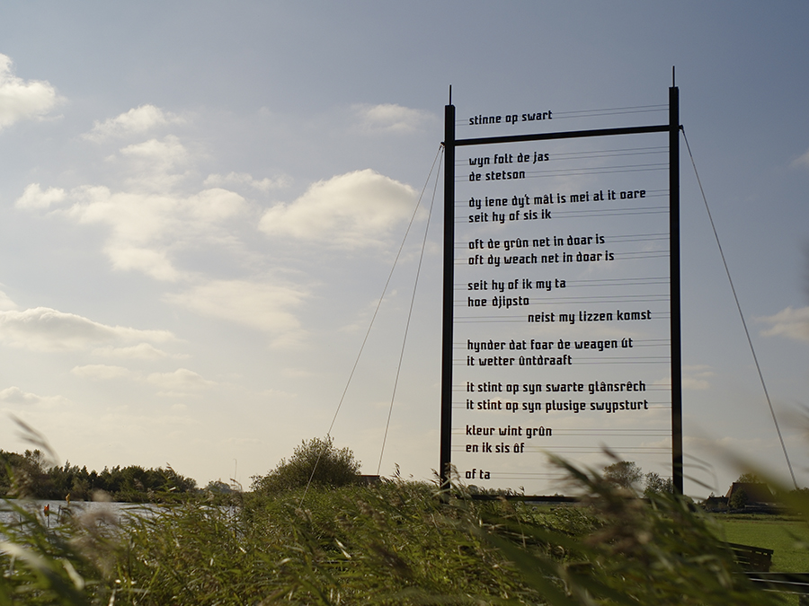
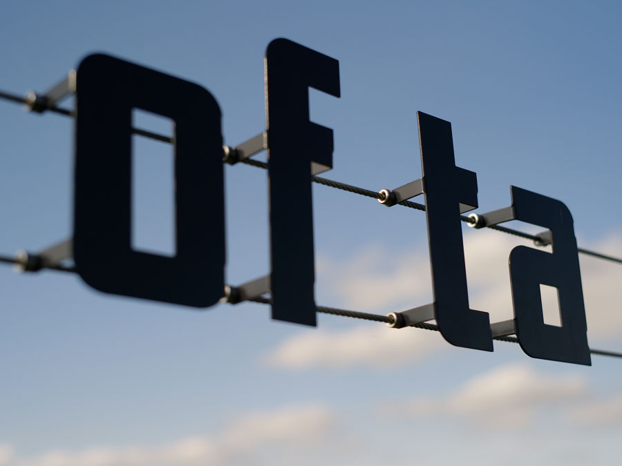
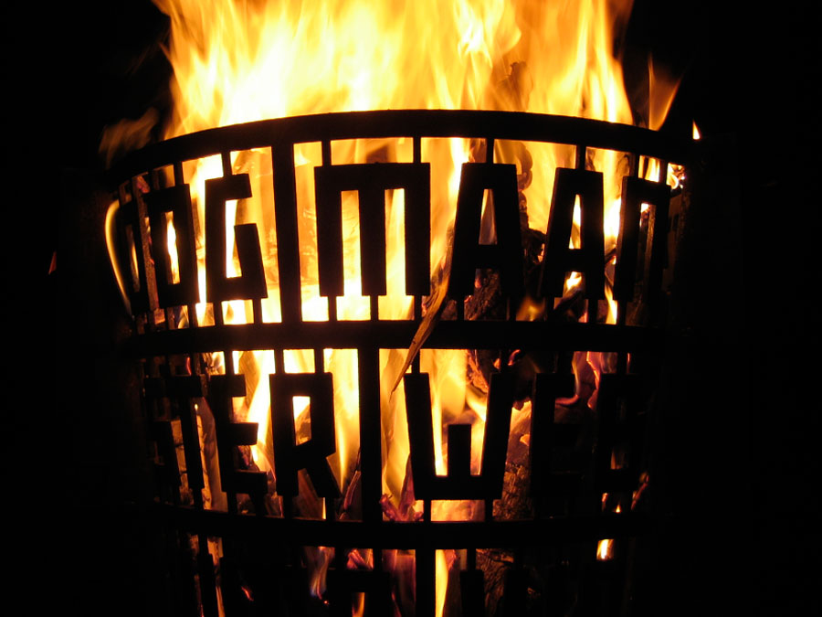
The last speaker of the conference, René Knip (NL), gave the most dynamic presentation, showing as many inspirational images of nature and travel as images of the actual work he had executed. “I'm influenced by everything I see, by walking, by architecture...” revealed René Knip. Most of his letters are architectural, built and constructed rather than drawn or written and there is a simple reason for this as René has to work with text in an architectural environment. Some of René's type designs are influenced by their function as for instance Laundry Sans, a hanging alphabet for the Stedelijk Museum. Others are very illustrative and playful as his work for Afrika Museum, or nature-inspired as his project for Groningen Museum in 2013. Atelier René Knip focuses on graphic design at the dividing line between flat and three-dimensional works. He combines a craftsman’s use of materials with a personal concept of design. As for example, the fire basket structured with writing so that when the fire burns the words flare up and disappear again.
René Knip is a graphic designer with a certain feel for environment, 3D objects, construction, colour and a feel for material in graphic design where his larger-than-life typographic style is unmistakable.
more pictures of Typosium
you might also like
Letterpress Amsterdam
A2 & New North Press’ 3D-printed letterpress font
Virgin Wood Type
Making new large type for letterpress
3D printing. MIAT

