
Our latest field excursion took us to Antwerp, where we had the privilege of visiting project Letter-Kunde, the extensive and unique collection by Patrick Goossens. Patrick is widely known within our community—not only as a dedicated historian and passionate collector, but also as a long-time advisor at the Museum of Industry (Ghent) and Plantin-Moretus (Antwerp) and a treasurer of AEPM. Many of us have crossed paths with him over the years at conferences, book and print fairs. His own academic work focuses on the "Developments and Impact of Technological Innovation in the Nineteenth-Century Belgian Printing Industry"—a subject that continues to shape his research and collecting practices.
Letter-Kunde is far more than a private collection; it functions as a working private press, a type foundry and a site for matrix engraving. The origins of the collection date back to the 1970s, beginning with a single treadle press and a rack of type. Initially, the intent was to produce small publications of historical texts and research. However, the limitations of a small typecase became quickly apparent: the original fonts, acquired from a commercial printer, were charming but insufficient for setting long text. This scarcity initiated a long, ongoing search for more type and equipment.
With the advent of the internet, the landscape of collecting changed dramatically. What once seemed rare suddenly became accessible, and the impulse to preserve as much as possible intensified. Over time, Patrick’s efforts evolved into a more structured and historically grounded approach.
Upon arrival in Antwerp, having travelled from various cities across Belgium and the Netherlands, we were warmly welcomed by Patrick at his expansive warehouse. Thomas, who had arrived a day earlier to assist with preparations, was already inside, joined by Yuri, a skilled punchcutter and frequent user of the Benton engraving equipment housed in the collection.
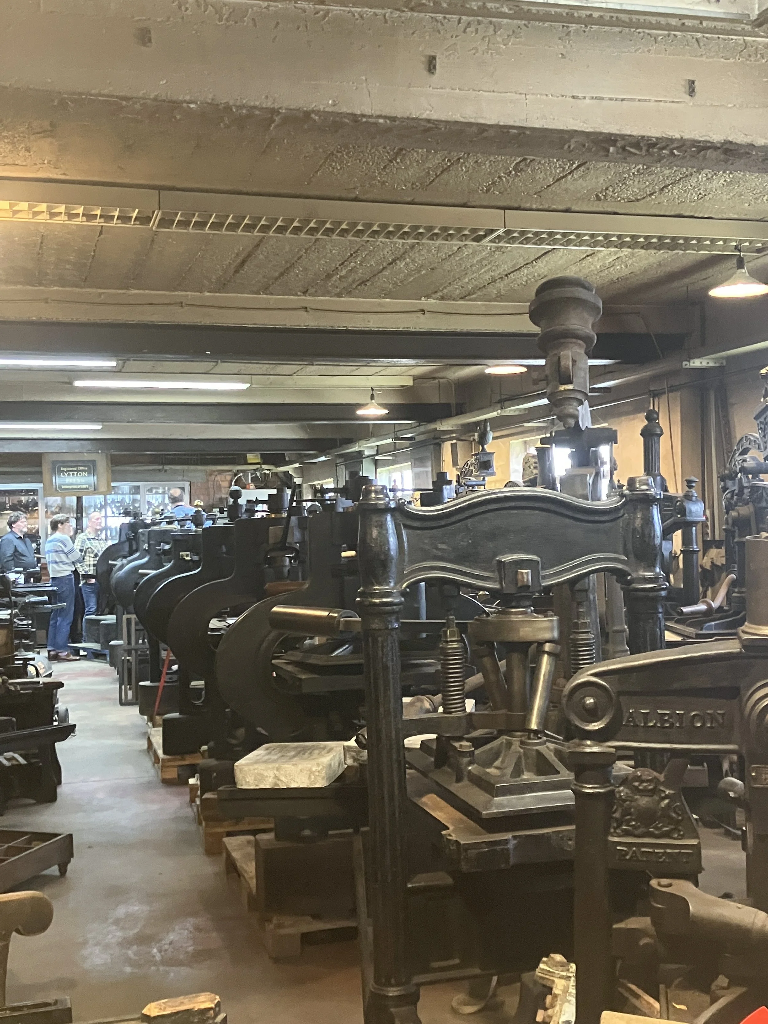
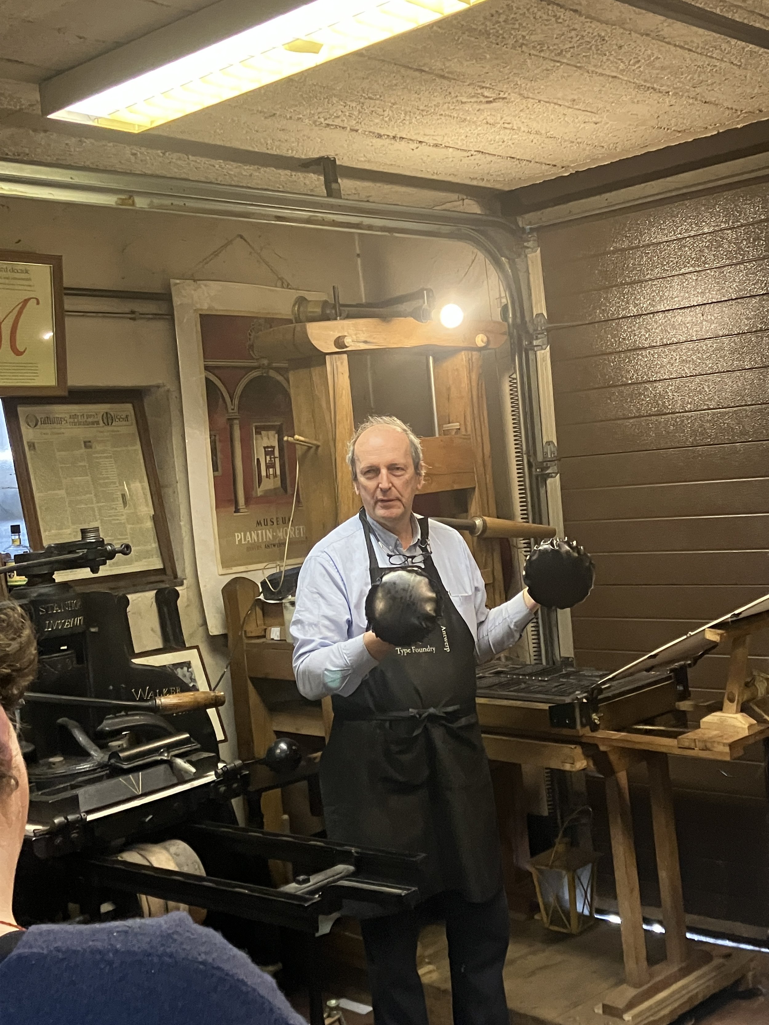


Our visit began in the room dedicated to hand presses, where Patrick introduced us to various models including the Stanhope, Albion, and Columbian. His detailed demonstrations highlighted the mechanical differences among them and illustrated the technological evolution that led to the rise of cylinder presses—spurred by the demand for larger paper formats and increased production speed. Even in the nineteenth century, the drive for efficiency was relentless. Using an impressively sized Albion press, we had the opportunity to print a section of text (eight pages imposed on a single sheet), experiencing firsthand the tactile rhythm of inking by hand and positioning the sheet on the tympan.

Among the many presses, one particularly charming tabletop model captured everyone’s imagination. Compact yet fully functional, it offered a romantic vision of letterpress at home—an appealing alternative to the logistical challenges of storing full-scale equipment.
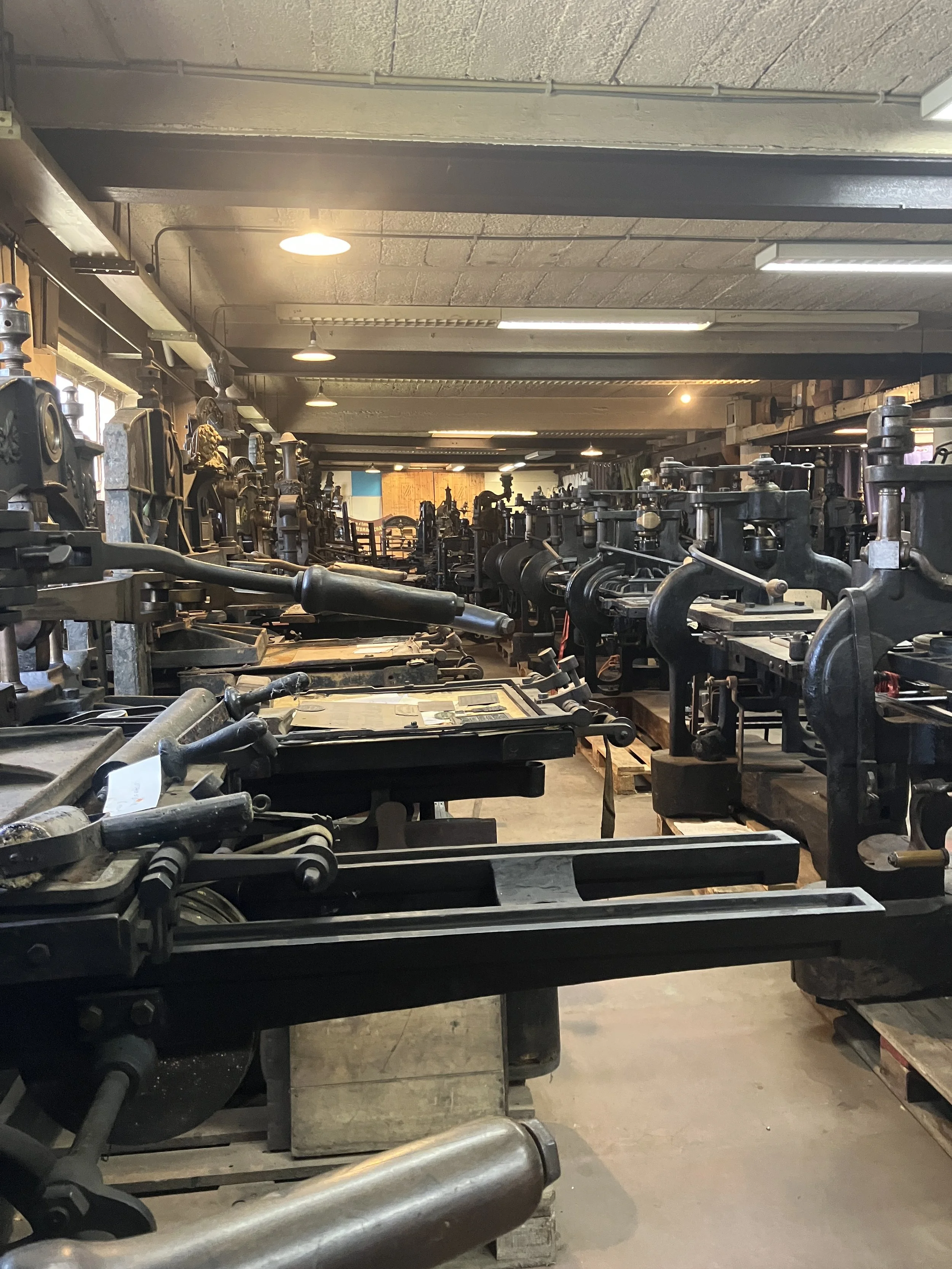
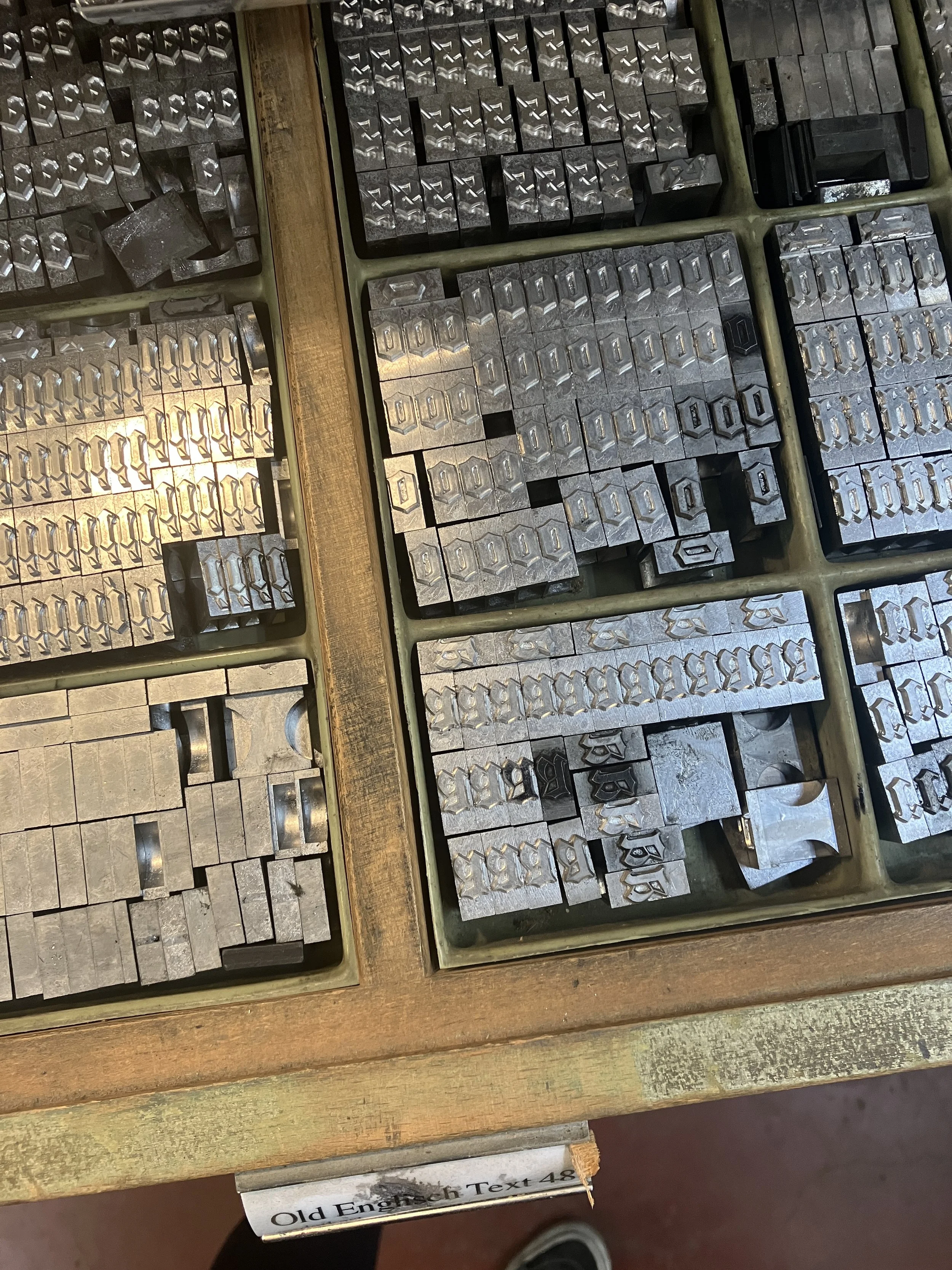
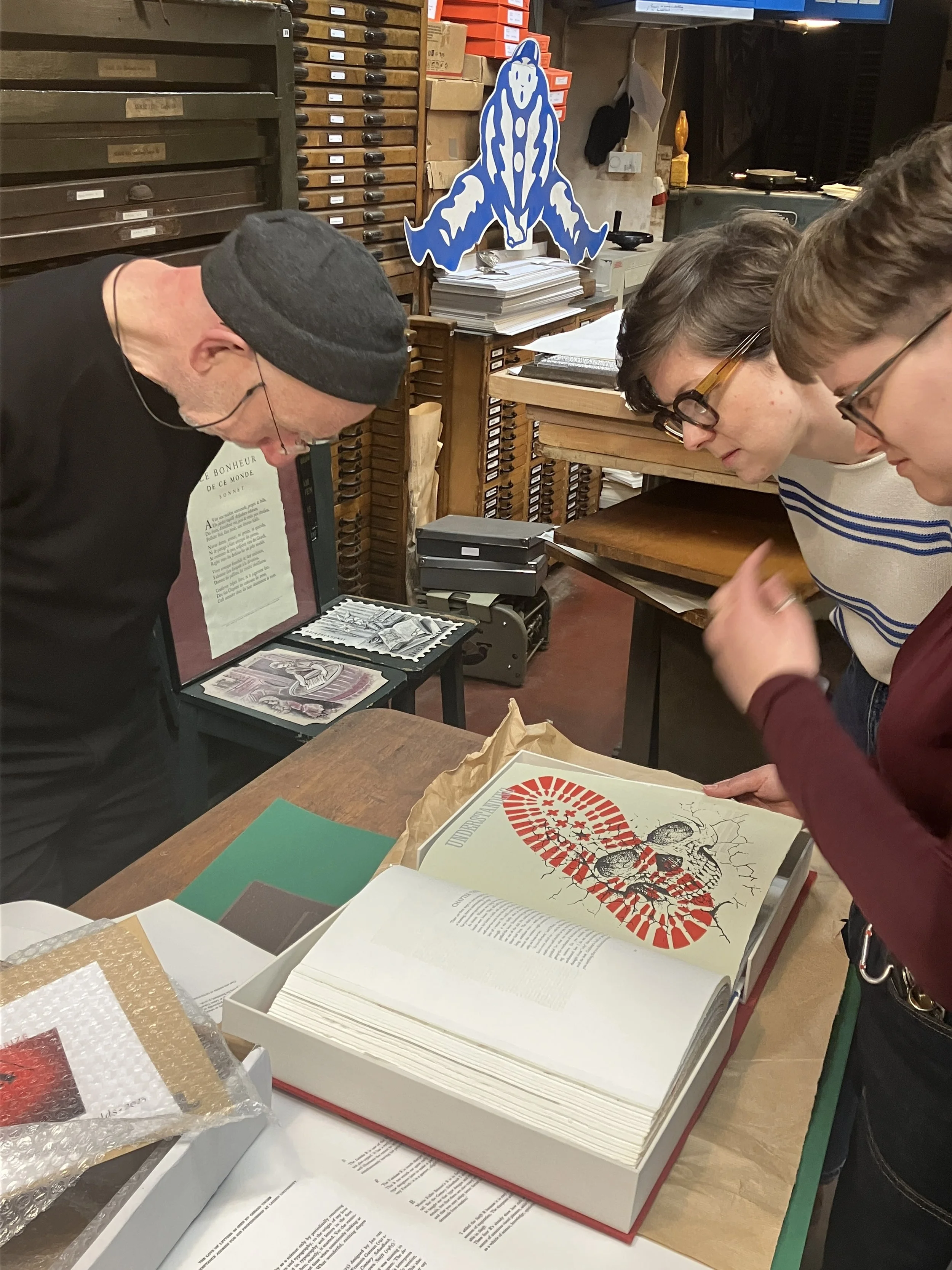
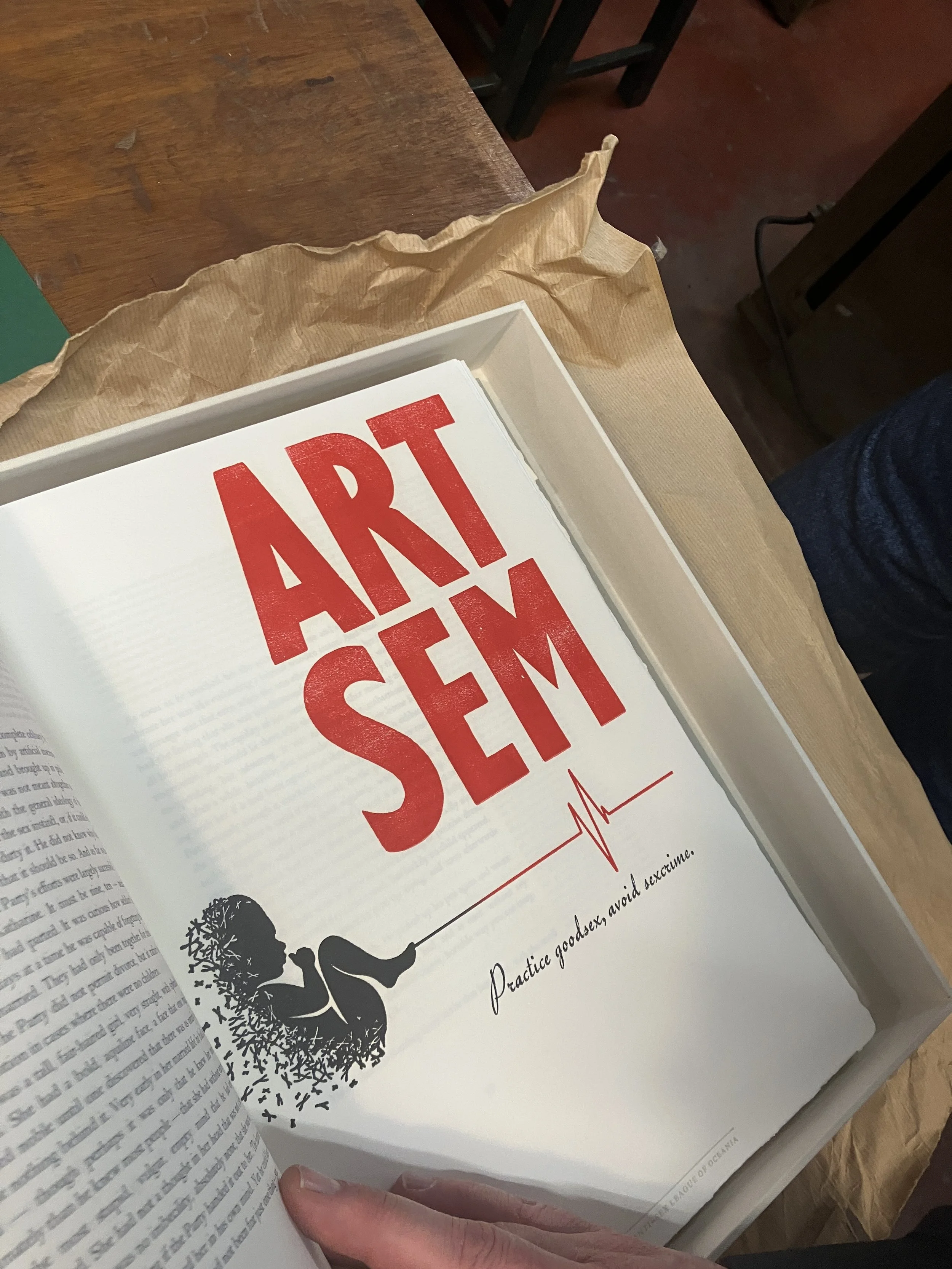
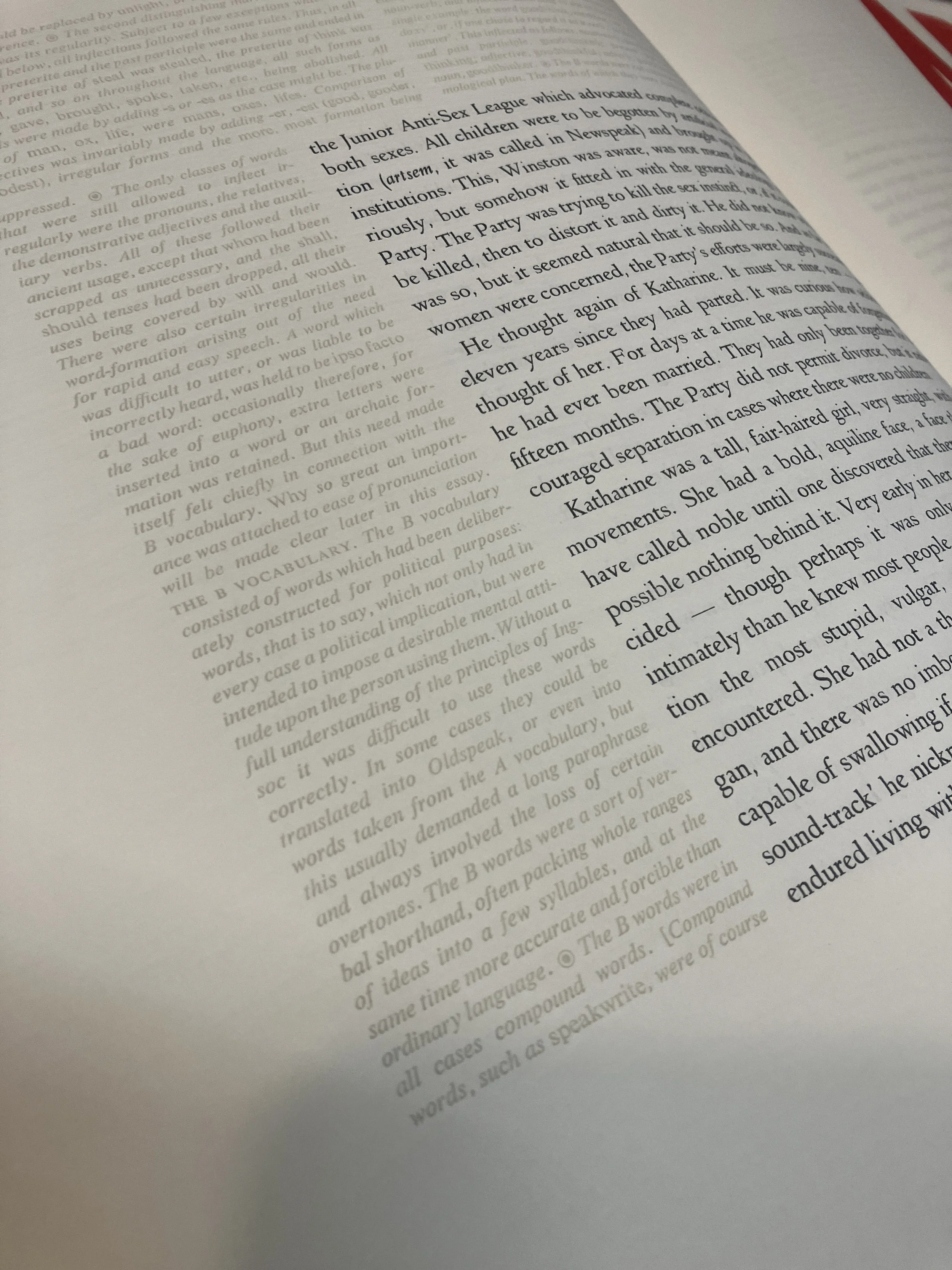
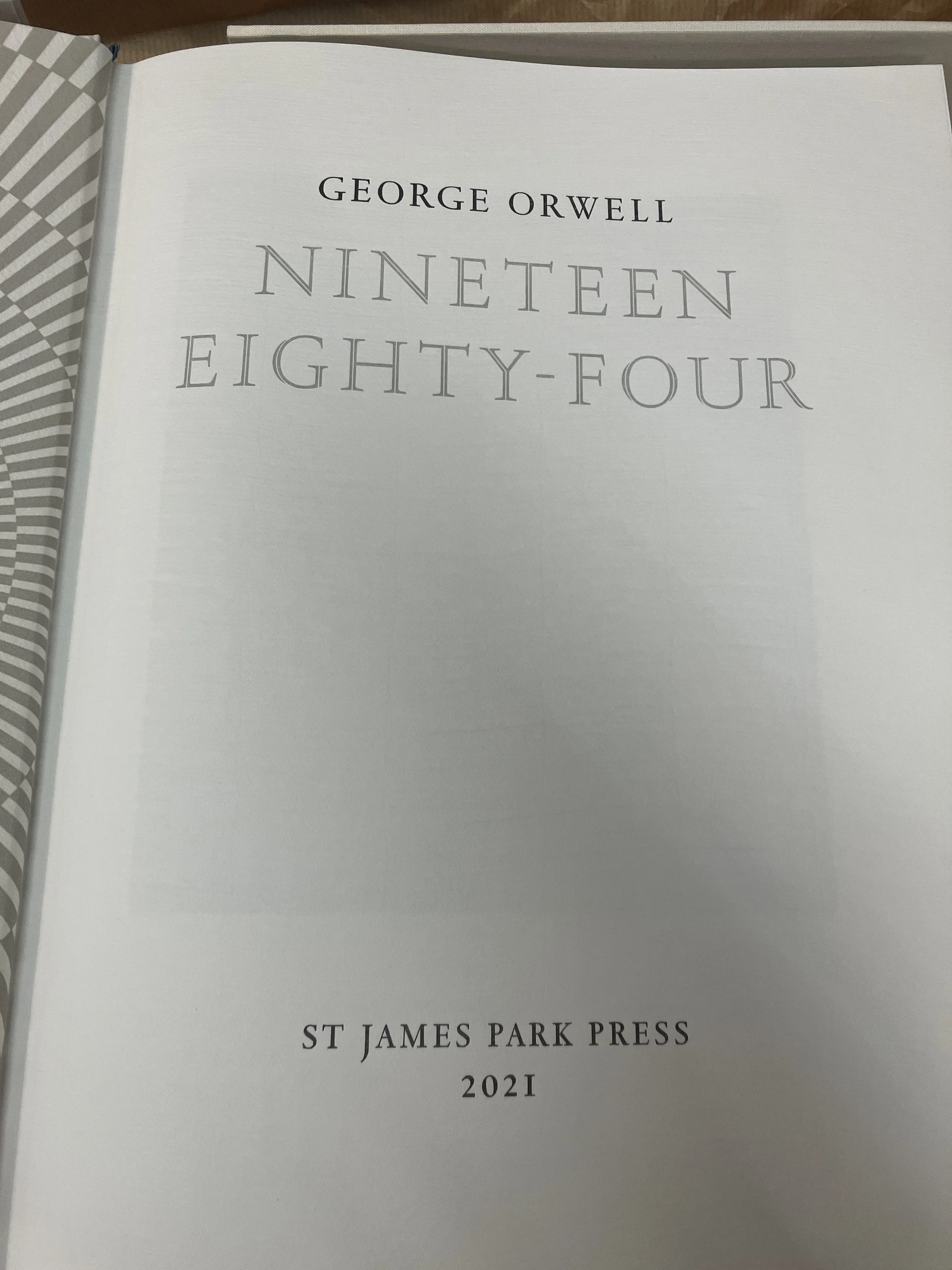
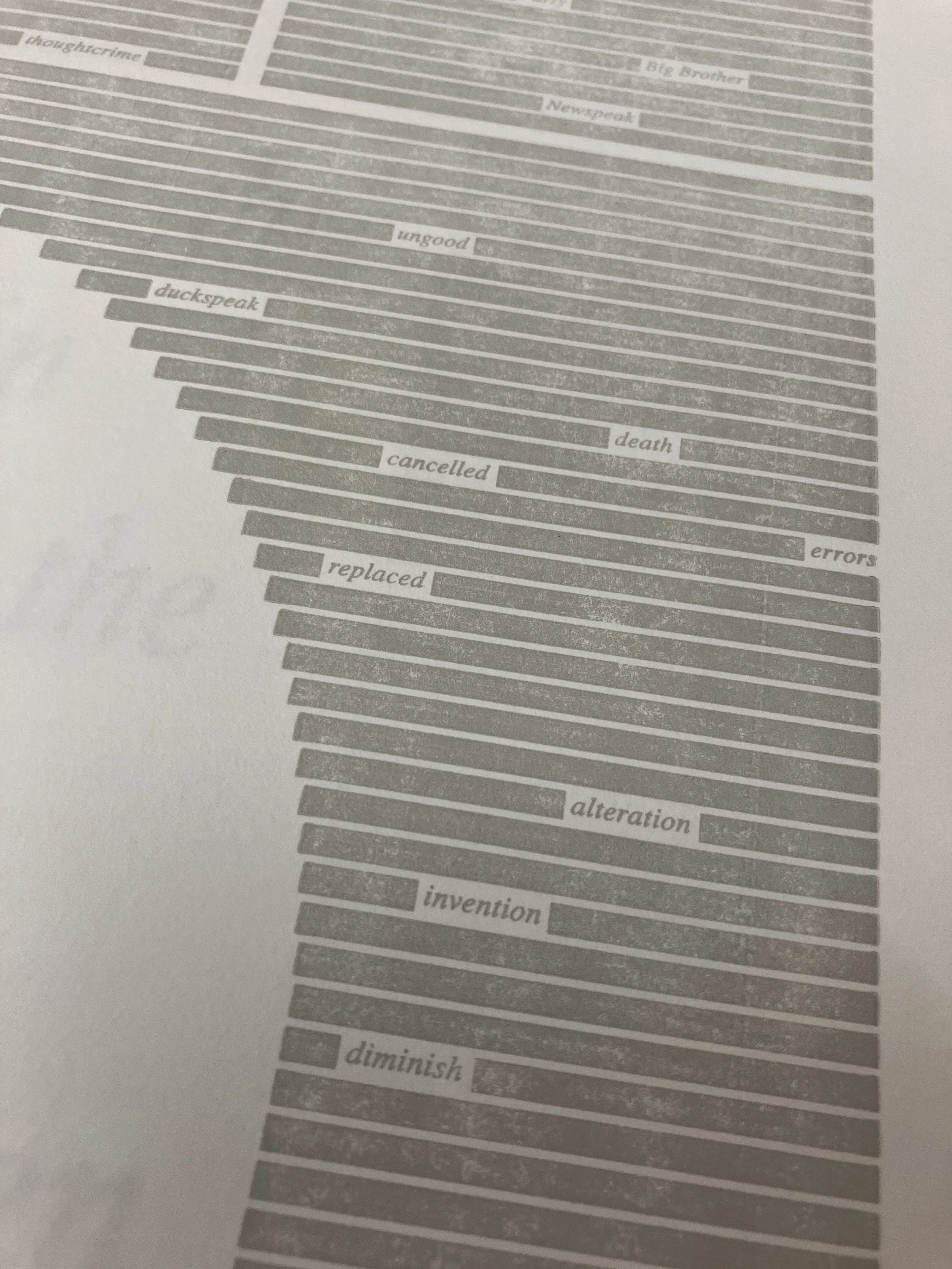
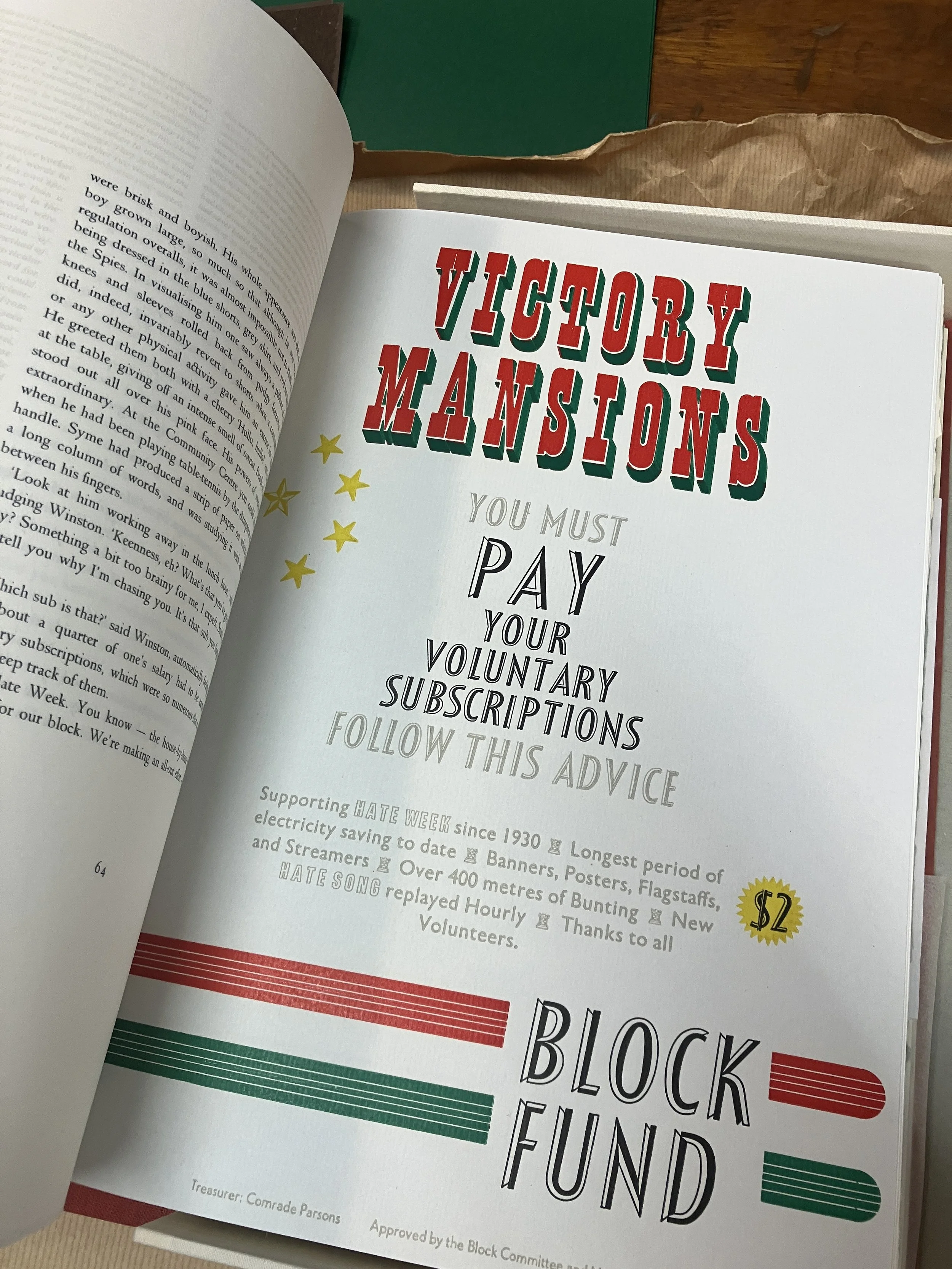
Our exploration continued into the area housing cylinder presses, including examples such as the Korex, Vandercook, and Heidelberg. Along the walls stood cabinets filled with metal type. Patrick shared with us some remarkable examples of contemporary letterpress craftsmanship, notably George Orwell’s Nineteen Eighty-Four, printed in 2021 by St James Park Press. This edition—printed on 120gsm Zerkall —features extra twenty-four sewn-in sheets of handmade paper, each bearing a letterpress illustration. The typographic palette is consisted from an extraordinary range of handset wood and metal type, including both foundry and Monotype faces. The craftsmanship, conceptual integrity and typographic sophistication of this volume left us speechless.
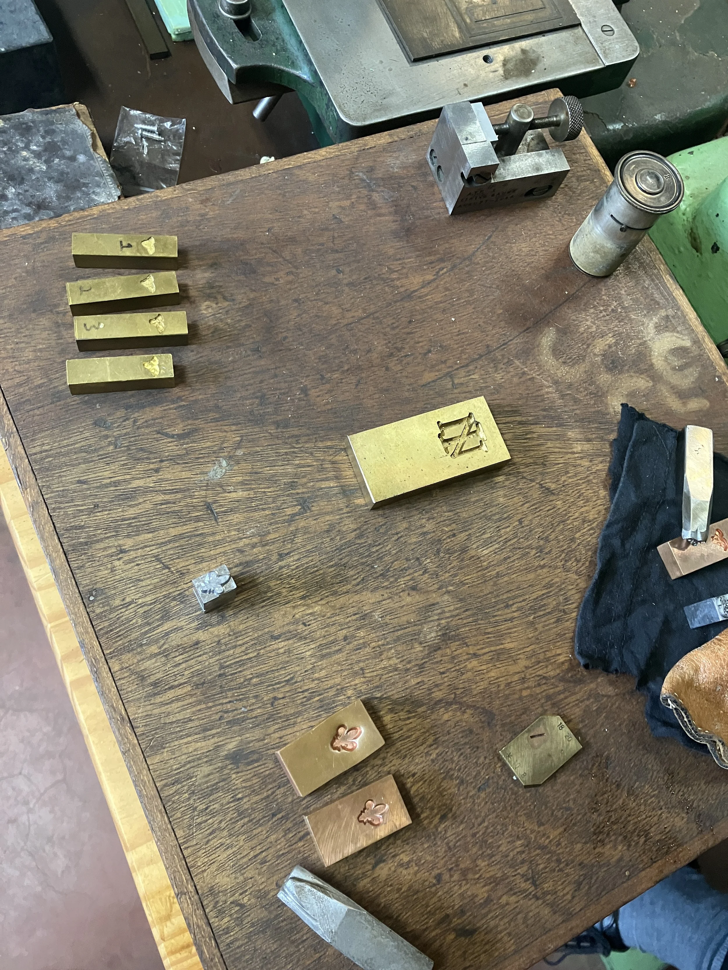
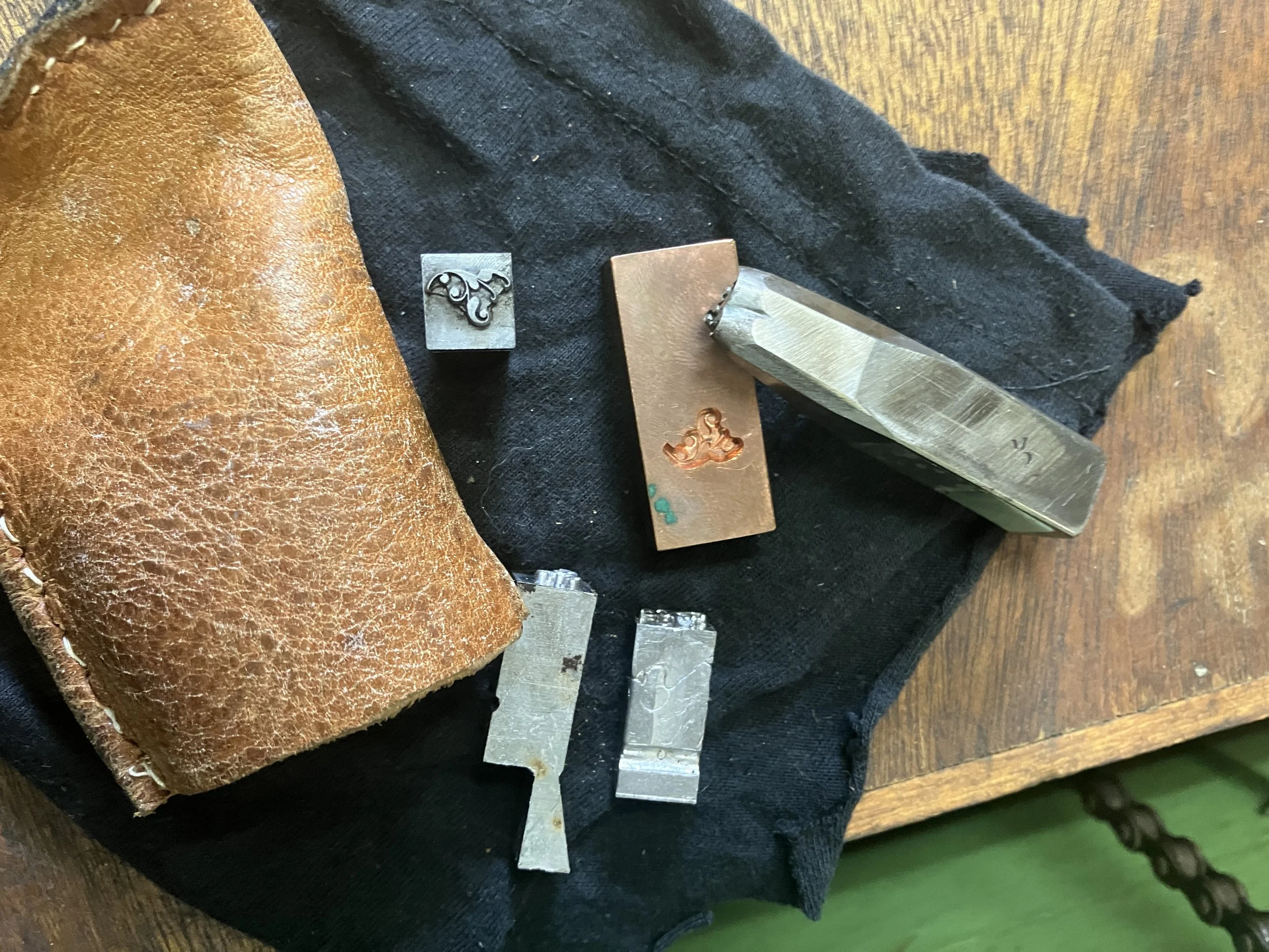
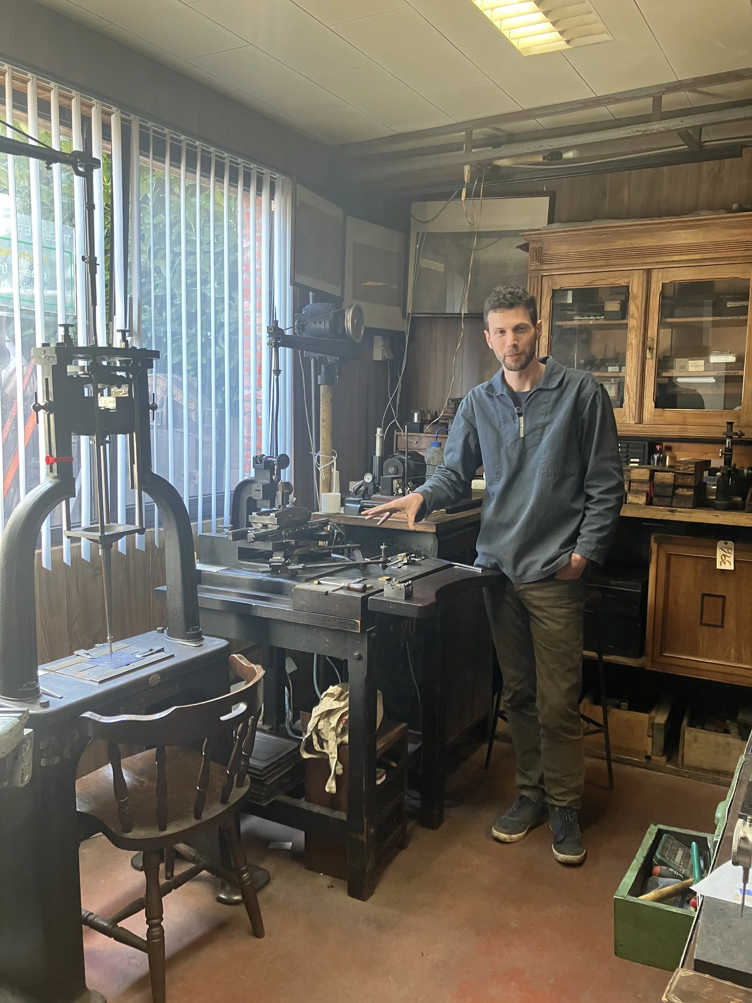
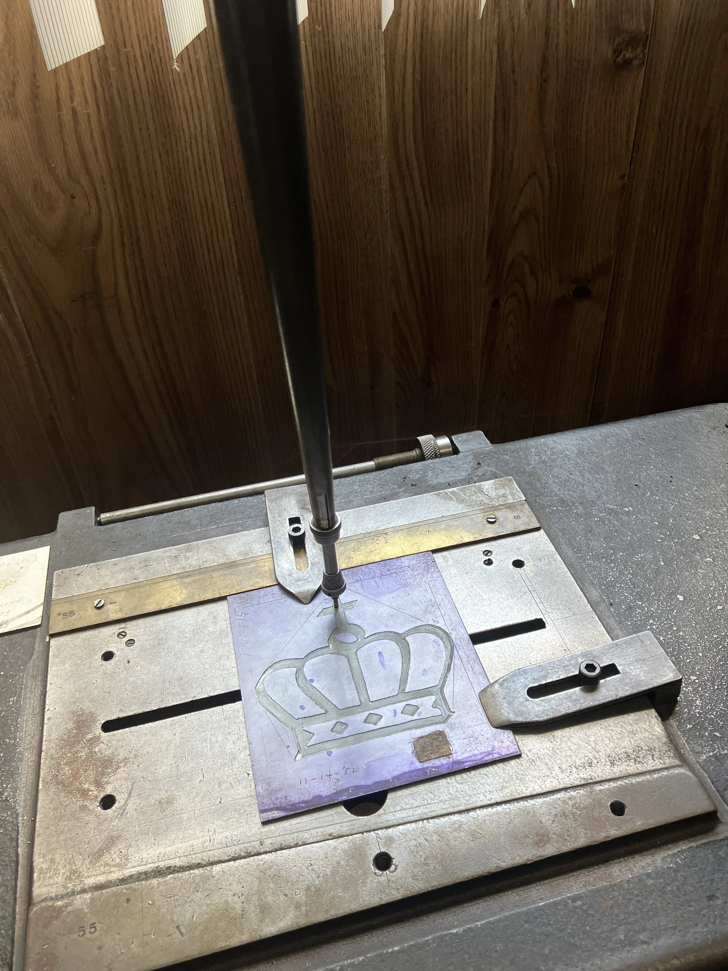


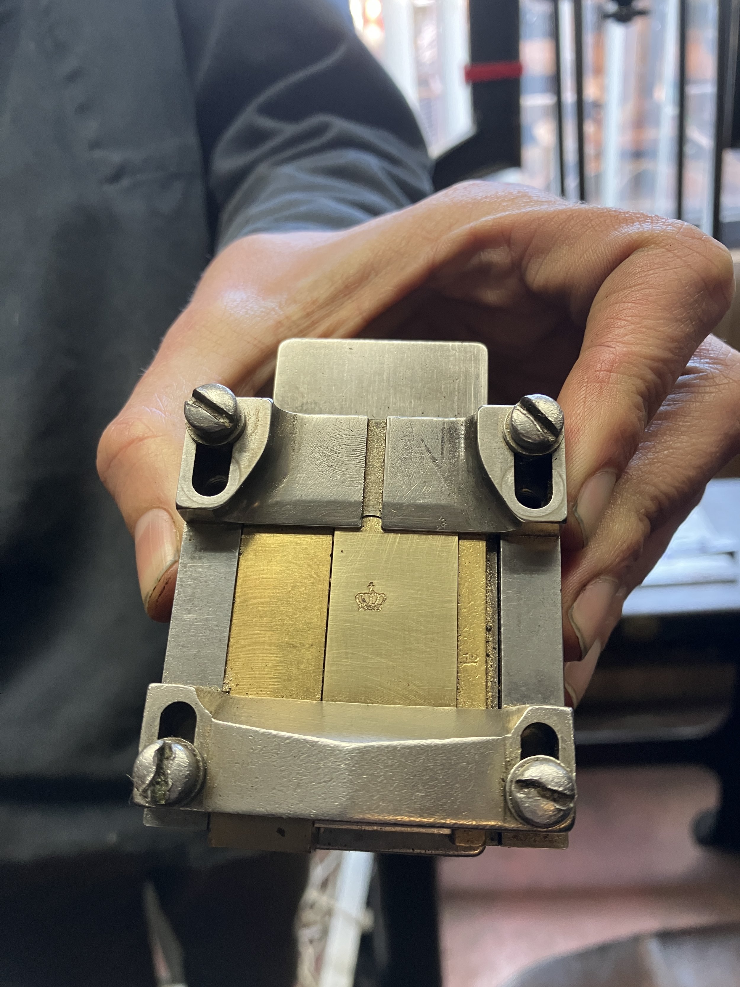
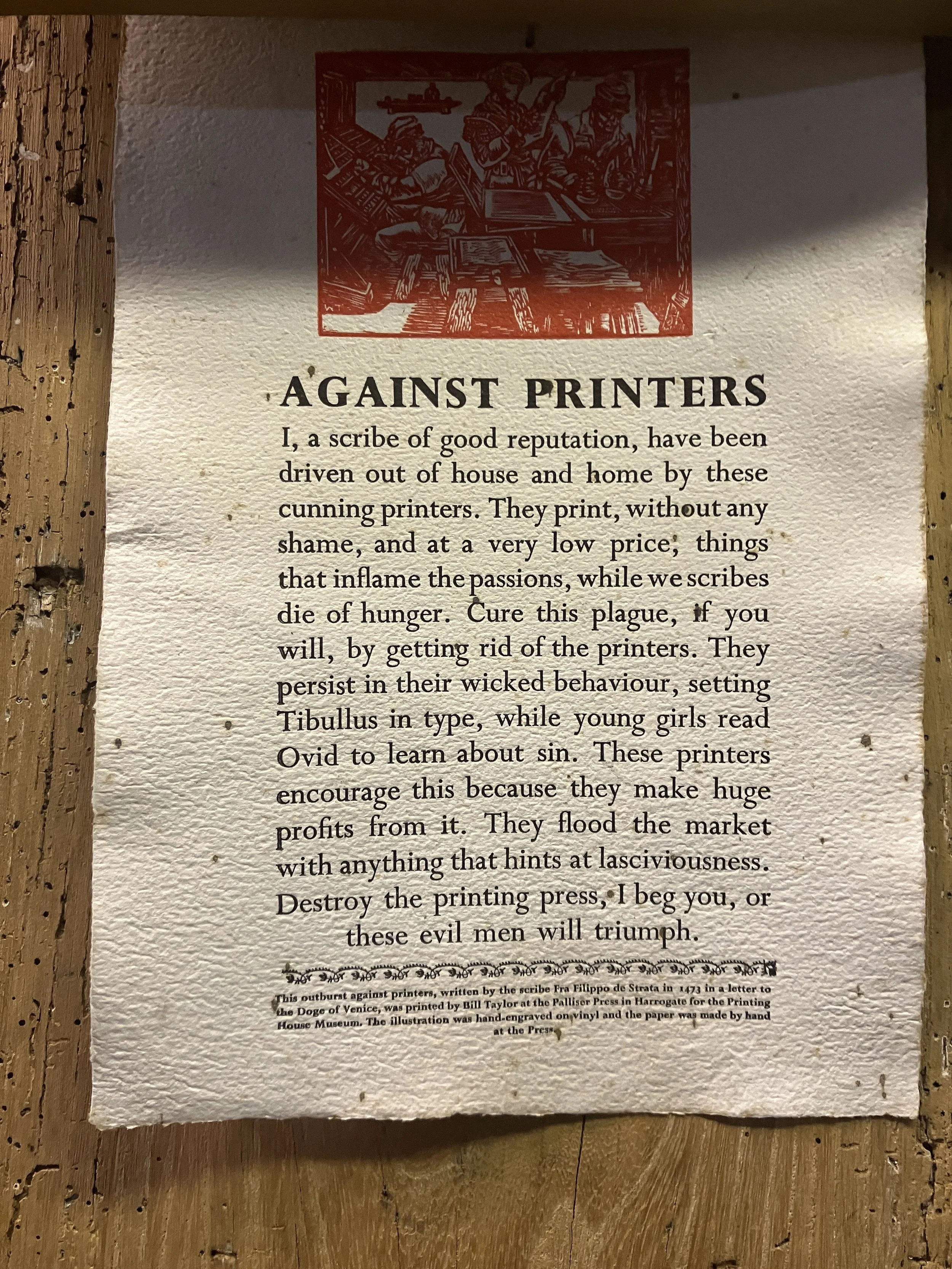
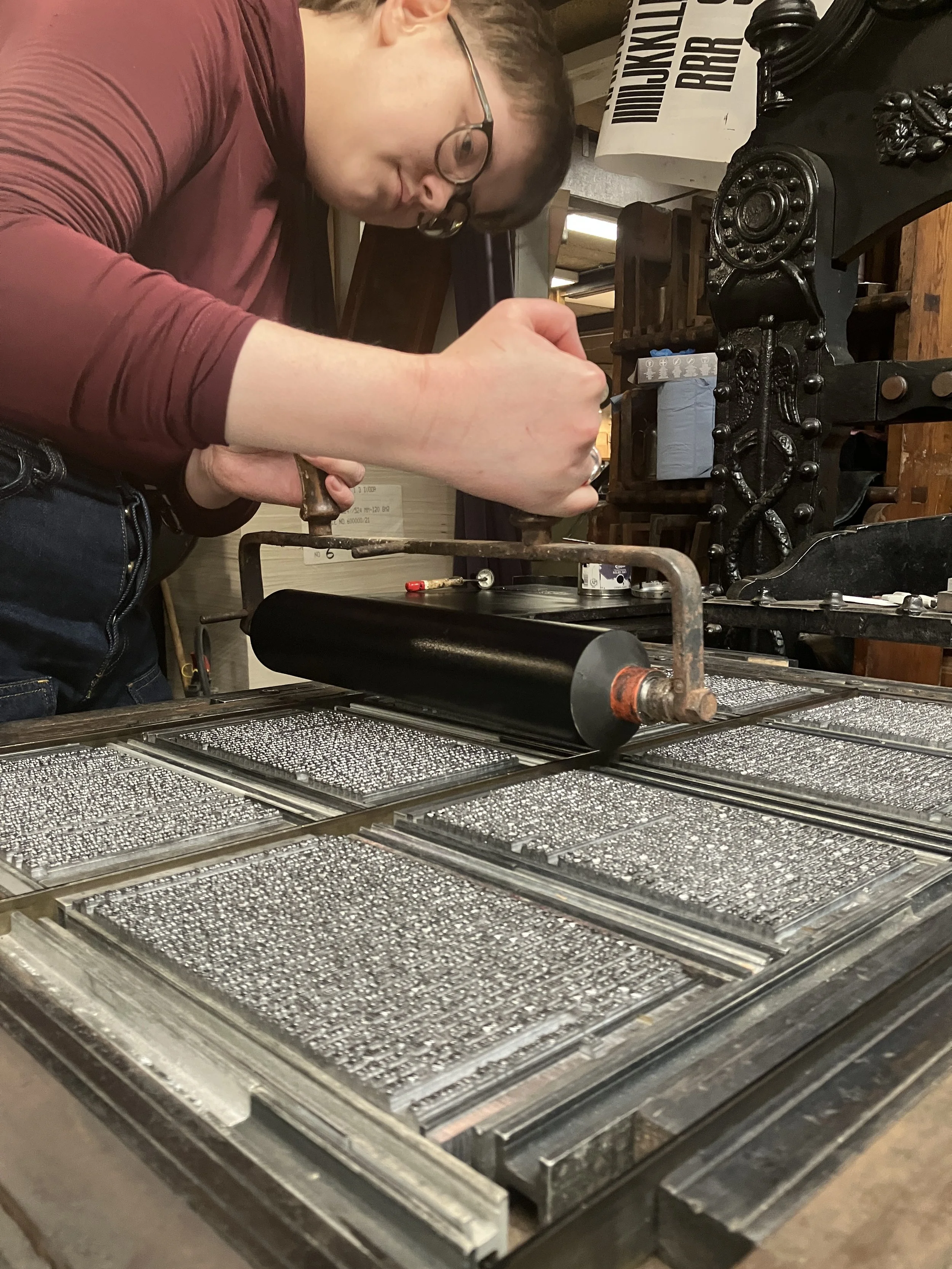
Following a break for coffee and sweets kindly provided by Patrick, we proceeded to one of the highlights of the collection: the Benton engraver. Under the guidance of Yuri, we were introduced to the complex and meticulous process of matrix engraving—a critical step in the creation of metal type. The level of precision required quickly became evident, deepening our appreciation of type production. For those interested in this topic, I would recommend revisiting Patrick’s presentation from the 2018 ATypI conference in Antwerp, where he explores the impact of technologies such as electrotyping and mechanical engraving on nineteenth-century type design and production.
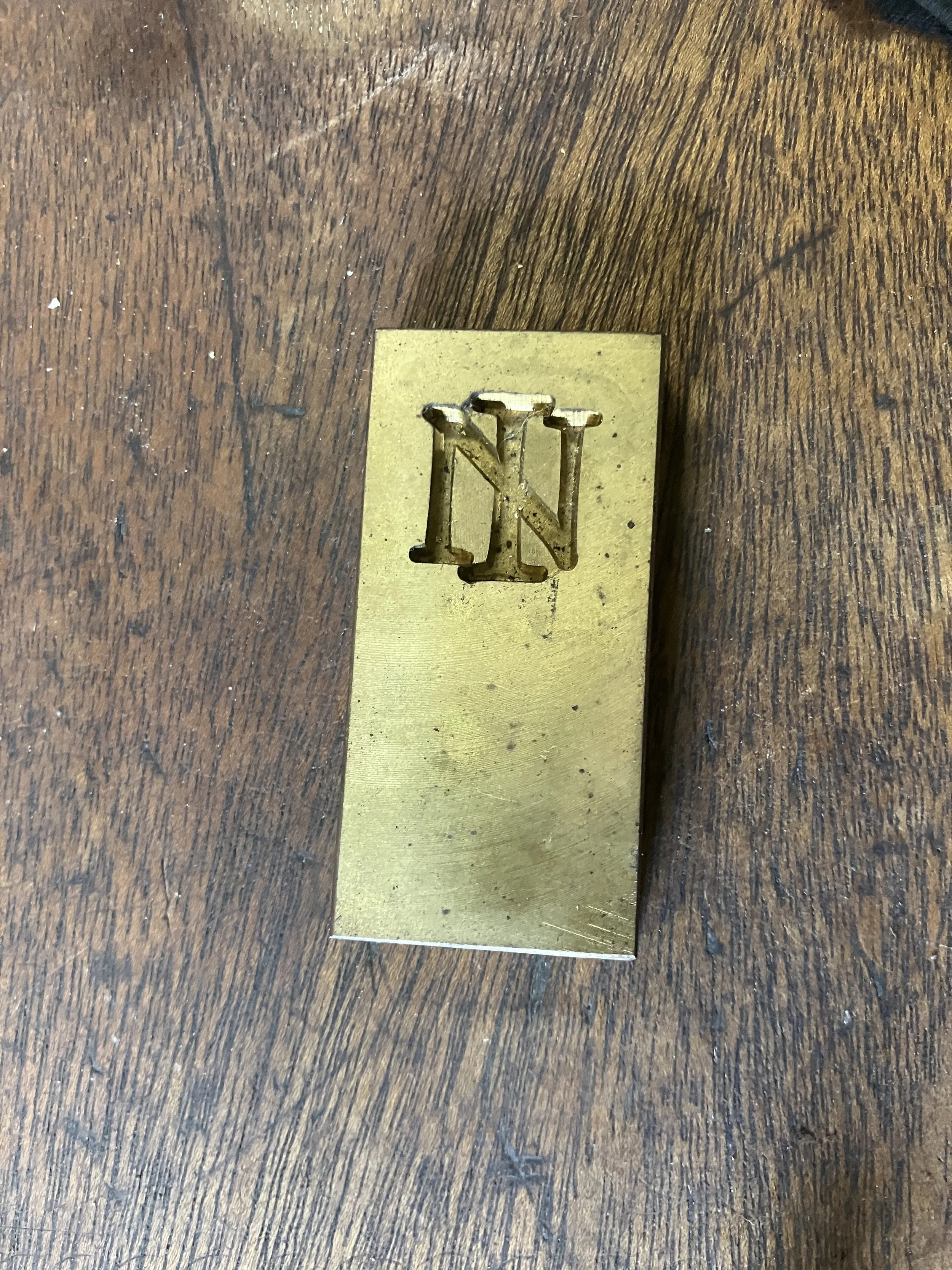
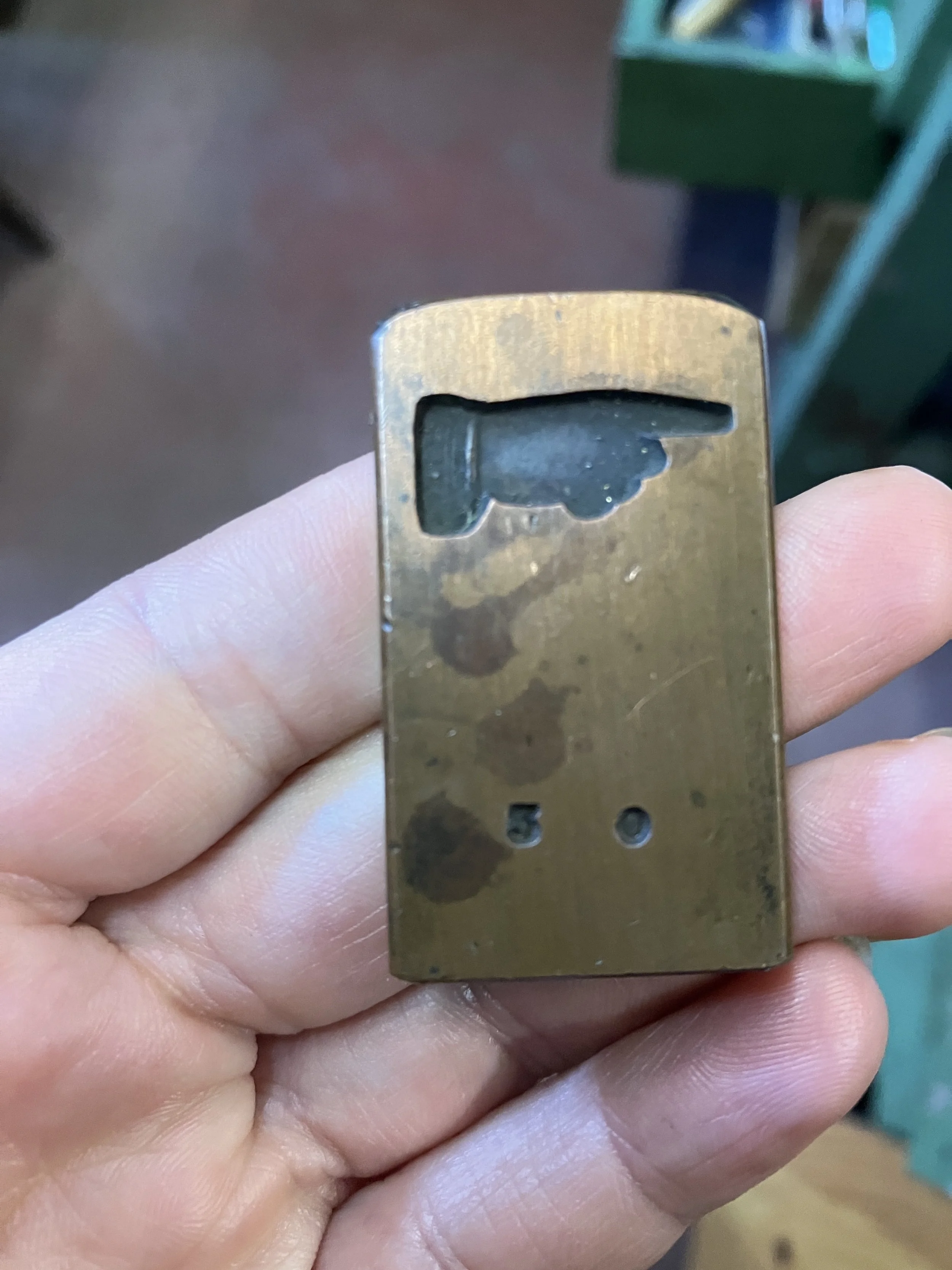
The final space we explored was the typecasting room, home to an impressive collection of machines dedicated to the art and engineering of hot metal typesetting. Patrick introduced us to the fundamental principles of the process: casting individual letters by pouring molten metal into brass moulds known as matrices. Particular attention was given to the Monotype caster, where Patrick demonstrated the casting of single characters—each produced with precision and remarkable speed using a high-performance, water-cooled mould. Unlike line-casting systems such as Linotype, Monotype composition relies on individual matrices for each character, allowing for greater typographic flexibility while requiring a more intricate mechanical setup. As with so many aspects of traditional printing, the process reflects a deep interconnection between craftsmanship, engineering, and typographic design.
We had an unforgettable day and are truly grateful to Patrick for welcoming us so warmly and spending the entire day guiding us through his remarkable collection. It was a rare opportunity to see such an extensive archive of printing history up close.
more pictures en videos here
you might also like
Lang leve de zwarte kunst | Jaaropleiding Letterzetten 2026-2027
Long live the Black Arts / Visiting the National Playing Card Museum in Turnhout
Long live the Black Arts / Visiting Hendrik Conscience Heritage Library and Museum Plantin-Moretus in Antwerp
Long live the Black Arts / One-year course typesetting 2024-2025. The beginnings. Atelier t.
Letterpress learning programme 2023. Atelier t.
3 days of printing fun or making posters at the Atelier t.
Three-day workshop for Kalamazoo Book Art Center students at the Museum of Industry
Gentse Feesten 2024 or “De boere-kermis”.
AEPM annual conference 2024. Printing museums and the Art of Survival.
TYPA, Tartu (EE). 23-25.05.2024.