
Letters are everywhere—from newspaper headlines to road signs, from posters shouting cheerfully to the letter that addresses you sternly. With bold strokes, flowing curves, or sharp angles, the choice of type strengthens the message. Typography often goes unnoticed, yet it is a unique art form where craftsmanship and creativity meet. Reason enough for the Industriemuseum to dedicate an exhibition to it.
THE POWER OF TYPOGRAPHY
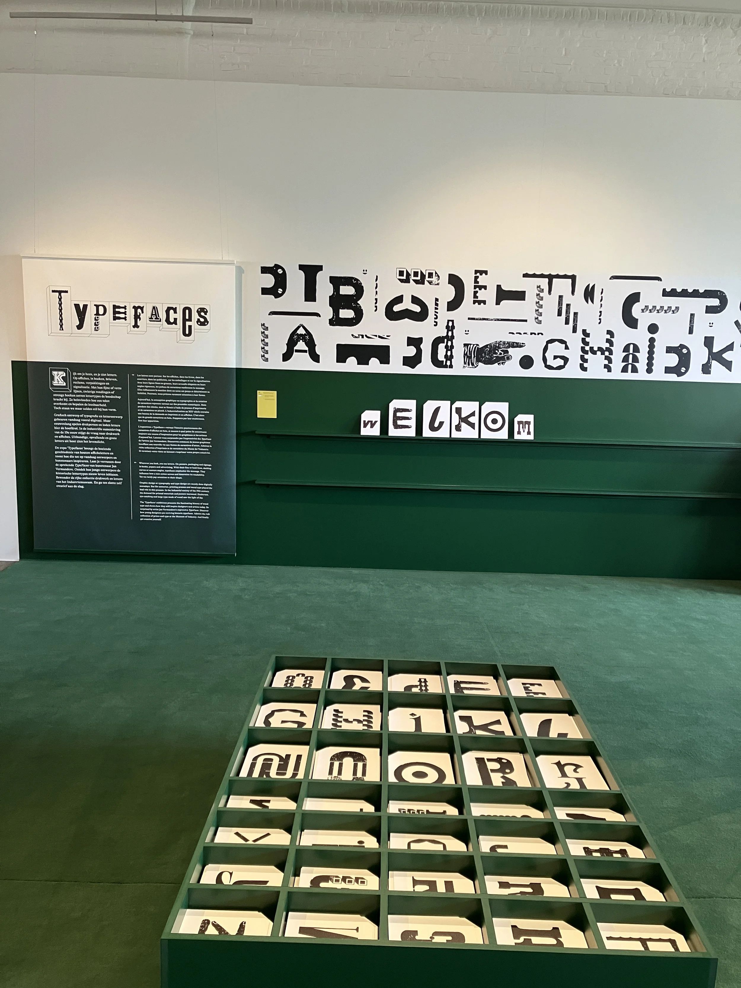
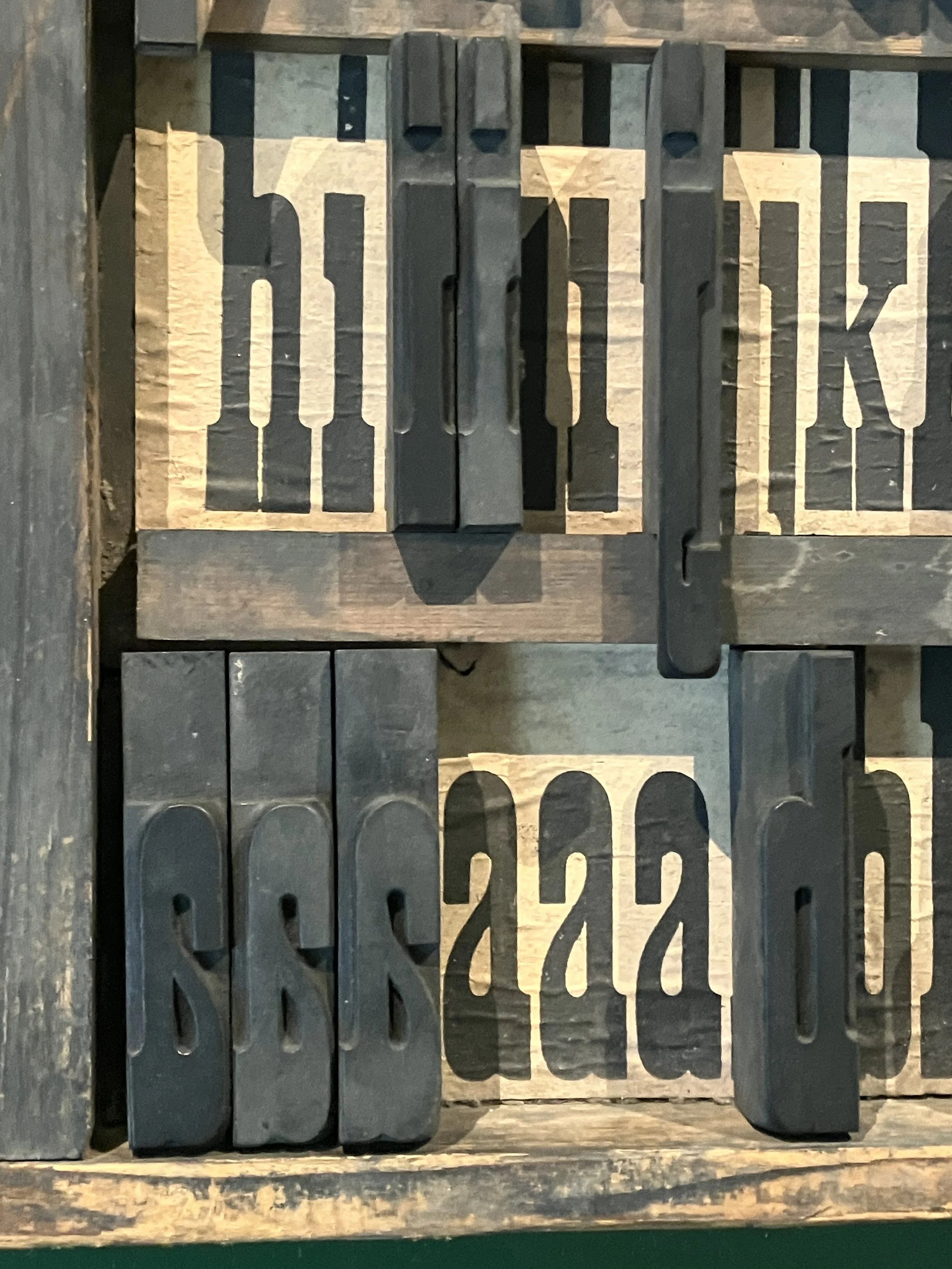
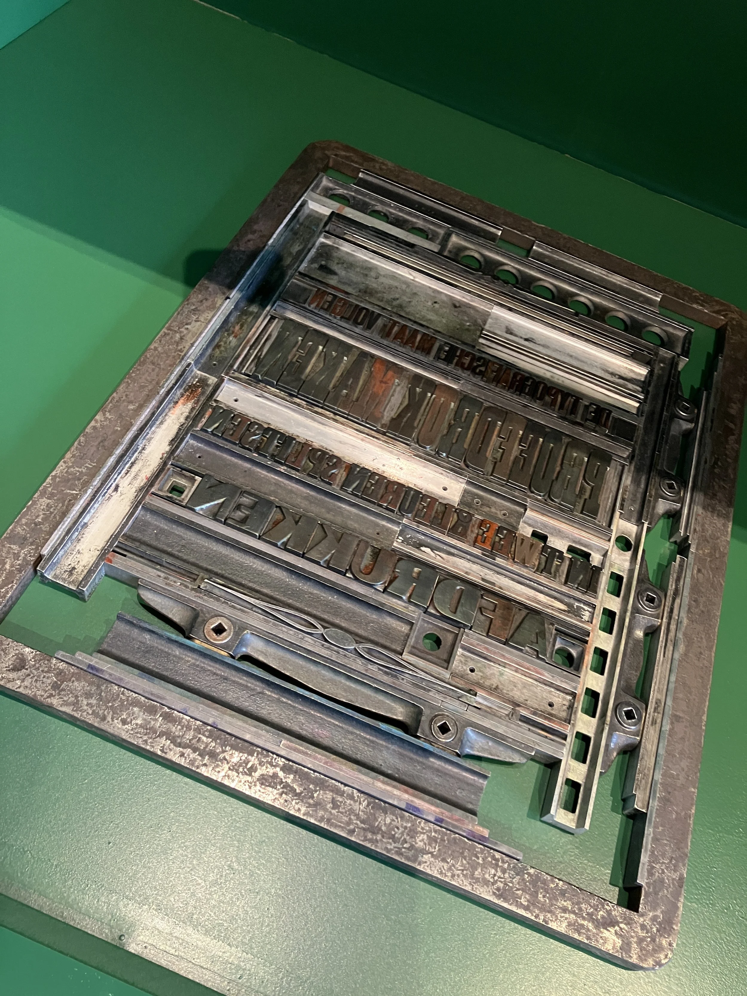
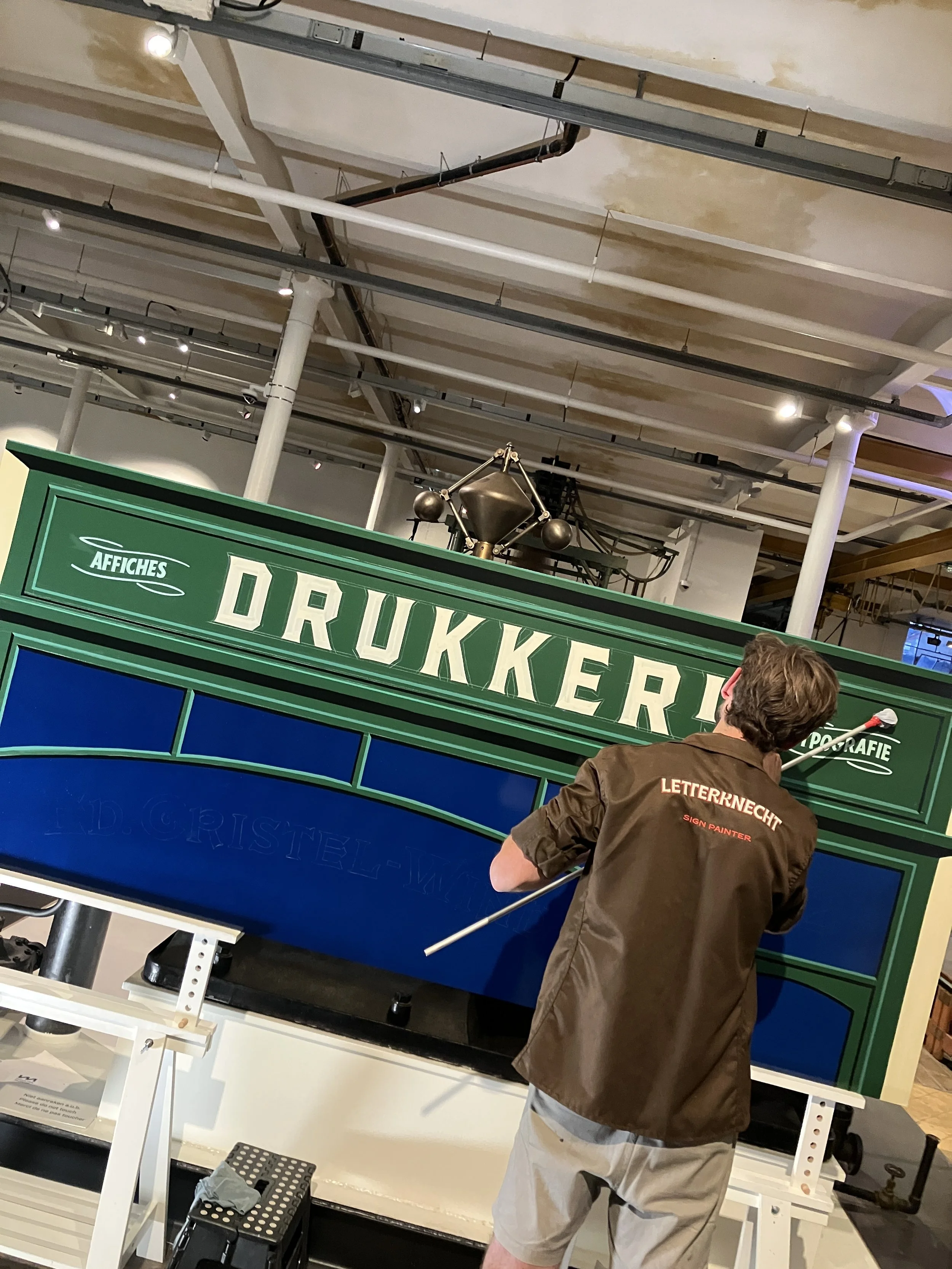
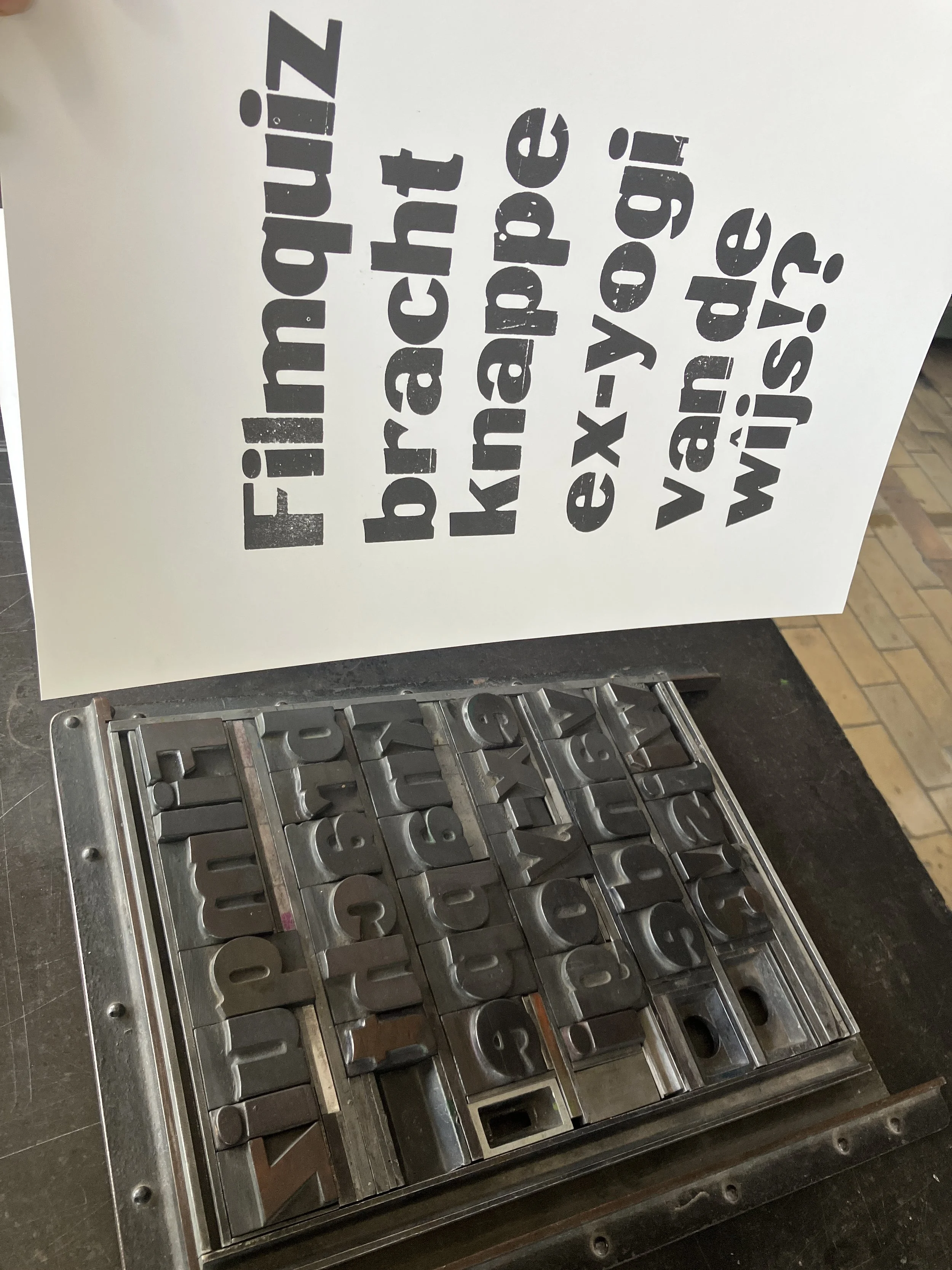
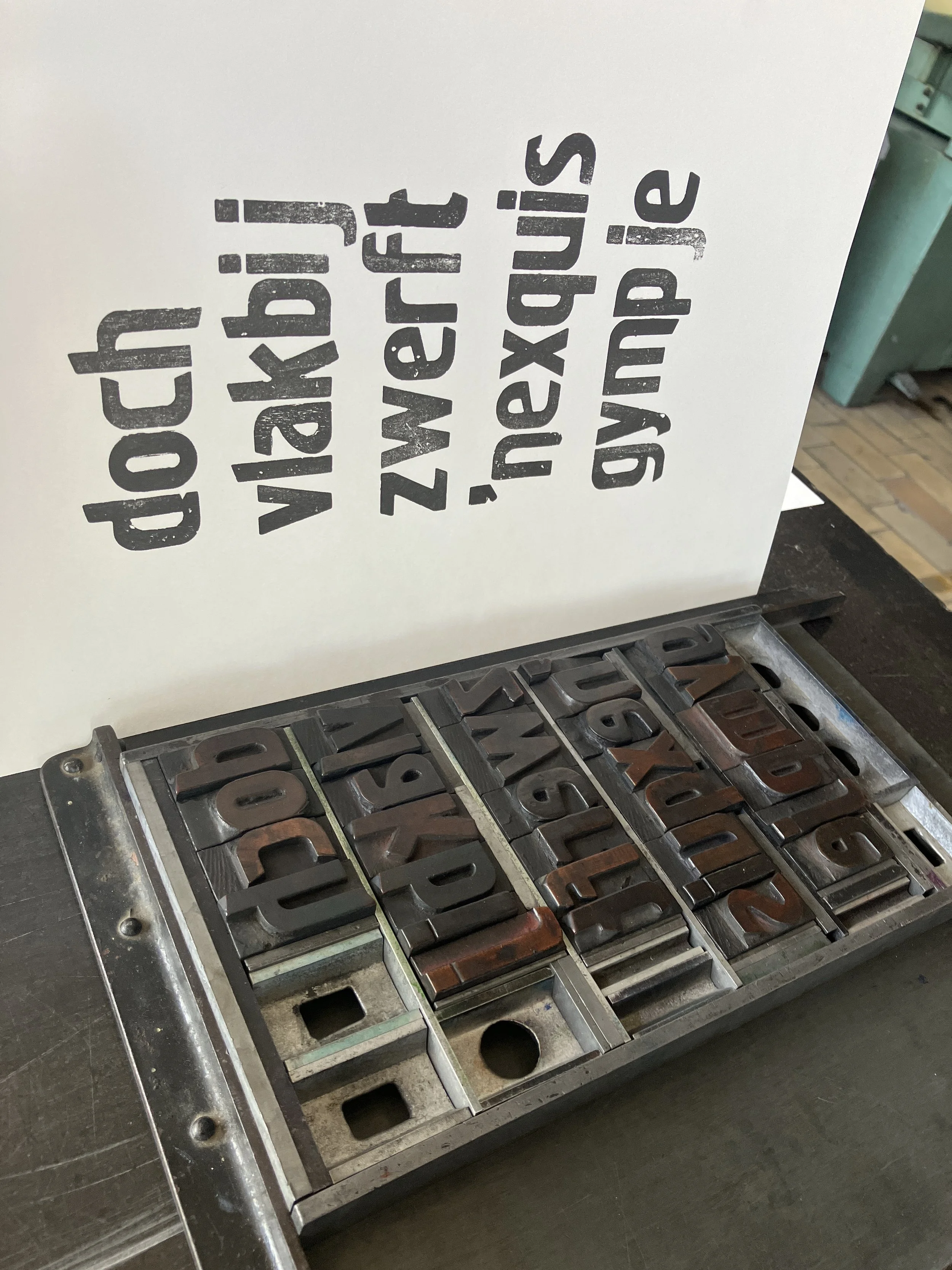
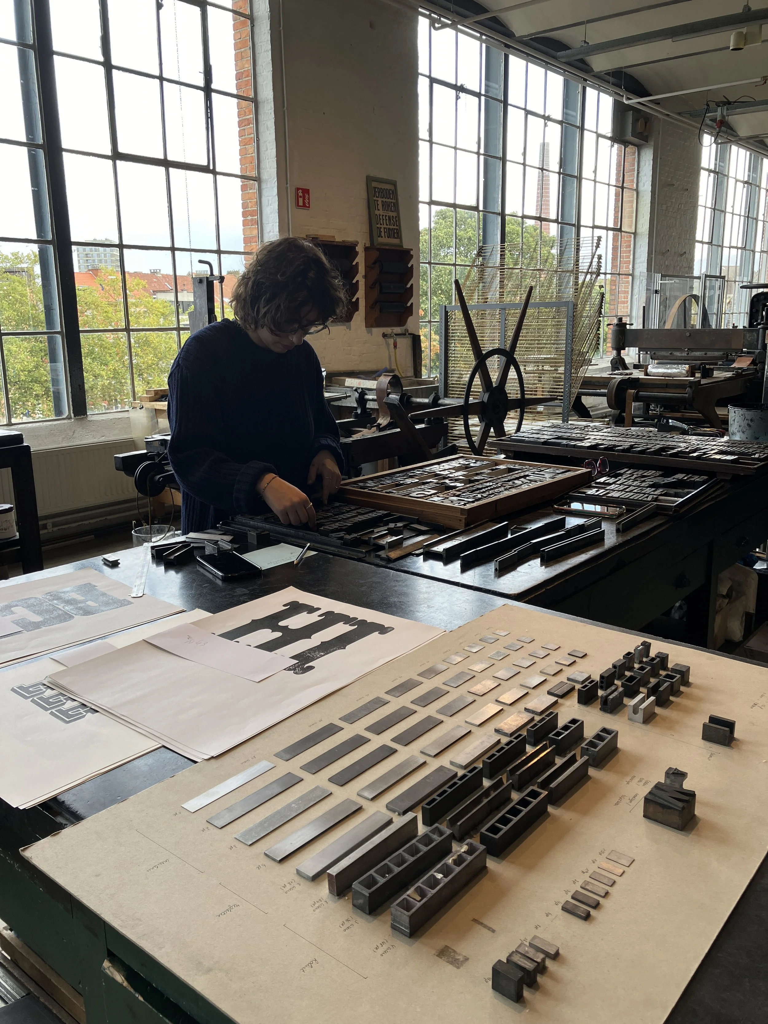
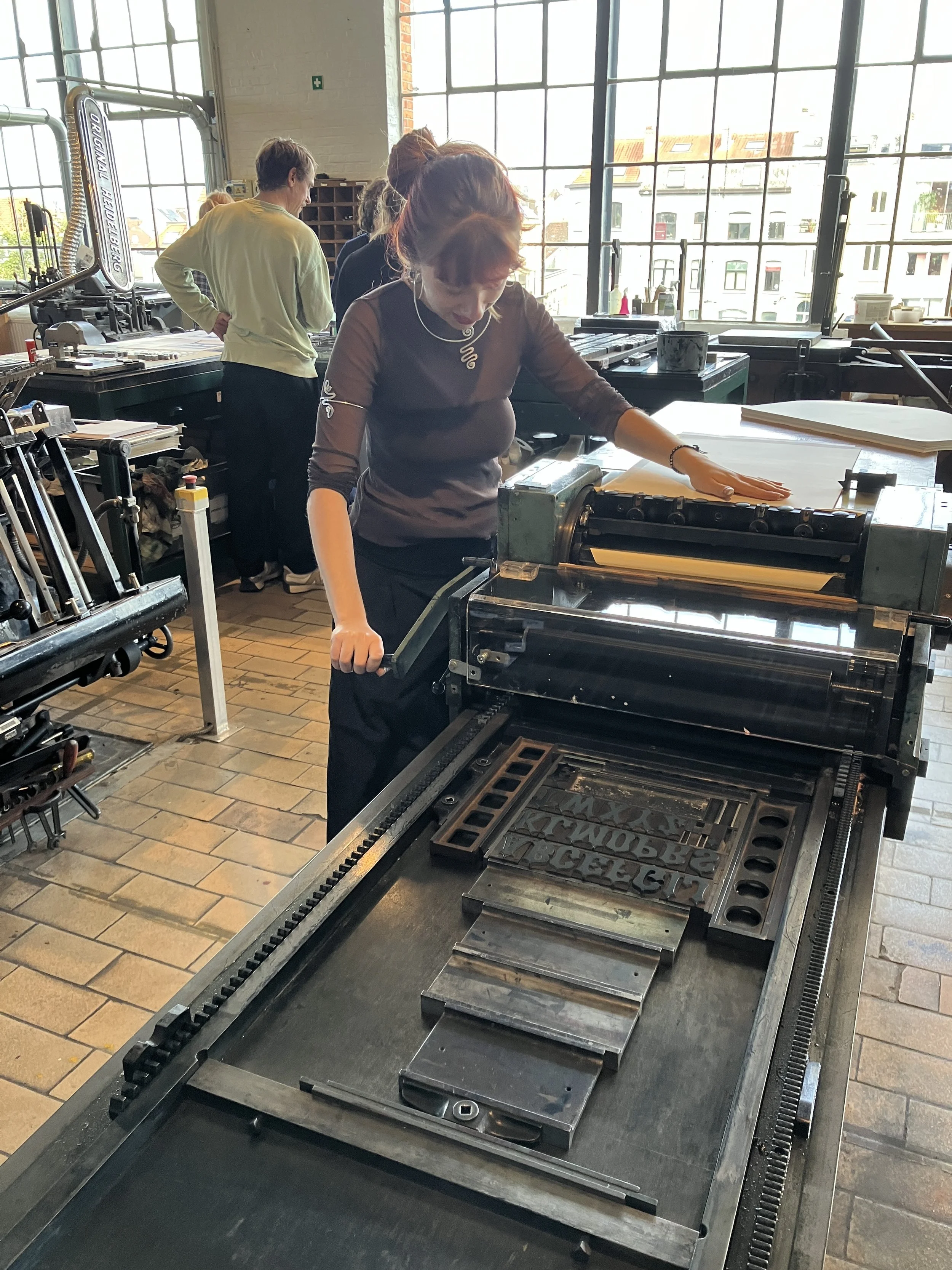
Today, letters are created digitally, but well into the 20th century they were made physically for printing. Wood display type is among the most striking and expressive examples. The exhibition Typefaces evokes the atmosphere of a print shop and showcases the fascinating history of wooden letters since the 19th century. Through unique wood type, historical printed matter, an interactive making space, and contemporary projects, you discover the power and versatility of typography.
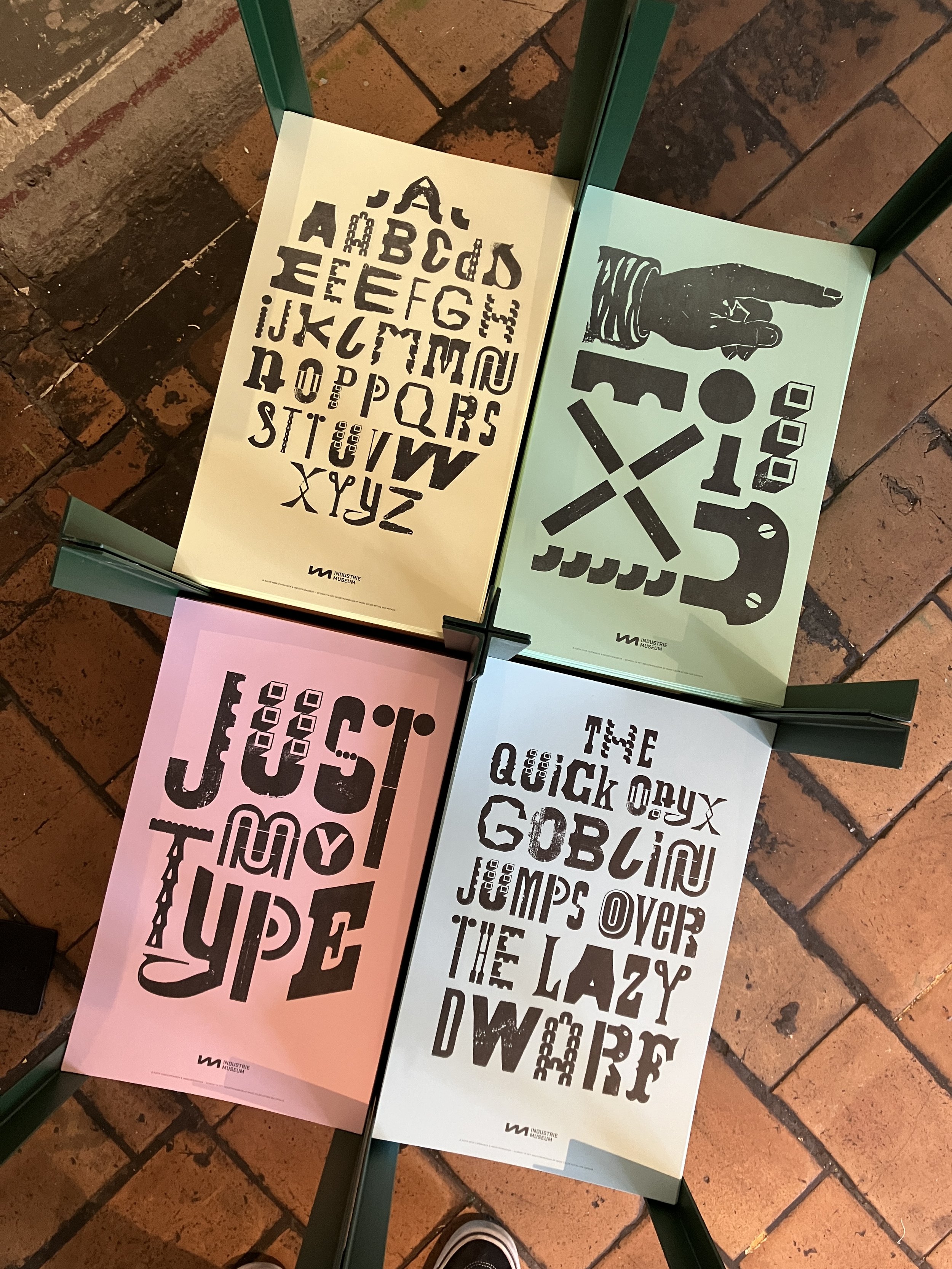

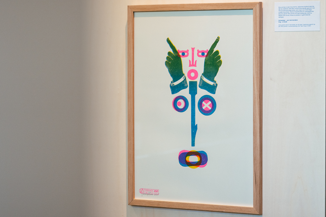
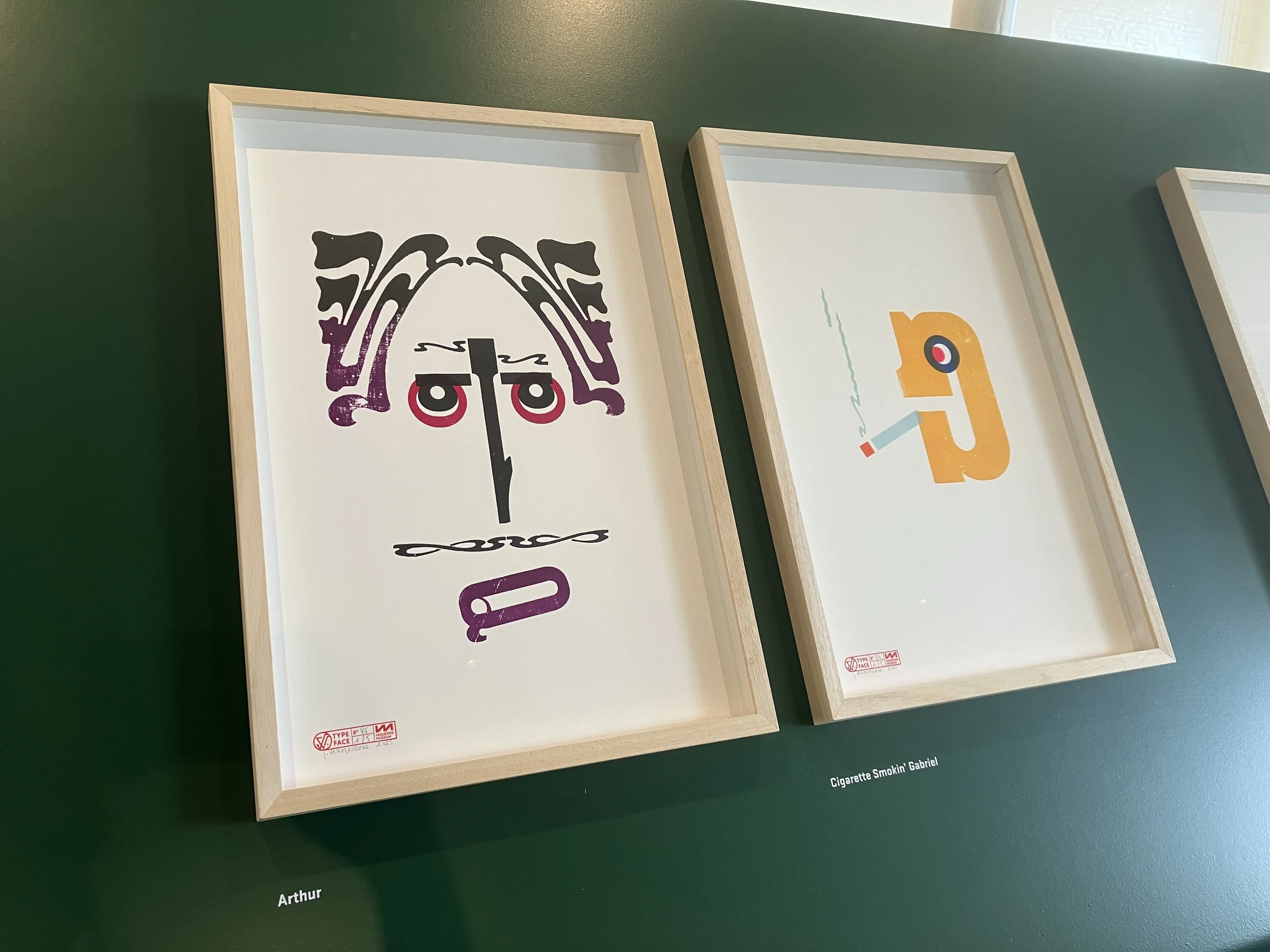
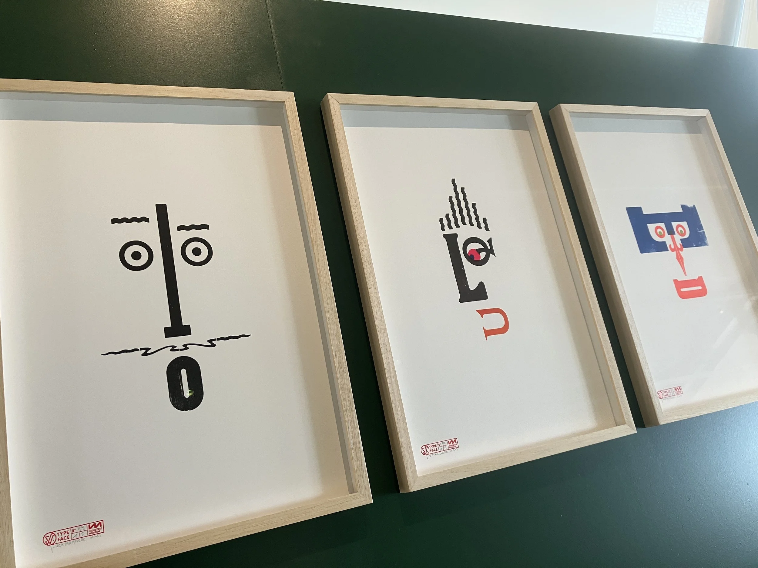
One of the four posters, printed by Jan on the RISO in collaboration with Topo Copy, is available in the museum shop.
TYPEFACES
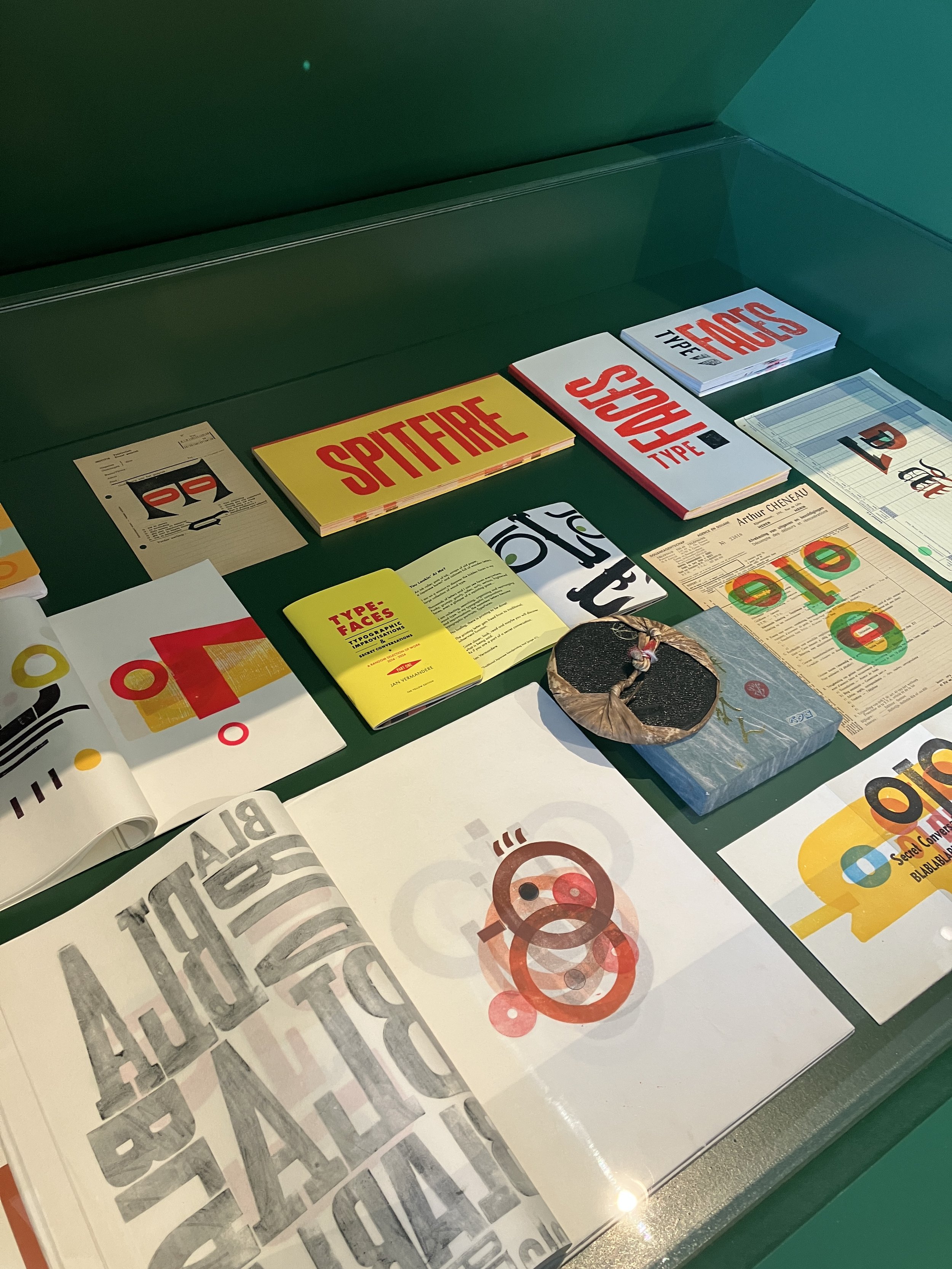
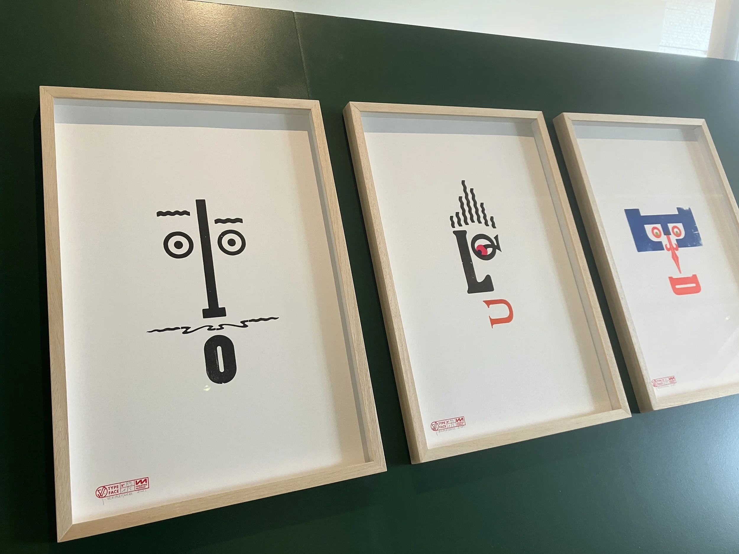
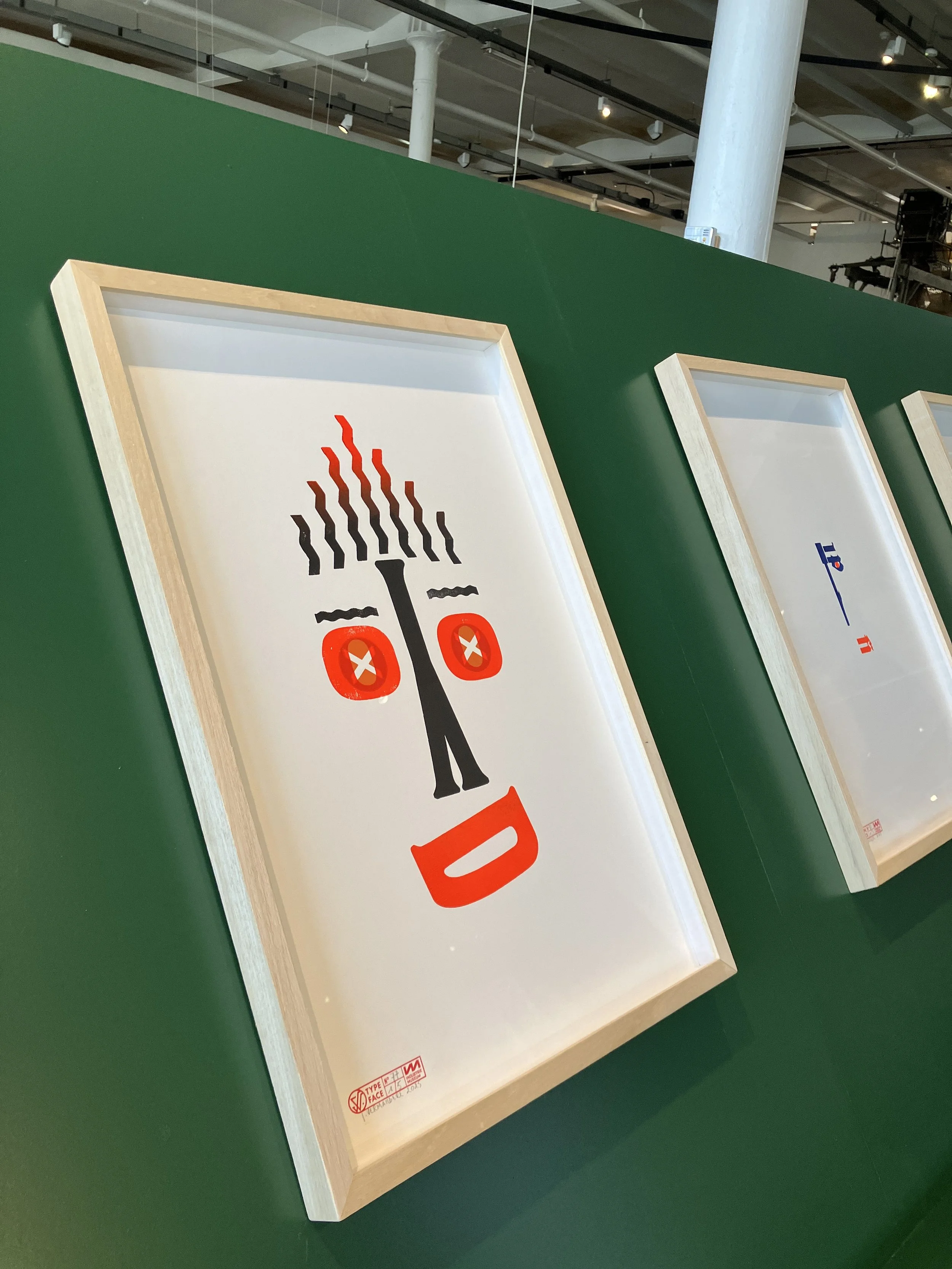
A true eye-catcher in the exhibition is the surprising TypeFaces series by Jan Vermandere. As artist in residence, he spent six months working in the museum’s print studio. There, he immersed himself in the wood type collection to create a series of “letter faces.” With simple, playful compositions, he liberates the letters from their traditional function.

LUCA students & yours truly in the Museum of Industry
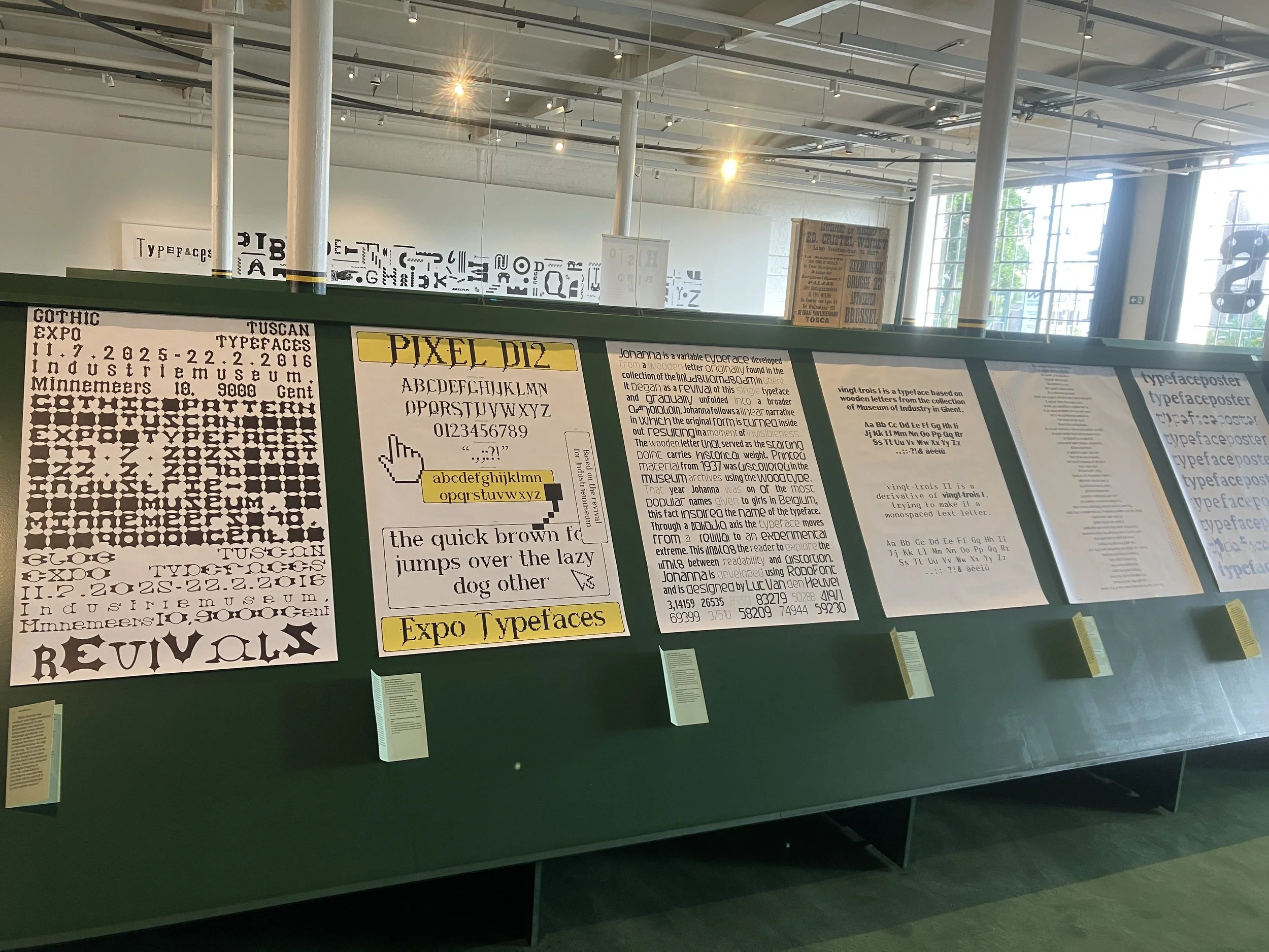
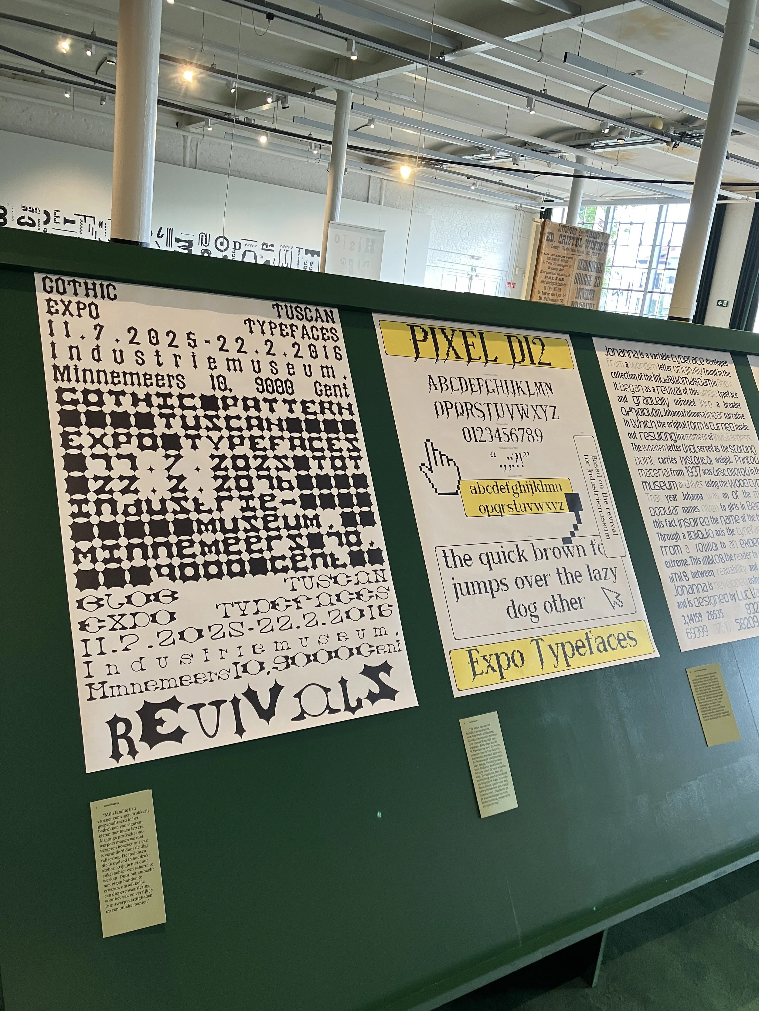
DIGITAL REVIVALS
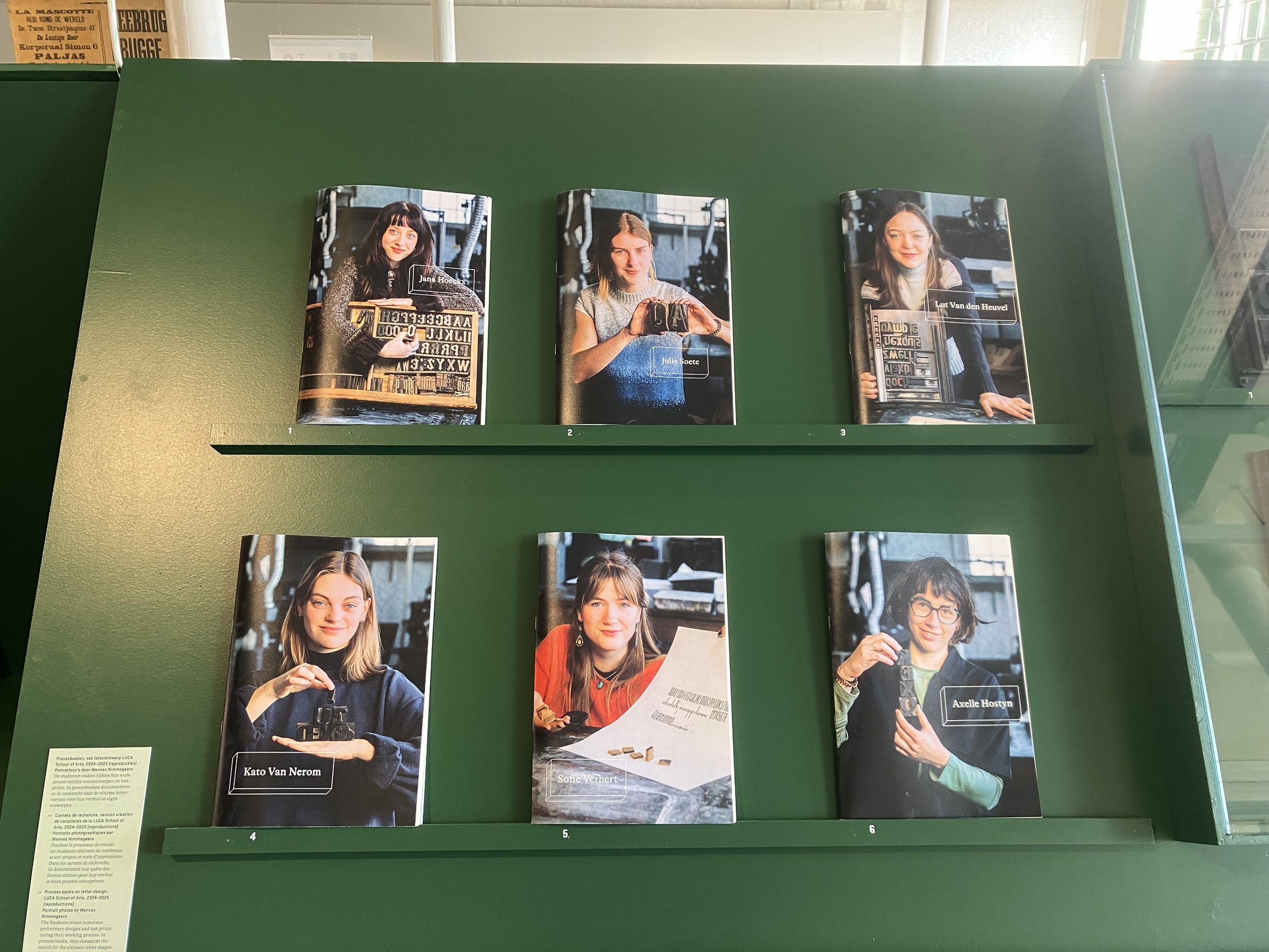
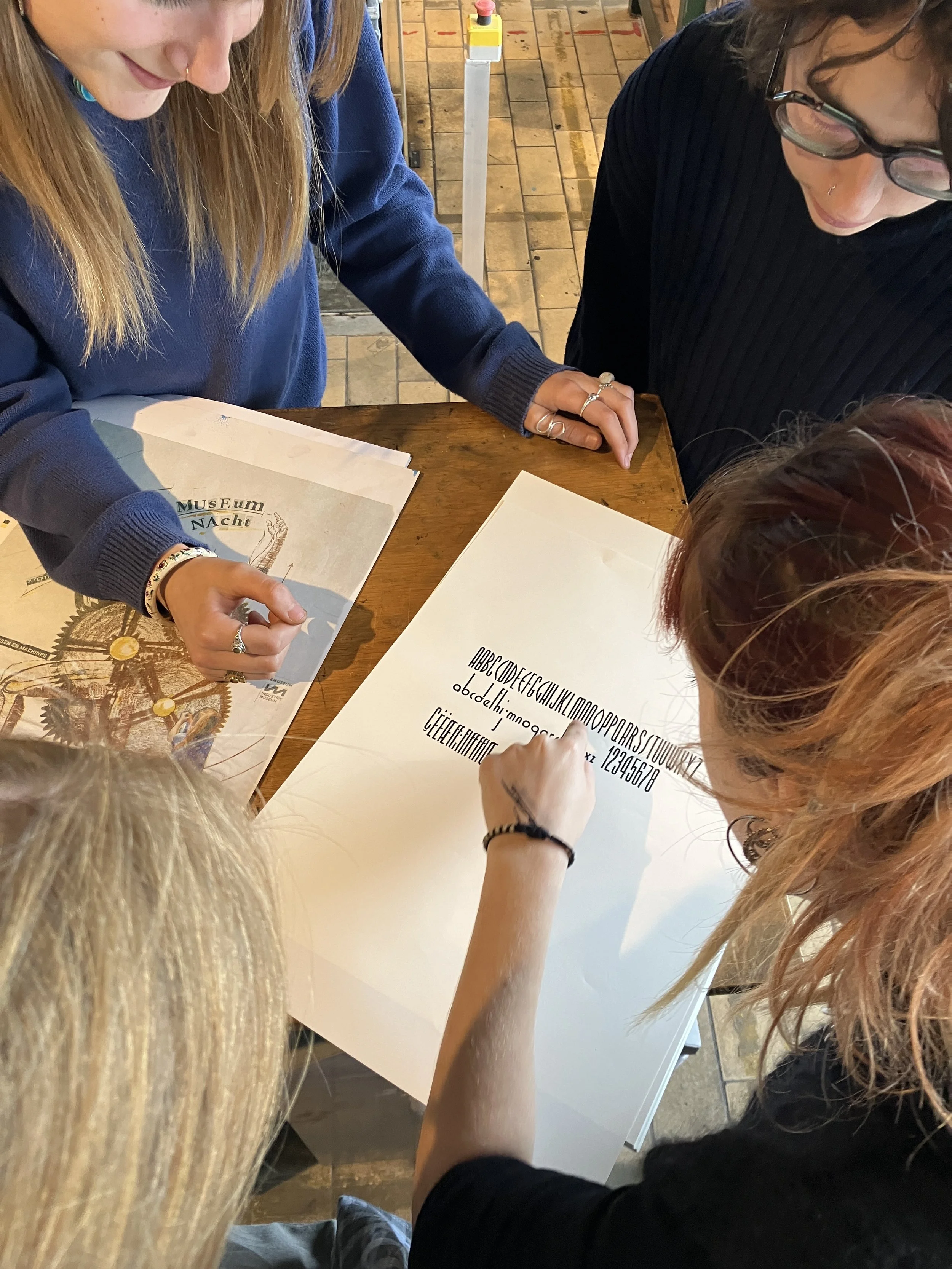
The exhibition also highlights the work of six graphic design students from LUCA School of Arts (Ghent). Axelle Hostyn, Jana Hoeckx, Julie Soete, Kato Van Nerom, Lut Van den Heuvel and Sofie Verbert each selected a wooden typeface from the museum collection and created a digital revival of it. The exhibition offers insight into their process and shows how contemporary designers bring historical letters back to life.
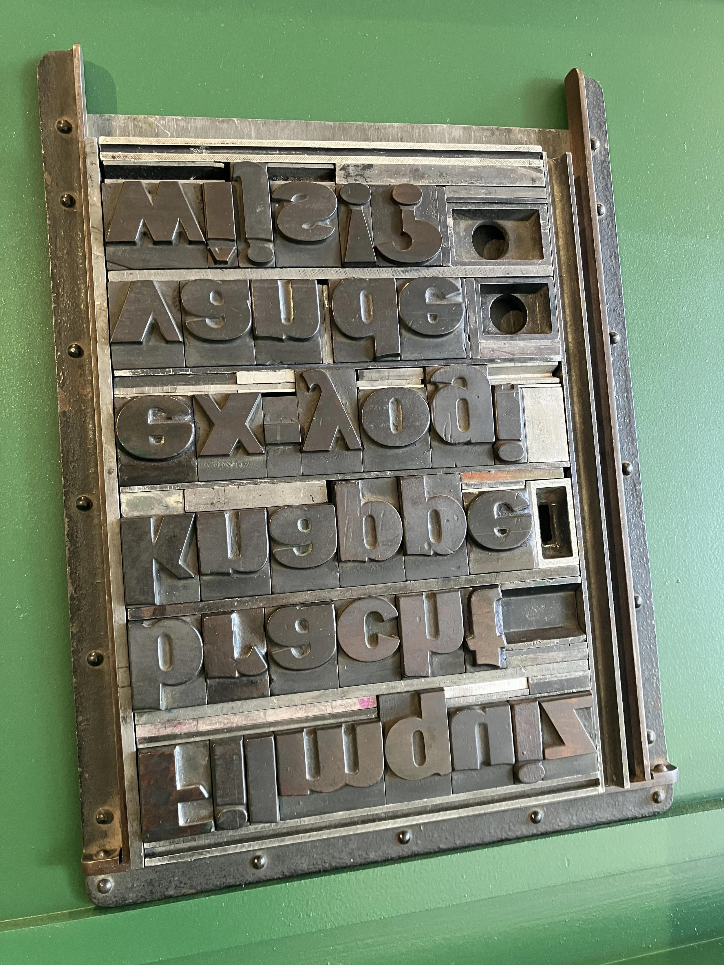

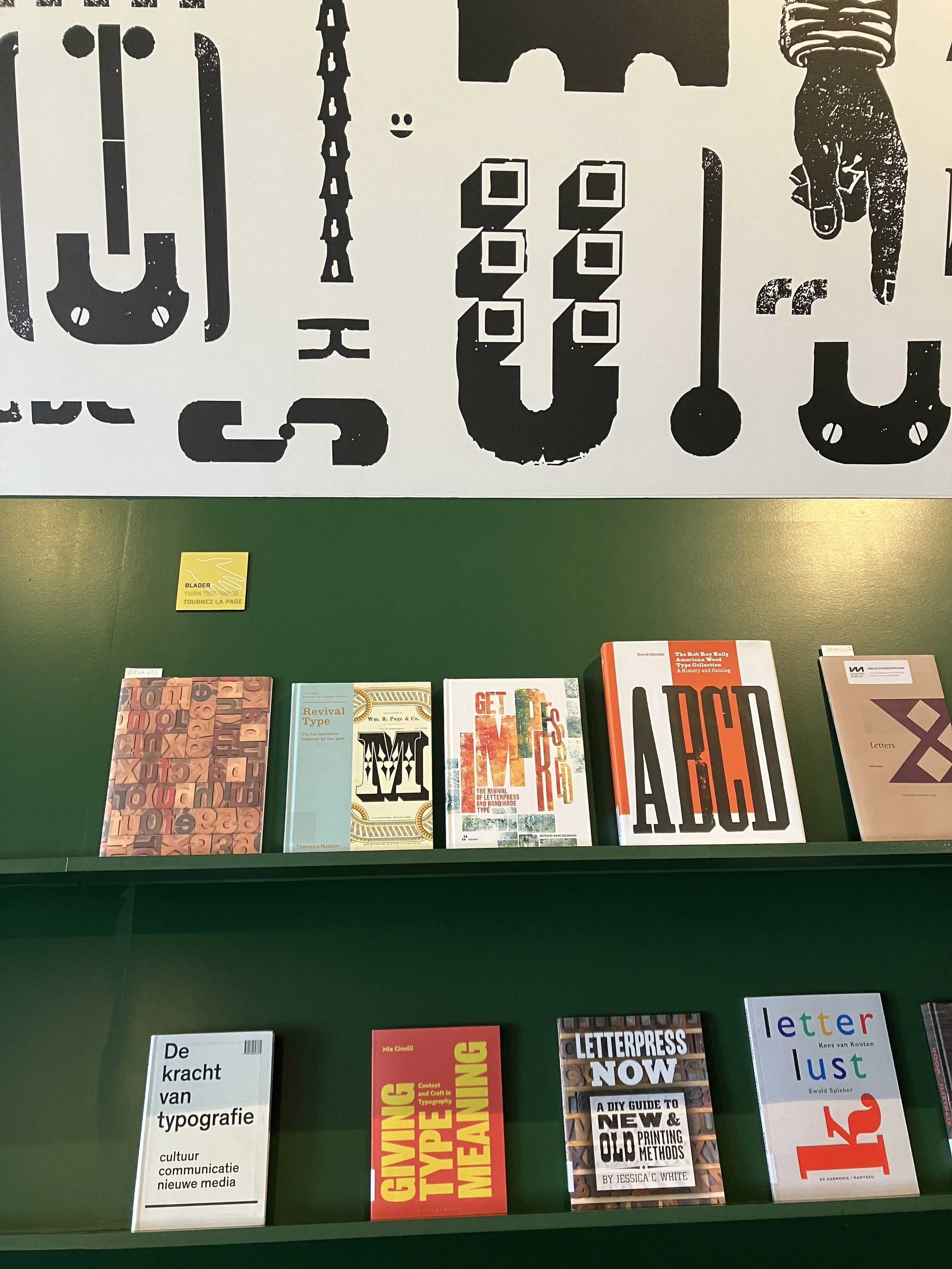
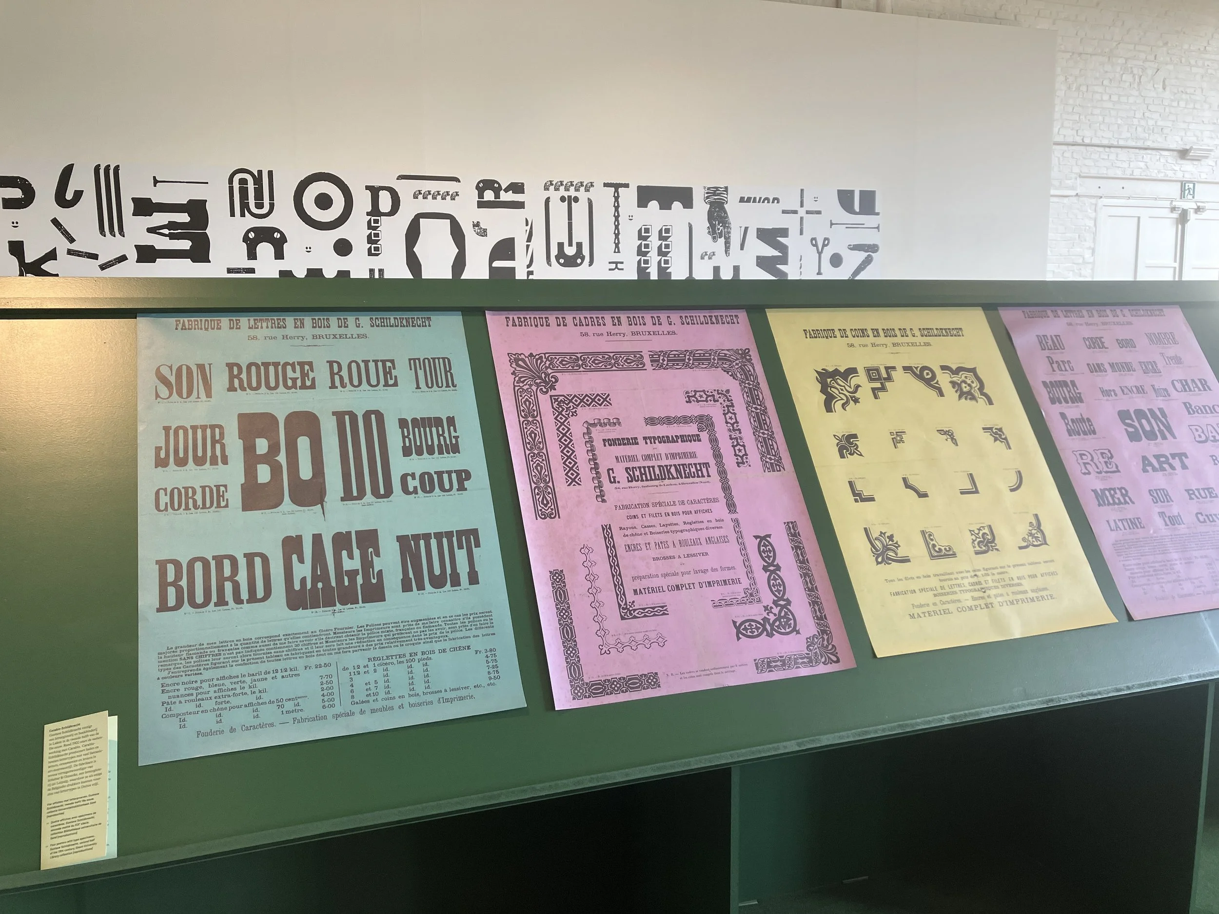
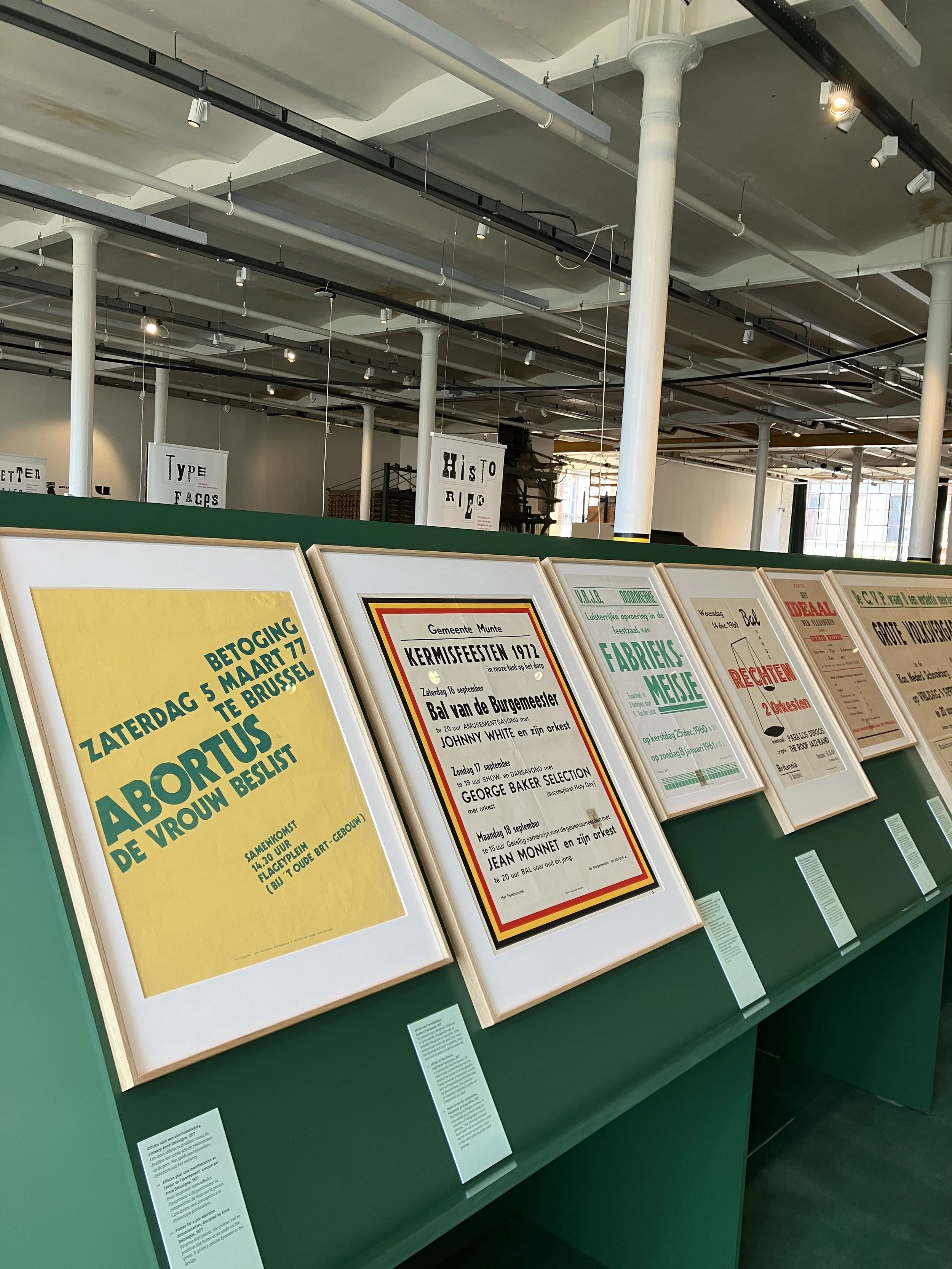
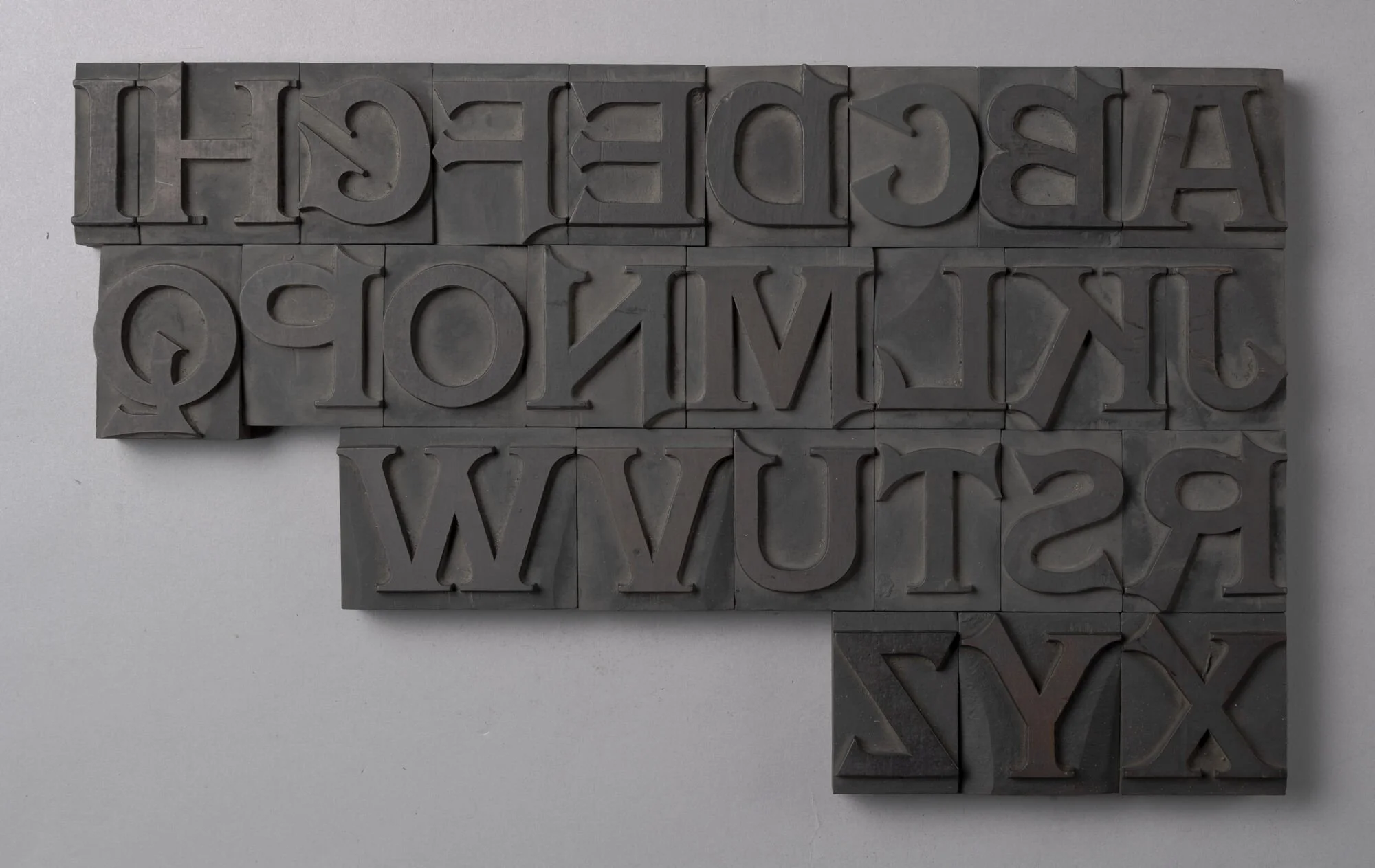
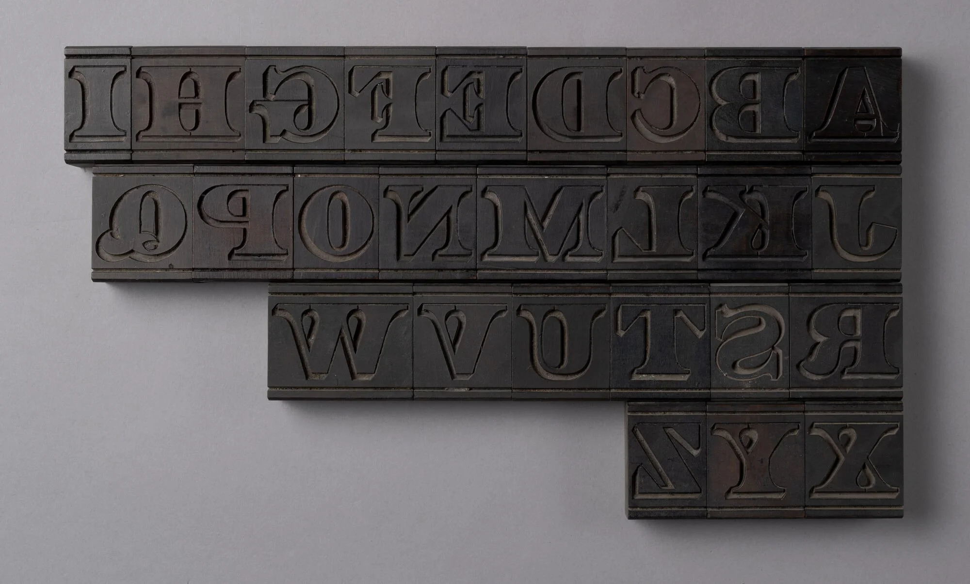
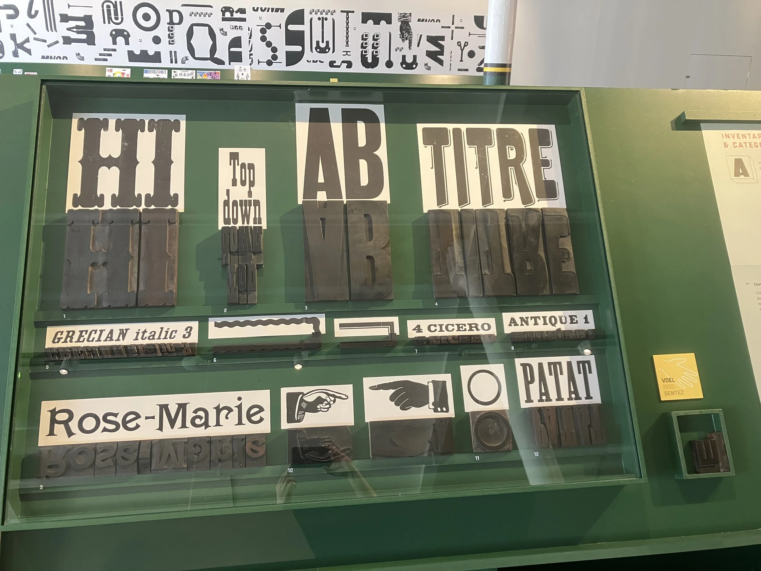
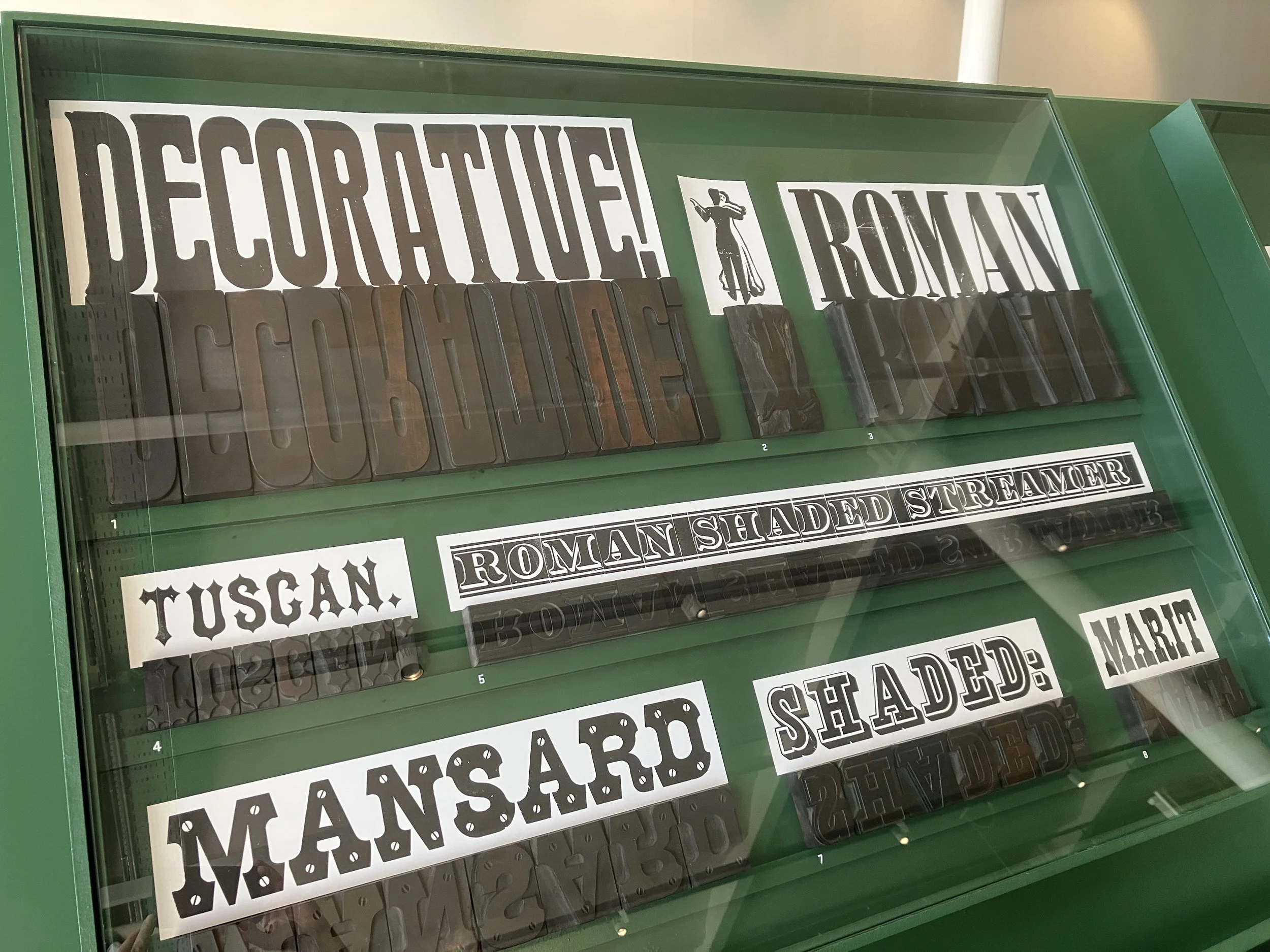
THE HISTORY OF WOOD TYPE
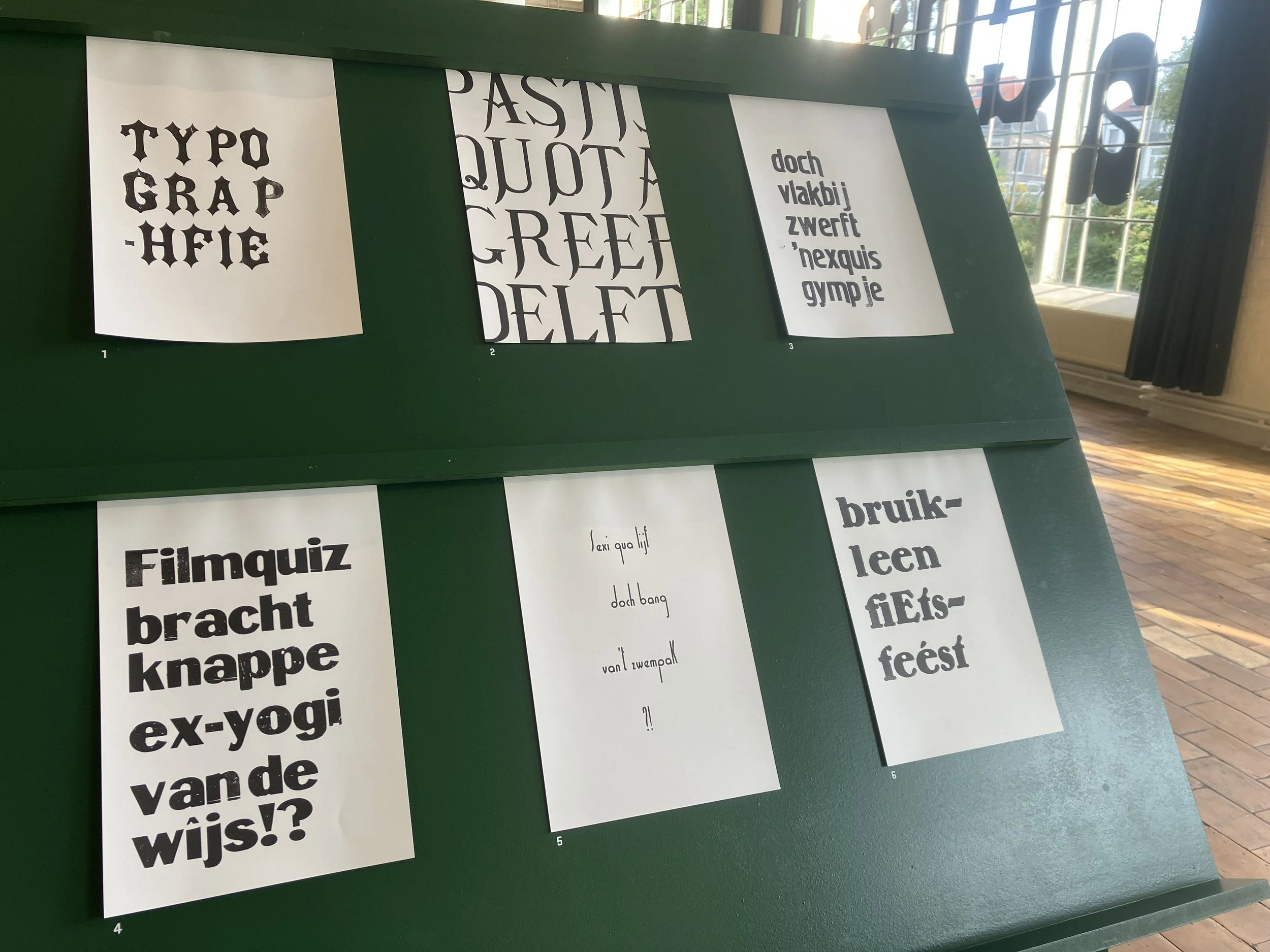
In addition to these contemporary projects, the exhibition sheds light on the rich history of printing with wooden type. Jo De Baerdemaeker guides visitors through his research Typo Belgiëque, which explores the origins and evolution of typography in Belgium since the 19th century. Fascinating objects, type specimens, and posters reveal the production process and historical use of wooden letters.


Inventory sheet with info
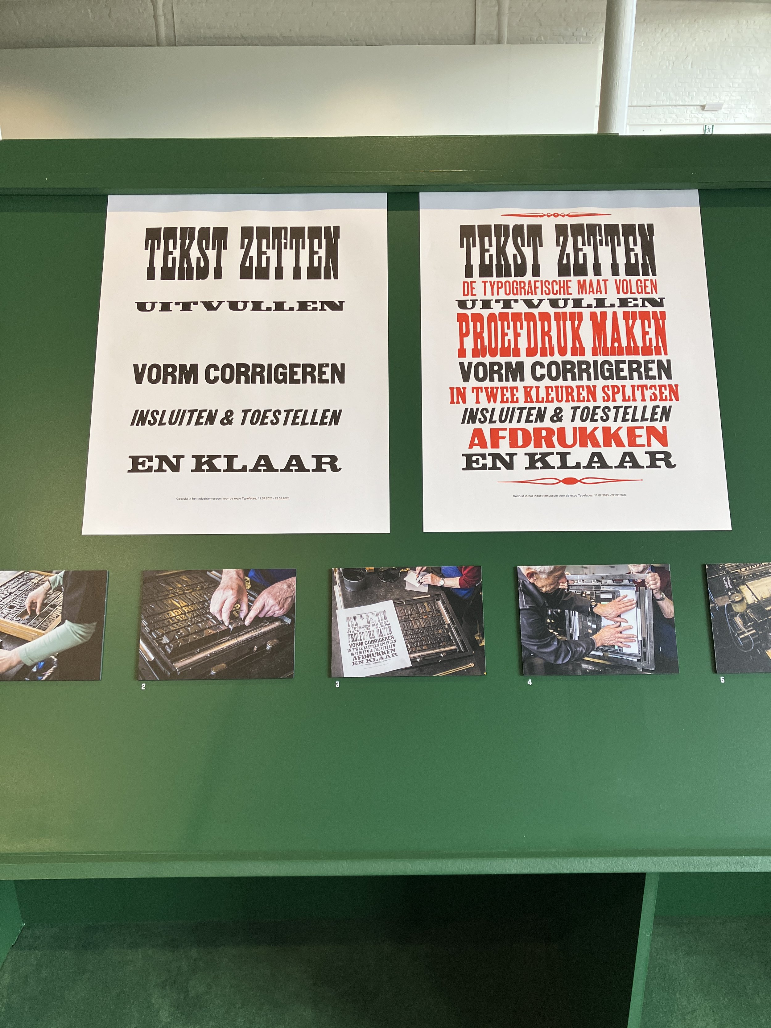
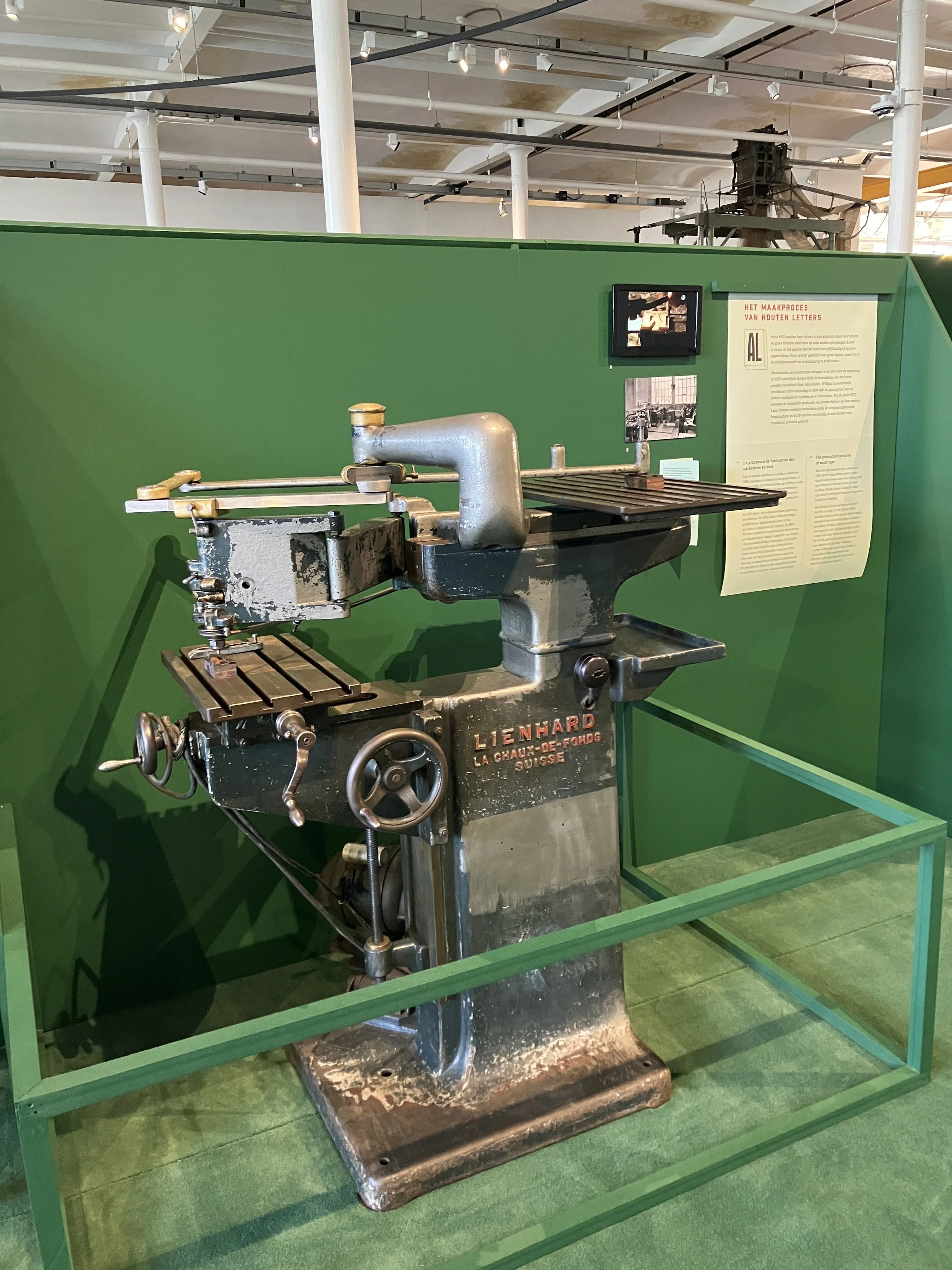
LETTER COLLECTION & OPEN MAKING SPACE
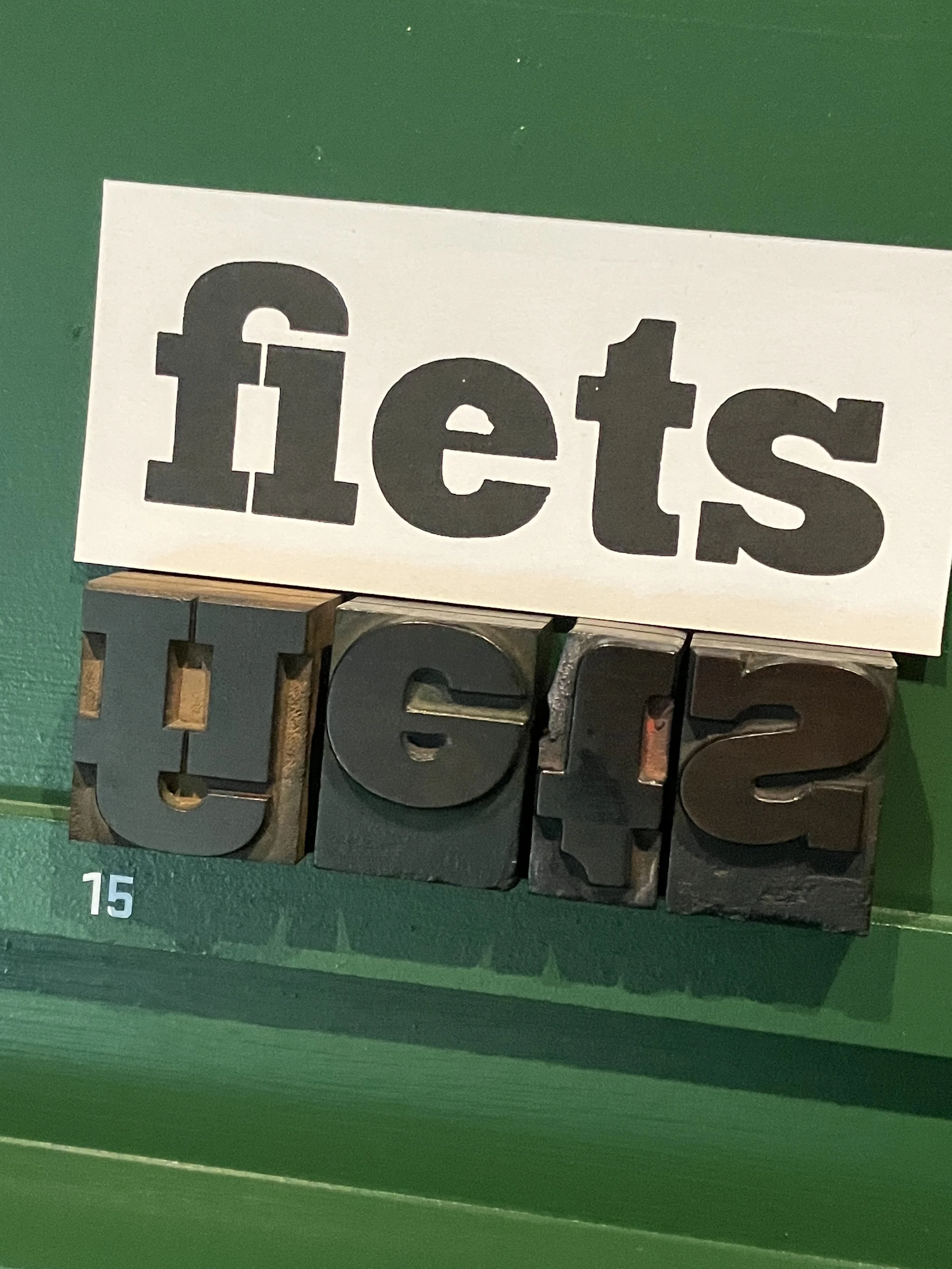
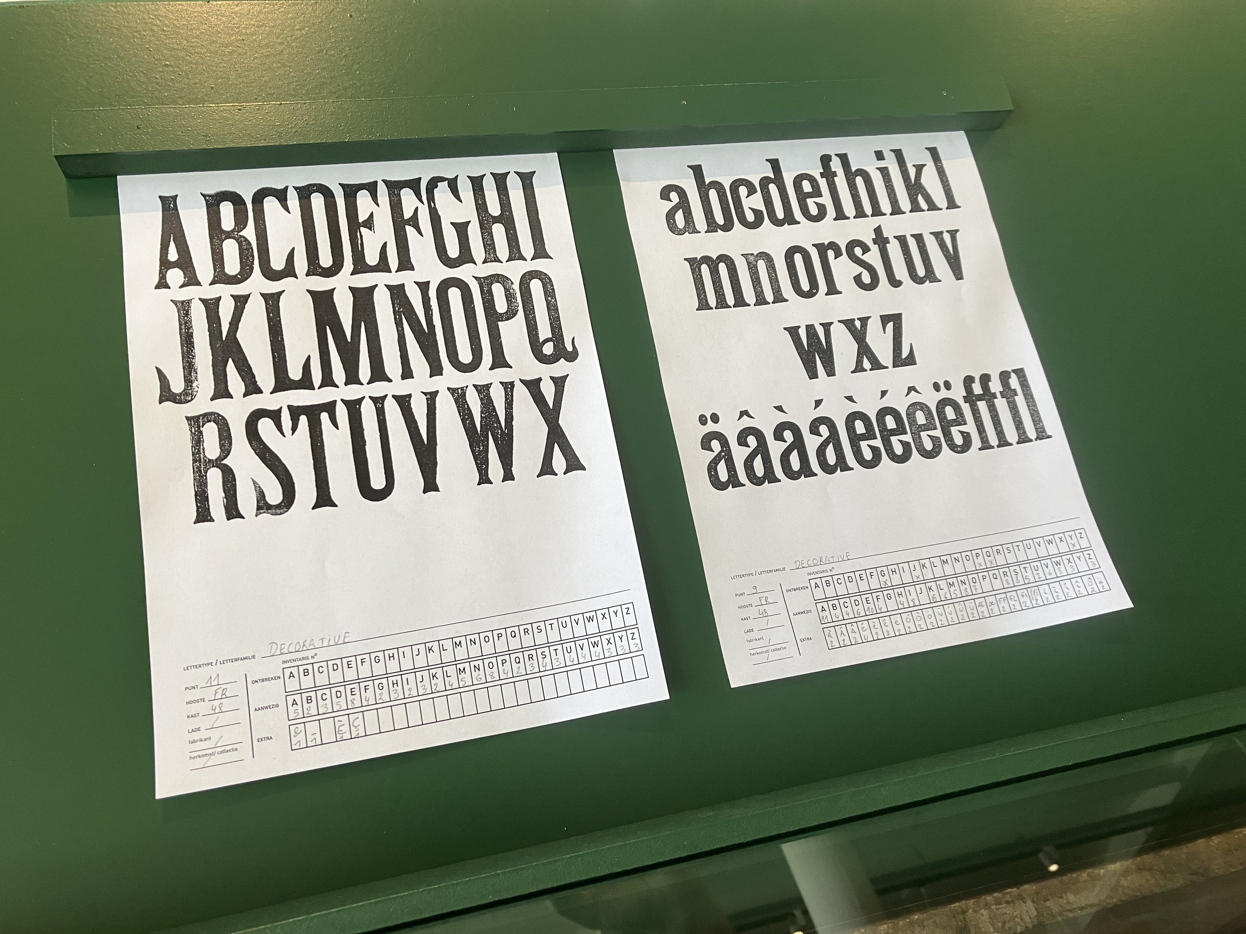
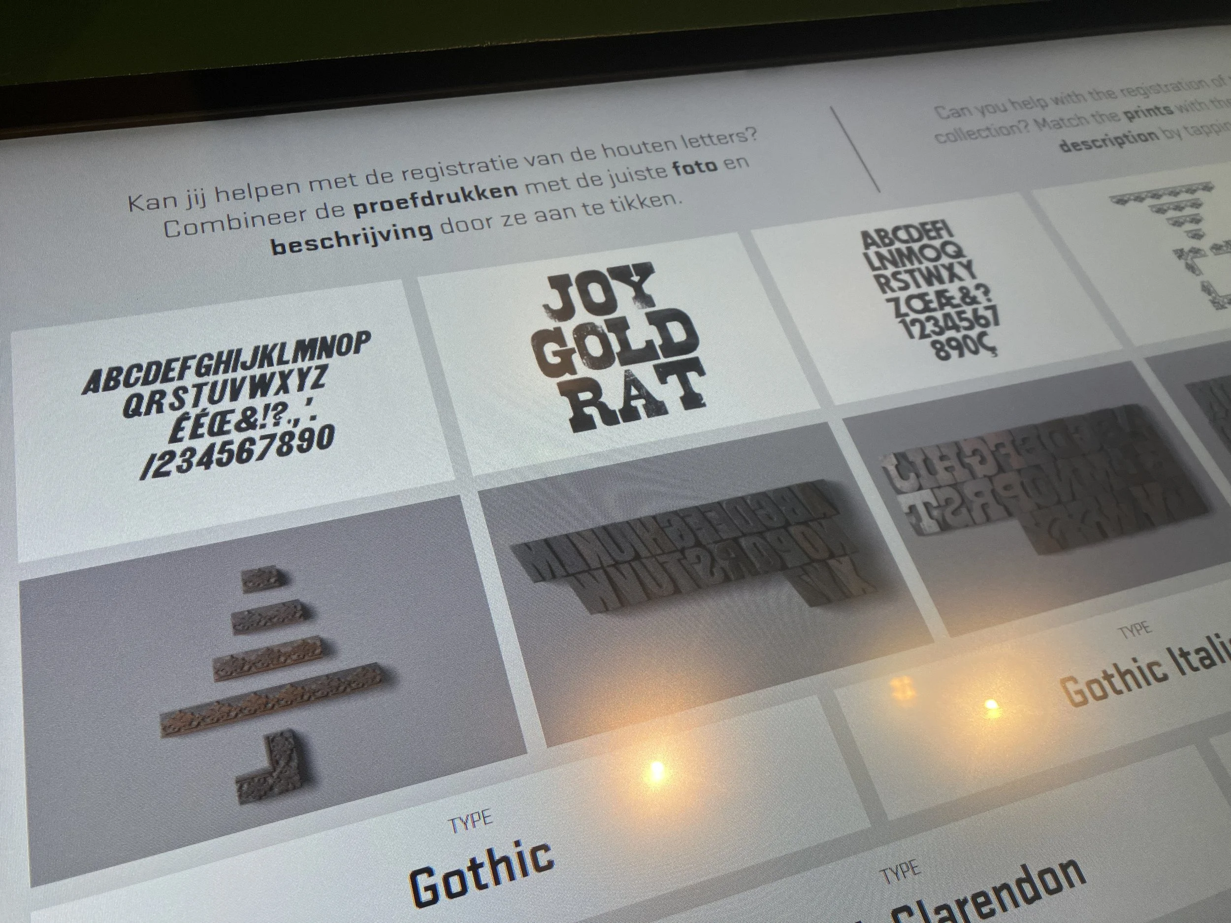
What began years ago as a personal project has grown into an extensive inventory effort. Each wood type font/display letter has been printed, scanned, and described in technical sheets for a working manual. This first phase has now been successfully completed.
The Industriemuseum is gradually cataloguing and digitising its type collection. The exhibition offers a behind-the-scenes look at this monumental undertaking. You’ll discover the museum’s diverse wooden letter collection and how these letters are used to create posters. You can also browse part of the collection online.


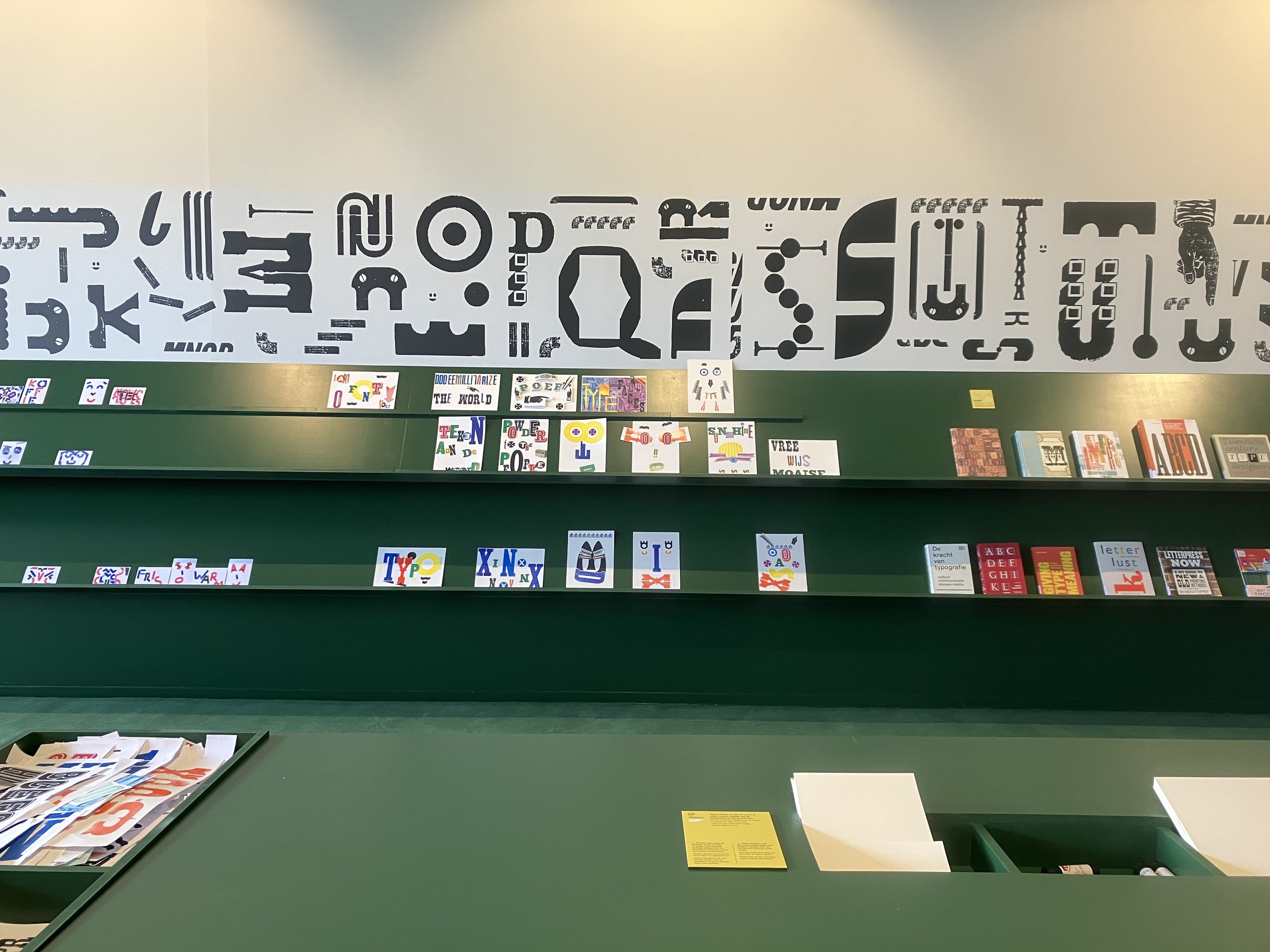
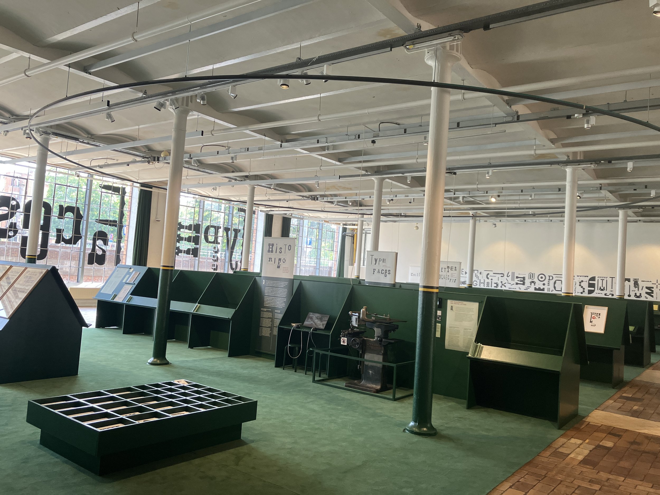
Feeling inspired? In the open making space, you can start experimenting yourself with letter stamps and collage letters.

Expo // Typefaces. 11.07.2025 - 22.02.2026
Industriemuseum
Minnemeers 10,
9000 Gent
website
you might also like
28.09.2025. Type Talk door Jo De Baerdemaeker - Typo Belgiëque // Verhaal achter de Belgische drukletters
19 oktober. Leerkrachtendag drukkerijafdeling in het Industriemuseum - schrijf je in
Workshops najaar 2025 - link