The wood-type collection at the Museum of Industry in Ghent is exceptional, and I’m lucky to work with it every day. Typesetting cards and posters, pulling prints in the museum’s workshop — even after all these years I’m still discovering new, curious, and beautifully worn pieces in the drawers.

A side note: the museum has been gradually cataloguing and digitising its entire wood type collection. The current exhibition, Typefaces, offers a behind-the-scenes look at this monumental project — a project I actually started over ten years ago as a personal initiative. The exhibition runs until 22 February, so there’s still time to catch it.


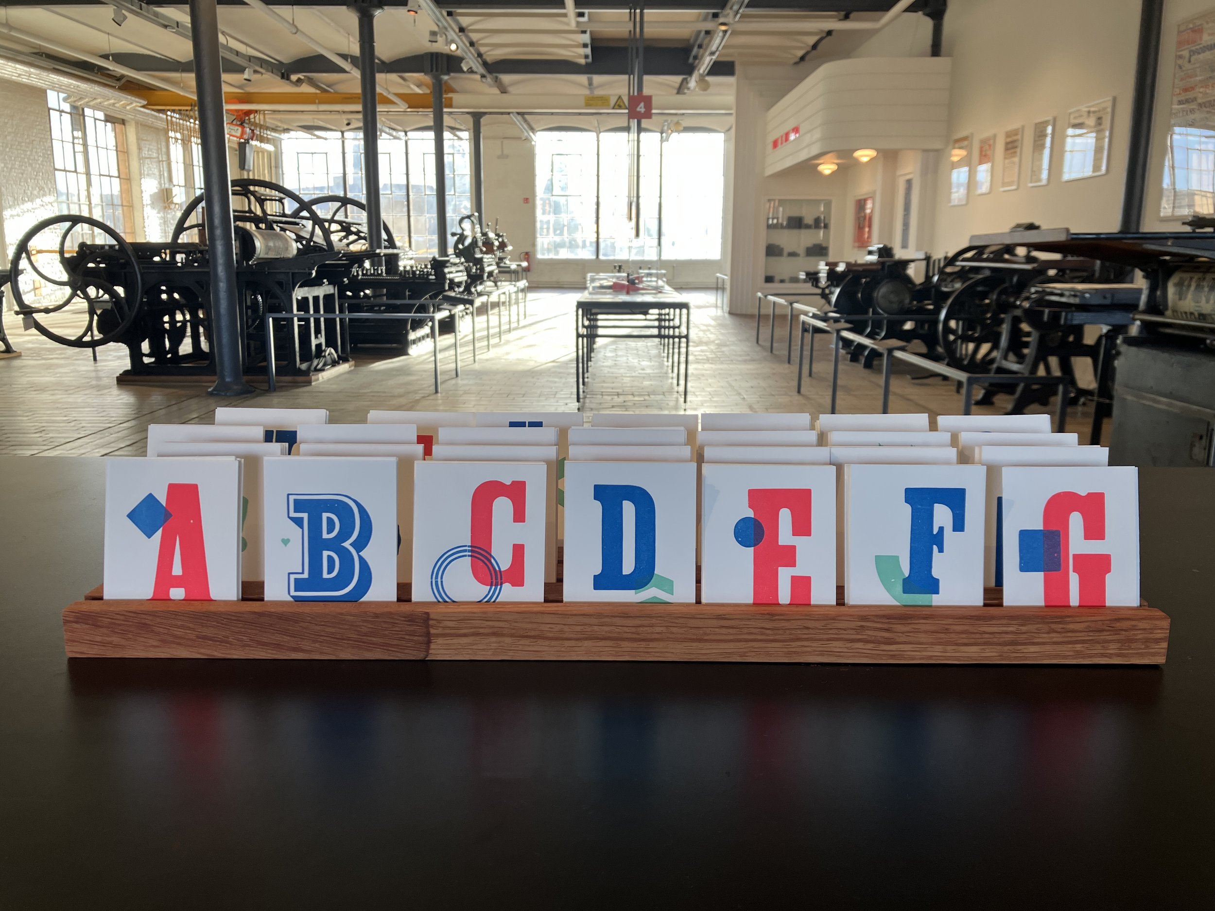
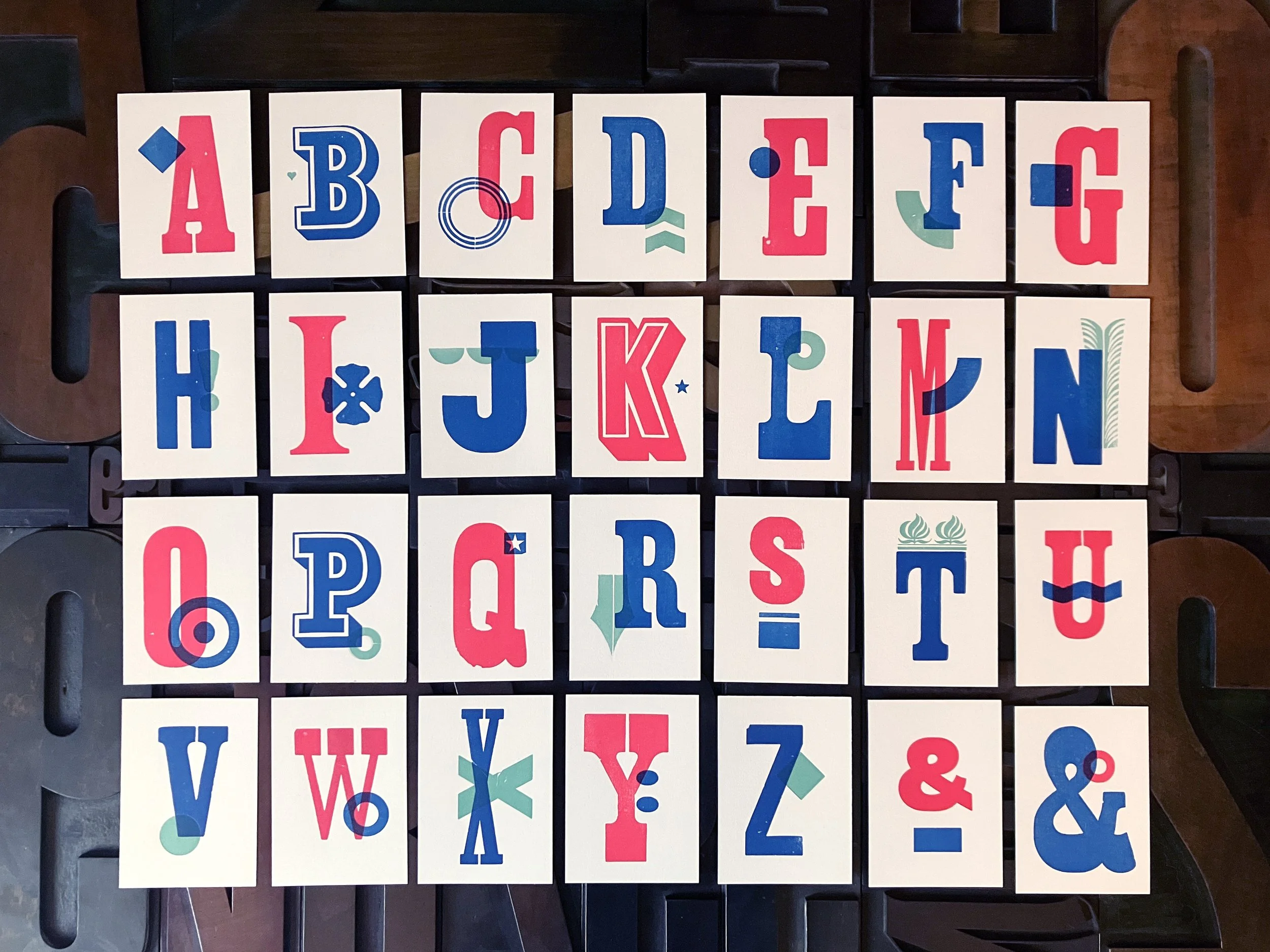
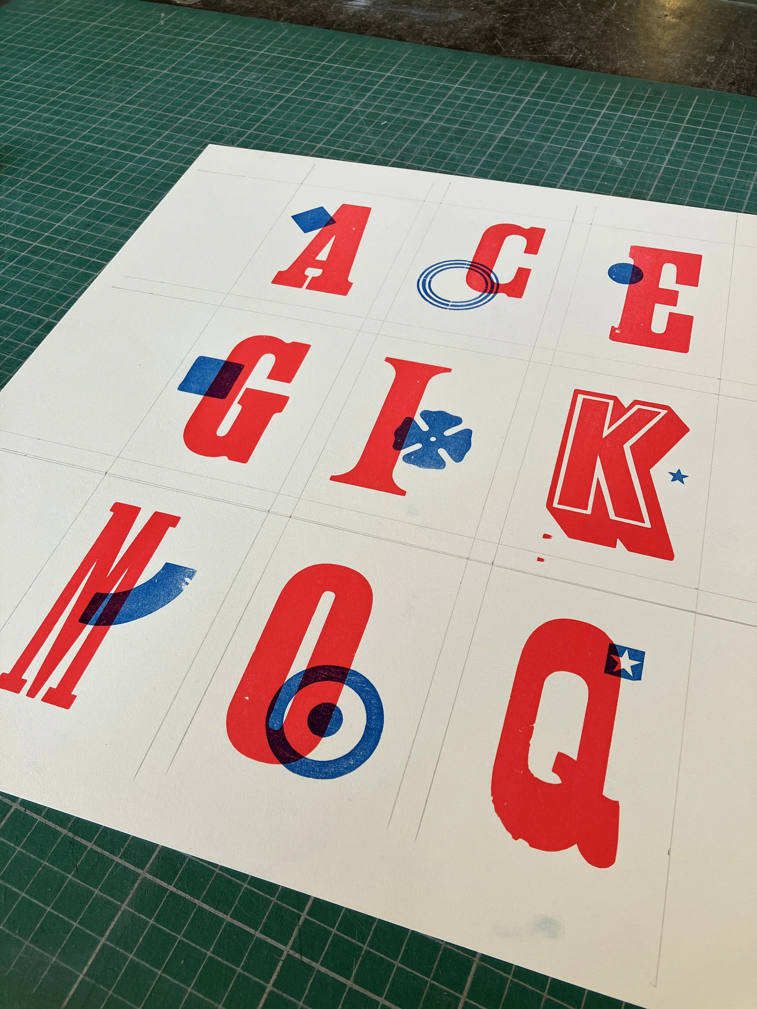
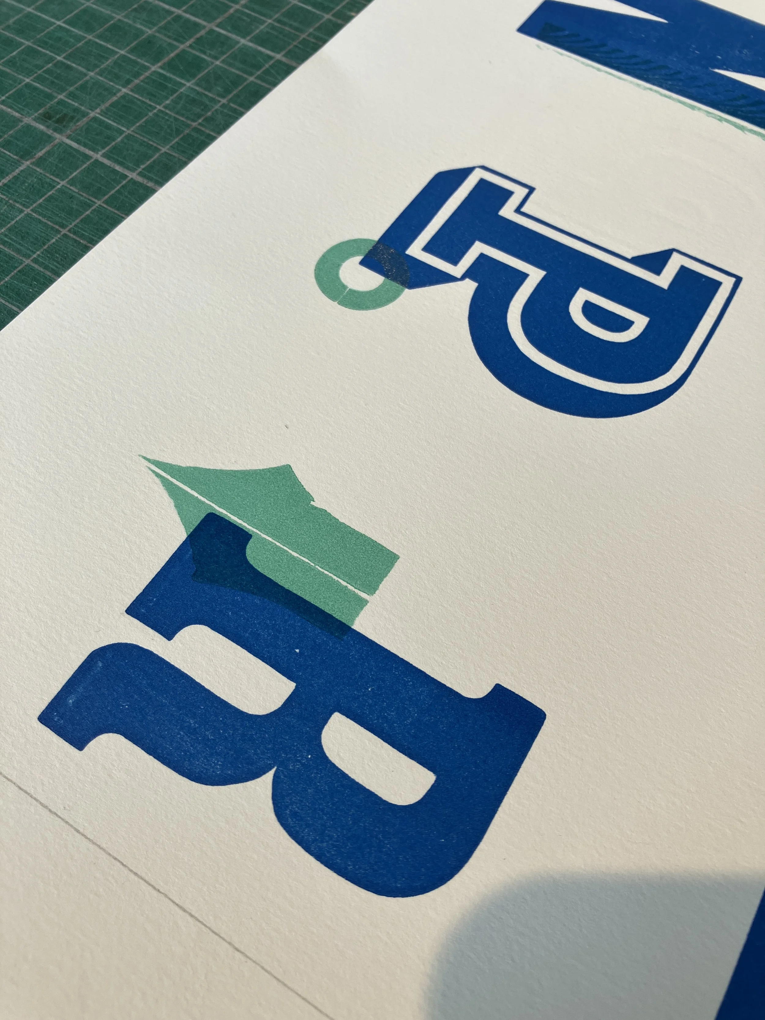
For this project, the mission was clear: let the wood type shine. I created a series of alphabet cards, mixing letters and ornaments from the collection and printing them in three punchy colours — fluorescent red, cyan, and light green. Instead of a classic postcard, we went for a more intimate A7 format. Small card, big personality.
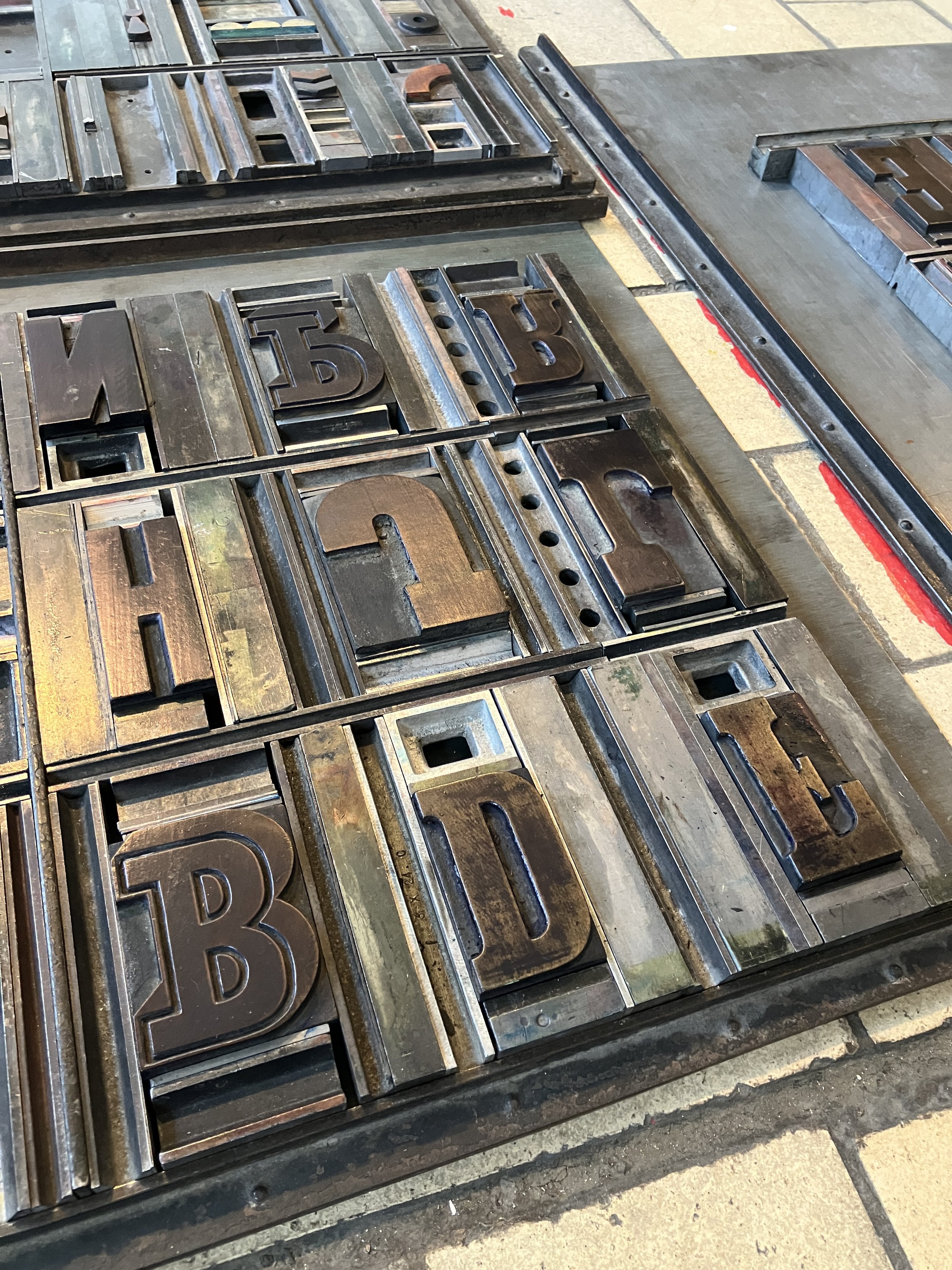
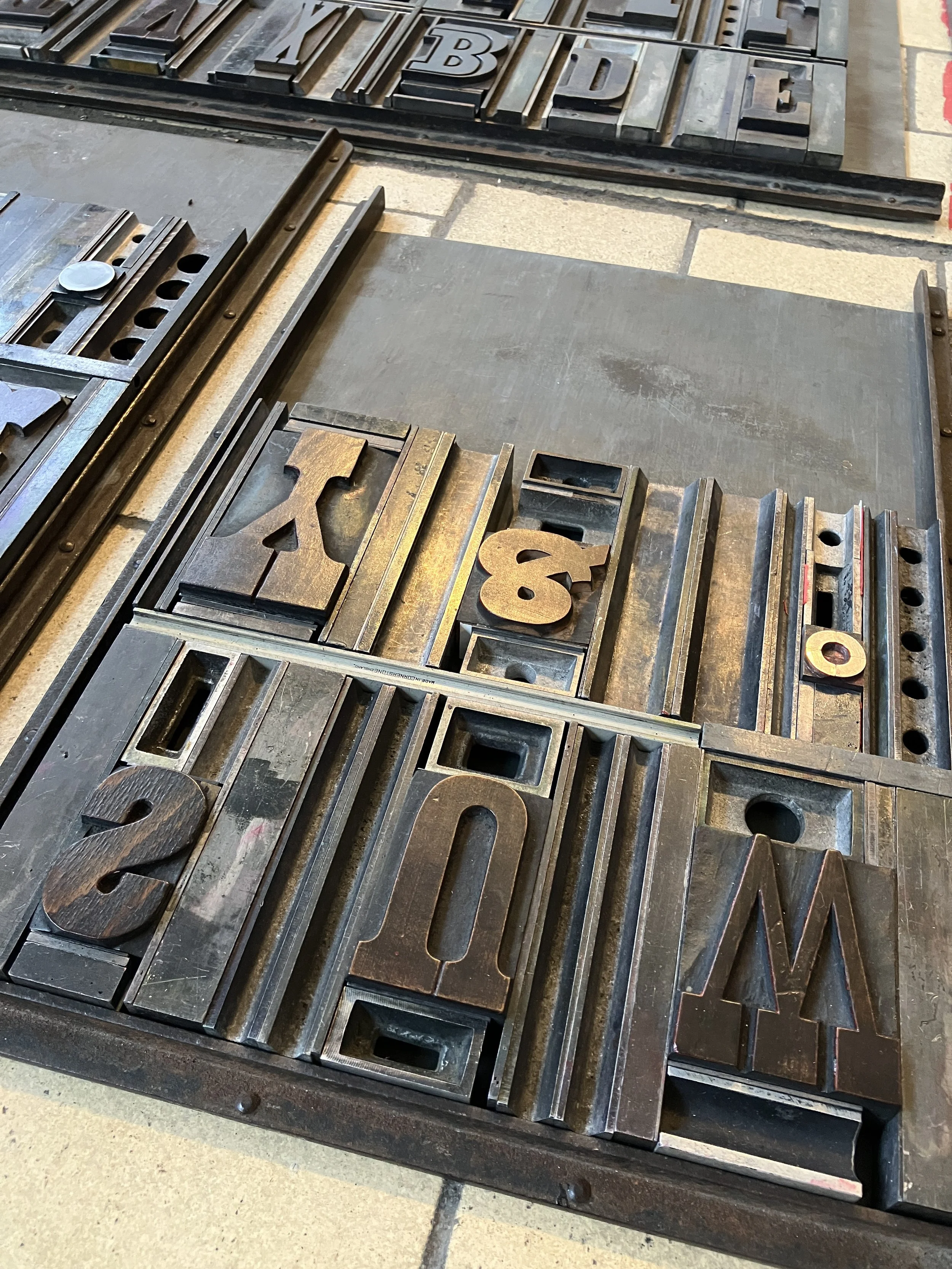
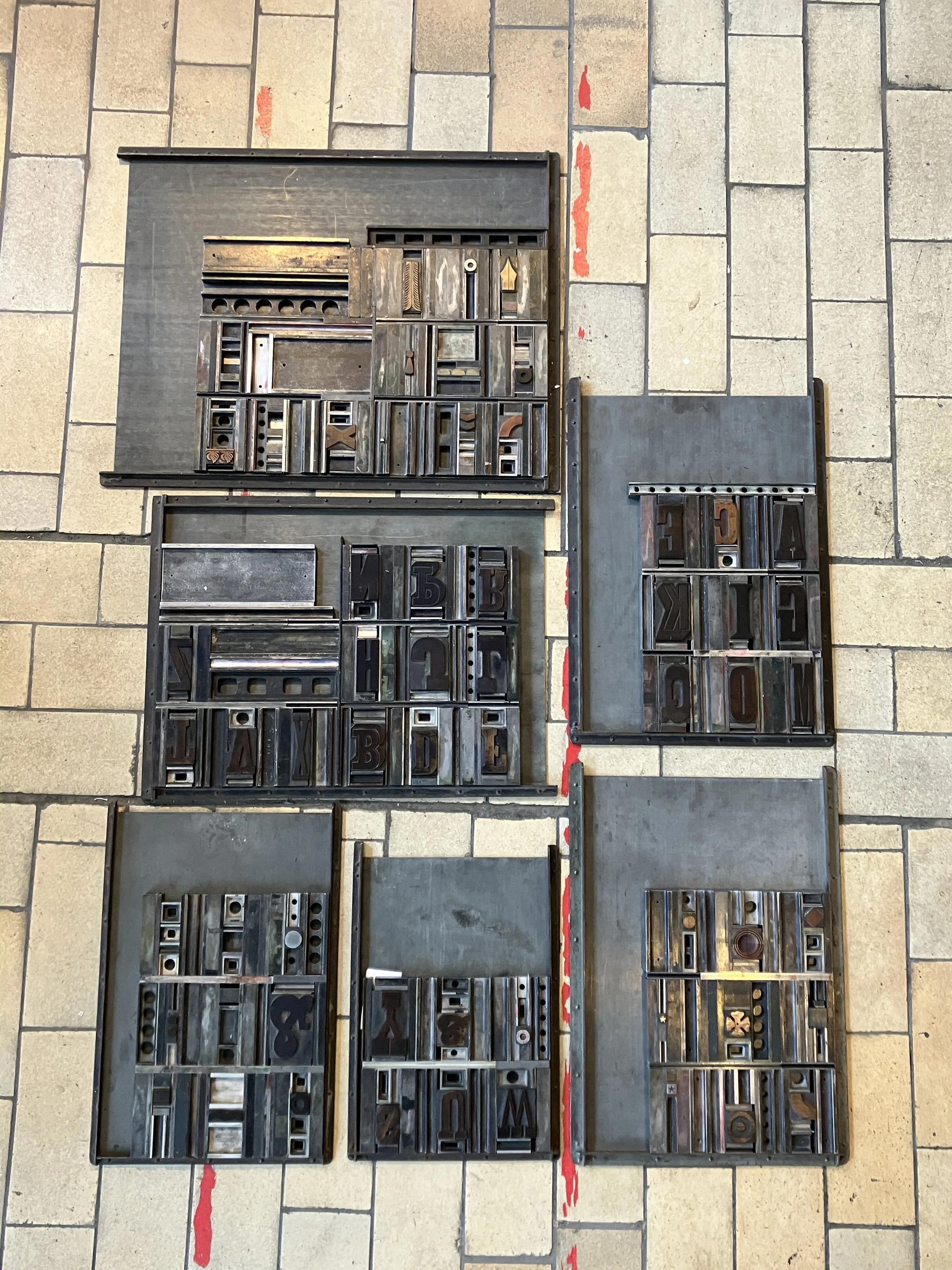
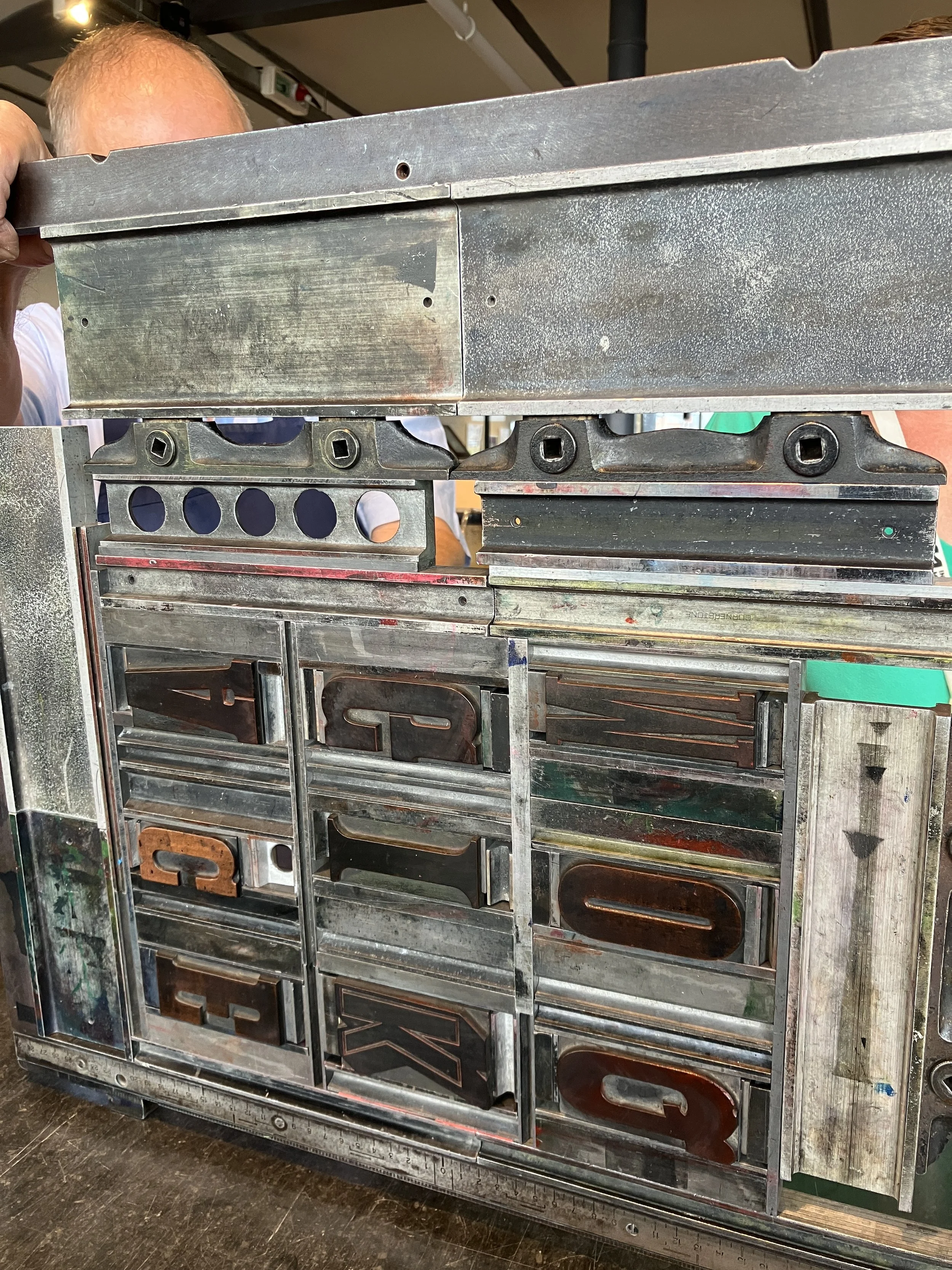
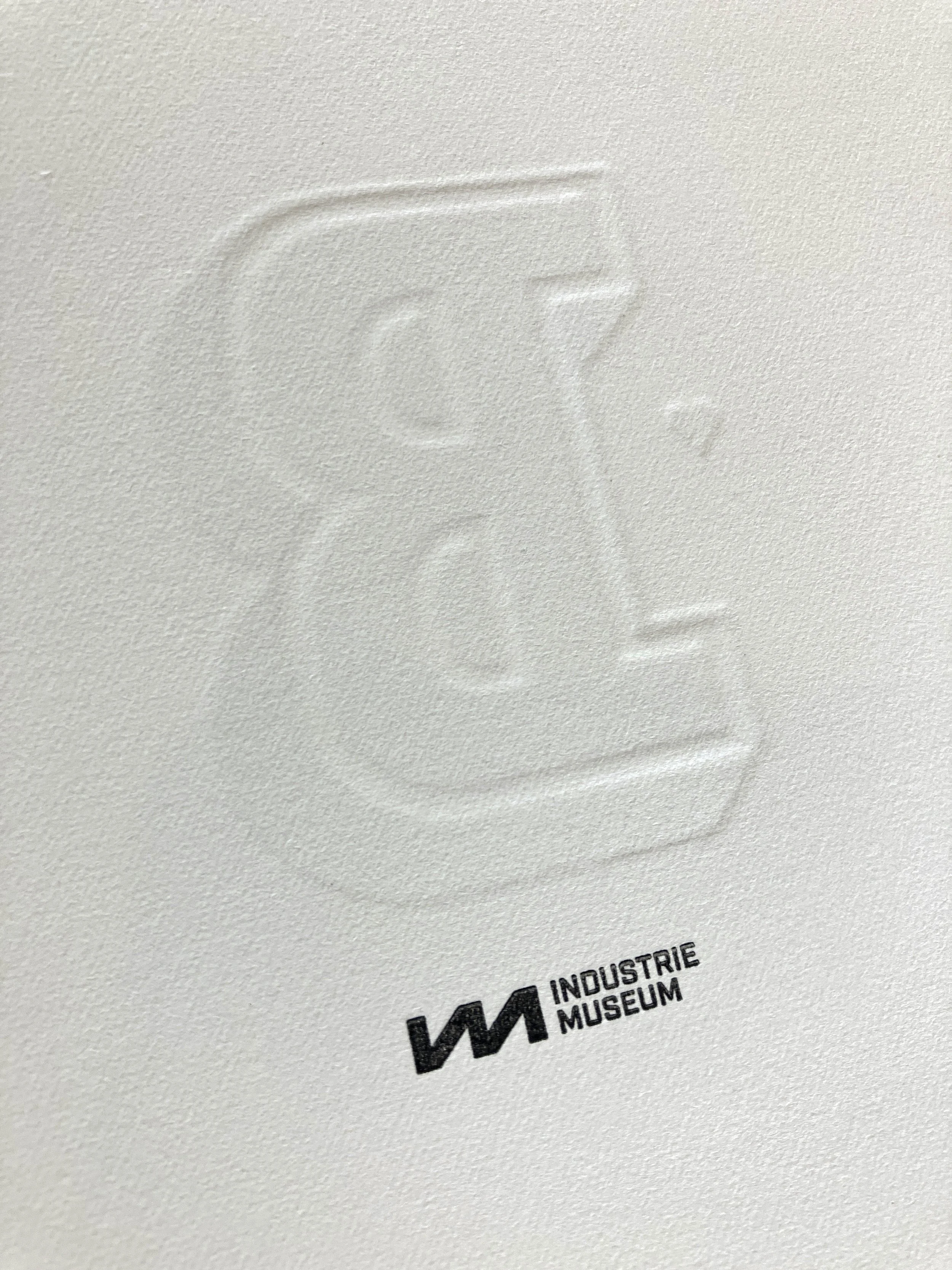
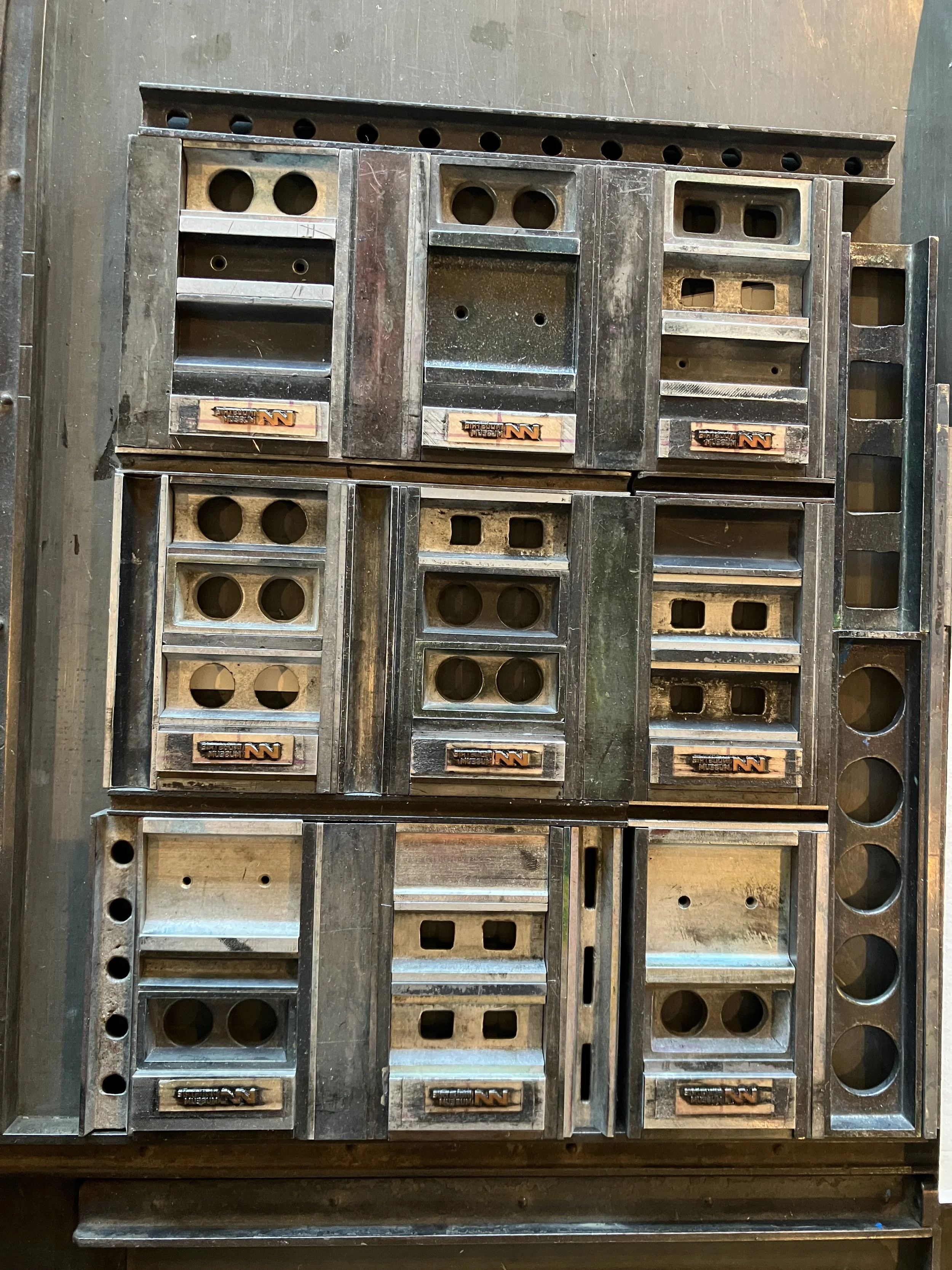
My first step was a kind of typographic treasure hunt: selecting capitals, ornaments, wood, metal — making sure the visual rhythm felt balanced. Once the selection was ready, I began typesetting. In total I composed eight formes: one set to cover the 26 letters, two ampersands, and one extra forme with nine polymer clichés of the museum’s logo for the reverse side.
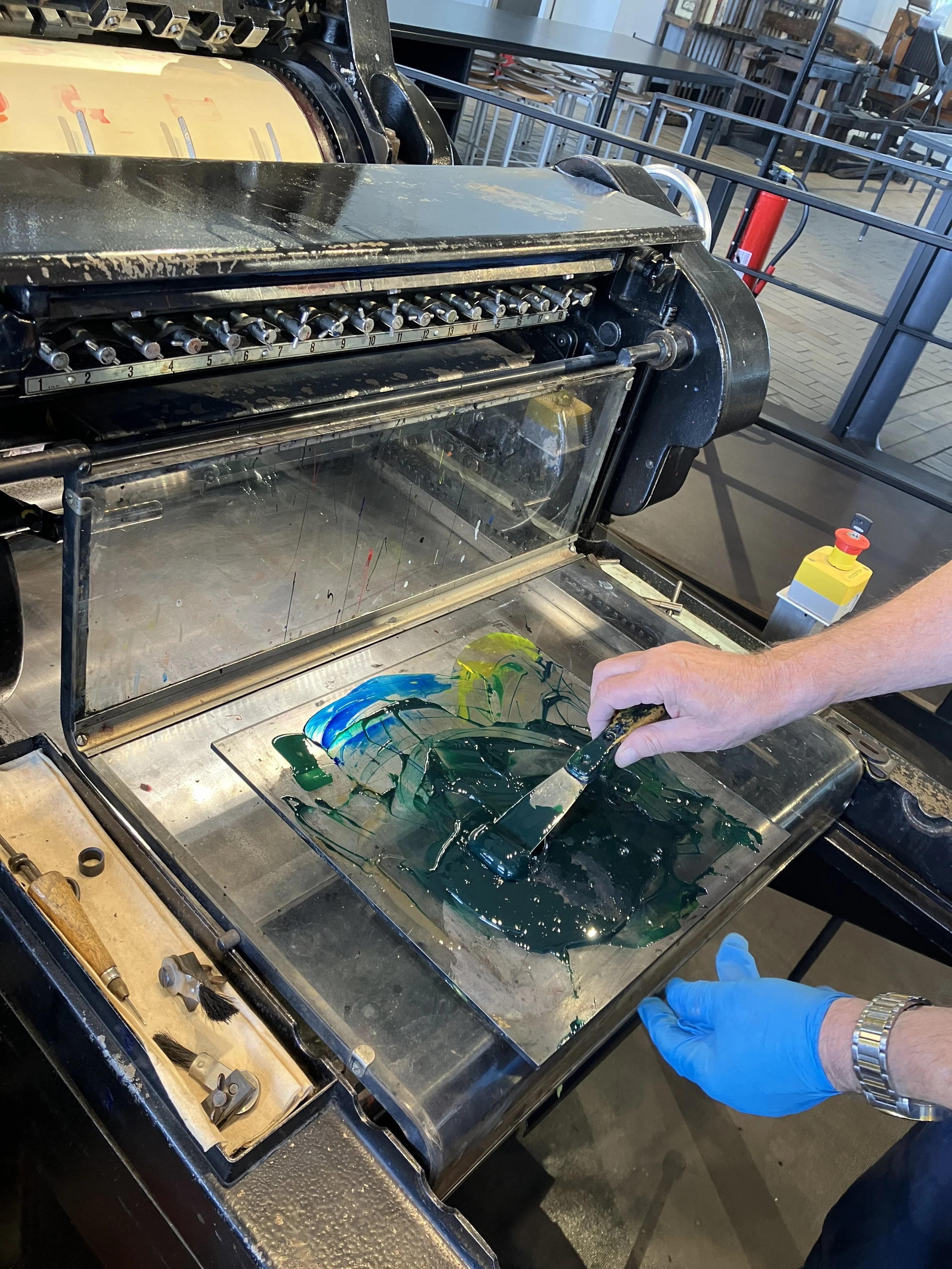
With the formes assembled, it was time for the make-ready. Many of the wood-type pieces have lived long lives, so differences in wear and type height had to be corrected. Then came colour mixing and proofing each forme to check alignment and spacing.
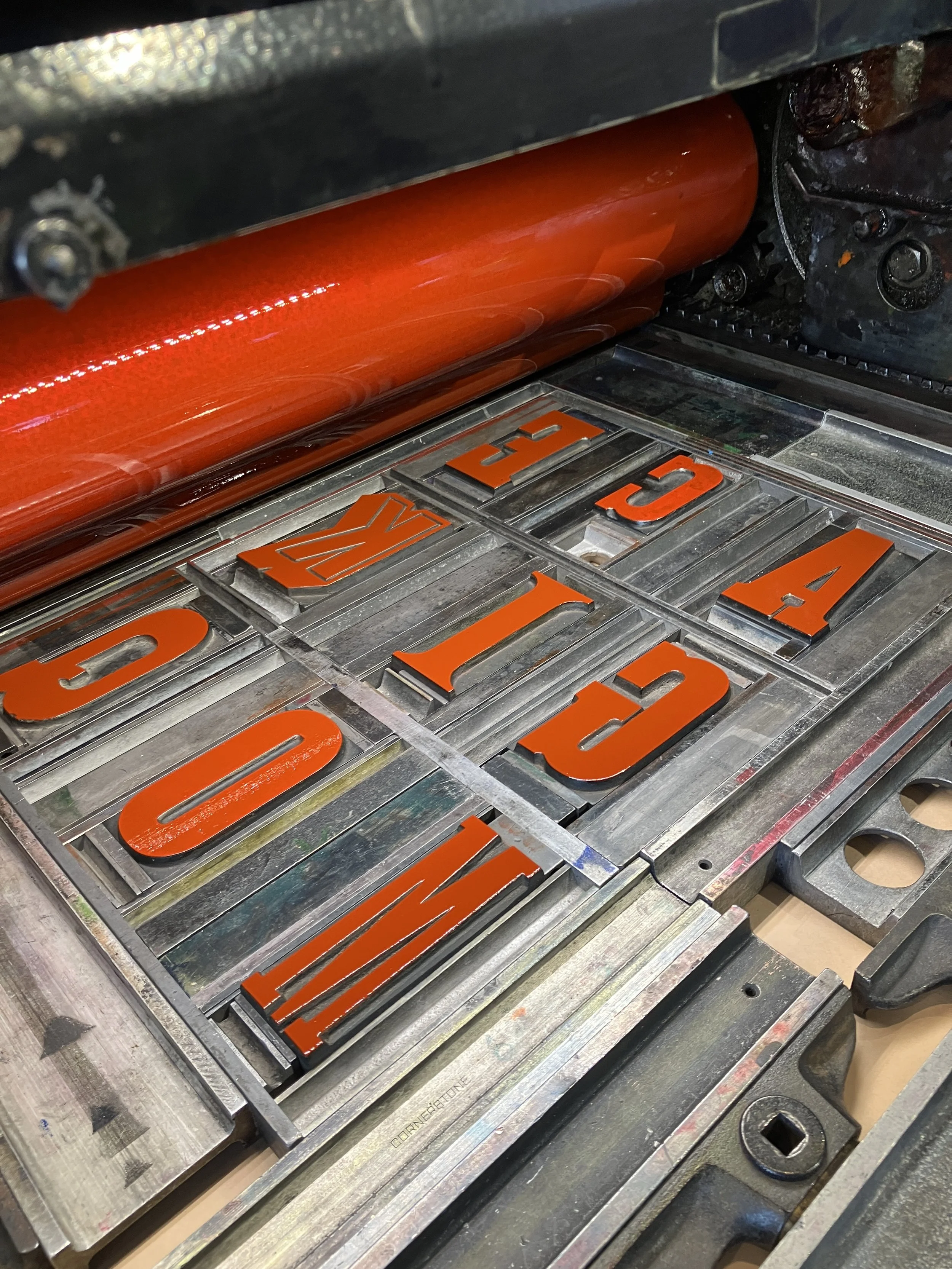
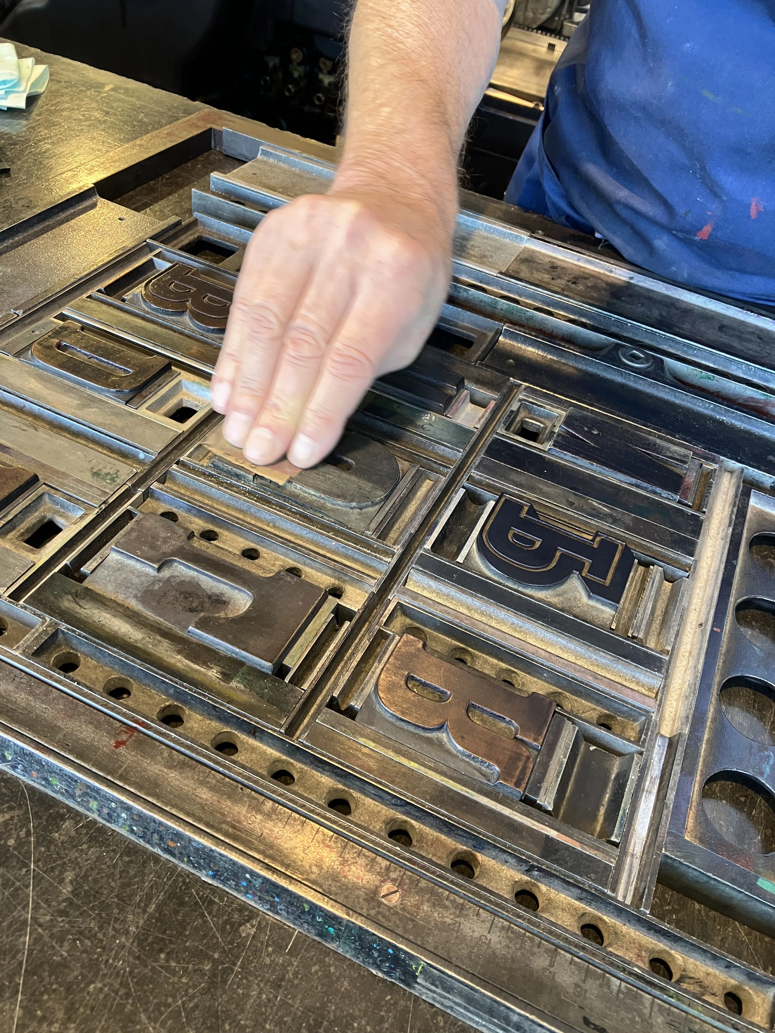

Because we needed to print a large quantity, volunteer-printer Jean-Pierre suggested using the Heidelberg cylinder press. Brilliant idea — except the type height on this press turned out to be different from the FAG I normally use. The Heidelberg (originally built for the Indonesian market but never exported) requires 24.63 mm type height, whereas the FAG works with 23.56 mm.
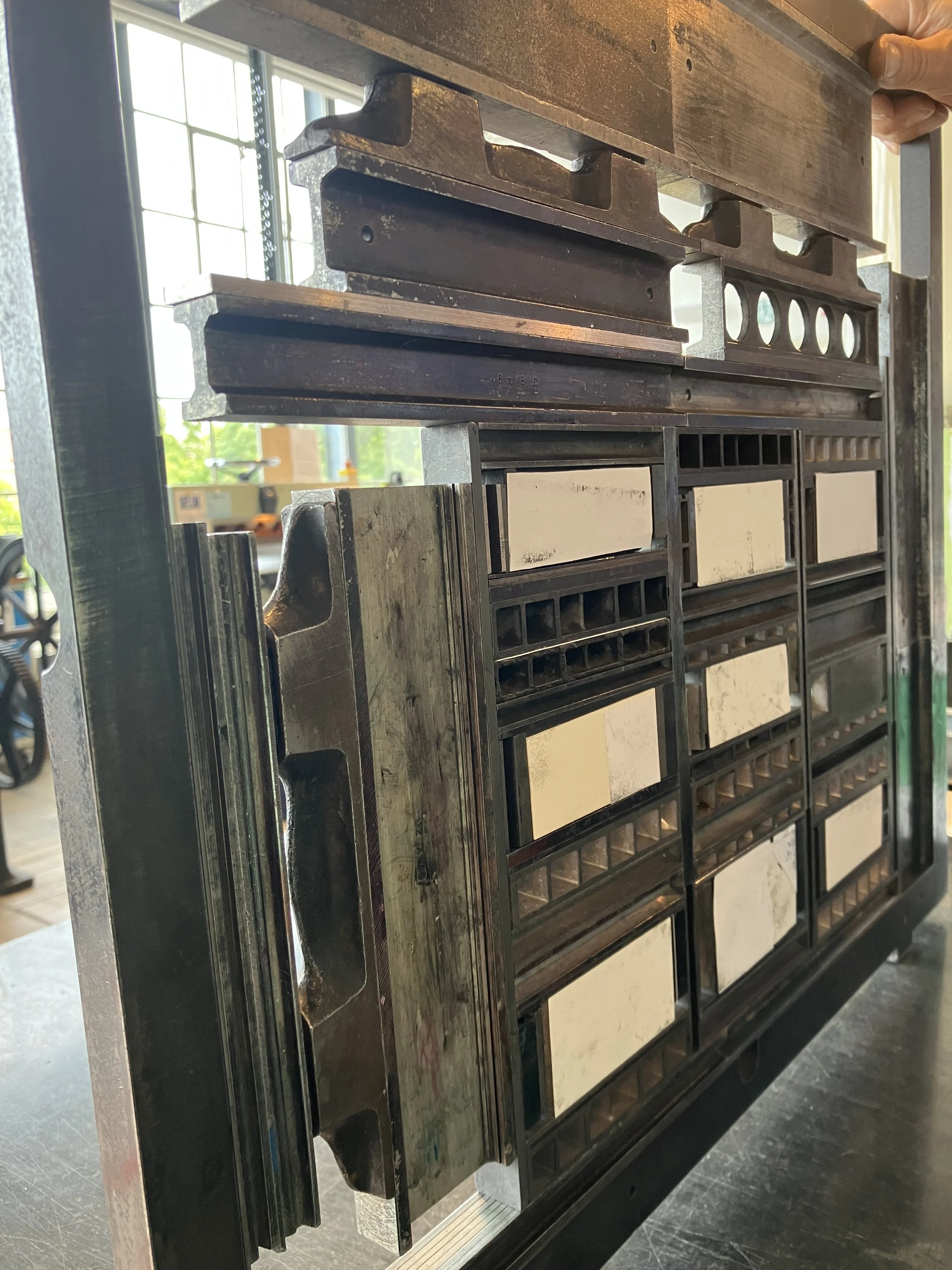
So we started over: measuring, adjusting, gluing tiny papers under individual letters — all the practical joys printmakers know too well.
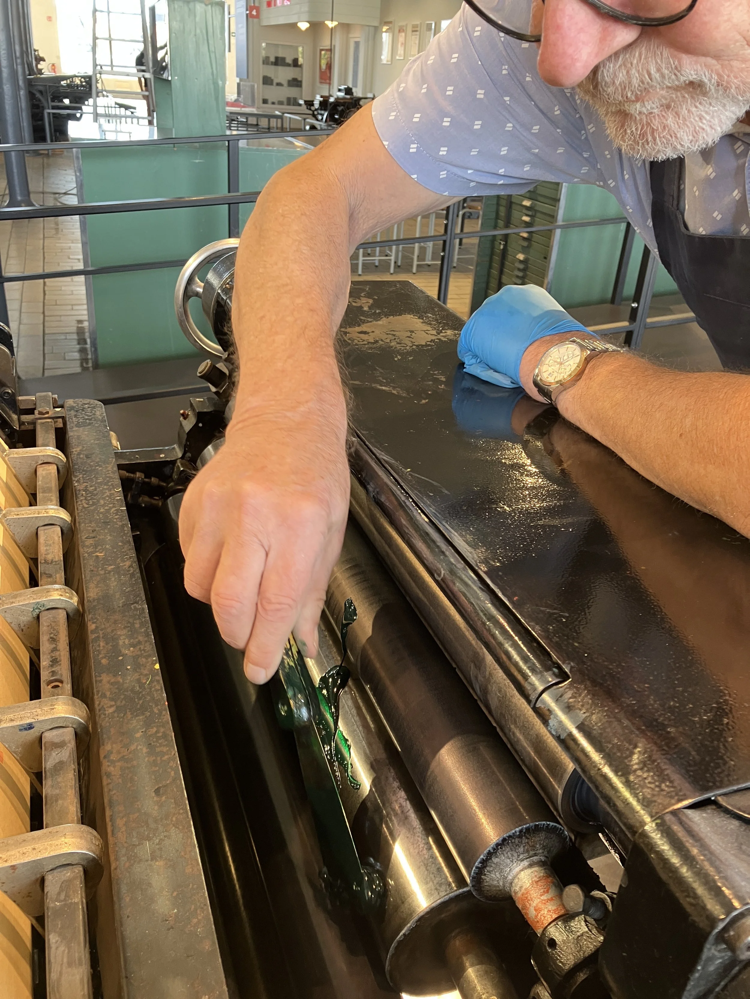
Once everything was corrected and locked up into a larger frame, the first print run went smoothly. The second gave us trouble when some spacing material began to rise. After finishing the print runs on Heidelberg, I returned all the formes to the FAG to print them again without ink, this time to create a tactile relief effect not achievable on the Heidelberg.
The backs of the cards were also printed on the FAG, which meant more measuring, more adjusting, and yes — more print runs than I can remember (and probably more than I want to admit).
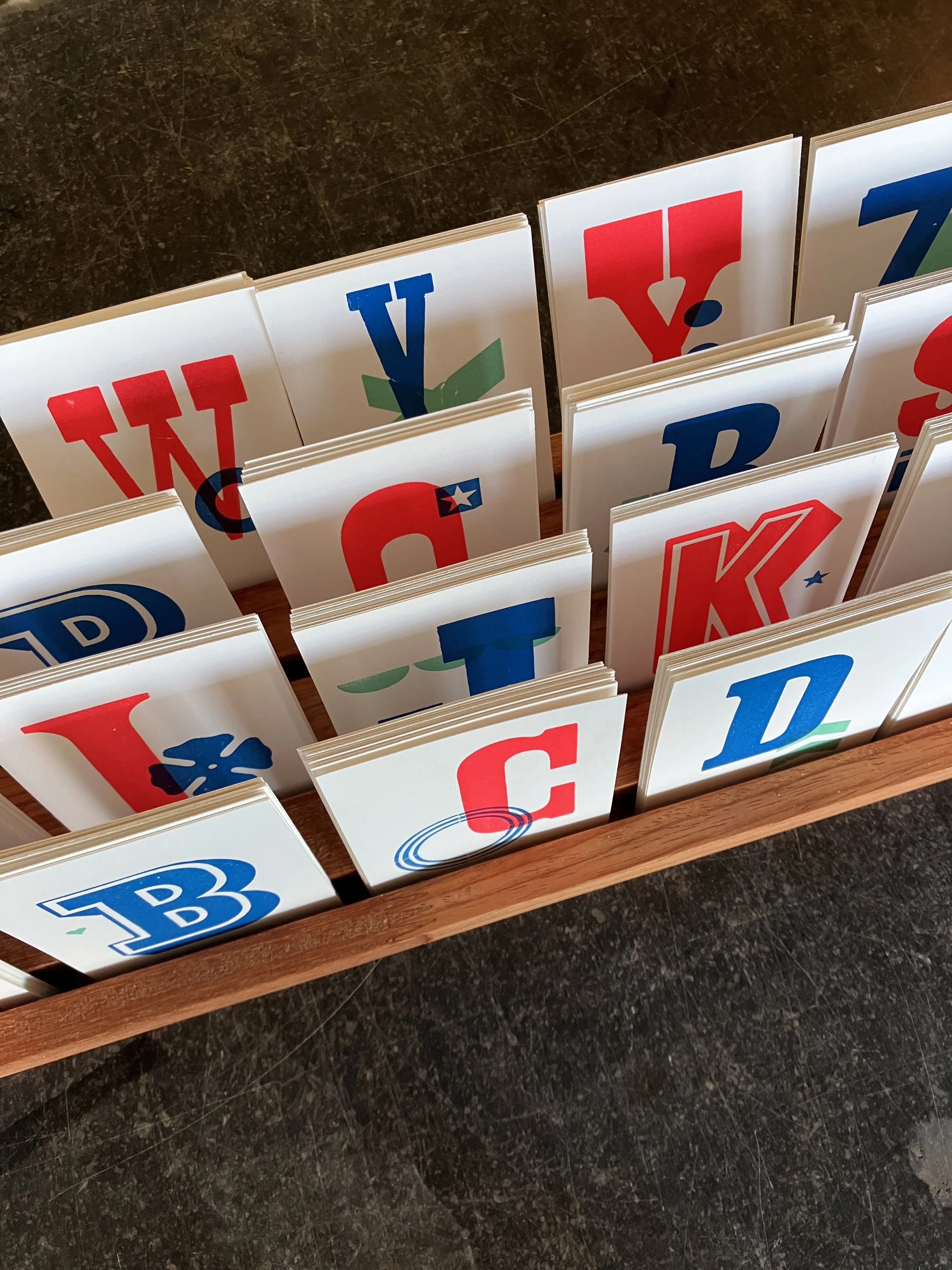
After printing and drying, it was time for trimming. And to finish it all, my colleague Renzi built a beautiful bespoke wooden display stand for the museum shop.
Although I regularly produce postcards and posters set from wood and metal type, this is one of the first project where the wood-type collection takes the spotlight. I’m excited to keep exploring the collection — so keep an eye on this space, and on the museum shop. There’s more to come ;)