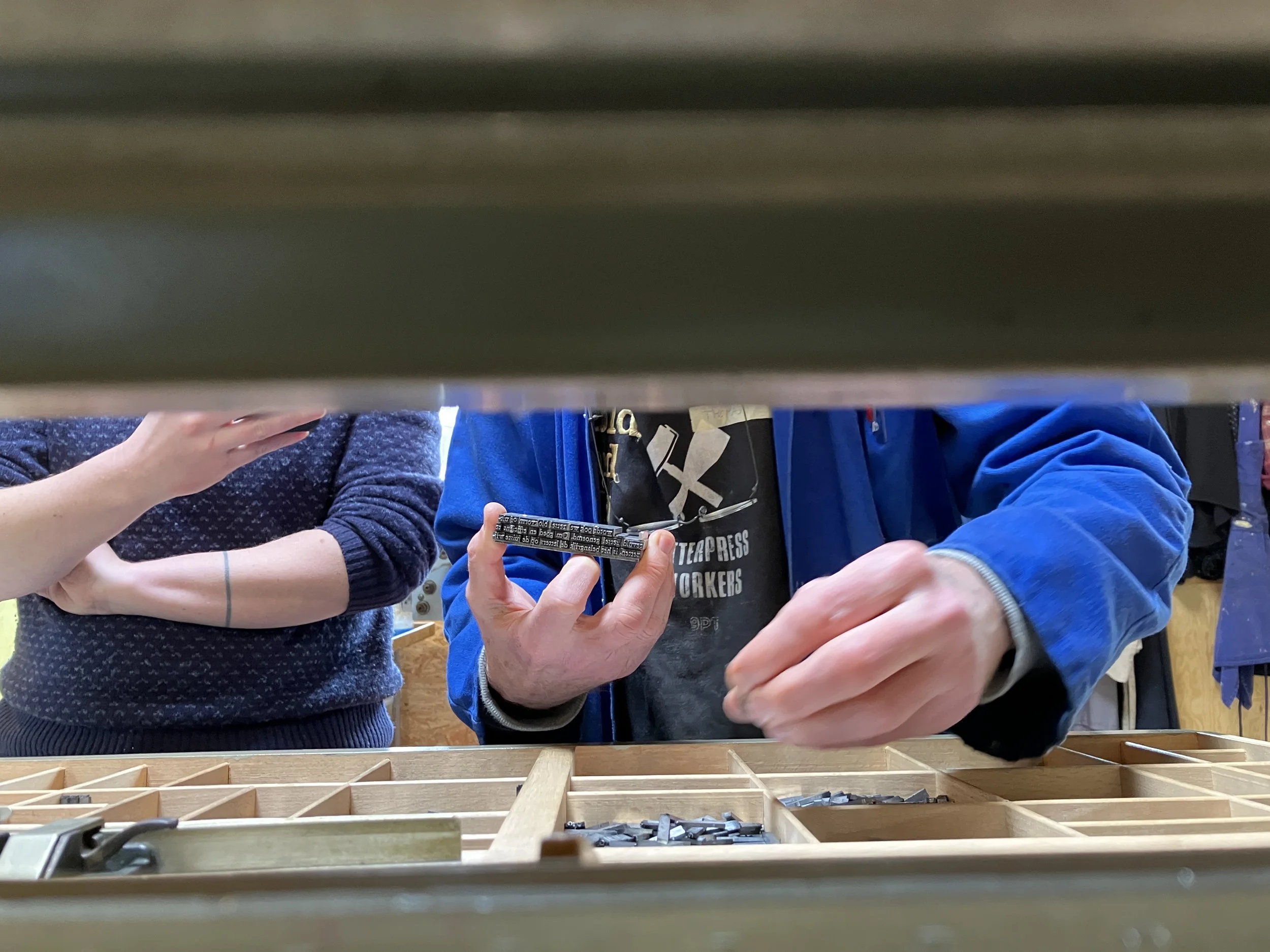
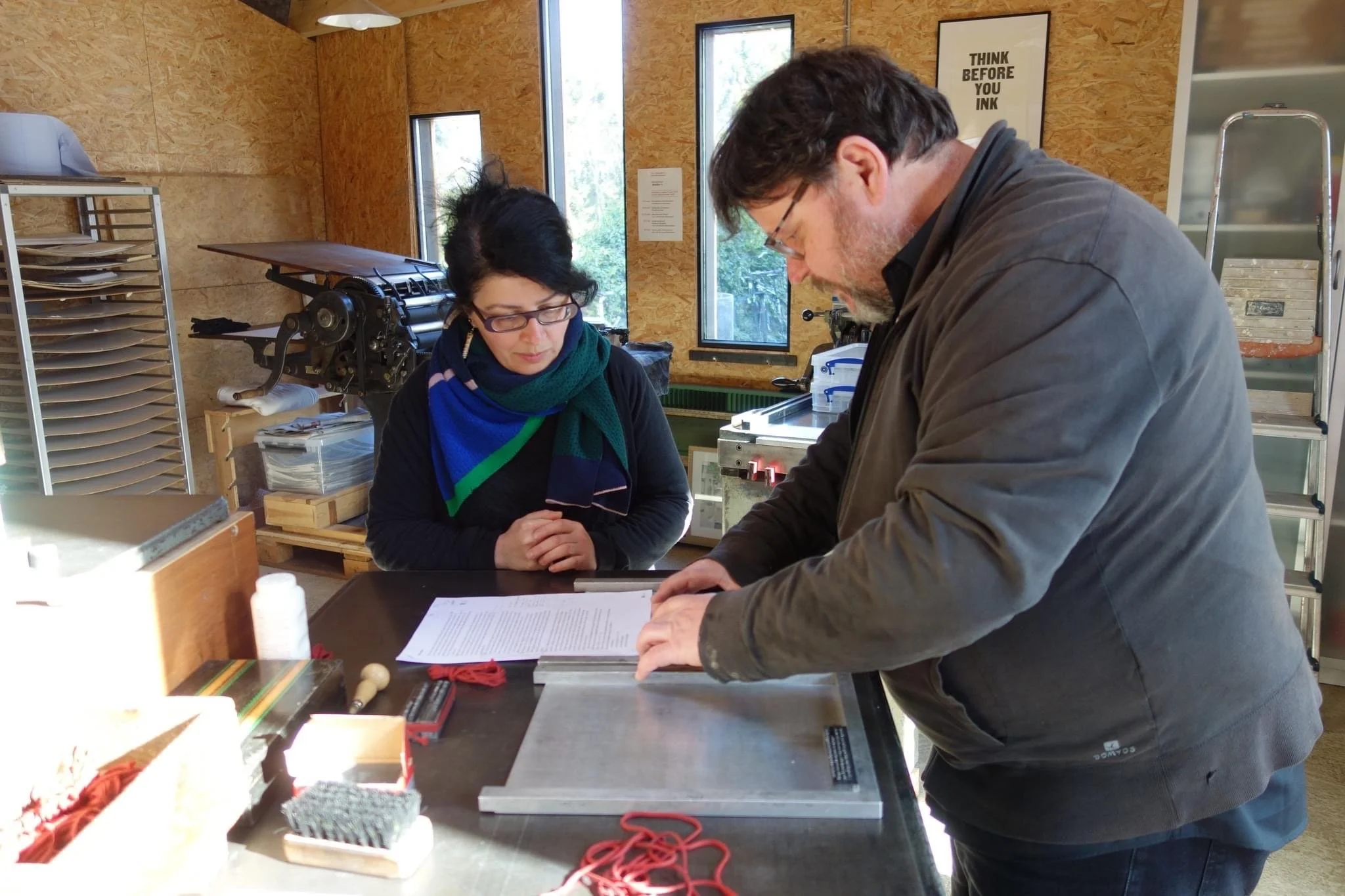
As the Easter holidays was approaching it was time for the second meet-up for our Meester-leerling project, led by Thomas Gravemaker with Niels Goovaerts and yours truly as exemplary students. This time our 3-day course took place at the Atelier t in Bierbeek. A newly built studio with 3 proofpresses and a large collection of metal and wood type seemed like a perfect playground for our next assignment: setting text. A long piece of text. This meant getting a the typescript, calculating the number of characters per line, drawing a basic layout, and then calculating the characters and lines again, the spacing and of course, deciding on whether it should be typeset in Garamond 10 or 12pt.
So on Friday morning, after having breakfast and sipping a cup of coffee we got the instructions from Thomas and began with the calculations. Then we decided on the layout of our page: the final format and the margins. After the total length of the given text had been calculated we could calculate the number of characters per line and were ready for the actual typesetting.
But before getting into the 'real' working mode I'd like to introduce you to the Atelier t, an art print studio in Bierbeek, near Leuven (BE) which not everybody is familiar with (yet).
Atelier t was founded by Katleen Vereecken and Niels Goovaerts. In the spring of 2022, a new, spacious and well-equipped print studio was built. Over the years, a large amount of wood and metal type was collected. In the Spring of 2022 all the – often newly cast – foundry type from LetterpressAmsterdam was purchased, thus creating an extensive high quality type collection. The studio is equipped with 3 quality proofing presses, an Eickhoff, a FAG and a Korrex Stuttgart. A small library completes the set-up.
Atelier t is an open workspace for slow printing. You are most welcome for letterpress printing and other techniques. You can follow one of the workshops or come up with your project, for which we offer tailor-made guidance.
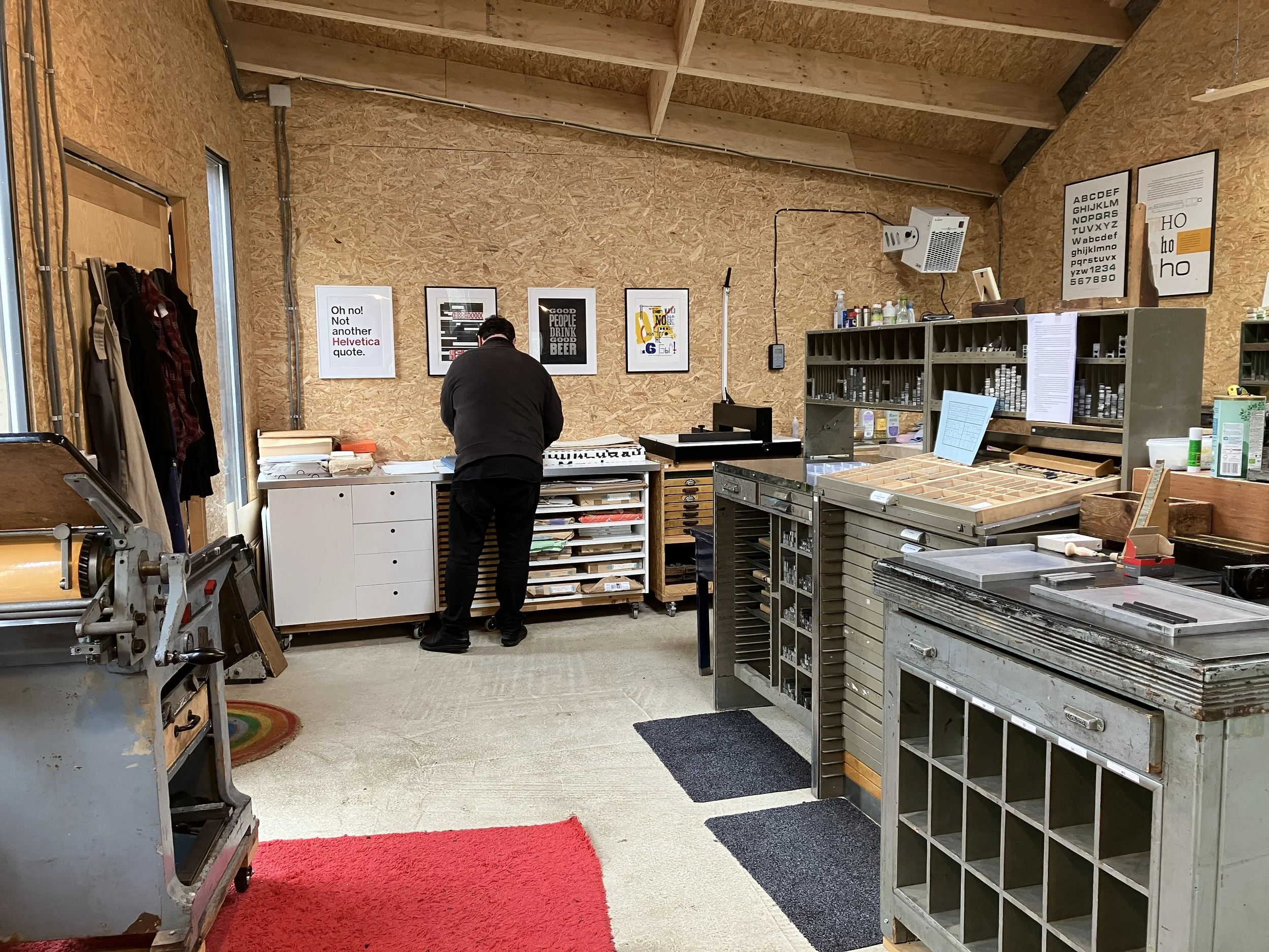
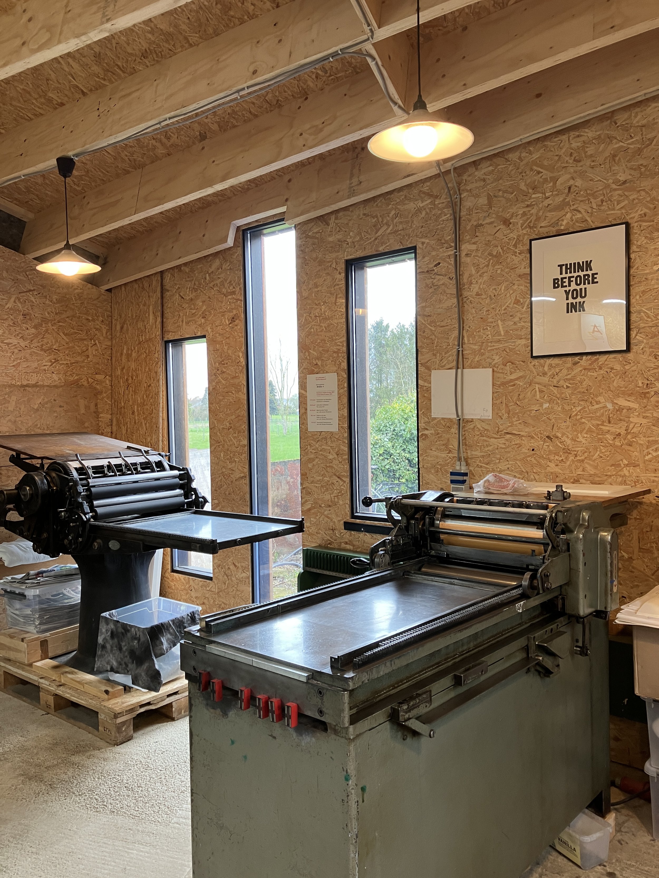
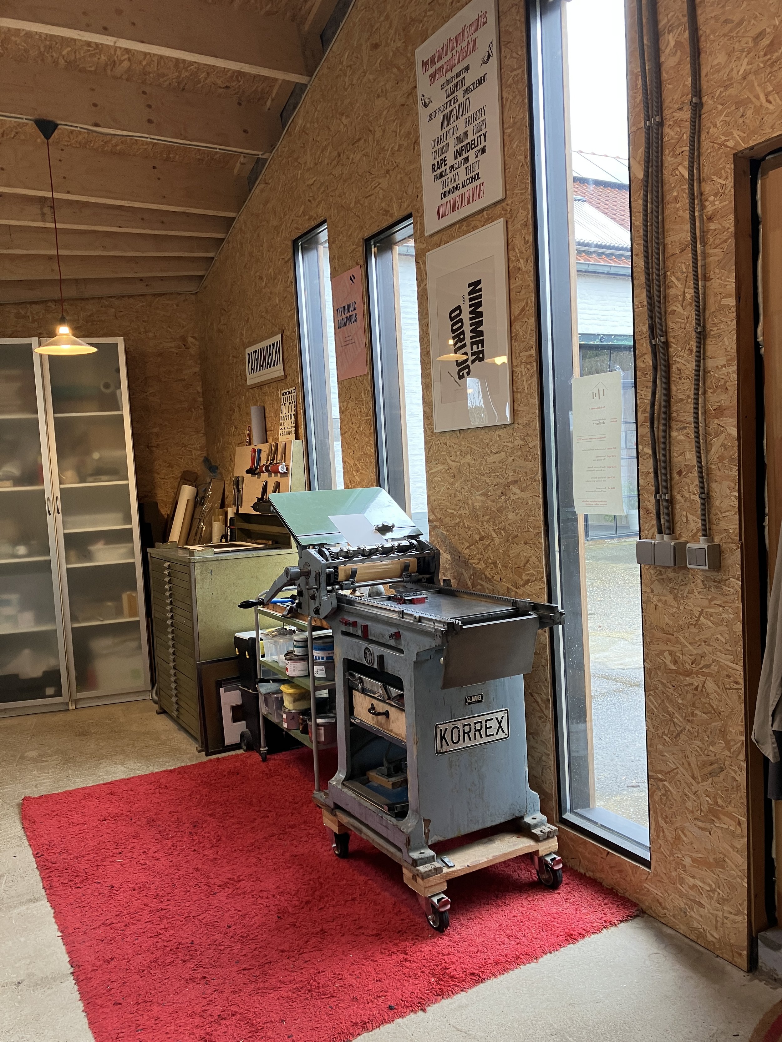
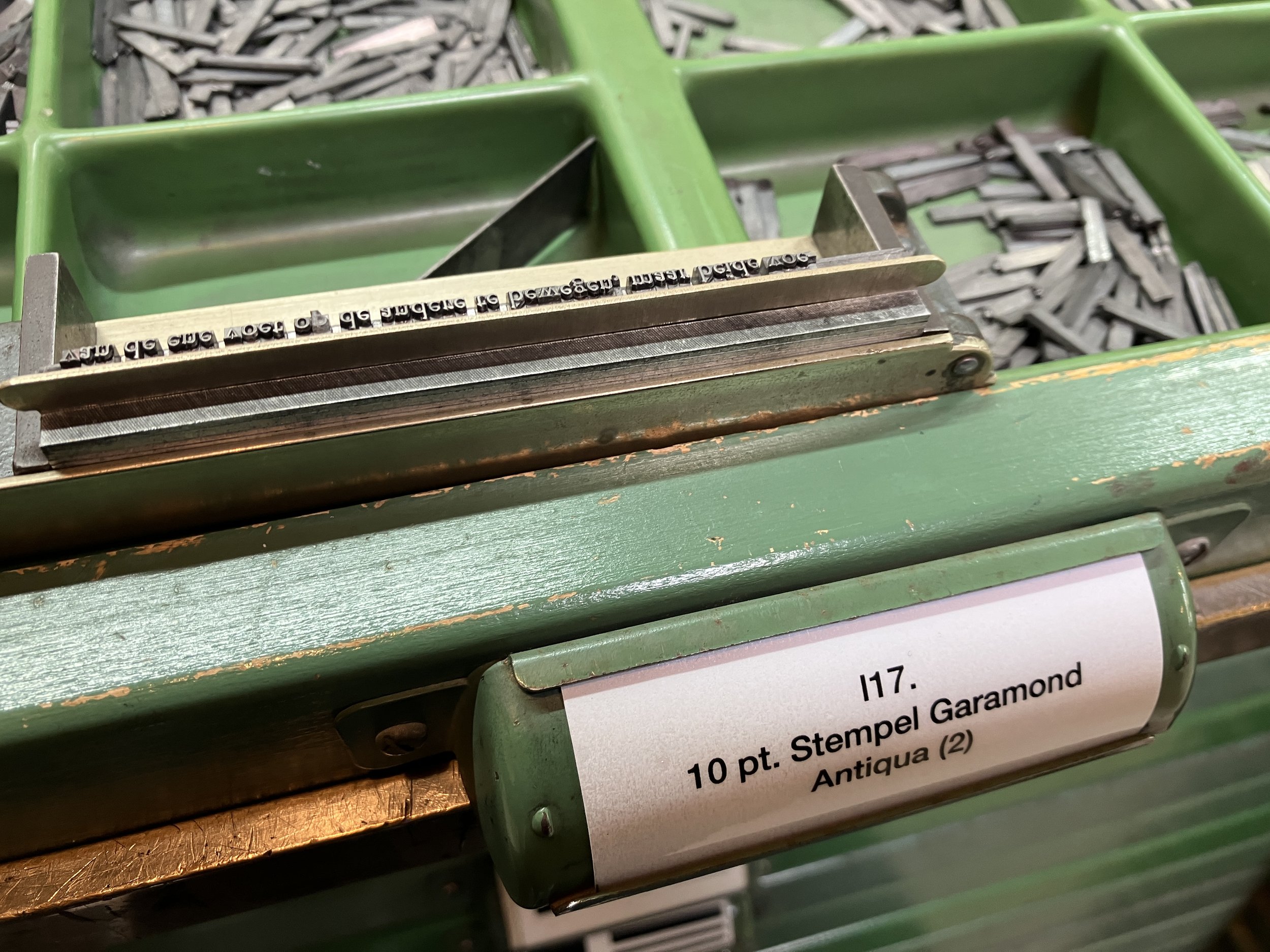
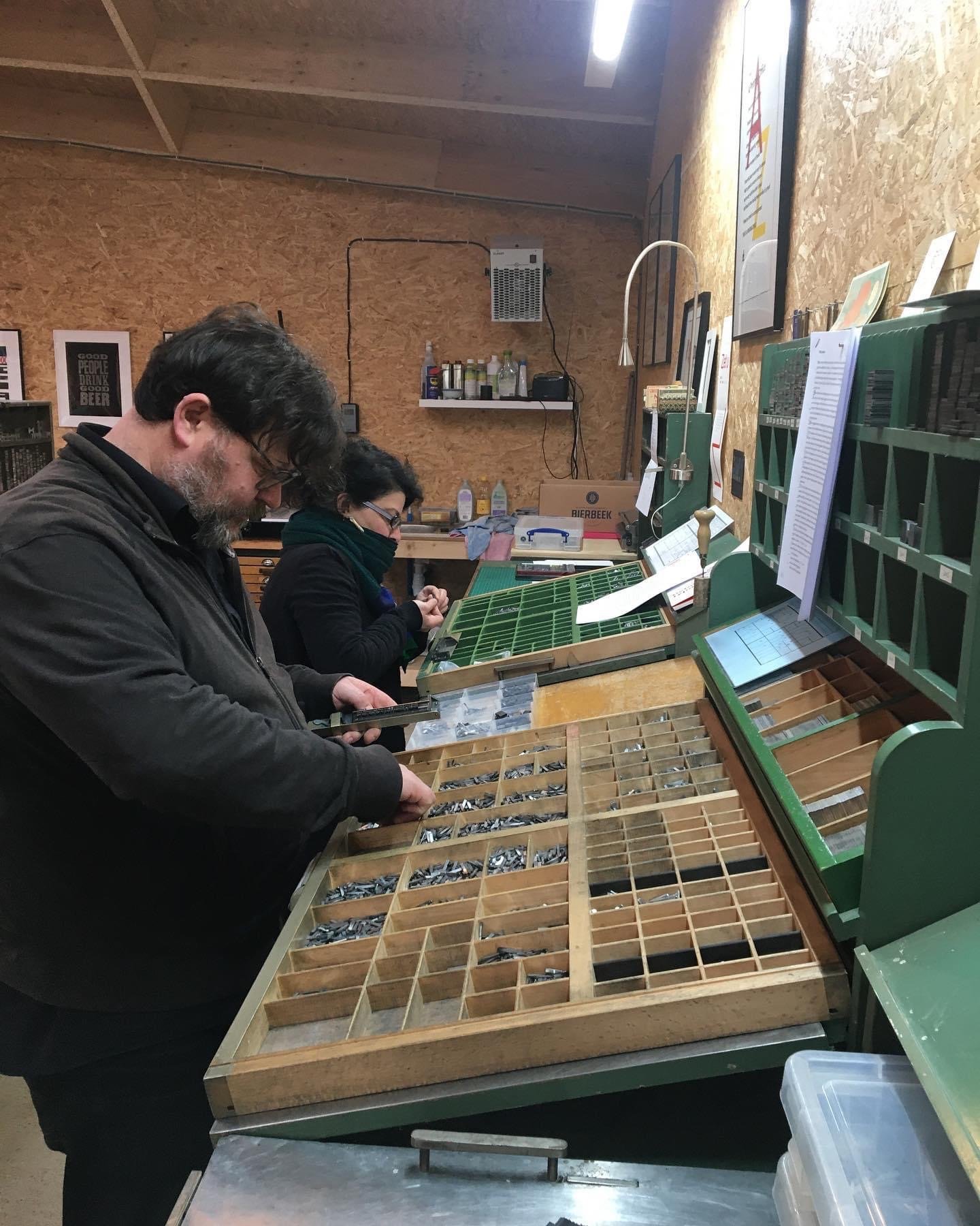
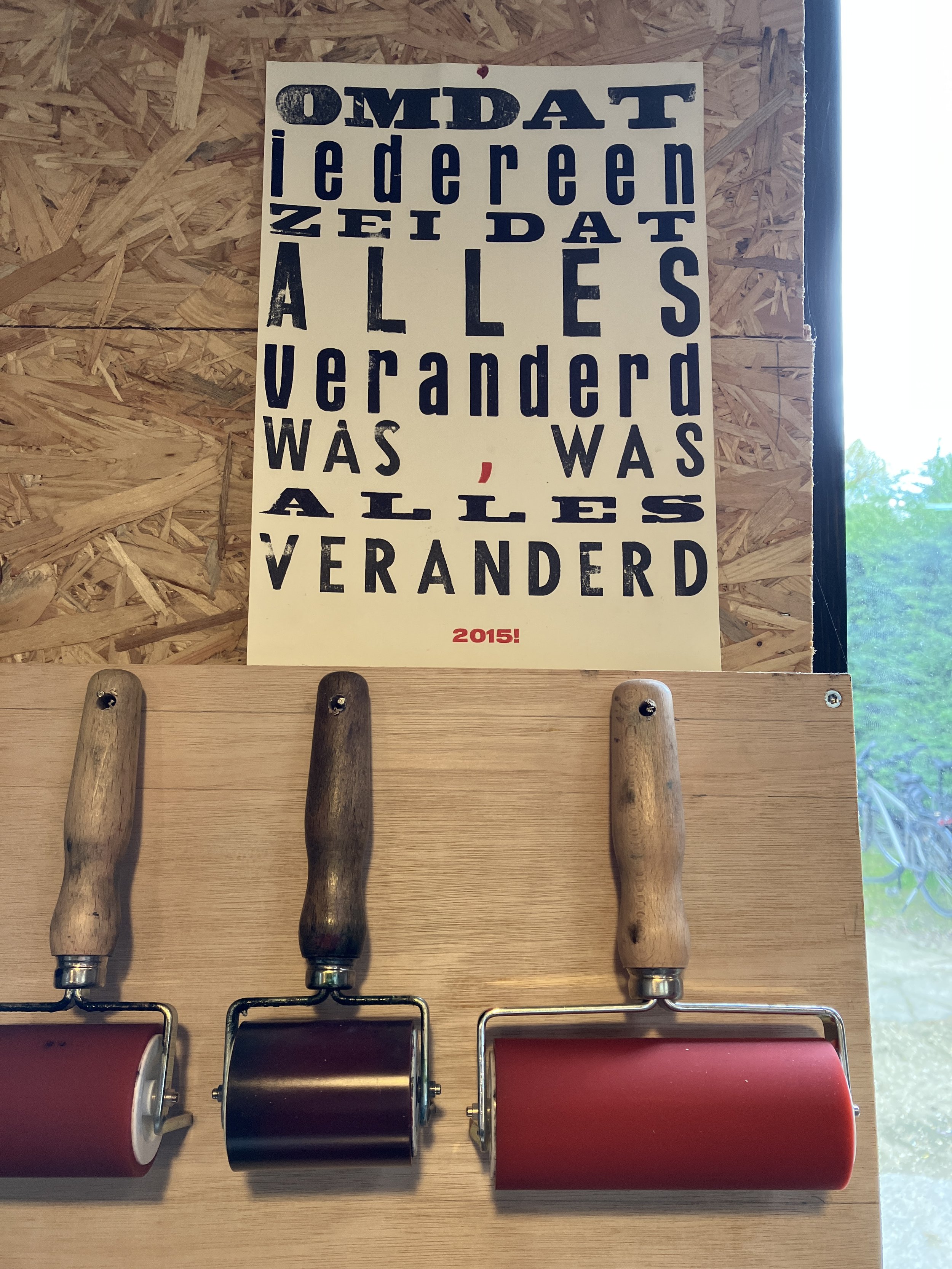
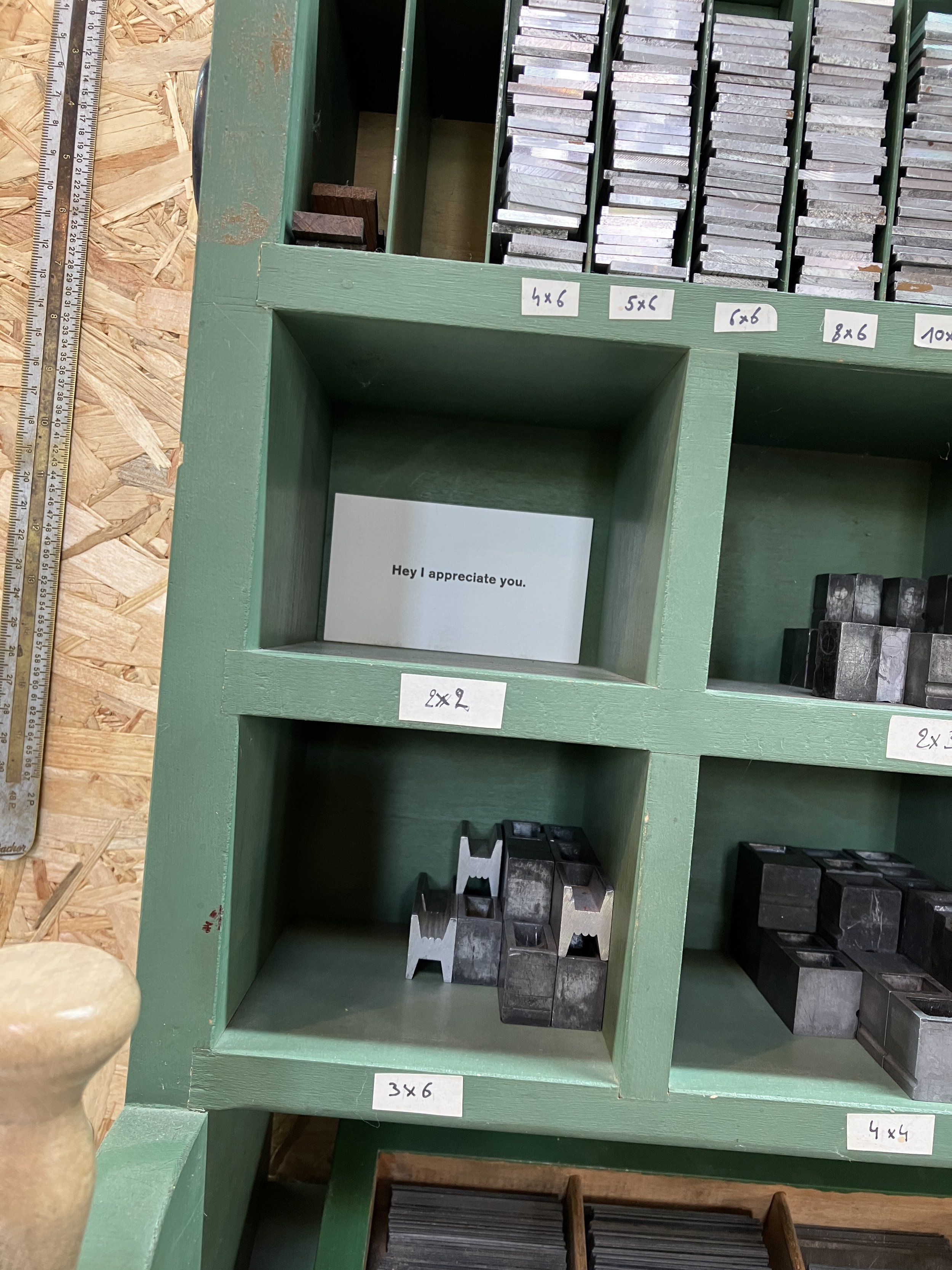
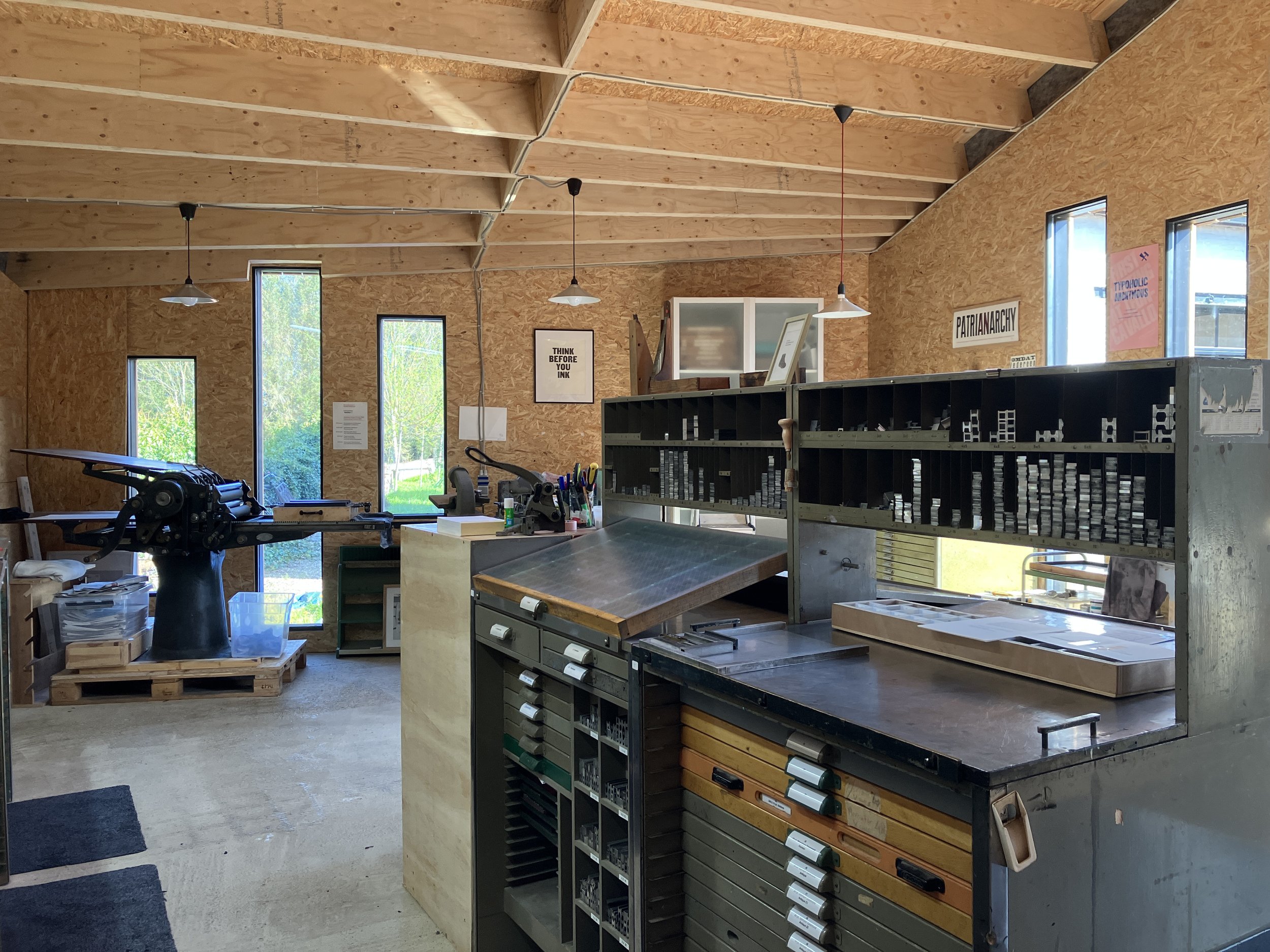
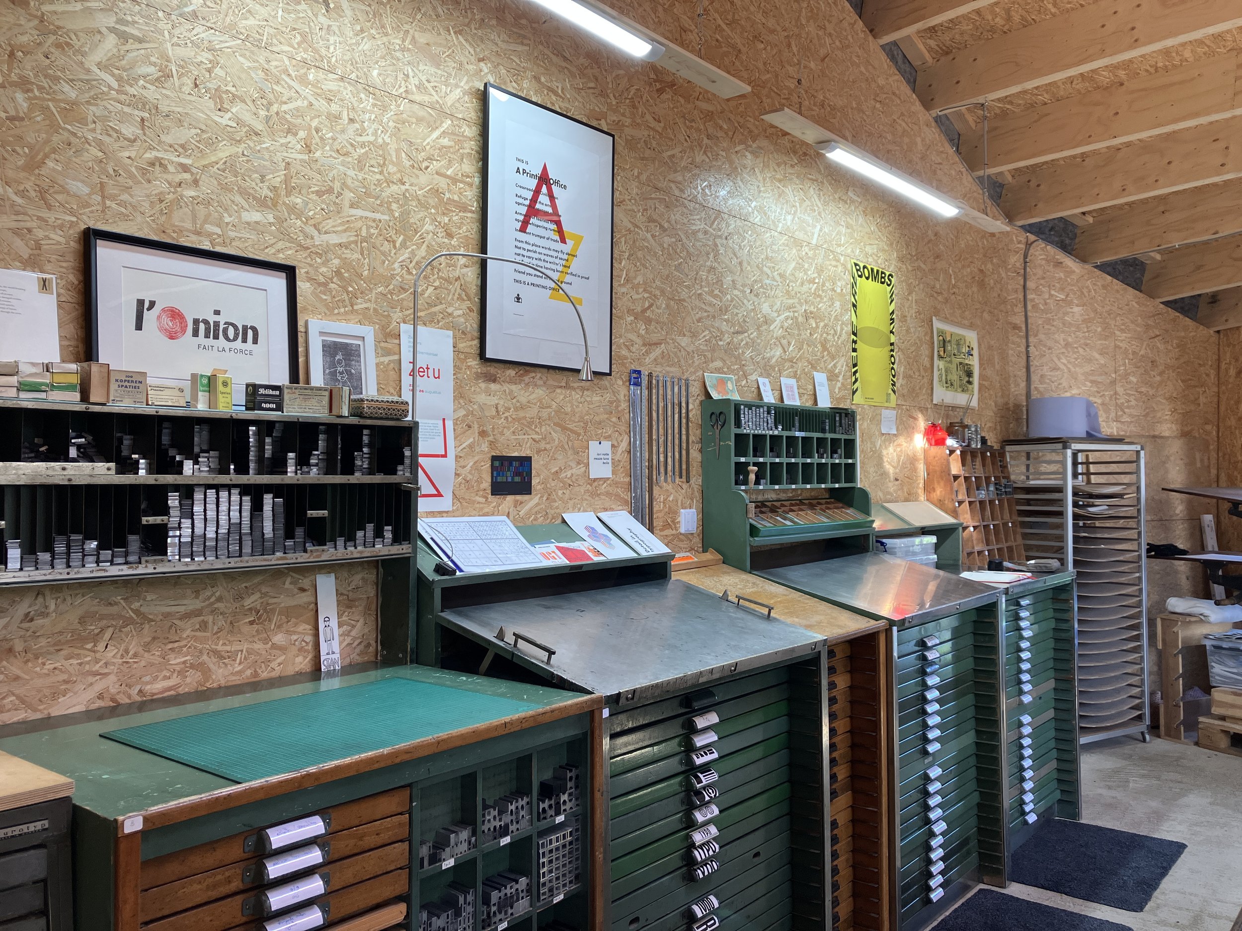
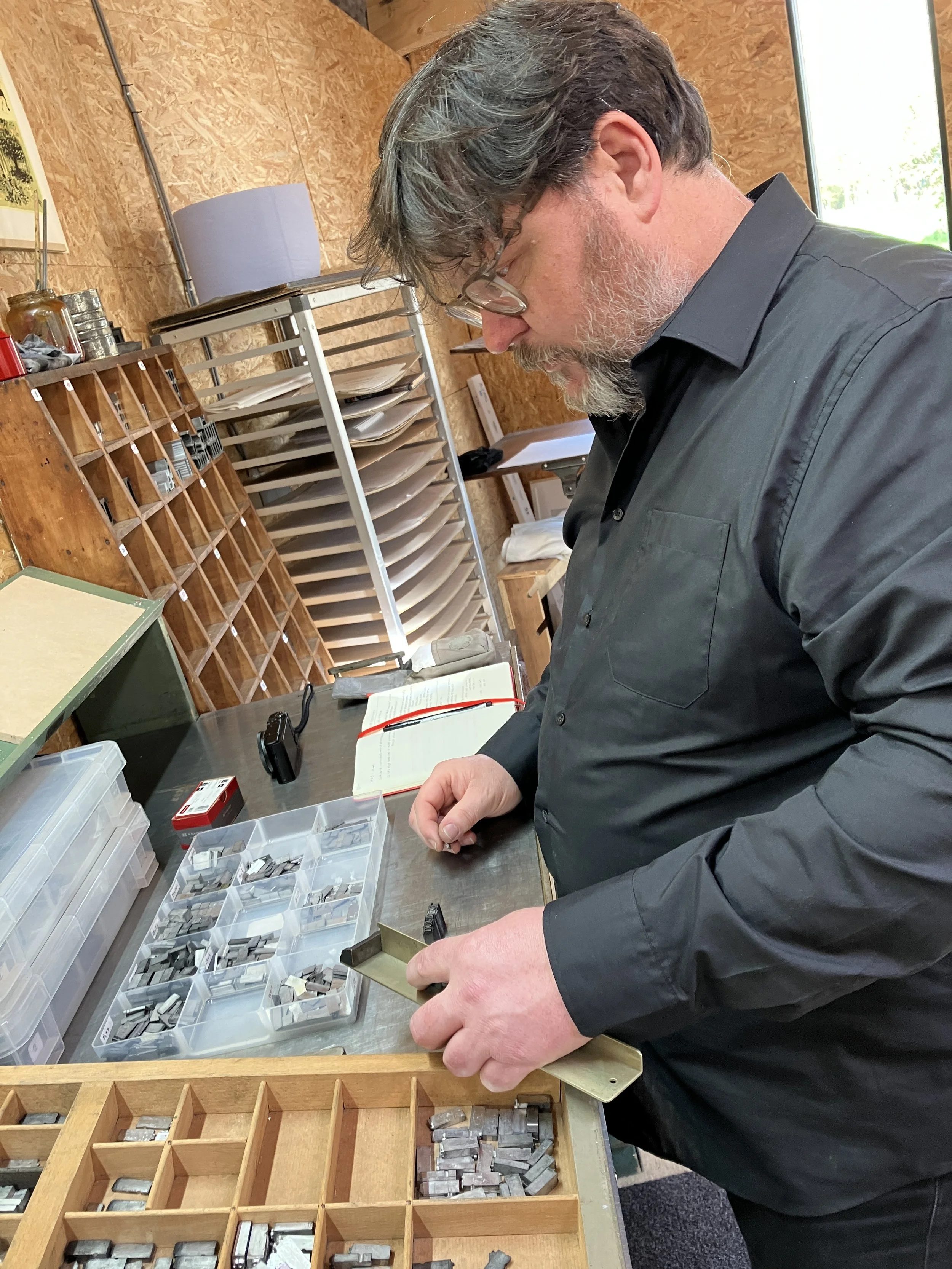
Although the space might seem not very big at first sight, it is very well organized. It is practical and cozy. There is enough space around the printing presses and the meticulously labeled cabinets full of metal type are standing alongside the wall and in the middle of the studio, allowing a small group of people to have enough space to put a galley and start working. Thomas Gravemaker has been advising and helping out not only with the layout of the workspace but also with tiny practical details which made the working process much easier. Well, as you might know, the spacing material is normally kept in the case itself. And you might have experienced that the spaces are frequently getting mixed up, especially after running workshops. So at Niels' place, the dashes are absent from the case. Instead, they are placed in plastic boxes, neatly organized by thickness and arranged by the point size. This makes the typesetting and dissing easier and the problem of 'spacing chaos' in the case itself is almost eliminated.
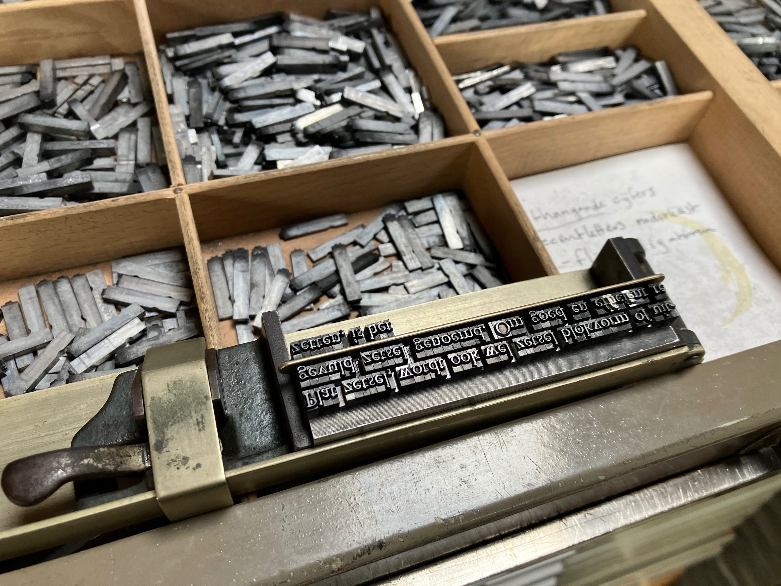
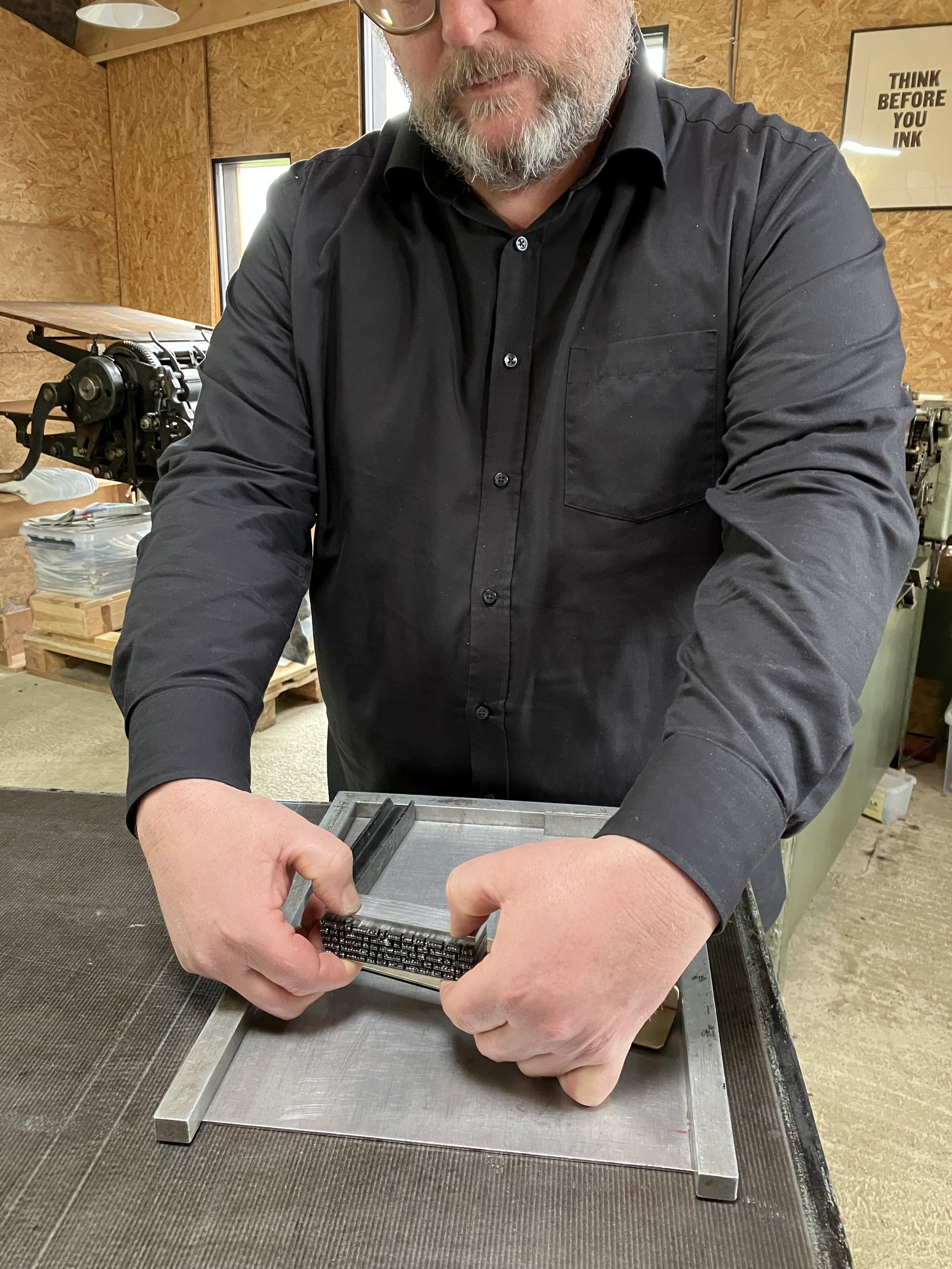
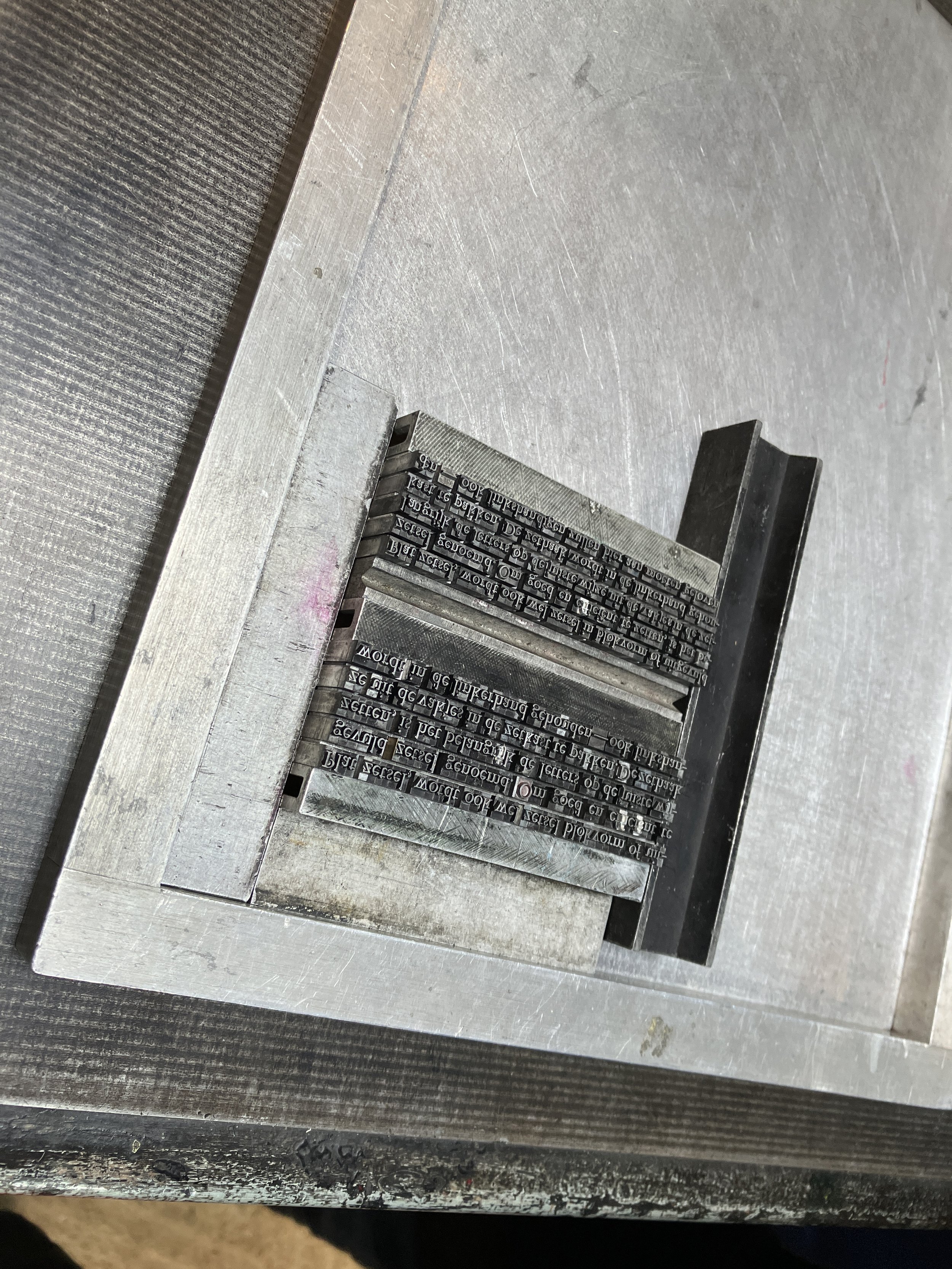
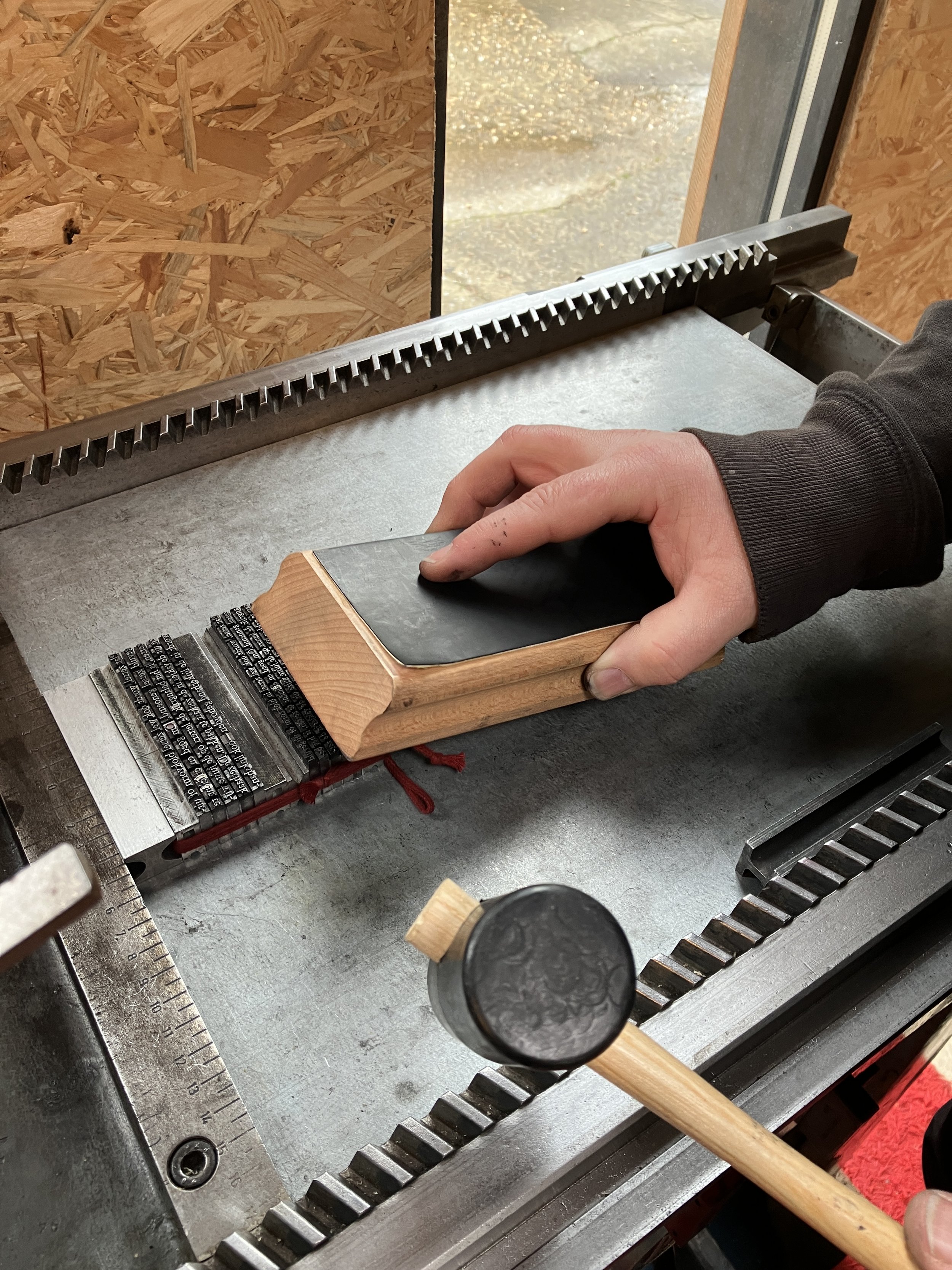
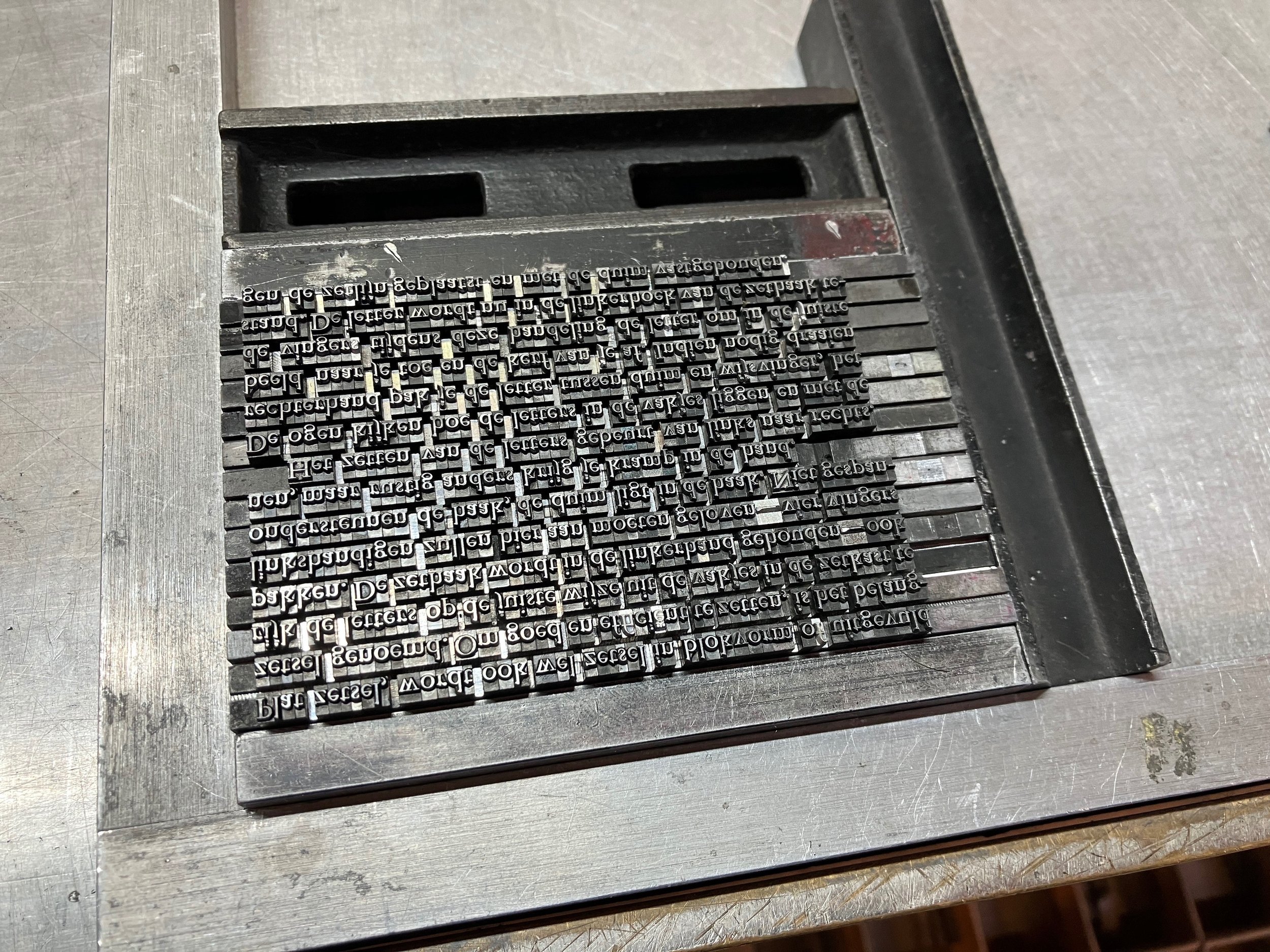
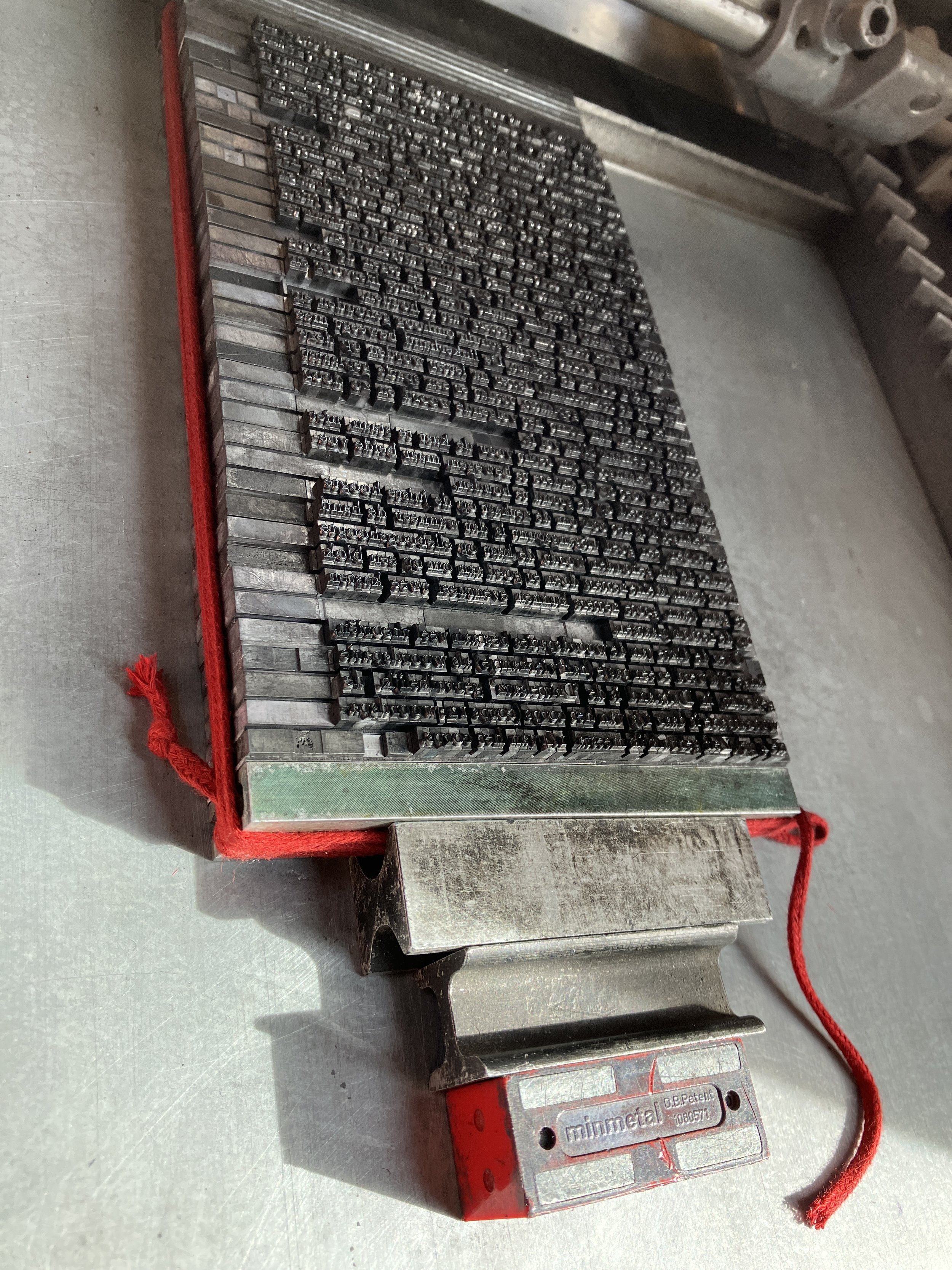
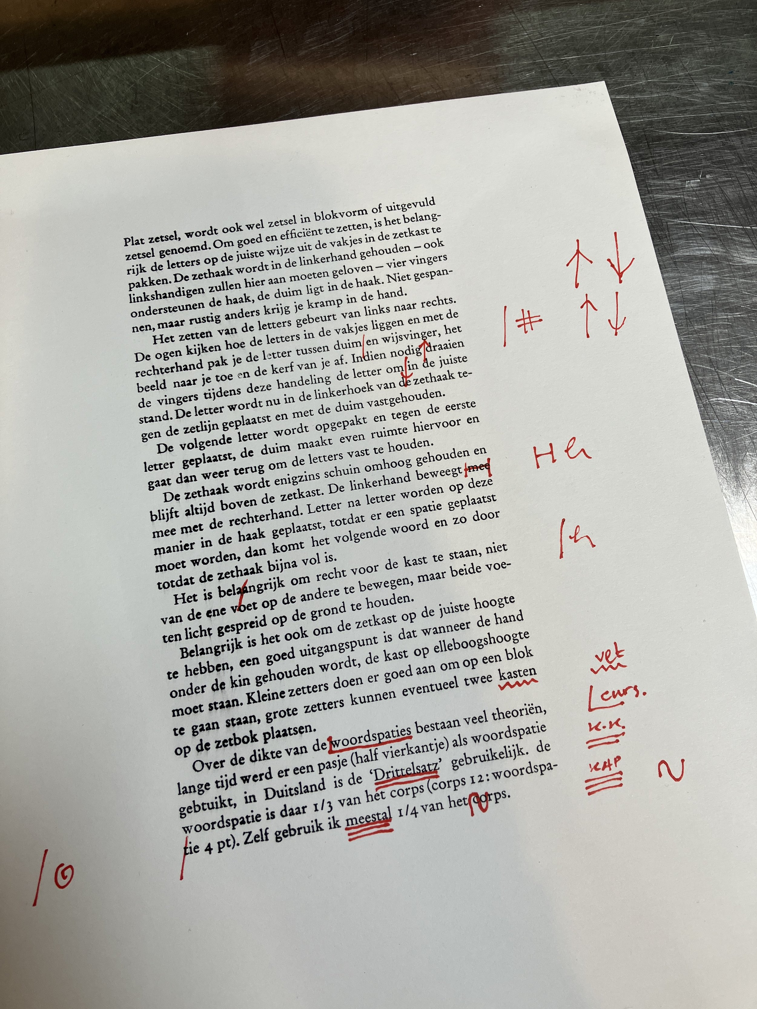
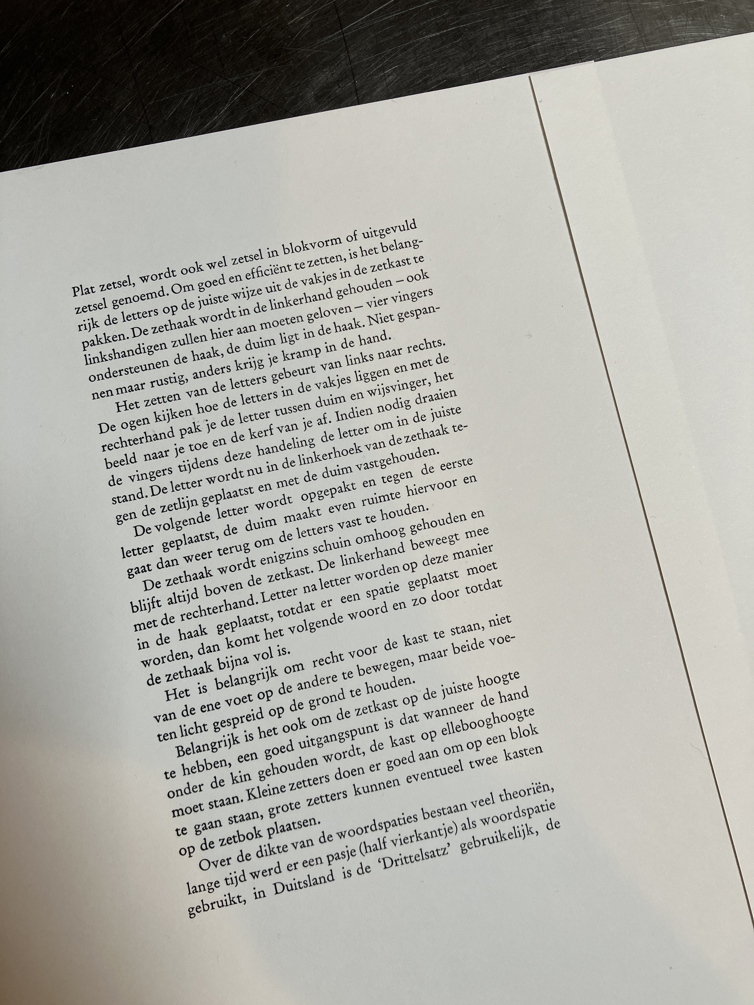
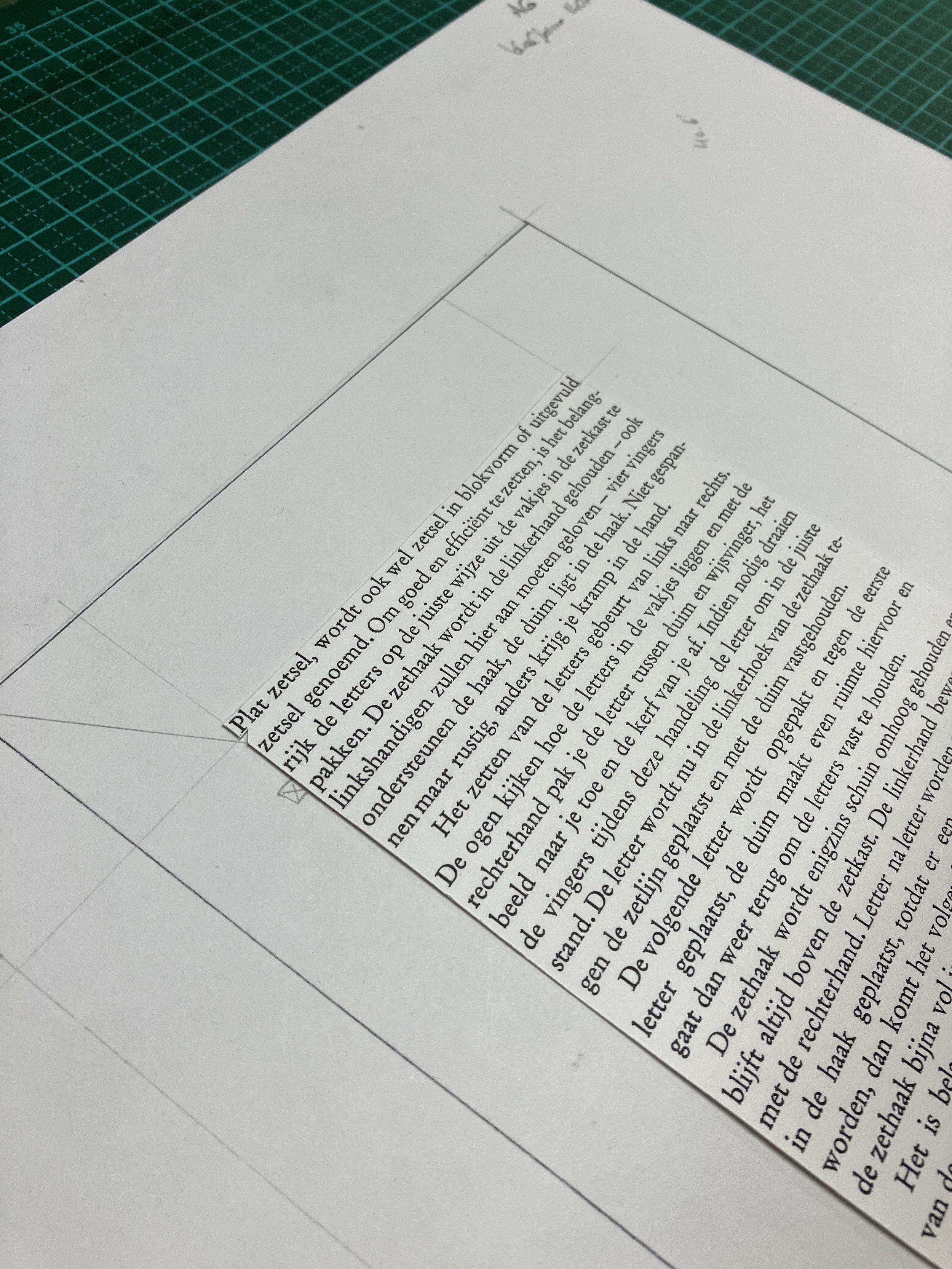
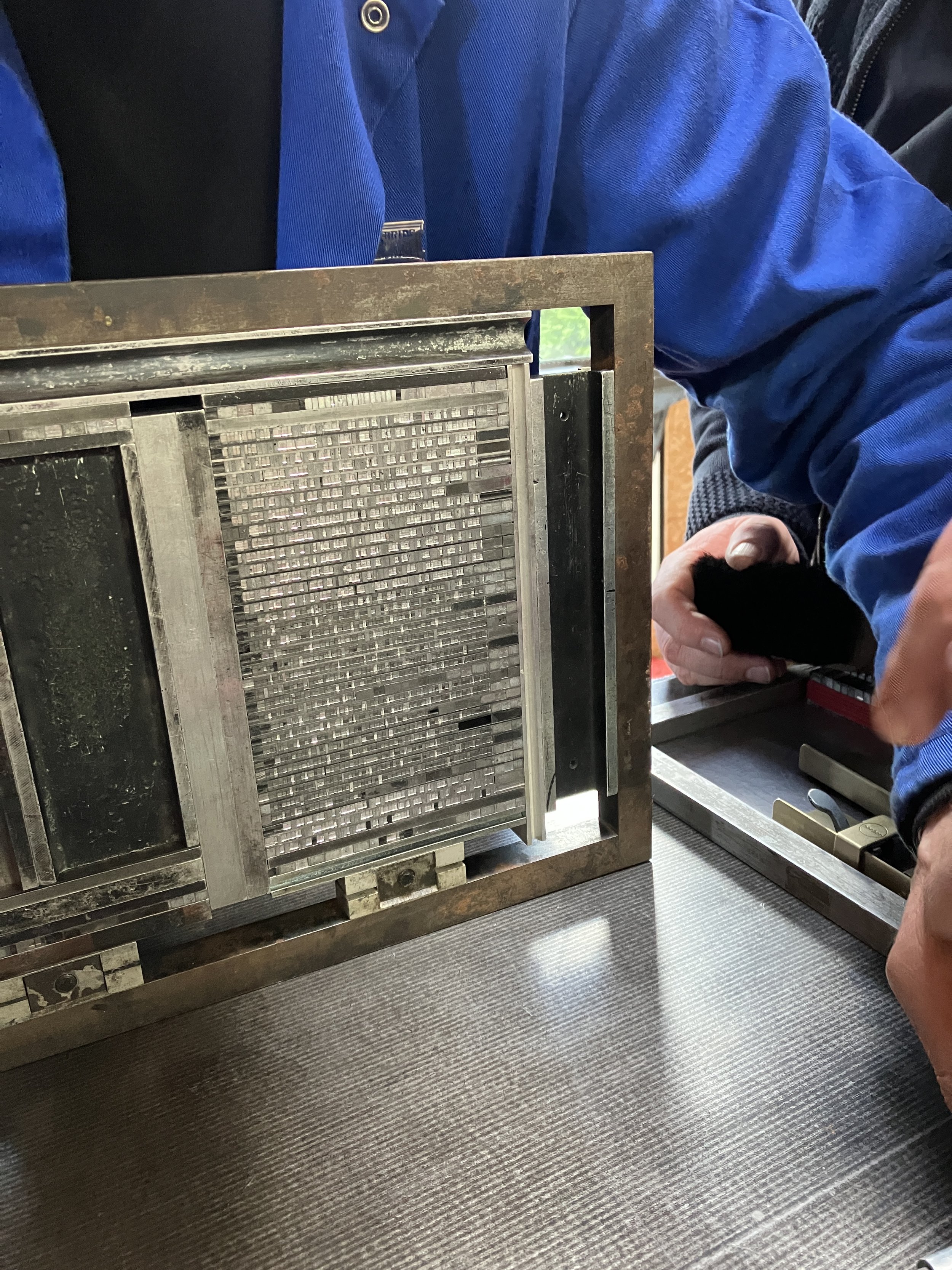
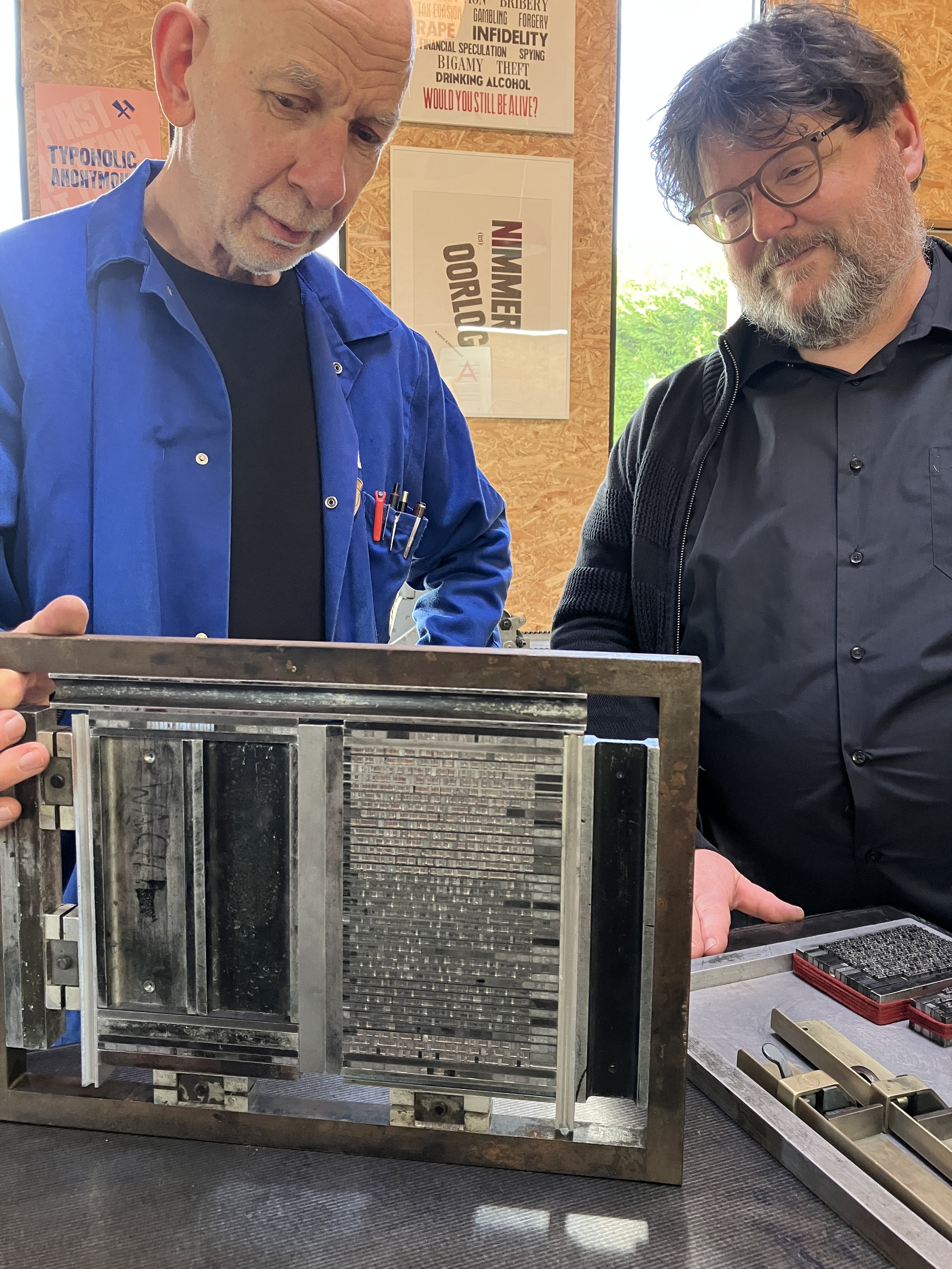
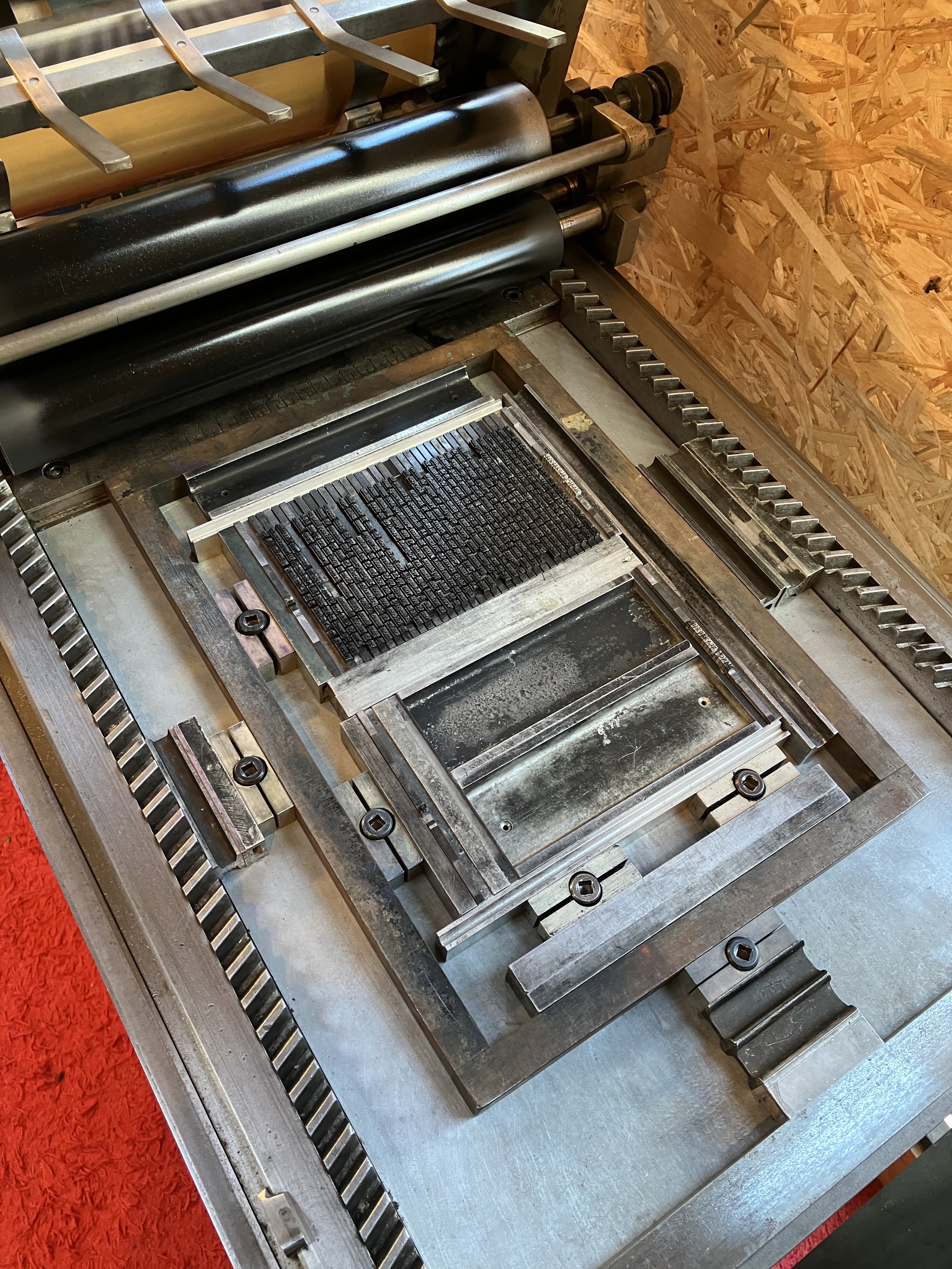
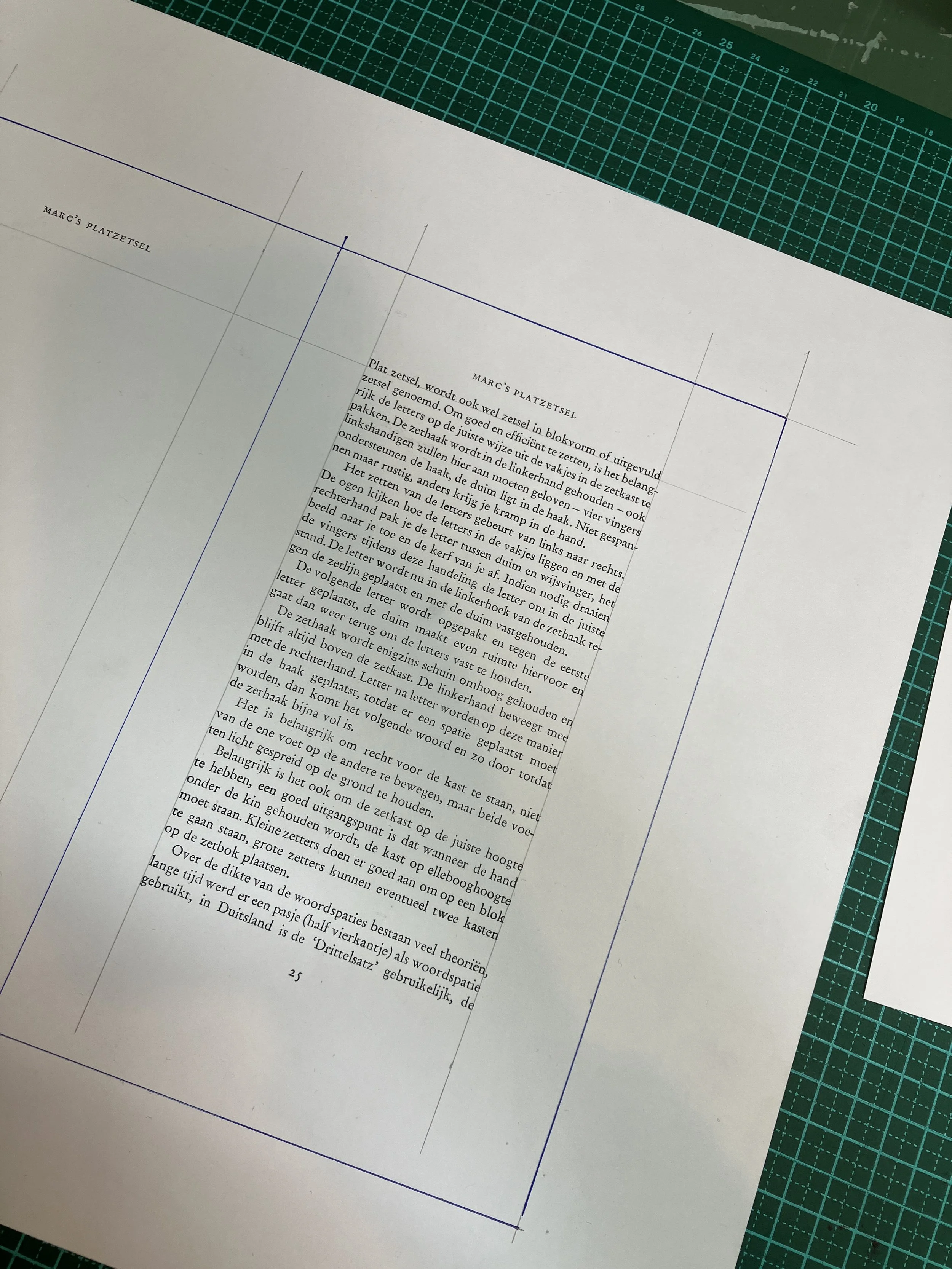
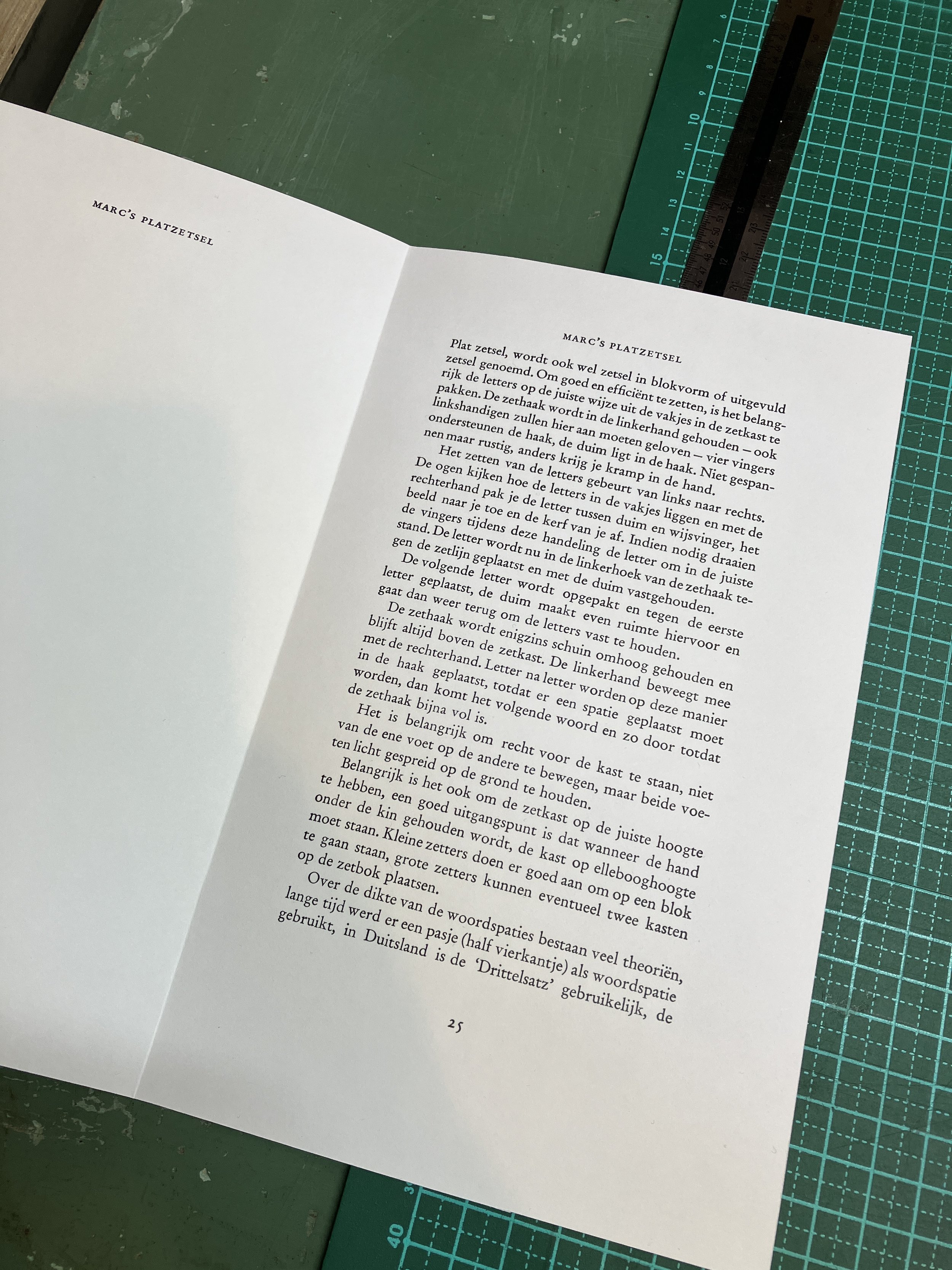
And now back to typesetting. Before deciding on whether our text should be printed in Garamond 10 or 12pt with 2pt leading, we decided to typeset the first paragraph in both sizes, print a proof and then make the final decision. Well, although Garamond is a beautiful character the 12pt seemed a bit big for typesetting a long text. So I dissed the 12pt and we started typesetting with 10pt. After proofing and correcting the typos - as I set the same word twice and had to 'rebuild' about 5 lines of text to get it right - we managed to get a perfect print. This printed page was carefully cut out by Thomas and pasted on our layout page that we prepared in the morning. Then the folio (page number) and the small title were added and another proof print was made. Time for a dinner break and a glass of wine!
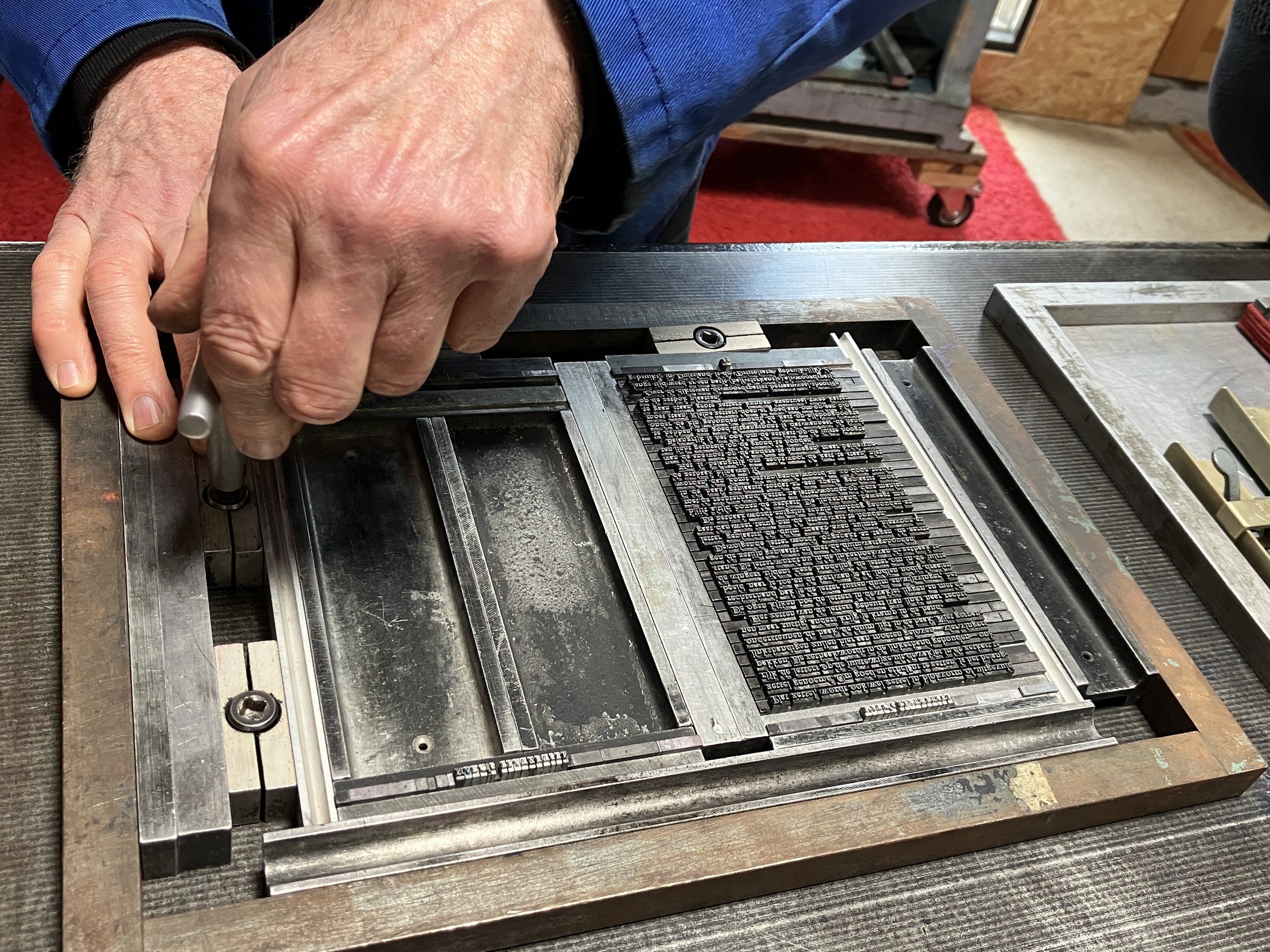
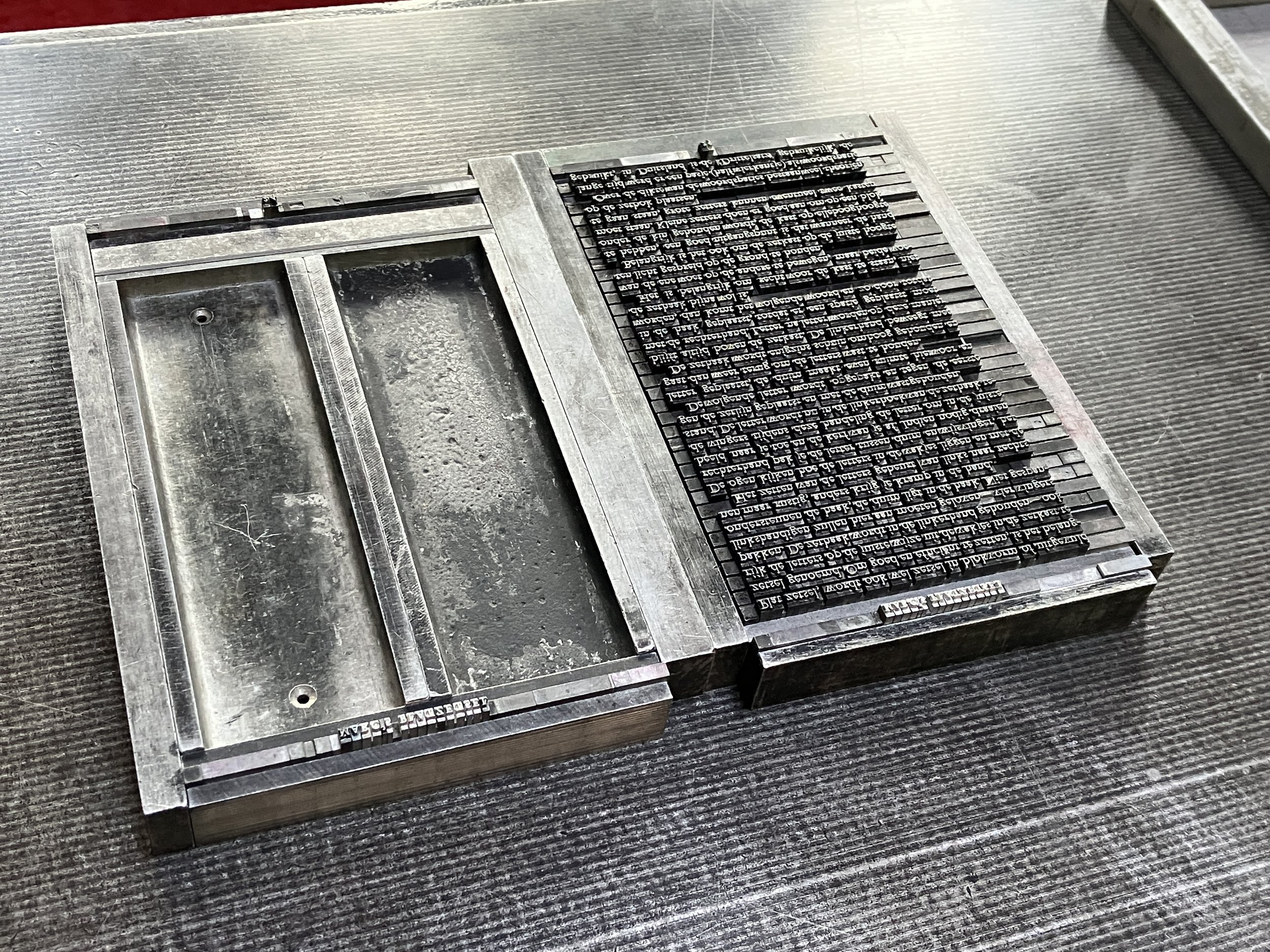
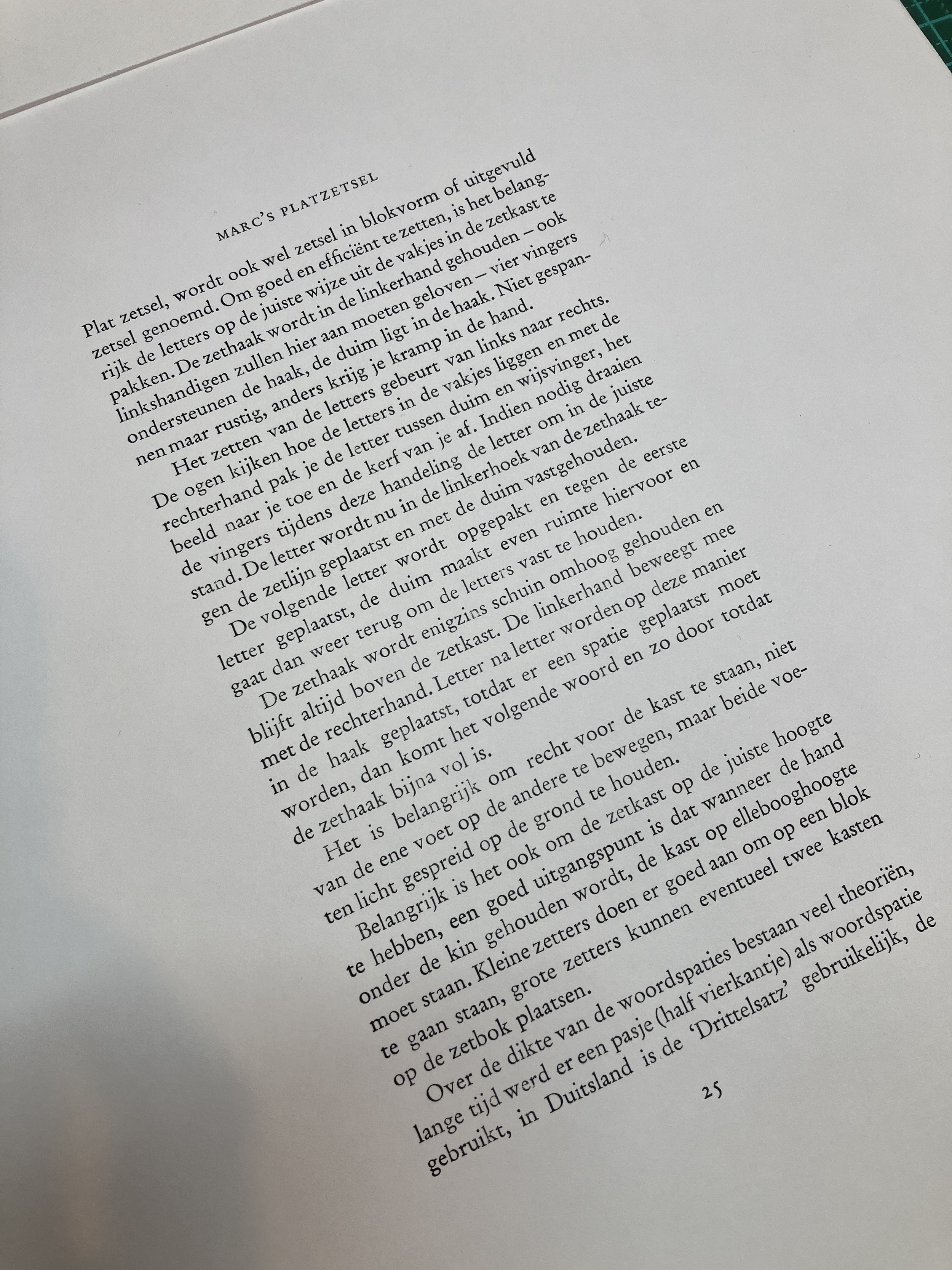
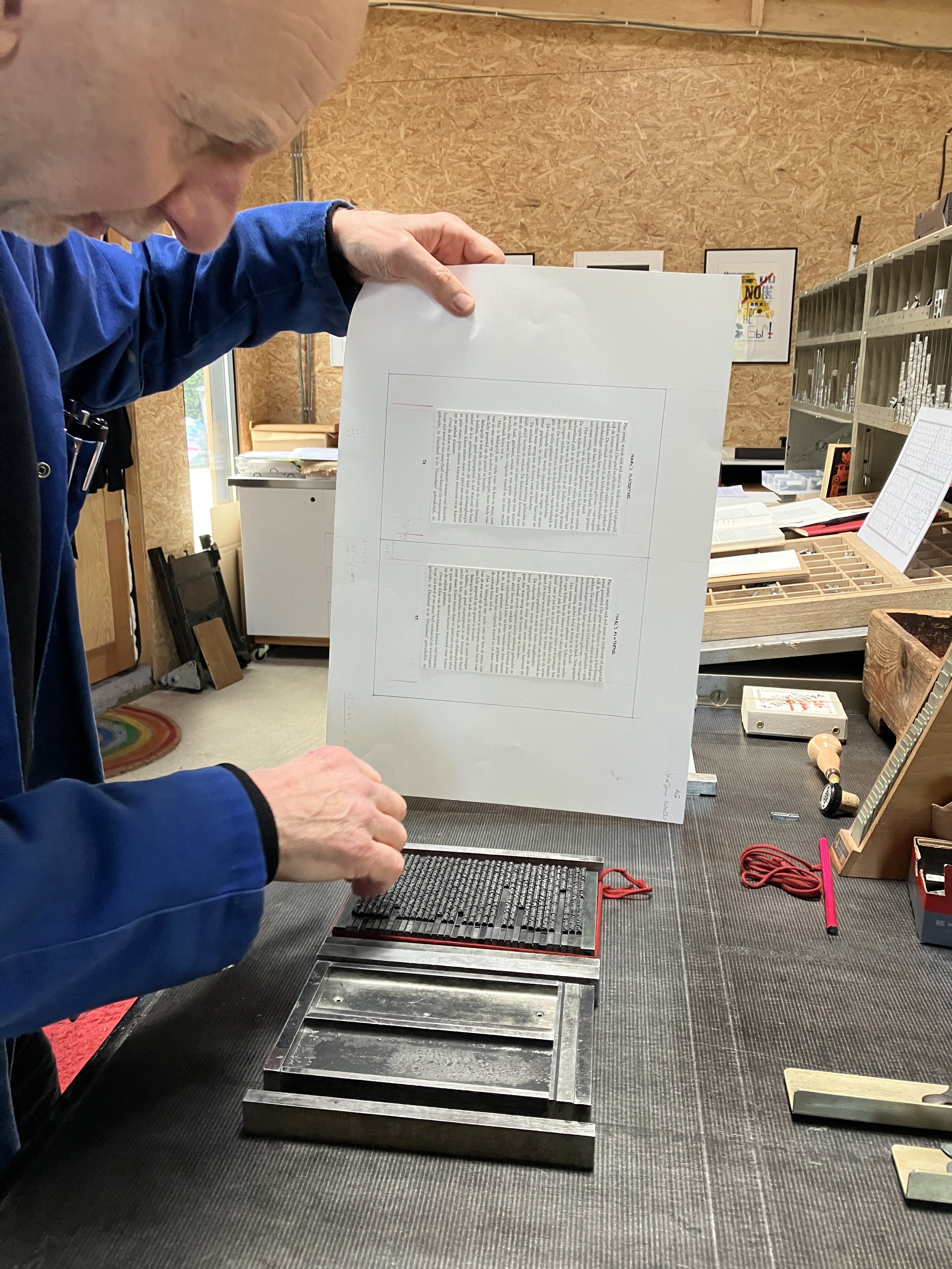
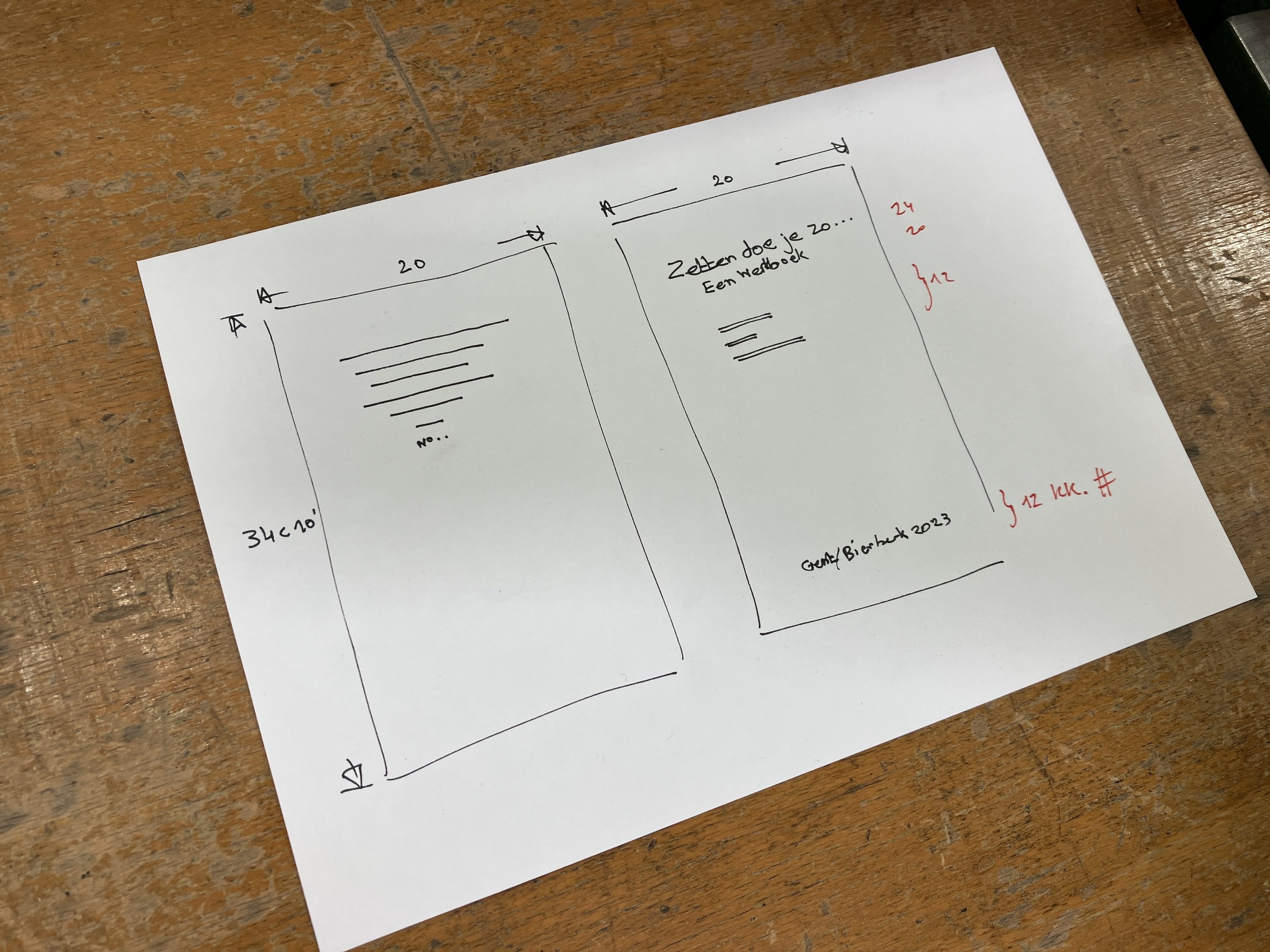
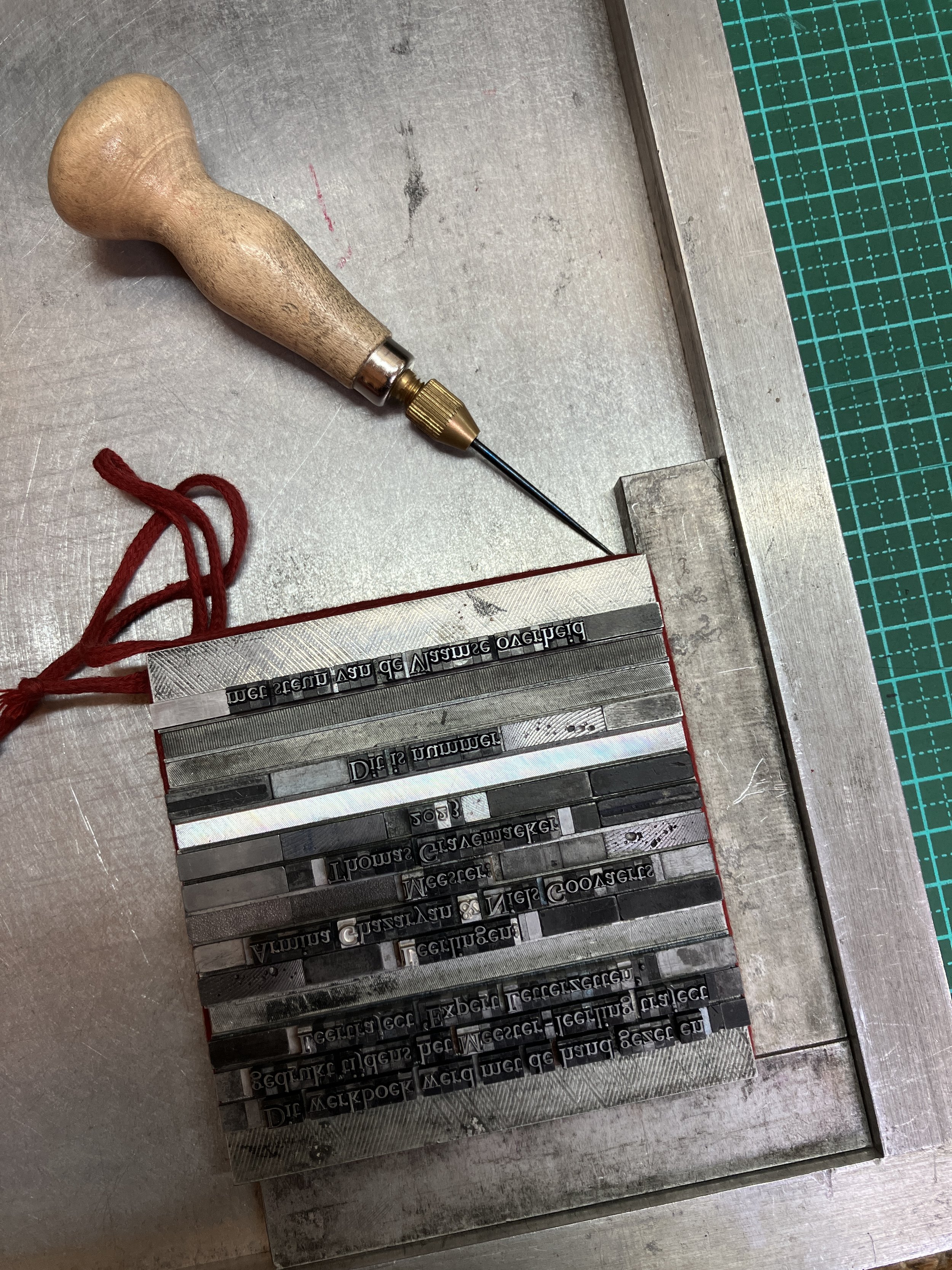
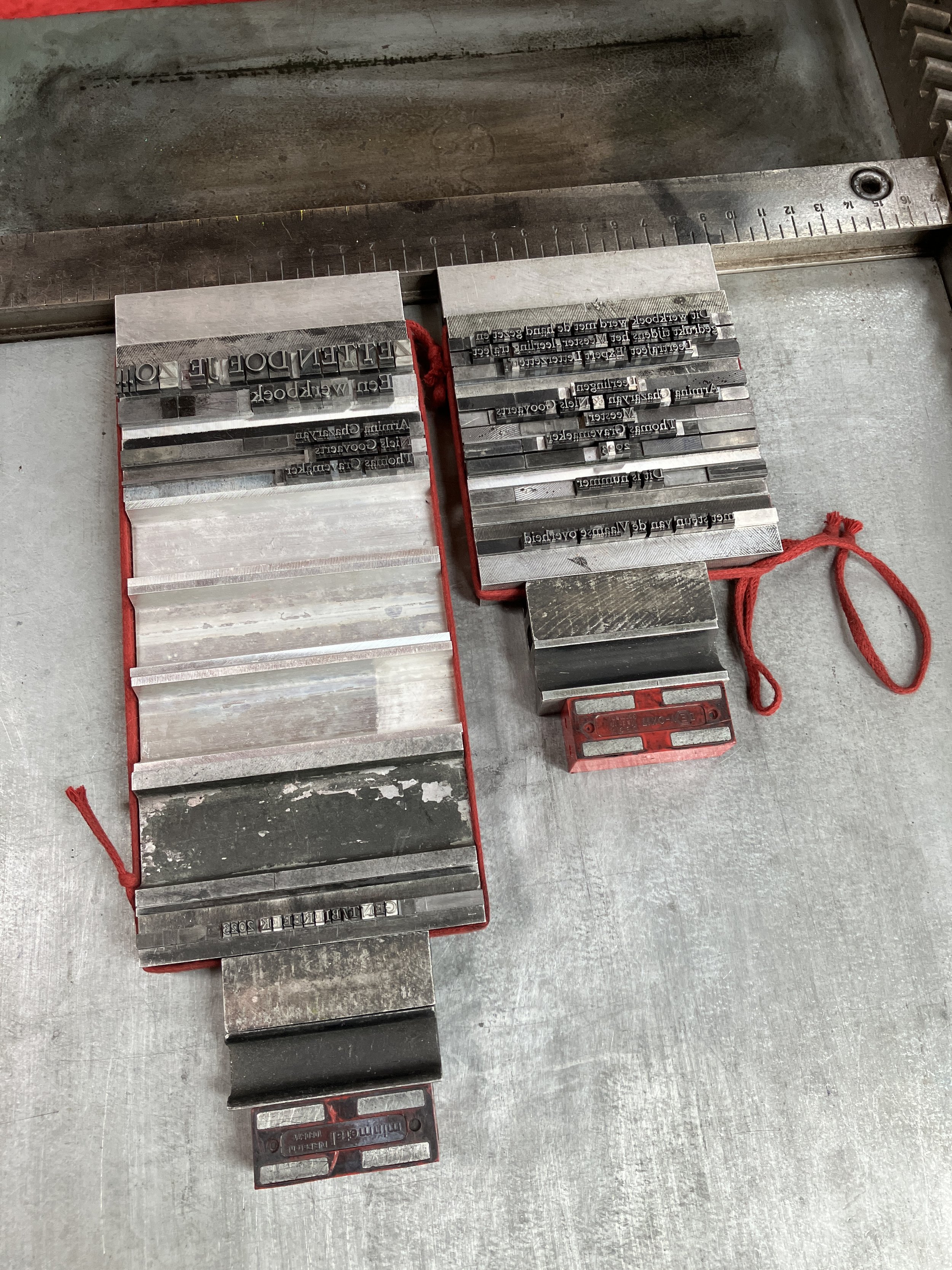
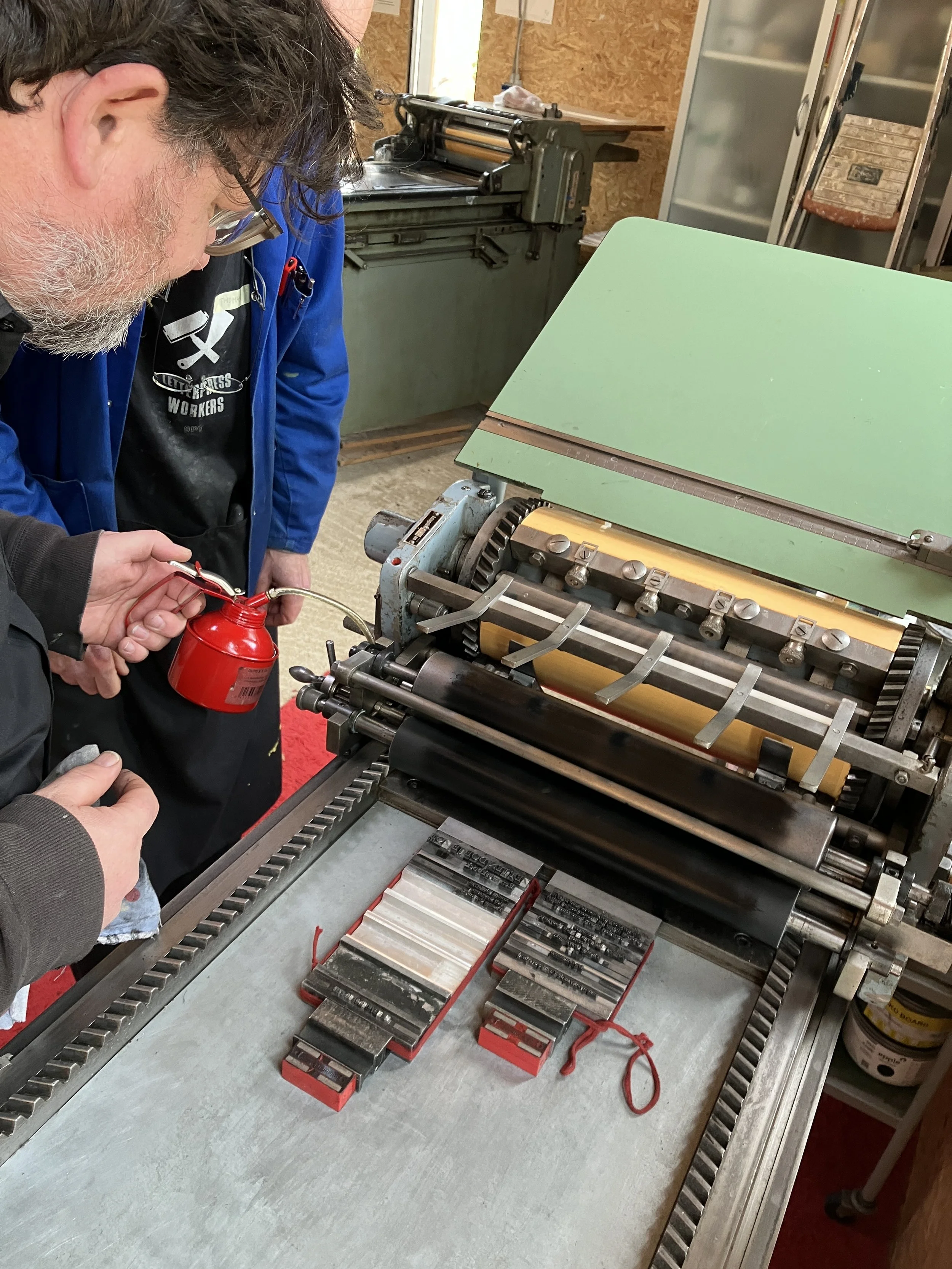
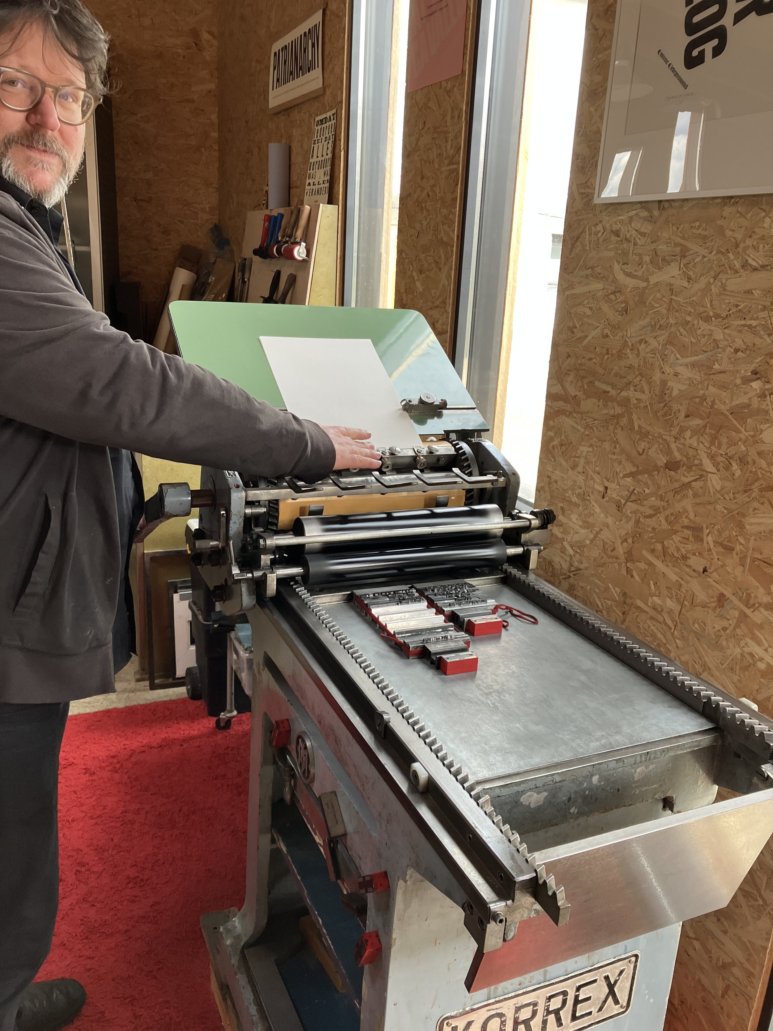
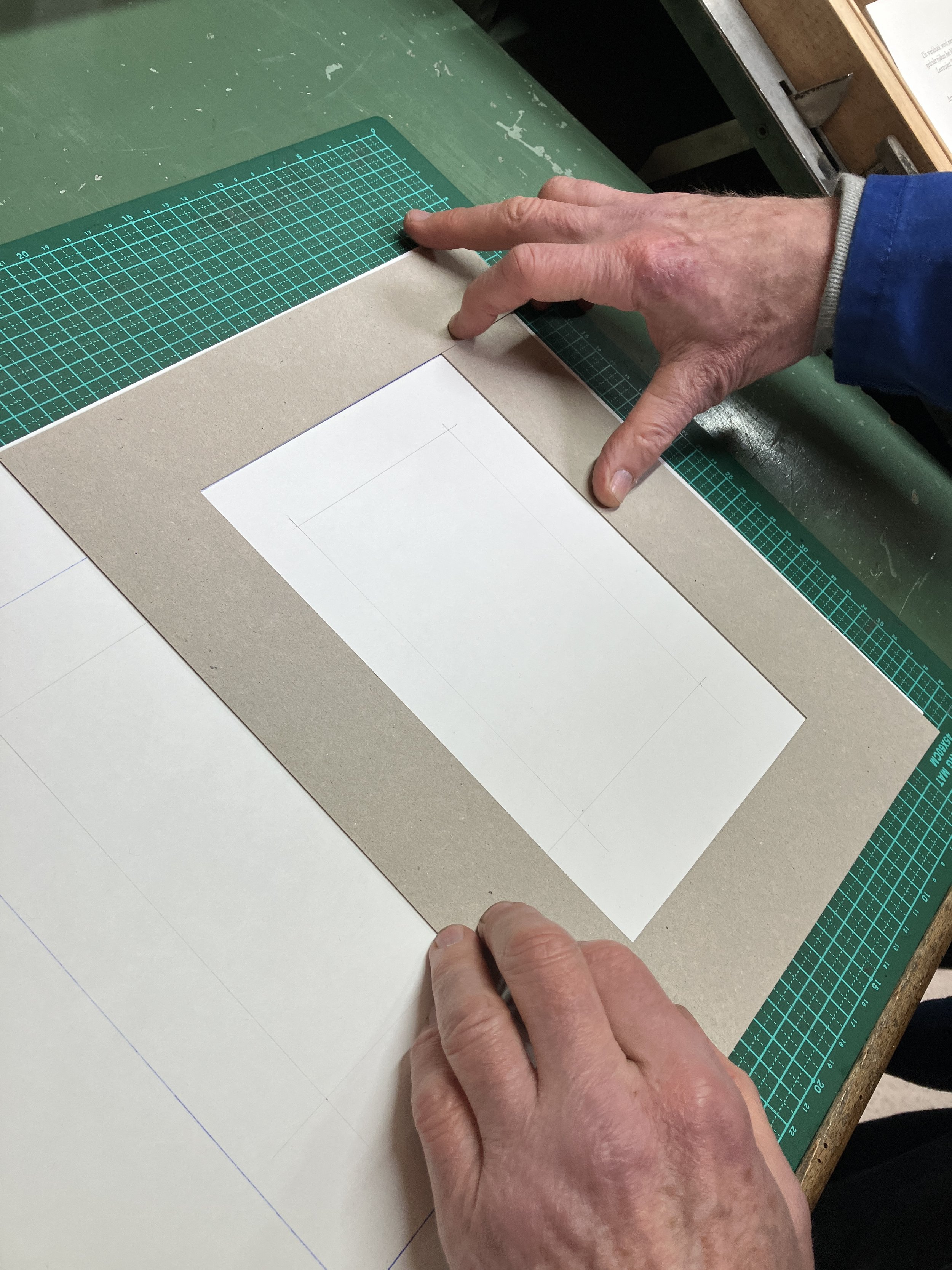
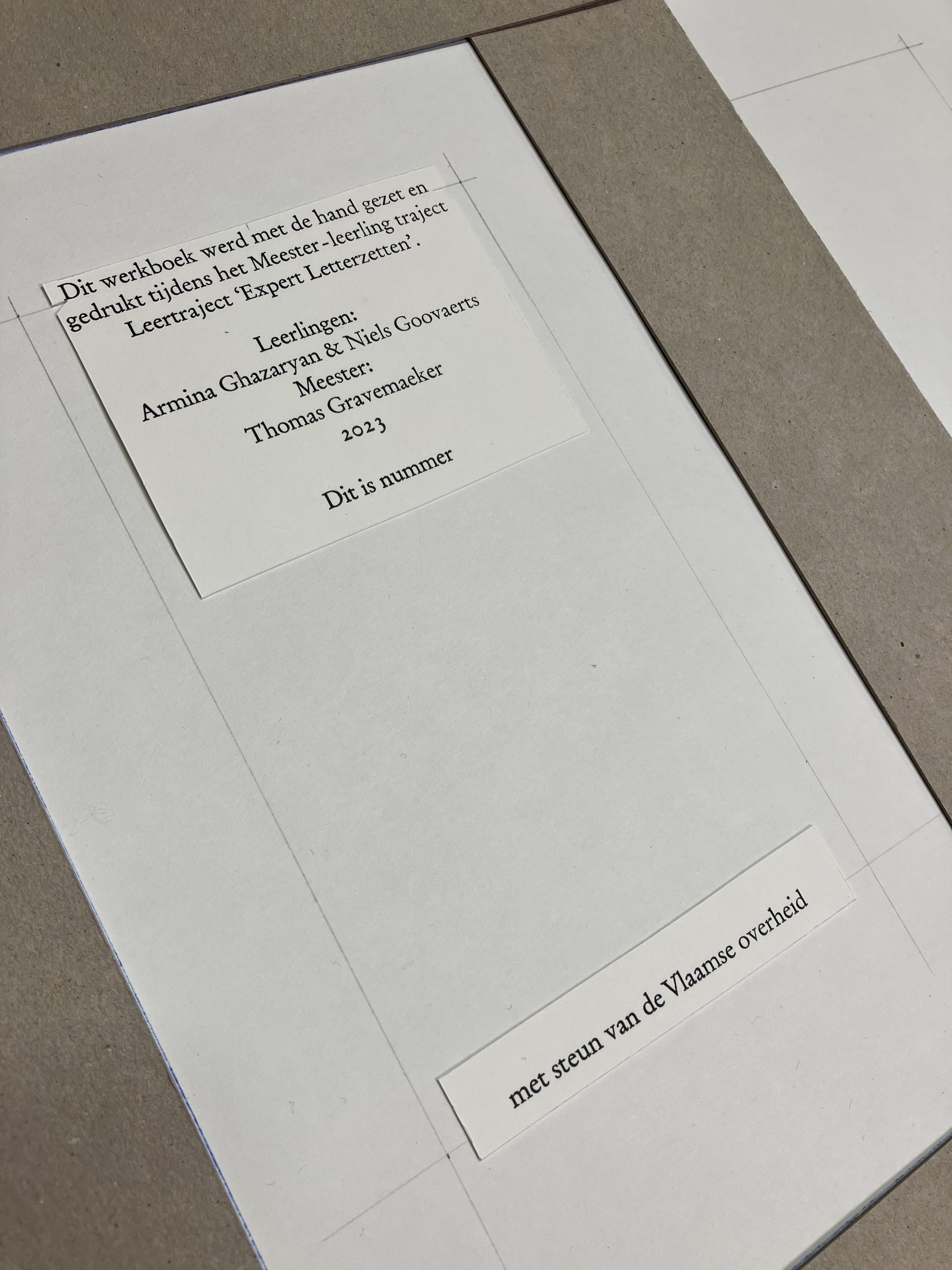
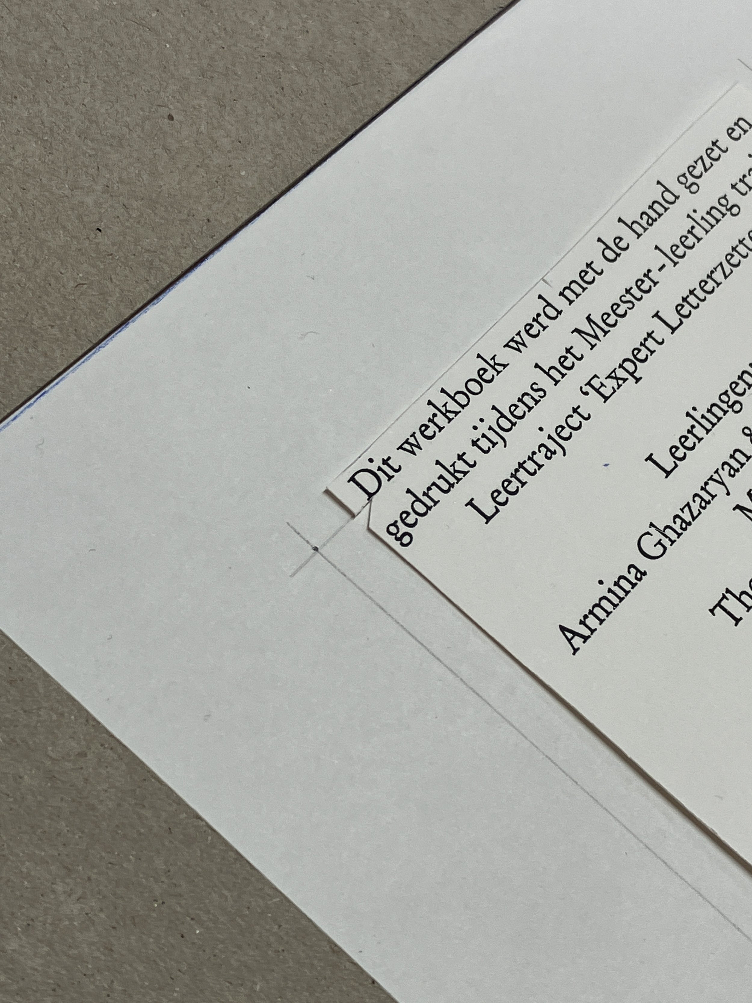
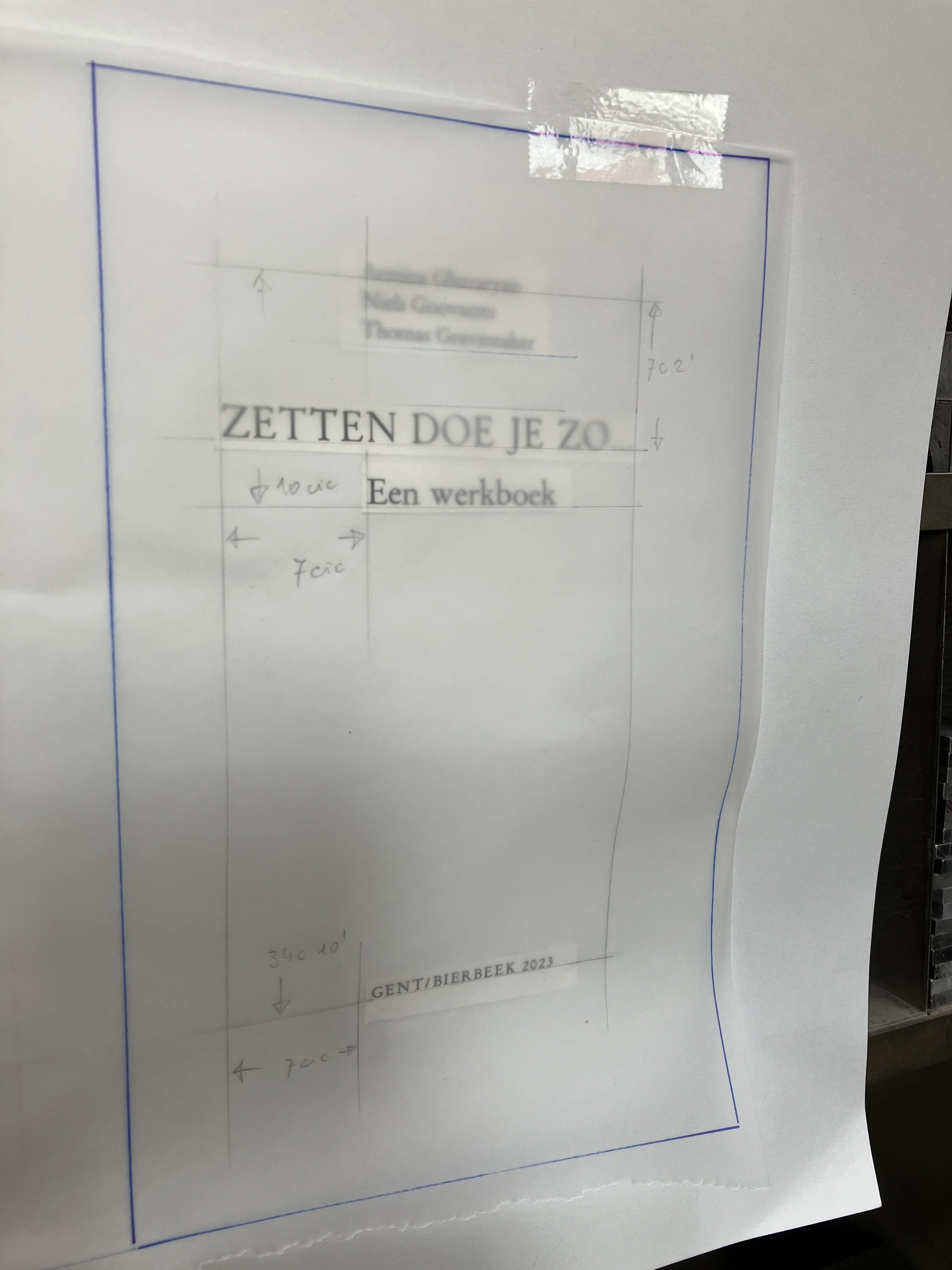
The last day we spent deciding on the title page: the text, the layout, and the size of the type. One more day of typesetting, proofing, cutting out, and pasting the prints and designing the page. Once satisfied with the results it was time to tidy up. Dissing the type, cleaning up the printing press, drinking a cup of coffee, packing bags.
These were very intense but very informative three days. Where we learned not only about typesetting but also about tricks of the trade. And this knowledge is even more valuable.
The next lessons will be taking place in the Museum of Industry, so stay tuned ;)
more pictures here
you might also like
Back to school or letterpress learning programme 2023
iBookBinding is returning to the Museum of Industry (Ghent)
Gentse Feesten 2022! Or poster, card and Late Donderdag.
’Ka-ching!’ Posters for the Museum of Industry
The Museum of Industry. Textile Posters.
Posters for the MIAT
Das es straffe kaffee
Nog een potse truust
Museum Night at the MIAT. 01.12.16
Letterpress Workshop by Thomas Gravemaker (LetterpressAmsterdam) at the MIAT
DRUKOPSTRAAT 7. 4-5.05.2019. Museum of Industry. Gent
Sunday type walks in Bookish Talks by iBookBinding
Born in Armenia, grew up between Russia and the Netherlands and now living in Belgium chasing my graphical madness

