
When walking through Oudburg in Ghent, which I do quite often, I have noticed a number of small changes over the years. Signs disappear. Façades are repainted. Businesses move on. New lettering takes their place.
None of these changes is particularly dramatic. But together they tell us something about how the visual identity of a street evolves.
Two places in particular caught my attention: Ceci n’est pas une épicerie at Sluizeken and the long-established brasserie Aba-jour on Oudburg. And further along the street, at number 52, there was another interesting example: Antiek J. Parret.
Three different businesses, three different approaches to lettering, and three reminders that a shopfront is never quite as permanent as it appears.
2011
2026
Date: 2011 & 2026
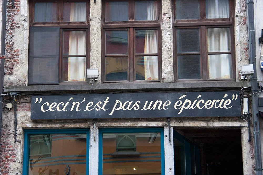
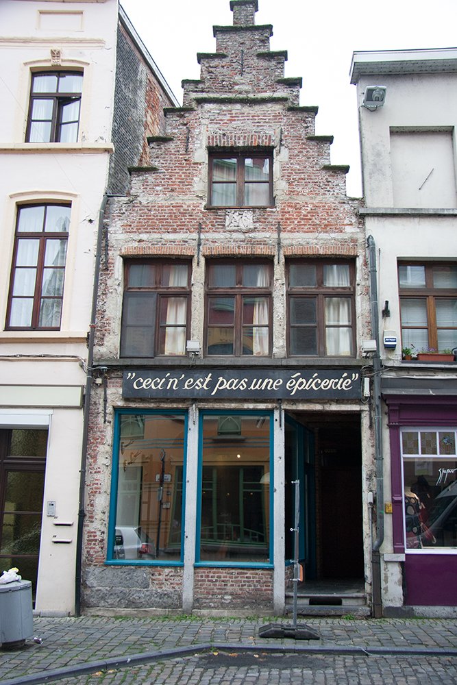
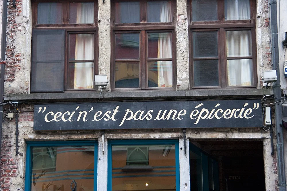
Info: Strictly speaking, Ceci n’est pas une épicerie is at Sluizeken rather than on Oudburg itself, but it belongs naturally to the same walk through this part of Ghent. It was an interior shop, but what first caught my eye back in 2011 was not what was inside. It was the beautifully hand-painted sign above the entrance. The name already invited you to look twice.
2011
Ceci n’est pas une épicerie — “This is not a grocery store” — plays with René Magritte’s famous Ceci n’est pas une pipe. Here, the joke became part of the identity of the shop and, consequently, part of the street.
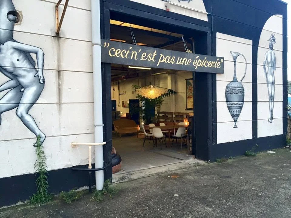
temporary location at KERK GENT
I remember seeing the Ceci n’est pas une épicerie identity appear again at another location, with the painted board moving with the business. That location was KERK GENT. It is no longer there. The site was sold to property developers, and another chapter of the building's history came to an end.
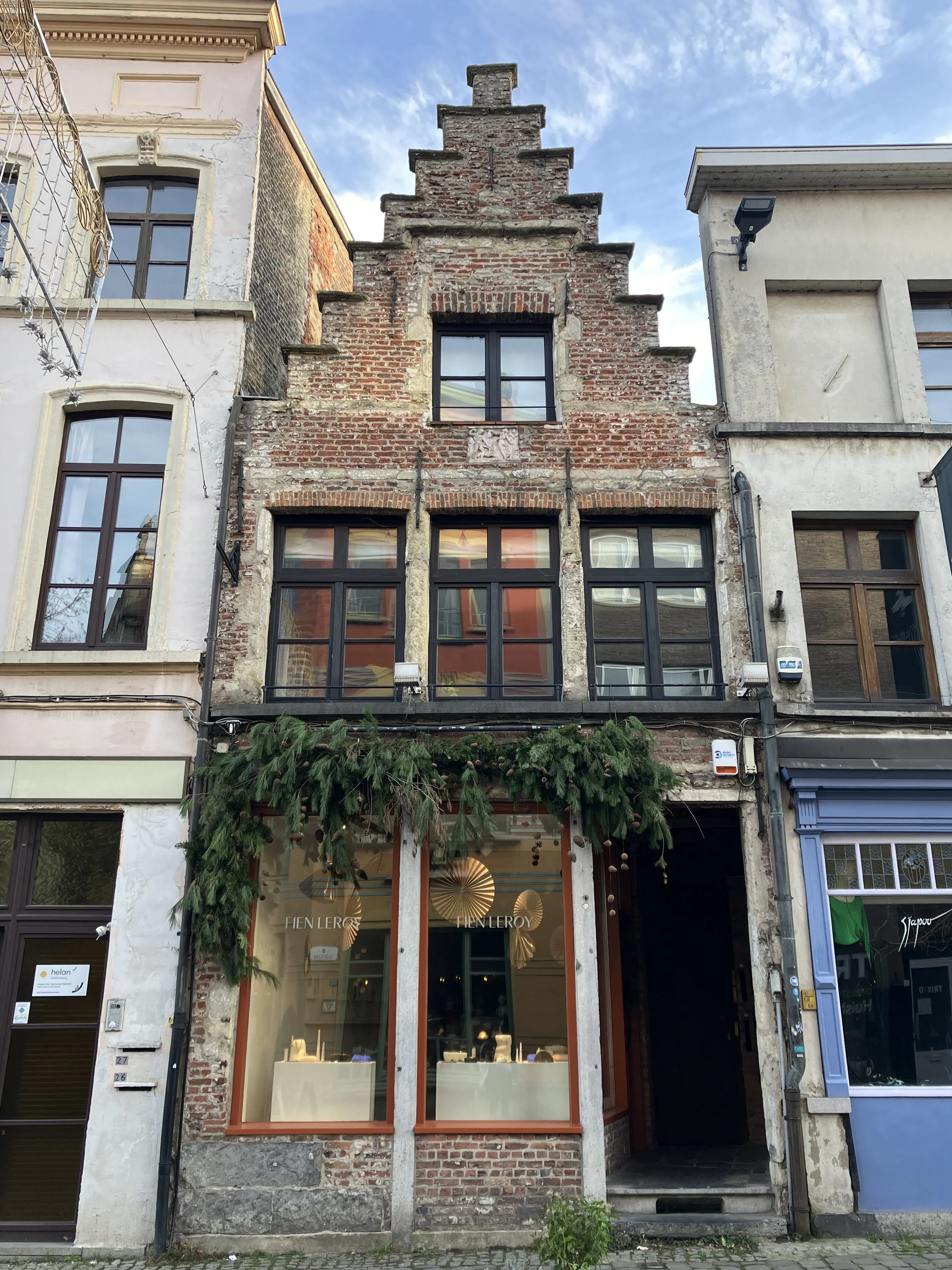
Over the years, different businesses occupied the premises. One of them was Mayenne Nelen. With each change, the façade changed too: a new name, a new sign, another layer of commercial history. Today, the premises are occupied by jewellery designer Fien Leroy, whose handcrafted silver and gold jewellery has its own quiet visual language (picture above).
The businesses have changed, but the façade continues to function as a kind of visual archive. A sign is never simply information telling us what is inside. Sometimes it becomes a marker of a particular moment in the life of a building.
2015
2015
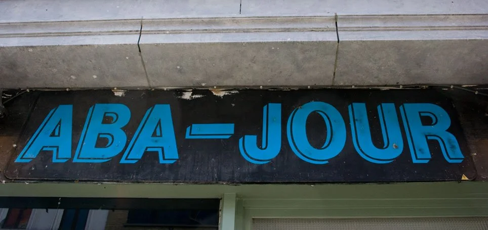
Moving further along Oudburg, another change in lettering can be seen at the entrance of the long-established brasserie Aba-jour. Many people visiting Ghent will already know it: Belgian beer, Flemish food and, in warmer weather, a terrace overlooking the Leie. But before looking at the menu, look at the façade.
Date: 2015 & 2026
Info: The building itself is considerably older than the restaurant. It forms part of Ghent's nineteenth-century commercial architecture and was designed by Ghent architect Prosper Buyck as a shop building. Aba-jour is a shortened form of the French abat-jour, associated with a lampshade or light reflector. The unusual spelling has become part of the restaurant's identity.
But what interests me most is what happened to the lettering. Until a few years ago, the façade carried hand-painted lettering. The letters had a shaded blue appearance, giving the name a certain depth. They felt less like a conventional logo and more like something made specifically for the building. This is one of the things that makes painted shop lettering so interesting.
It doesn't necessarily belong to a typeface in the conventional sense. It belongs to the tradition of commercial sign painting: letters made for a particular surface, a particular business and a particular street. The irregularities are part of the character. The spacing. The shadows. All of these details make hand-painted signage different from a logo reproduced from a digital file.
And then it changed.
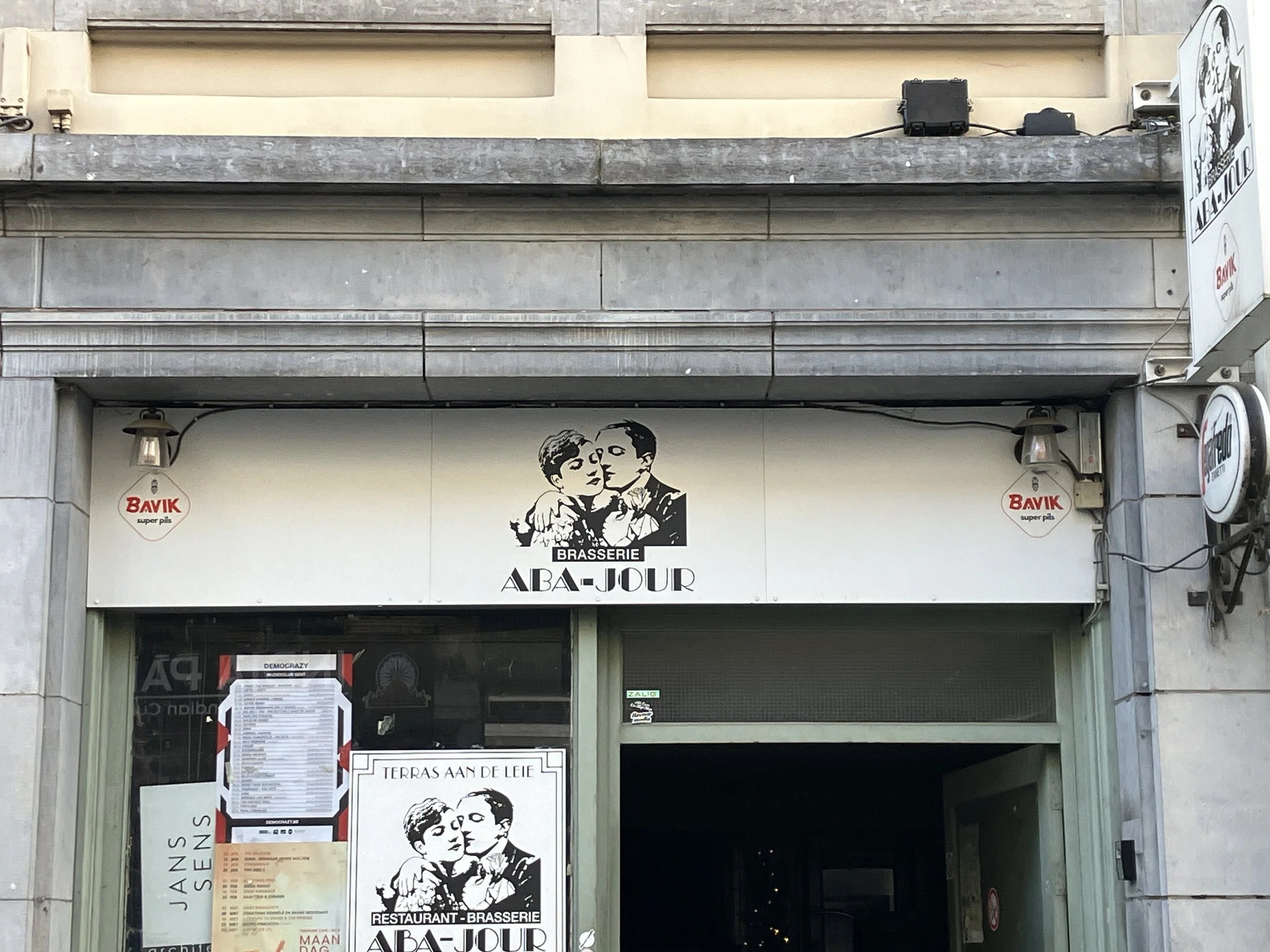
2026
The painted lettering was replaced by a much simpler white board with a small black Aba-jour logo. The visual hierarchy is completely different. Where the earlier lettering occupied the façade and announced itself through painted letters, the new sign behaves more like a contemporary piece of corporate identification: a rectangular field, a logo and a clear separation between sign and architecture. Neither approach is necessarily better or worse. They simply belong to different ideas about what a business sign should be. The older lettering feels embedded in the building. The newer sign feels attached to it. That small difference is what makes the change worth noticing.
2011
2026
Date: 2011 & 2026
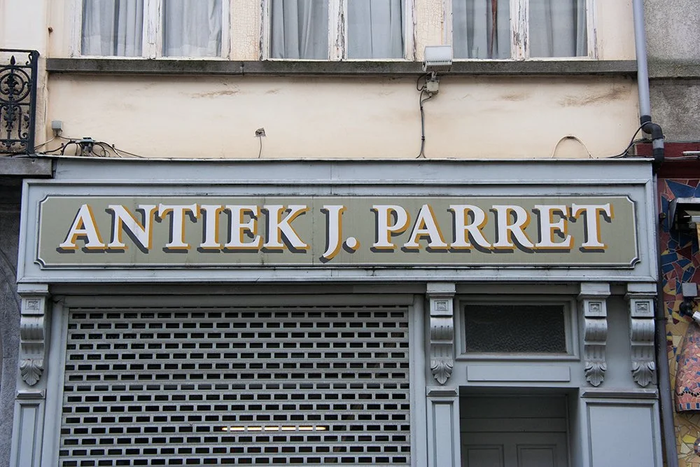
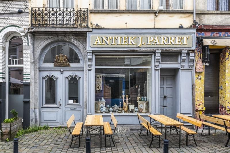
Info: Further along Oudburg, at number 52, another kind of commercial lettering caught my eye. Antiek J. Parret was established in 2005 as an antique shop specialising in applied arts and objects dating from before 1850. Faience, majolica, stoneware, porcelain and terracotta. Silver, bronze, brass, pewter and wrought iron. Glass, wood and stone. Sculpture, paintings, religious and archaeological objects. There was also a company called Wapenhandel J. Parret (J. Parret arms dealer) registered at Oudburg 52. So there may be two different J. Parret businesses occupying the same address at different periods.
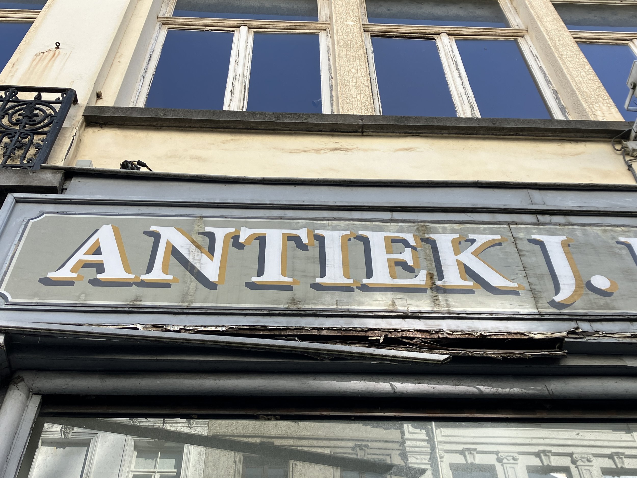
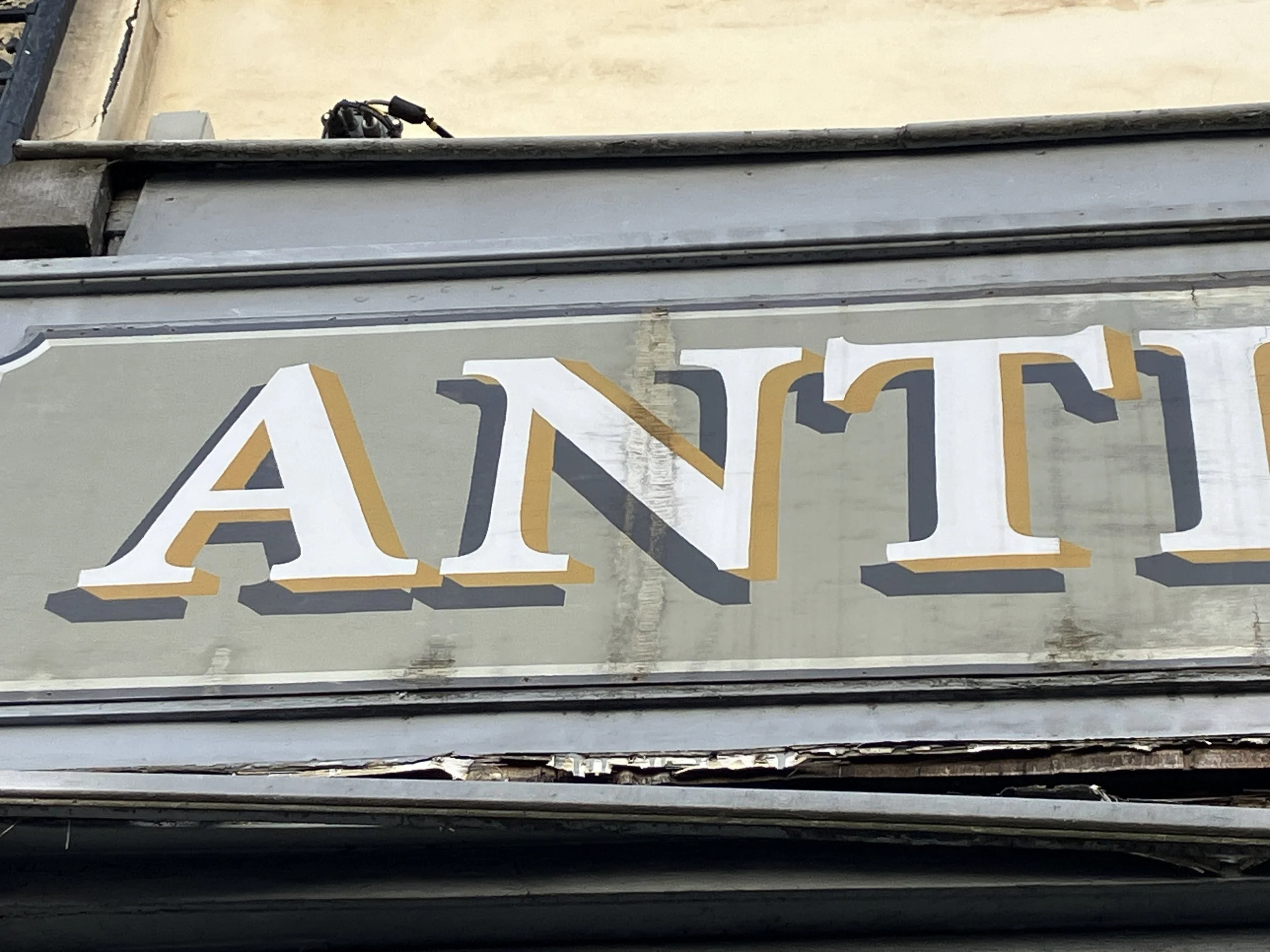
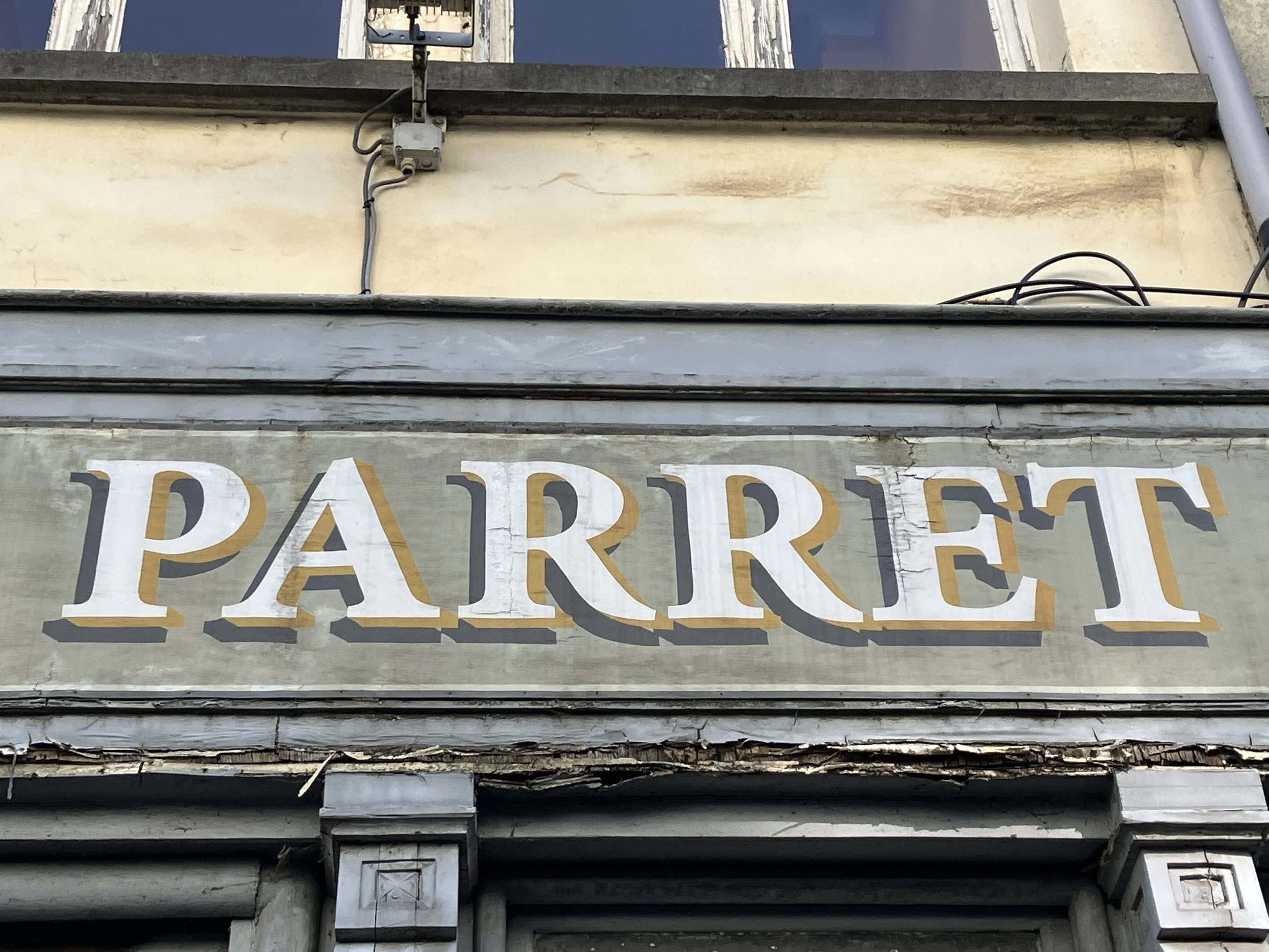
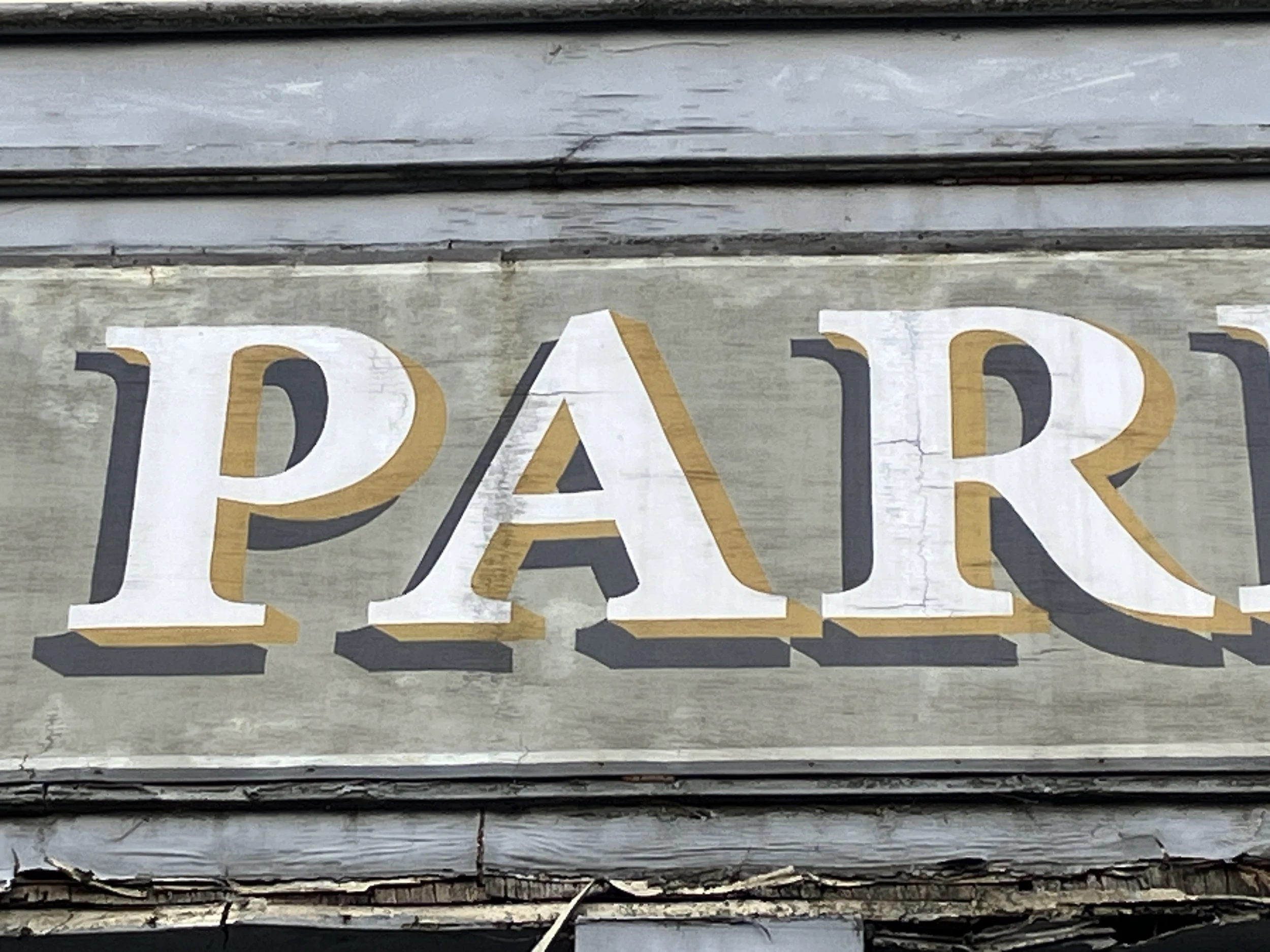
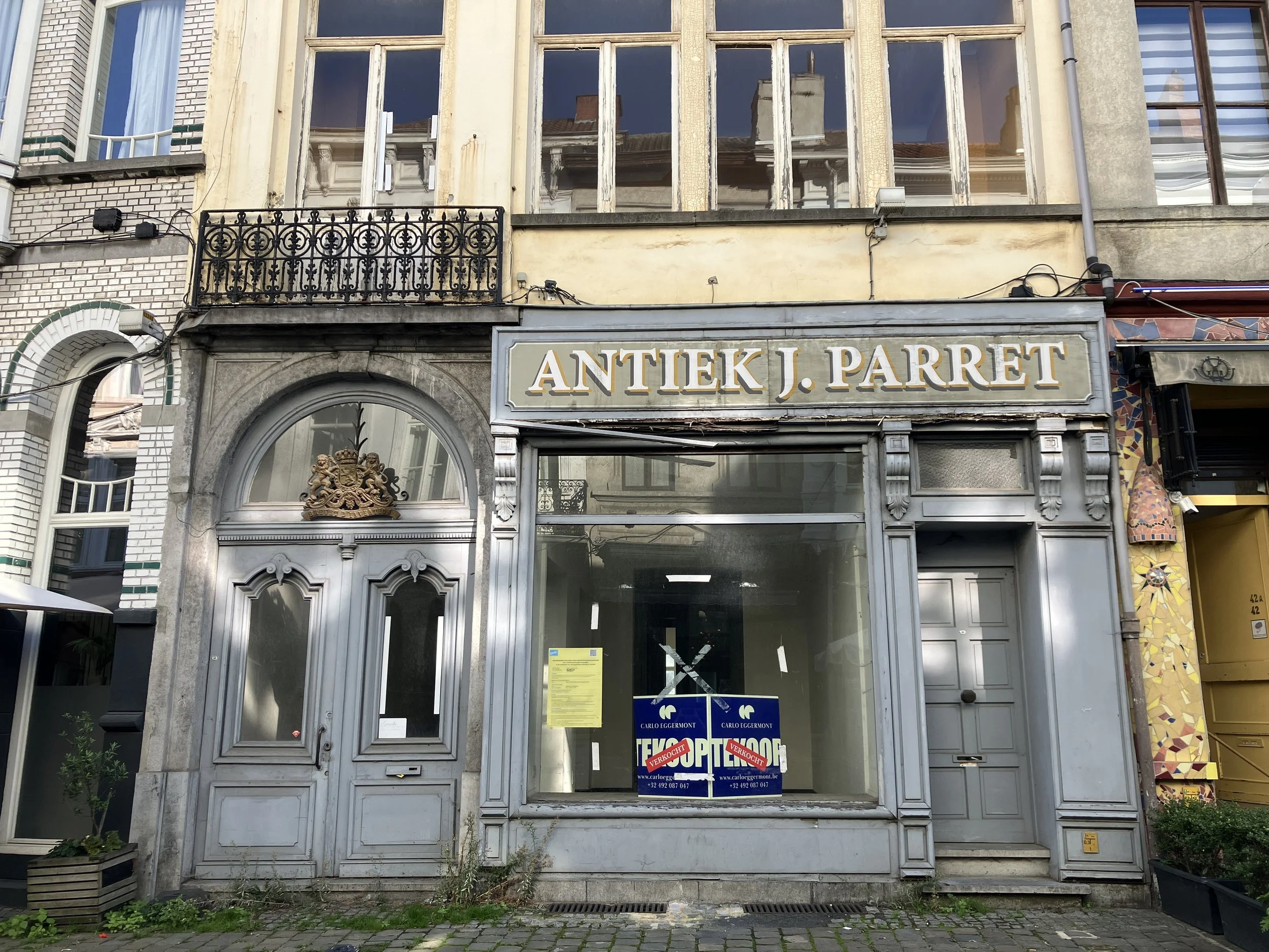
But the most interesting thing, from a typographic point of view, was the shopfront itself. The wooden pui and hand-painted lettering formed a single composition with the display windows. This wasn't a modern shopfront with a separately designed corporate sign attached to it. The lettering and objects behind the windows all belonged to the same visual world. That seemed particularly appropriate for an antique dealer. The shop was presenting itself as an object from another time. The lettering was part of that story.
2021 source
The business may have been established only in 2005, but its visual language deliberately looked backwards. And this is one of the things that makes commercial lettering so interesting: it tells us not only what was sold, but also how a business wanted to be seen from the street.
Today, Antiek J. Parret is closed and the premises have been sold to property developer and will become a hotel. Another piece of Oudburg's visual history will be moved from the street into photographs and memory.
2026
Walking through Ghent, it is easy to overlook these transitions. A sign disappears. A new one is installed. A shop changes hands. A painted board is removed. A façade is cleaned and repainted. Three shopfronts, three different relationships between lettering and architecture. The street is constantly being rewritten. Businesses come and go, but the façades remain like paper on which generations leave their marks.
to be continued…
you might also like
Type Walk in Ghent. Before & After. Looking up: the fading letters of Cockney's Distillery.
Type walk in Ghent. Before & after. 90 years of Dossche Sport.
Type walk in Ghent. Before & after. Marchandises & stories.
Type walk in Ghent. Before & after. Only “Beerhouse” remains.
Type walk in Ghent. Before & after or from lace to lunch: the changing story of Kraanlei 33.
Sunday type walk in Pressing Matters magazine
Sunday type walks in Bookish Talks by iBookBinding
Follow my Sunday type walks on Instagram