Letterpress artist Rob LoMascolo talks about the traditional craft of printing in a short instructional videos on Fortnight online documentary project.
Read More
Call for entries. 30th Anniversary Poster & Broadside Exhibit
image by Interrobang letterpress
"In celebration of the 30th Anniversary of the founding of the LGNE, the Letterpress Guild of New England (1982-2012), it was decided to mount an exhibition to educate, entertain, and inform the public. What better form than the letterpress poster and broadside, mediums which have always served that purpose."
click here for more details
exhibition
September 1st - 30th, 2012
The Arsenal Center for the Arts
Watertown, Massachusetts
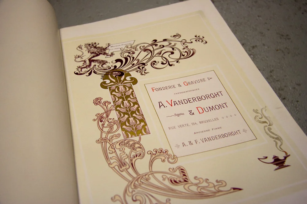
Vanderborght & Dumont
While doing research in the MIAT museum library I discovered two Belgian type specimen books by Vanderborght & Dumont type foundry.
First one is a well produced comprehensive specimen with a large section of Elzevir, and ornamental faces plus a large section (109 leaves) of decorative material. The book is 22x28cm and in a very good shape. The second specimen is not in perfect state, some pages are missing.
The type foundry was established in Brussels by Michel-Joseph Vanderborght (1801 - 1870). Vanderboorght optimized the typecasting manufacturing by having a cooling system to double output of the characters.

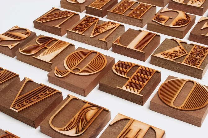
Laser cut Bodoni
This decorative alphabet was produced by Nigel Bents, Paul Oakley and Jonny Holmes at Chelsea College of Art & Design. Based on a downloaded Bodoni Poster font, it was designed digitally by students using Illustrator, laser cut out of 3mm plywood by Cut Laser Cut in Vauxhall and mounted on type-high block by Stef Willis in the college workshop.
It was then printed at Graham Bignell's New North Press in Hoxton."
Absolutely beautiful!
Read MorePressless Etching
"…artists and biologist are taught to observe the nature.
Biologist are taught to study the functioning of the organic physical world
and the artists are taught to make social observation of the physical world."
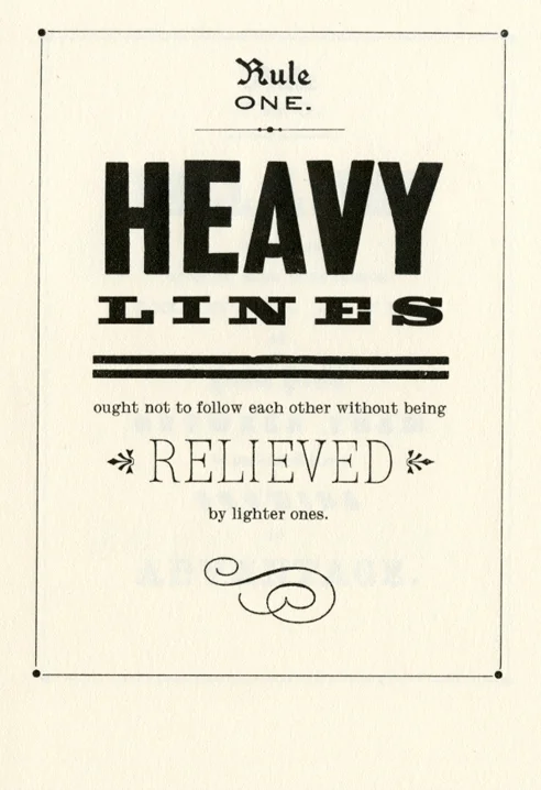
Rules
Absolutely love this quotes/rules from "Nineteenth Century Job Printing Display - The Poster", a little guide about typesetting/printing typeset with metal type and printed by Bowne & Co., Stationers in 1989 in New York. Clean instructions for being a good composer!
Read MoreBetween writing and type: the stencil letter
Just spotted an interesting exhibition in Antwerp next week:
"An exhibition of stencil letters from the 18th century to the present day. Assembled by Eric Kindel and Fred Smeijers, the exhibition will feature a rich selection of stencil letters in the context of artefacts, documents and ephemera, including stencil plates and stencilling devices, specimens and catalogues, patent inventions and much more. A highlight of the exhibition will be a set of new stencil typefaces designed by Maurice Göldner, Pierre Pané-Fauré and Fred Smeijers. "
practical info
20 April — 29 June 2012
Opening Thursday 19 April
Catapult
Projectspace Kades—Kaden
Rubenslei 10
2018 Antwerp
Belgium